EVALUATION QUESTION 2: HOW EFFECTIVE IS THE COMBINATION OF YOUR MAIN PRODUCT (VIDEO) AND ANCILLARY TEXT (DIGIPAK AND ADVERTISEMENT)?


When discussing a combination it would refer to synergy which is when two or more things work together for a greater impact (mutual benefit). In this case, how well does the Music Video work with the Digipak and Magazine advertisement?

PLANNING PROCESS...
When planning the synergy for all our products we tried to collaboratively come up with clear ideas as to how we could keep the consistency throughout our products as so we considered the:
- Theme - Minimalism/euphoria
- Colours - Monochrome + an extra colour (blue, green, pink & yellow) Burst of colour for euphoria - monochrome for minimalism.
- Costume - same costume used throughout, make up, accessories
- Artist Brand Image
- Mise en scene - Props.
Linking all the products together created a brand image and identity for our artist which enhances and promotes her.
COLOURS...


For our music video we instantly knew we wanted to use the colours black and white, originally we decided that we wanted a black and white edit throughout and we even had costumes and settings consistent with this black and white theme. However when it came down to editing it just did not look good with a black and white edit throughout. Although we didn't originally intend to use colour but along the process we began to think that this burst of colour will add that euphoric feel and amplify the song a lot more. After creating the Music Video we had a colour palette of - Black, White, Blue, Pink, Green and Yellow to work with. As the digipak do's and don't's limit the colour palette to max 3 colours I had the option of black, white and one extra colour.
COLOURS...
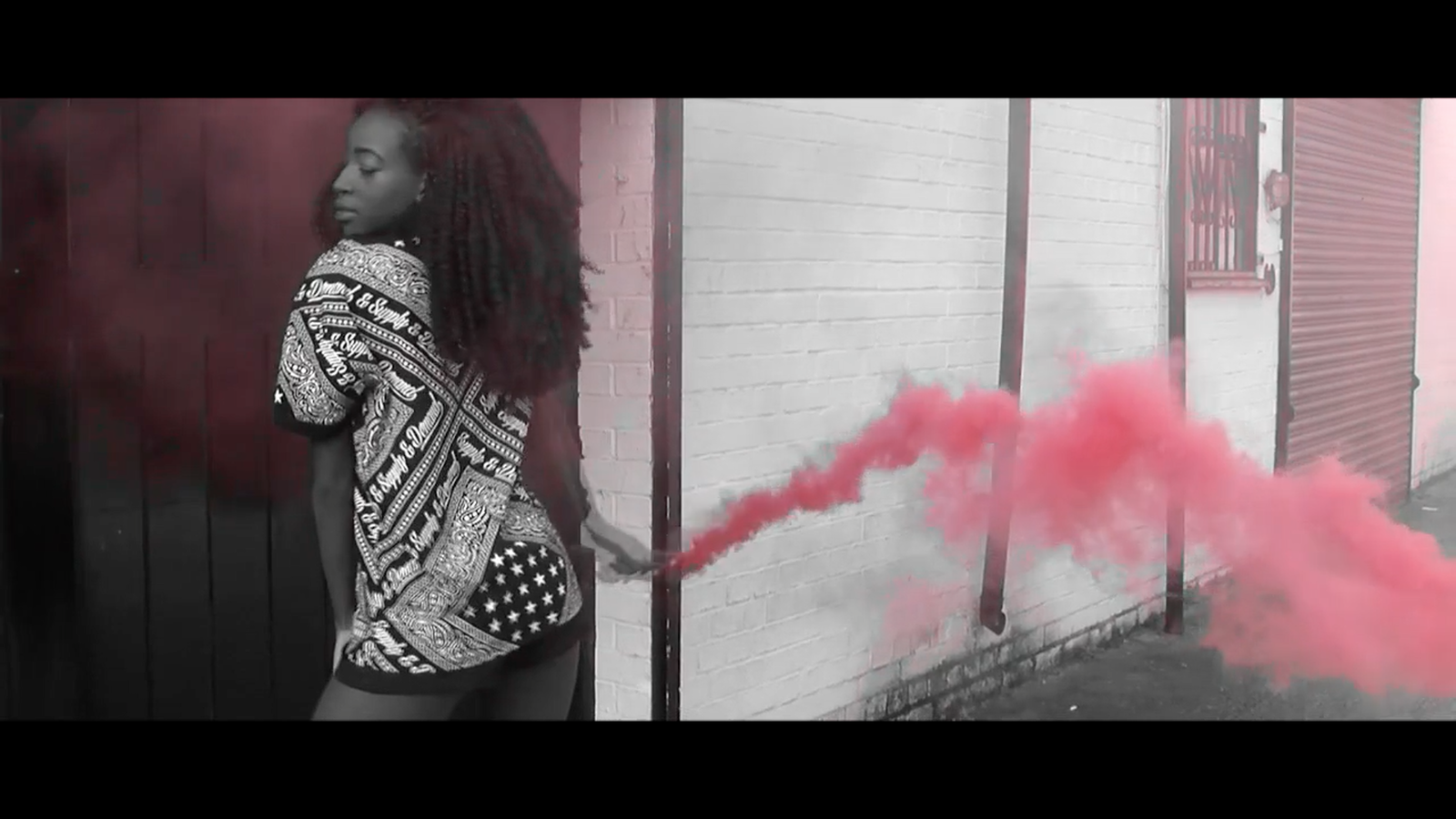
So how did the colours link the music video and ancillary texts together? In the music video the most significant aspect was the Colour Separation edit on the smoke shots, where the whole footage was in black and white but the smoke was in colour. Again the image I used in the digipak and advertisement used this same edit. - This makes all three products easily identifiable as 'Yasmin Ally's' work.


COSTUME...
Costume, motif and accessories that created our artists brand image, for example her big hair, nose ring and black and white paisley top. I decided to use a picture for my digipak and advert with this specific costume, as throughout the music video she had a full black outfit except this shot where she had both black and white. Her big hair and nose ring are part of her brand image and in order to successfully promote her and ensure people recognise the link between the Music Video and the ancillary products, I needed to make this imagery of her repetitive.


PROPS...
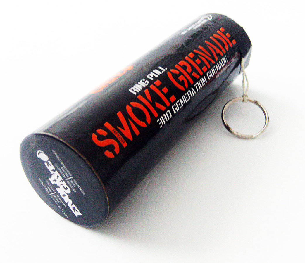
From the beginning, we had to plan out how we would link our products together. When I first heard the song I instantly thought, drugs to make a person have 'high' sensations. This led to the thoughts of smoke. Initially we did not know how we would incorporate the smoke but eventually Chenny got hold of the smoke grenades and it all came into play. As this prop stood out the most in our Music Video and the editing also was highlighted, I felt it was only right to make the smoke our key visual and use it across all three products. Also the smoke shots was the part of the music video I felt would be most attractive to our audience, the wow factor and so I wanted to emphasise it through all the products.


LINKING THE ANCILLARY...
The reason why I decided to repeat the same image of the digipak on the advert, is to further emphasise the artists image. The constant emphasis will further promote her and make her recognisable which will engage her more with the audience. Also using a similar image on the interior of the digipak, with repetitive colours, costume and locations, makes it more appealing to the audience.


REAL MEDIA PRODUCTS...
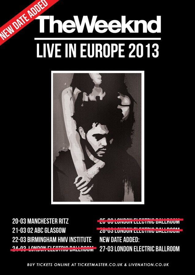
One real media product that is similar to mine and that had great influence on my ideas of synergy is from The Weeknd and the how he link his Rolling Stone video to his trilogy album. The video was simple and used a minimalistic colour palette like we have. This was further reinforce in his digipak and advertisement. Also the main image used was direct out of the video. This synergy further strengthens the audiences ability to identify the Weeknd as an artist. Although I had not personally done that the picture I used was very similar to the footage used in the video. The use of the same costume across all products and our key visual of the smoke grenade prop sets our artists image and allows our audience to easily recognise her.


*video linked below*
SUCCESS?
Looking at all my final media products, I can tell there is a significant sense of synergy throughout. Firstly using the same colour scheme reinforced the simplistic theme and the burst of colour definitely achieved the euphoric feel which I was attempting to convey. There is a clear link between the ancillary products and the main product, through the use of colour, costume and props and it is definitely easily recognisable to the audience.


deck
By nadayasmin
deck
- 2,543

