Vue.js
The Practical Guide
@N_Tepluhina
What will we learn today?
- Components structure and contracts
- Abstracting and reusing logic
- Component composition
@N_Tepluhina
When your project grows...

@N_Tepluhina
Components structure and contracts
@N_Tepluhina
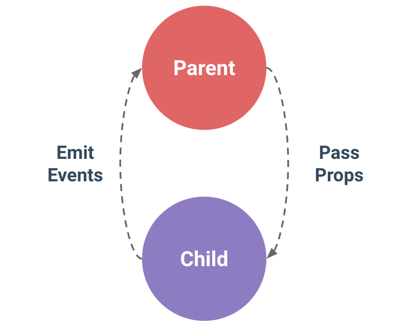
One-way data flow
@N_Tepluhina
One-way data flow
- DO NOT mutate props
- ...even if props are objects
- ...even if they passed 6 levels deep
- avoid pass method as a prop, emit an event instead
@N_Tepluhina
My cool modal component
<script>
export default {
  props: {
    headerText: String,
    descriptionText: String,
  }
}
</script>

<template>
  <div class="modal">
    <h2>{{ headerText }}</h2>
    <p>{{ descriptionText }}</p>
    <div class="modal-actions">
      <button @click="$emit('modal-ok')">OK</button>
    </div>
  </div>
</template>
Can we render a logo if there is no header text?
@N_Tepluhina
My cool modal component
<script>
export default {
  props: {
    headerText: String,
    descriptionText: String,
  }
}
</script>

<template>
  <div class="modal">
    <h2 v-if="headerText">{{ headerText }}</h2>
    <img v-else src="https://picsum.photos/100">
    <p>{{ descriptionText }}</p>
    <div class="modal-actions">
      <button @click="$emit('modal-ok')">OK</button>
    </div>
  </div>
</template>
Can we change a logo link? We need different logos for different modals
@N_Tepluhina
My cool modal component
<script>
export default {
  props: {
    headerText: String,
    descriptionText: String,
    logoUrl: String
  }
}
</script>

<template>
  <div class="modal">
    <h2 v-if="headerText">{{ headerText }}</h2>
    <img v-else :src="logoUrl">
    <p>{{ descriptionText }}</p>
    <div class="modal-actions">
      <button @click="$emit('modal-ok')">OK</button>
    </div>
  </div>
</template>
For some modals we need a cancel button!
@N_Tepluhina
My cool modal component
<script>
export default {
  props: {
    headerText: String,
    descriptionText: String,
    logoUrl: String,
    isCancelShown: Boolean
  }
};
</script>

<template>
  <div class="modal">
    <h2 v-if="headerText">{{ headerText }}</h2>
    <img v-else :src="logoUrl">
    <p>{{ descriptionText }}</p>
    <div class="modal-actions">
      <button v-if="isCancelShown" @click="$emit('modal-cancel')">Cancel</button>
      <button @click="$emit('modal-ok')">OK</button>
    </div>
  </div>
</template>
@N_Tepluhina
My cool modal component
We also want different colors for 'OK' button
Can we render more than simple text on description?
We would like an icon to specify the modal type...
@N_Tepluhina
My NOT COOL ANYMORE modal component
@N_Tepluhina
Slots
<script>
export default {
  props: {
    headerText: String,
    descriptionText: String,
    logoUrl: String,
    isCancelShown: Boolean
  }
};
</script>

<template>
  <div class="modal">
    <h2 v-if="headerText">{{ headerText }}</h2>
    <img v-else :src="logoUrl">
    <p>{{ descriptionText }}</p>
    <div class="modal-actions">
      <button v-if="isCancelShown" @click="$emit('modal-cancel')">Cancel</button>
      <button @click="$emit('modal-ok')">OK</button>
    </div>
  </div>
</template>
@N_Tepluhina
Slots
<script>
export default {
  props: {
    descriptionText: String,
    logoUrl: String,
    isCancelShown: Boolean
  }
};
</script>

<template>
  <div class="modal">
    <slot></slot>
    <p>{{ descriptionText }}</p>
    <div class="modal-actions">
      <button v-if="isCancelShown" @click="$emit('modal-cancel')">Cancel</button>
      <button @click="$emit('modal-ok')">OK</button>
    </div>
  </div>
</template>
@N_Tepluhina
Named slots
<script>
export default {}
</script>

<template>
  <div>
    <slot name="header"></slot>
    <slot name="description"></slot>
    <div class="modal-actions">
      <slot name="actions"></slot>
    </div>
  </div>
</template>
@N_Tepluhina
Named slots
<!-- parent component -->

<template>
  <my-modal>
    <template #header>My header</template>
    <template #description>
      <h4>
        Here is my awesome description
      </h4>
      <span>Description text goes here</span>
    </template>
    <template #actions>
      <button v-if="isCancelShown" @click="onCancel">Cancel</button>
      <button @click="onSubmit" :style="{backgroundColor: okColor}">OK</button>
    </template>
  </my-modal>
</template>
@N_Tepluhina
Scoped slots
<!-- MyModal.vue -->

<script>
export default {
  data() {
    return {
      loading: true
    };
  },
  created() {
    setTimeout(() => (this.loading = false), 3000);
  }
};
</script>

<template>
  <div class="modal">
    <slot name="header" :loading="loading"></slot>
    <slot name="description"></slot>
    <div class="modal-actions">
      <slot name="actions"></slot>
    </div>
  </div>
</template>
@N_Tepluhina
Scoped slots
<!-- App.vue -->

<my-modal>
  <template #header="{ loading }">
    <h2>You have joined Vue workshop!
      <template v-if="loading">Wait for it...</template>
    </h2>
  </template>
  ...
</my-modal>
@N_Tepluhina
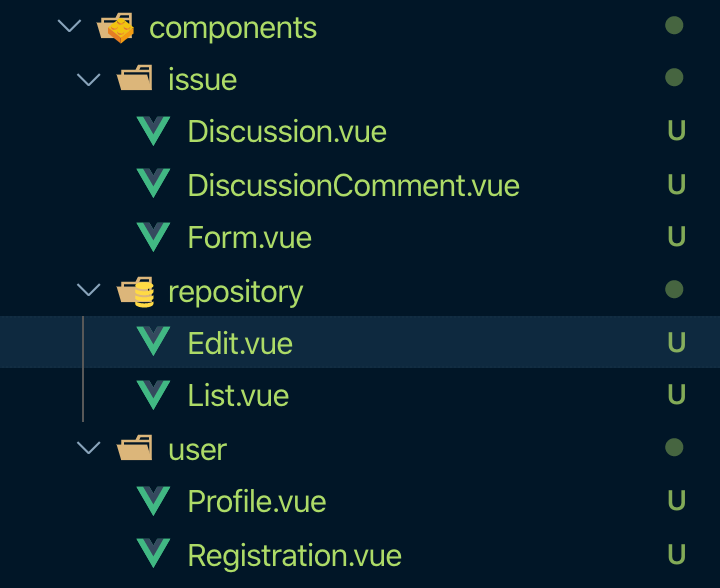
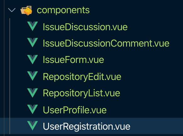
Flat
Nested
@N_Tepluhina
Flat
Nested
- easy to navigate
- easy to refactor
- good for smaller projects
- more structured
- test near component
- components folder is not bloated for bigger application
@N_Tepluhina
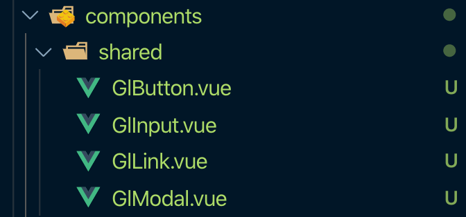
Base/Shared components (atoms)
- buttons
- inputs
- modals
- ...everything you can imagine in component library
@N_Tepluhina
Add a prefix!
@N_Tepluhina
Make them as dumb as possible
- no global state bindings
- minimum local state
- props, emitted events and slots
Q & A
@N_Tepluhina
Vue.js: The Practical Guide
By Natalia Tepluhina
Vue.js: The Practical Guide
Smashing Workshop - Day 2


