Vogue Website
Masthead
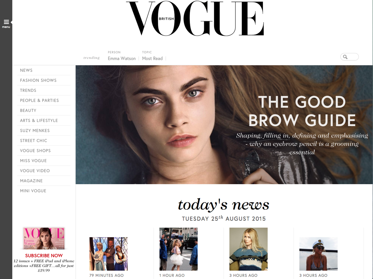
The masthead for this magazine as at the centre of the top of the page. It is very large and also uses the same font from the magazine showing a clear link making it easy to associate with the magazine.
Colours
The colours for this website are very neutral and a lot of monochrome is used. This corresponds to the colours used in the magazine as they are also often neutrals, black and white. This works will with the brand as it shows a continuous colour scheme making it look professional and more appealing to the reader.
Links
Unlike in many other websites, the links are placed to the left of the page giving the website a unique feel. This has been done as we read from left to right so the designer is assured that we will see the links to the other web pages created by the Vogue company.
Text
There is not a lot of text used on this website as it is very organised and uses images for the articles instead. However, the main article featured in the magazine does have a basic description which gives a view of what is going to be in the article hopefully engaging the attention of the reader.
Search Bar
A search bar is featured at the top of the page which indicates that the company is very popular and well known as people are able to search for particular articles that they may be very interested in. This is also used to show the extent of organisation used on the page showing the time that has been taken to create the website in an appealing manner.
Vogue Website
Linked Pages
Vogue
By Natalie Cairns
Vogue
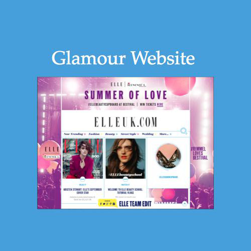
Deconstruction of the elle website