Style BEMIT !
@Nathandm


* {
    margin: 0;
    padding: 0;
    -moz-box-sizing: border-box;
    -webkit-box-sizing: border-box;
    box-sizing: border-box;
}
body, html {
    height: 100%
}
@font-face {
    font-family: 'Lato web';
    font-style: normal;
    font-weight: 400;
    src: url('fonts/Lato-Regular.eot');
    src: url('fonts/Lato-Regular.eot?#iefix') format('embedded-opentype'), url('fonts/Lato-Regular.woff') format('woff'), url('fonts/Lato-Regular.ttf') format('truetype'), url('fonts/Lato-Regular.svg#latoregular') format('svg');
}
body {
    font-family: 'Lato web', sans-serif;
    font-size: 100%;
    color: #202020;
    background: url(_state.data:image/png;
    base64, iVBORw0KGgoAAAANSUhEUgAAABkAAAAZCAIAAABLixI0AAAAOElEQVQ4y2N4Qz3AAMSfP73DJCEIPxuNZBh112Bz14cPEISPjdVdg9Ws0fAaDa8hHF6j5dcQcxcA3DHODs/IAR8AAAAASUVORK5CYII=) repeat;
    line-height: 1.5;
    overflow-x: hidden;
    -webkit-font-smoothing: antialiased;
    text-rendering: optimizeLegibility;
}
/* $COLOR SCHEME */
.main-header {
    border-top: 5px solid #3a3;
    border-top: 1px dashed #3a3;
}
.intro-wrap {
    background-color: #3a3;
    color: #fff;
}
.intro .h2, .intro .mega, .intro h1, .intro h2 {
    color: #fff;
}
a {
    color: #2a2;
    color: #080;
    color: #880;
    text-decoration: none;
    border-bottom: 1px dotted #AA0;
}
.c-comments-modal
.c-comments-modal__filter-area
.c-comments-modal__main-area
.c-comments-modal__comments
.c-comments-modal__comment-box
.o-layout
.o-layout--rev
.o-layout--middle
.o-layout--bottom
.o-layout--small
.o-layout__item
.u-display-none
.u-display-block
.u-display-inline
.u-display-inline-block
.u-hide-visually
BEM
Naming Convention
- Block: The sole root of the component.
- Element: A component part of the Block.
- Modifier: A variant or extension of the Block.
Absolutely every class in a project fits into one of these categories
.block__element--modifier {
...
}Markup's
transparency and clarity
<div class="media user premium">
<img src="" alt="" class="img photo avatar" />
<p class="body bio">...</p>
</div><div class="media user user--premium">
<img src="" alt="" class="media__img user__photo avatar" />
<p class="media__body user__bio">...</p>
</div>@import "../../app";
$comment-modal__container-padding: 20px;
.comment-modal__container{
margin: 20px;
padding: $comment-modal__container-padding;
background: white;
}
.comment-modal__layout-sider {
background: white;
min-height: calc(100vh - #{$header-height});
form {
padding: 32px 12px 12px;
input {
width: 70%;
}
button, input {
border-radius: 0;
}
}
}
.ant-btn {
border-radius: 0;
}
-
much safer
-
more informed
-
reuse, change,
or remove them.
Really Great !!
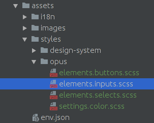
ITCSS
Most people (and architectures) attempt to split CSS projects up into thematic groups.
??? cascade, inheritance or specificity ???
Generic to explicit
Low specificity to high specificity
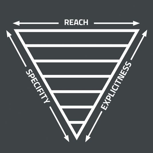

- Settings – used with preprocessors and contain font, colors definitions, etc.
- Tools – globally used mixins and functions. It’s important not to output any CSS in the first 2 layers.
- Generic – reset and/or normalize styles, box-sizing definition, etc. This is the first layer which generates actual CSS.
- Elements – styling for bare HTML elements (like H1, A, etc.). These come with default styling from the browser so we can redefine them here.
- Objects – class-based selectors which define undecorated design patterns, for example media object known from OOCSS
- Components – specific UI components. This is where majority of our work takes place and our UI components are often composed of Objects and Components
- Utilities – utilities and helper classes with ability to override anything which goes before in the triangle, eg. hide helper class
B's
- Less thinking on naming and styles location
- focus on solving front-end challenges
- Objects reusability
- generic objects and project specific components
-
File size and styles duplication
- if you find yourself repeating a lot of styling in components, you could consider moving those styles to separate objects
C's
- Bullet One
- Bullet Two
- Bullet Three
BEMIT !!
.c-comments-modal
.c-comments-modal__filter-area
.c-comments-modal__main-area
.c-comments-modal__comments
.c-comments-modal__comment-box

.o-layout
.o-layout--rev
.o-layout--middle
.o-layout--bottom
.o-layout--small
.o-layout__item

.u-display-none
.u-display-block
.u-display-inline
.u-display-inline-block
.u-hide-visuallyStyle BEMIT
By Nathan Damie


