Hello,
Day #1
I'm Nethanel,
Creative Web developer
Day #1
CSS Cover-Up Workshop
Day #1
Session 3
· SVGs in CSS.
· Keyframes animations.
· CSS Functions Calc ().
· Colors styling, gradients and Clipping.
· CSS variables and counters tricks.
Session 4
· CSS Layout grid and flex-box.
· Media quires.
Session 1
· Intro to basic HTML.
· Intro to CSS.
· CSS Selectors.
· Understanding Shadow elements (user agent shadow DOM).
Session 2
· CSS Transform.
· Transitions animations.
· Units & sizing in CSS.
Session 5
· CSS Filters.
· CSS unique tags.
Session 6
· Intro to SCSS compiler.
· CSS resources.
· CSS Performance.
Day #1
Day #1
Day #1
Day #2
Day #3
Working with Codepen.io
Day #1
Day #1
Intro
Basic HTML
Day #1
What is HTML?
-
Stands for Hyper Text Markup Language.
-
Is the standard markup language for creating Web pages.
-
Describes the structure of a Web page.
-
HTML elements tell the browser how to display the content.
- It can be assisted by technologies such as Cascading Style Sheets (CSS) and scripting languages such as JavaScript.
Day #1
Day #1
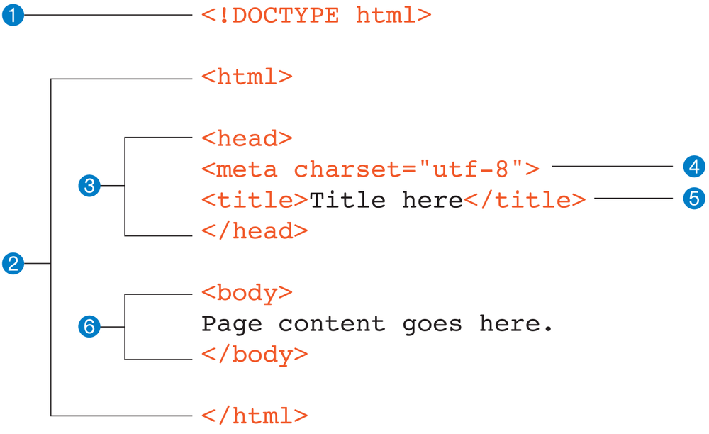
HTML Structure
Day #1
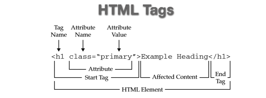
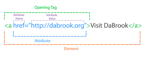
HTML Tags & Attributes
Day #1
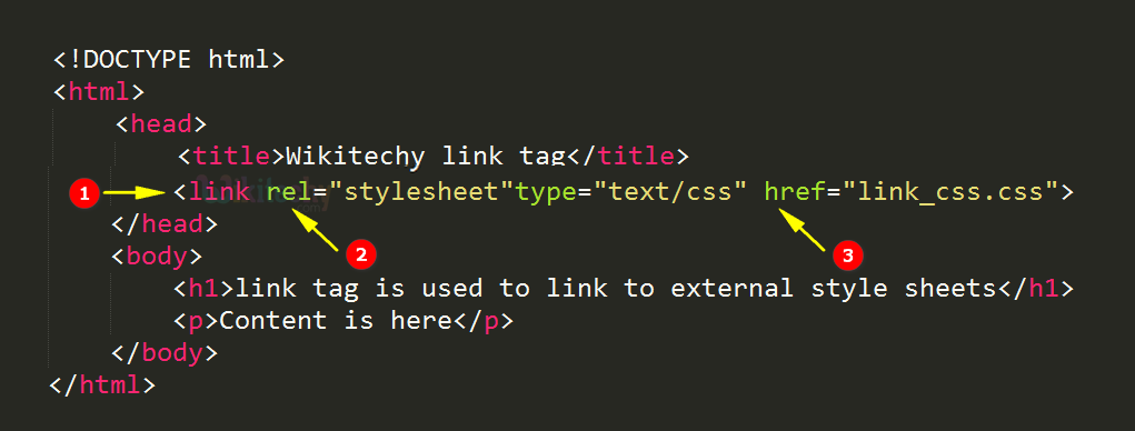
HTML link tag and more
CSS Intro
Day #1
What is CSS?
- CSS or Cascading Style Sheet allow you to control the layout of your HTML document.
It is a simple way to add style such as font colors or spacing in your web page.
- CSS is usually a text file that is separate from your HTML file.
- HTML is used to define the page’s content while CSS is used to define how the content and web page will look.
Day #1
CSS Structure
Day #1
/* CSS Structure */


p {
  color: red;
}
Selector
Colon
Declaration Block
Semi Colon
Curly Braces
Value
Property
Three Kinds of CSS
Day #1
<!DOCTYPE html>
<html>
<head>
<style>
  body {background-color: powderblue;}
  h1   {color: blue;}
  p    {color: red;}
</style>
</head>
<body>

<h1>This is a heading</h1>
<p>This is a paragraph.</p>

</body>
</html>
Internal Style Sheets
<h1 style="color:blue;">A Blue Heading</h1>

<p style="color:red;">A red paragraph.</p>
Inline Style Sheets
<!DOCTYPE html>
<html>
<head>
  <link rel="stylesheet" href="styles.css">
</head>
<body>

<h1>This is a heading</h1>
<p>This is a paragraph.</p>

</body>
</html>
External Style Sheets
CSS Overview
CSS Selectors
Day #1
Basic Selectors
h1 {}


p {}


.thing {}


#uniquething {}
Day #1
By Tag
By Class
By ID
Attribute Selectors
input[type="text"] {
}


input[type="submit"] {

}
label[for="fContact"] {
float: none;
width: auto;
}a[href ^="mailto:"] {
padding-right: 20px;
backgroundimage:url(email.png);
background-repeat: no-repeat;
background-position: right center;
}Day #1
Combinators
Day #1
Combining selectors to target elements
Descendant Selector
Select all elements that are descendants of a specified parent
.wrapper p {
 font-size: 1.5em;
}
li {
color: #000;
}
ul > li {
color: red;
}Child Selector
Select all elements that are immediate children of a specified parent
Adjacent Sibling
Select elements that are the adjacent siblings of an element
.wrapper h1 + p {
 font-size: 1.5em;
}
.wrapper h2~p {
color: red;
}General Sibling
Select elements that are the siblings of an element
Day #1
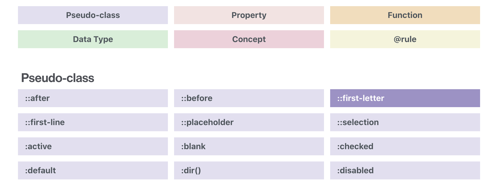
Pseudo-class selectors
A pseudo-class selector acts as if you have added a class to an element in the HTML mark-up
Pseudo-Class Selectors
a:link {}

a:visited {}
Day #1
Dynamic Pseudo-Class
a:hover {

}

a:active {

}

a:focus {

}
Day #1
Pseudo-Class Childs
Training #001
Training #002 ( :hover + )
Training #003 ( :hover )
Training #004
UI Element States
Pseudo-classes use with forms
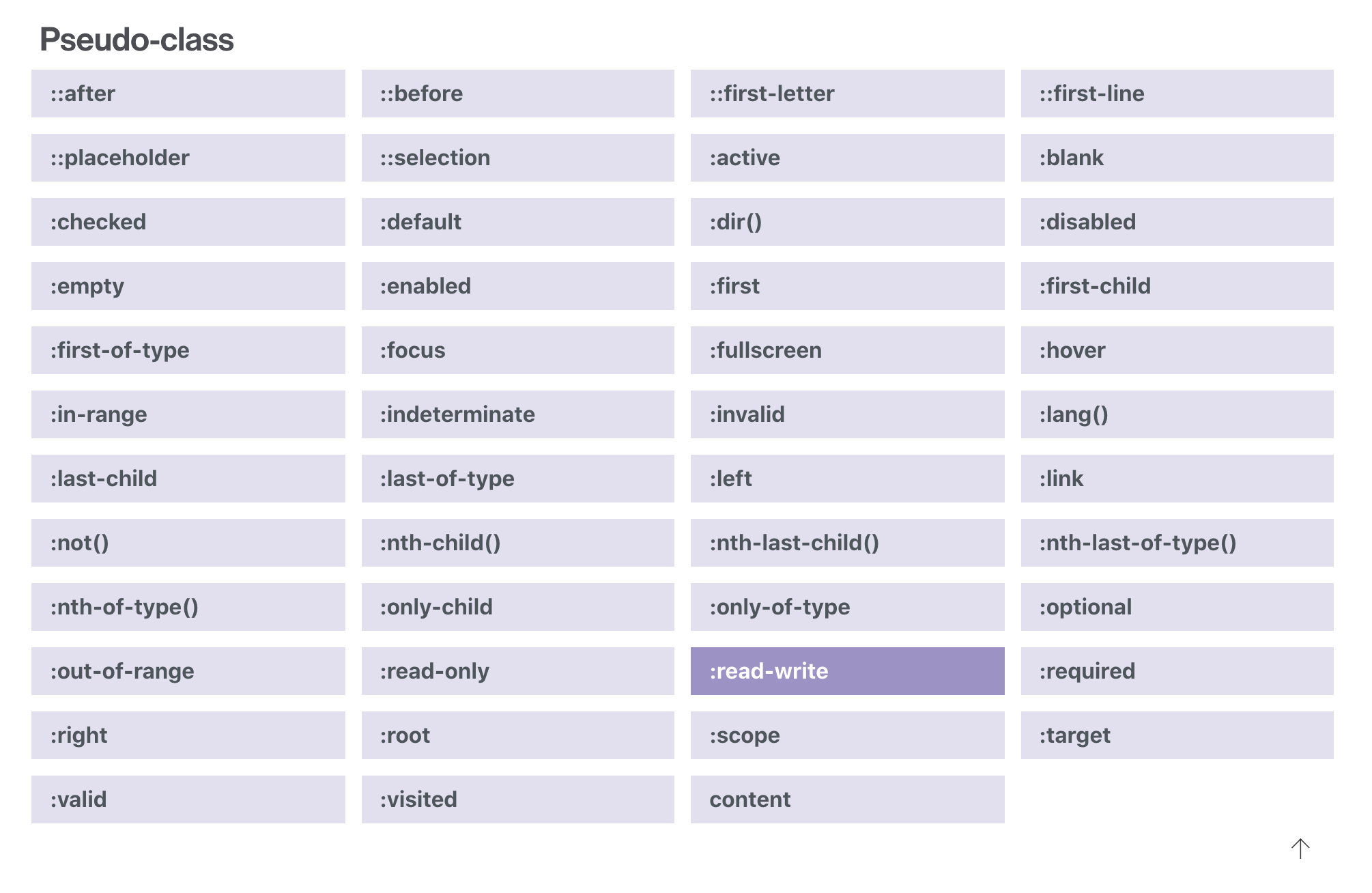
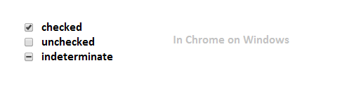
Day #1
:checked
the checked state of a checkbox or radio button
Day #1
:enabled | :disabled
detecting input element states
:default
:valid
:invalid
:in-range
:out-of-range
:required
:optional
:read-only
:read-write
The CSS3 Basic User Interface Module
Day #1
Day #1
:default
Day #1
:empty
Day #1
:in-range,
:valid,
:invalid
Day #1
:read-only,
:read-write,
:disabled
Day #1
:optional,
:required
Day #1
::placeholder
Pseudo-Classes Elements
A new element, such as a span, was added to your document and then the style applied to that
Day #1
.content:before {
  content: "Start here:";
}
::before
Render content before the element when using generated content
.content:after {
  content: "End here:";
}
::after
Render content after the element when using generated content
Day #1
Day #1
Training #005 - :after, :before
Day #1
.wrapper:first-letter {
  font-size: 200%;
  font-weight: bold;
  color: red;
}
:first-letter
the first character of the first line of text
:first-line
the first formatted line of text
Day #1
::selection {
    background-color: #222;
    color: white;
}

blockquote::selection {
    background-color: #aaa;
    color: white;
}
::selection
Day #1
:root
:root::after {
    content: "I am generated!";
    color: white;
    /* ... */
}
Day #1
Selectors Level 4
- a look to the near future with “CSS4 Selectors”
Day #1
:indeterminate
<input type="checkbox" indeterminate>
Day #1
:fullscreen
Day #1
p:not(.excerpt, .intro) {
 font-weight: normal;
}
:not
Level 4 enables the passing of multiple selectors to :not
Day #1
Training #006 - new
Day #1
Training #007 - new
Day #1
Single Or Double Colon For Pseudo-Elements?
The short answer is, in most cases, either.
The double colon (::) was introduced in CSS3 to differentiate pseudo-elements such as ::before and ::after from pseudo-classes such as :hover and :active. All browsers support double colons for pseudo-elements except Internet Explorer (IE) 8 and below.
Some pseudo-elements, such as ::backdrop, accept only a double colon, though.
Personally, I use single-colon notation so that my CSS is backwards-compatible with legacy browsers. I use double-colon notation on those pseudo-elements that require it, of course.
You are free to use either; there is really no right or wrong about this.
However, the specification, at the time of writing this article, does recommend using single-colon notation for the reason mentioned above, backwards compatibility:
Please note that the new CSS3 way of writing pseudo-elements is to use a double colon, eg a::after { … }, to set them apart from pseudo-classes. You may see this sometimes in CSS. CSS3 however also still allows for single colon pseudo-elements, for the sake of backwards compatibility, and we would advise that you stick with this syntax for the time being.
In the headings in this article, pseudo-elements that support both a single and double colon will be shown with both notations. Pseudo-elements that support only a double colon will be shown as is.
WebKit is a layout engine designed to allow web browsers to render web pages.
Is also the html/css rendering engine used in Apple's Safari browser, and in Google's Chrome.
css values prefixes with -webkit- are webkit-specific, they're usually CSS3 or other non-standardised features.
What is -webkit-?
button {
    -webkit-tap-highlight-color:transparent;
    -moz-tap-highlight-color:transparent;
    -o-tap-highlight-color:transparent;
    tap-highlight-color:transparent;
}
CSS Transform
Day #1
CSS Transform
Day #1
backface-visibility
This property specifies whether the “back” side of the element is visible when the element is rotated. It is used with 3D transforms. Accepts the following values:
visible: (default) back side of element will be visible, when rotated
hidden: back side of element is not visible
initial: sets the property to its default (visible) value
inherit: get the property value from its parent
Day #1
Day #1
Training #008 - new
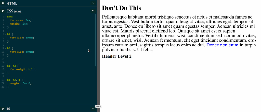
Units & sizing in CSS
Day #2
Absolute Lengths
| Unit | Description |
|---|---|
| cm | centimeters |
| mm | millimeters |
| in | inches (1in = 96px = 2.54cm) |
| px * | pixels (1px = 1/96th of 1in) |
| pt | points (1pt = 1/72 of 1in) |
| pc | picas (1pc = 12 pt) |
| em | Relative to the font-size of the element (2em means 2 times the size of the current font) |
|---|---|
| ex | Relative to the x-height of the current font (rarely used) |
| ch | Relative to the width of the "0" (zero) |
| rem | Relative to font-size of the root element |
| vw | Relative to 1% of the width of the viewport* |
| vh | Relative to 1% of the height of the viewport* |
| vmin | Relative to 1% of viewport's* smaller dimension |
| vmax | Relative to 1% of viewport's* larger dimension |
| % | Relative to the parent element |
Relative Lengths
example
Responsive Typograph
CSS variables
Define new properties with --prefix--custom-property: value;
CSS CUSTOM PROPERTIES FOR CASCADING VARIABLES
:root {
  --color-bg: blue;
  --my-font-size: 12px;
}


.box {
	background-color: var(--color-bg, white);
}
.theme {
--color-bg: blue;
--color-button: yellow;
}
.box {
background-color: var(--color-bg, white);
}
.button {
color: var(--color-button, black);
}.box {
background-color: white;
}
.button {
color: black;
}
/* blue theme file */
.theme .box {
background-color: blue;
}
.theme .button {
color: yellow;
}Theme exmaple
:root {
/*Colors*/
  --blue: #00BAF0;
  --white: #fff;
  --gray: #f4f4f4;
  --orange: #FF9545
  --green: #4c6520;

/*Style Guide*/
  --primary-color: var(--blue);
  --secondary-color: var(--white);
  --accent-color: var(--gray);
  --button-1: var(--orange);
  --button-2: var(--green);
}
Work with it!
CSS
Transitions animations
CSS transitions allows you to change property values smoothly, over a given duration.
div {
  transition-property: width;
  transition-duration: 2s;
  transition-timing-function: linear;
  transition-delay: 1s;
}
How to create transition
Transition-timing-function / easing
cubic bezier css
Example
training #010
Css Animations & Keyframes
@-webkit-keyframes NAME-YOUR-ANIMATION {
  0%   { opacity: 0; }
  100% { opacity: 1; }
}
@-moz-keyframes NAME-YOUR-ANIMATION {
  0%   { opacity: 0; }
  100% { opacity: 1; }
}
@-o-keyframes NAME-YOUR-ANIMATION {
  0%   { opacity: 0; }
  100% { opacity: 1; }
}
@keyframes NAME-YOUR-ANIMATION {
  0%   { opacity: 0; }
  100% { opacity: 1; }
}
Basic Declaration & Usage
#box {
  -webkit-animation: NAME-YOUR-ANIMATION 5s infinite; /* Safari 4+ */
  -moz-animation:    NAME-YOUR-ANIMATION 5s infinite; /* Fx 5+ */
  -o-animation:      NAME-YOUR-ANIMATION 5s infinite; /* Opera 12+ */
  animation:         NAME-YOUR-ANIMATION 5s infinite; /* IE 10+, Fx 29+ */
}
.box {
animation-name: bounce;
animation-duration: 4s; /* or: Xms */
animation-iteration-count: 10;
animation-direction: alternate; /* or: normal */
animation-timing-function: ease-out; /* or: ease, ease-in, ease-in-out, linear, cubic-bezier(x1, y1, x2, y2) */
animation-fill-mode: forwards; /* or: backwards, both, none */
animation-delay: 2s; /* or: Xms */
}.box {
animation: test 1s 2s 3 alternate backwards;
}
Animation Shorthand
Deep Set animation
example
training #011
body {

}

#box {
  background:url(https://i.imgur.com/bYSnuNE.jpg?1);
  background-size:cover;
  border:2px solid #000;
  border-radius:50%;
  width:200px;
  height:200px;
/*   box-shadow:0 0 25px RGBA(255,255,255, 0.10),
             -8px -8px 15px #000 inset,
             2px 2px 25px #000 inset,
             -45px -45px 25px RGBA(0,0,0, 0.5) inset,
             25px 25px 45px RGBA(0,0,0, 0.45) inset; */
  margin:6em auto;
  transform:rotateX(6deg) rotateY(6deg) rotateZ(6deg);
}
<div id="box"></div>
<img src="https://i.imgur.com/bYSnuNE.jpg?1" alt="">
KeyframesAnimations Steps()
.move {
  animation: move 10s steps(10) infinite alternate;
}

@keyframes move {
  from { top: 0; left: 0; }
  to   { top: 100px; left: 100px; }
}
CSS Motion Path
Exmple
training #002
<div class="frame">
  <div class="candle">
		<div class="shadow"></div>
		<div class="wick"></div>
		<div class="flame"></div>
  </div>
</div>
.frame {
position: absolute;
top: 50%;
left: 50%;
width: 400px;
height: 400px;
margin-top: -200px;
margin-left: -200px;
border-radius: 2px;
box-shadow: 1px 2px 10px 0px rgba(0, 0, 0, 0.3);
overflow: hidden;
background: #2c3e50;
color: #fff;
font-family: "Open Sans", Helvetica, sans-serif;
-webkit-font-smoothing: antialiased;
-moz-osx-font-smoothing: grayscale;
}
.candle {
position: absolute;
width: 60px;
height: 100px;
top: 160px;
left: 170px;
background: #fff;
border-radius: 3px;
box-shadow: inset -10px 0 0 0 #E0E5FF;
}
.candle .shadow {
position: absolute;
width: 120px;
height: 8px;
background: #1B233E;
bottom: -8px;
left: -30px;
border-radius: 3px;
}
.candle .wick {
position: absolute;
width: 4px;
height: 15px;
top: -15px;
left: 28px;
background: #AD88A9;
border-radius: 2px 2px 0 0;
}Create animation flame

SVGs & CSS
SVG stands for Scalable Vector Graphics.
SVG defines vector-based graphics in XML format.
What is SVG?

- Crisp on any display
- Less HTTP requests to handle
- Easily scalable for responsive
- Small filesize if you design for performance
- Easy to animate
- Easy to make accessible
- Fun!
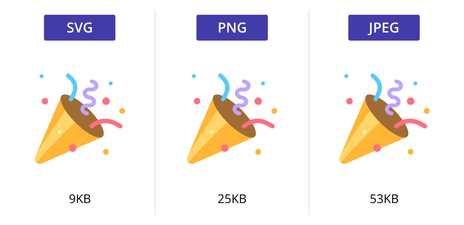
Why SVG?
Responsive svg
Basic SVG Explained
<svg version="1.1"
     baseProfile="full"
     width="300" height="200"
     xmlns="http://www.w3.org/2000/svg">

  <rect width="100%" height="100%" fill="red" />

  <circle cx="150" cy="100" r="80" fill="green" />

  <text x="150" y="125" font-size="60" text-anchor="middle" fill="white">SVG</text>

</svg>
What can we create with it?
SVG stroke-dasharray
<svg id="right_arrow" class="direction__right direction__item" version="1.1" xmlns="http://www.w3.org/2000/svg" xmlns:xlink="http://www.w3.org/1999/xlink" x="0px" y="0px" width="80px" height="80px" viewBox="0 0 80 80" xml:space="preserve">
  <polygon class="ring offset-colour" style="transform: translateX(4px); fill: #4CAF50;" points="32.5,52 47.5,40 32.5,28" />
  <circle class="circle" style="stroke: #4CAF50; transform-origin: center center;" cx="40" cy="40" r="36" fill="transparent" stroke="black" stroke-width="4" />
</svg>
body {
display: flex;
align-items: center;
justify-content: center;
height: 100vh;
}
.circle {
/* calculate using: (2 * PI * R) */
stroke-dasharray: 227;
stroke-dashoffset: 0;
}training #012
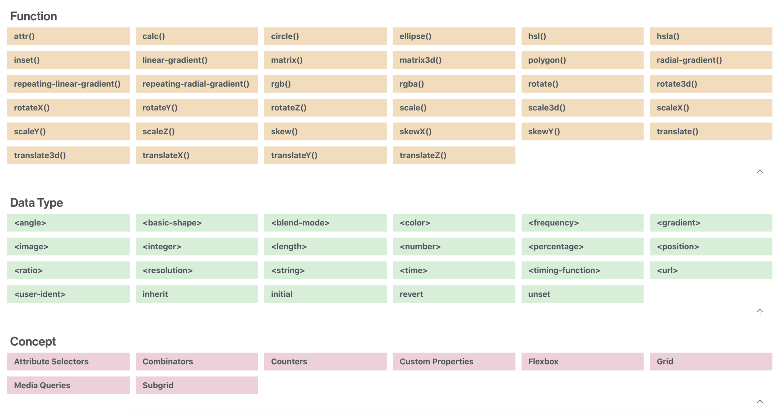
CSS Functions
CSS functions are used as a value for various CSS properties
CSS Functions
The calc() function performs a calculation to be used as the property value.
calc()
#div1 {
  position: absolute;
  left: 50px;
  width: calc(100% - 100px);
  border: 1px solid black;
  background-color: yellow;
  padding: 5px;
  text-align: center;
}
(abbreviation for ‘attribute’) is a function that returns as a string the value of an attribute of an element.
attr()
<li data-label="todo">Buy Milk</li>
li::before {
  content: attr(data-label);
  color: grey;
}
.background {
  background-color: red;
}

.background[data-background] {
  background-color: attr(data-background color, red);
}
training #013

<button data-tooltip="Cascading Style Sheets">My Button</button>
| cubic-bezier() | Defines a Cubic Bezier curve |
| hsl() | Defines colors using the Hue-Saturation-Lightness model (HSL) |
| hsla() | Defines colors using the Hue-Saturation-Lightness-Alpha model (HSLA) |
| linear-gradient() | Sets a linear gradient as the background image. Define at least two colors (top to bottom) |
| radial-gradient() | Sets a radial gradient as the background image. Define at least two colors (center to edges) |
| repeating-linear-gradient() | Repeats a linear gradient |
| repeating-radial-gradient() | Repeats a radial gradient |
| rgb() | Defines colors using the Red-Green-Blue model (RGB) |
| rgba() | Defines colors using the Red-Green-Blue-Alpha model (RGBA) |
| var() | Inserts the value of a custom property |
hsl()
HSL stands for “Hue Saturation Lightness”
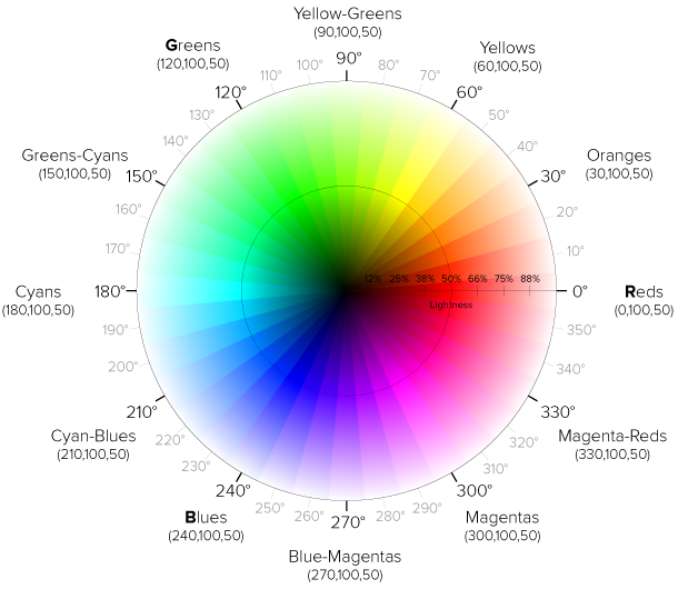
Cool one
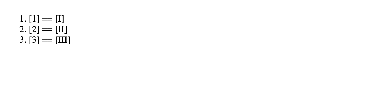
Counter()
<ol>
  <li></li>
  <li></li>
  <li></li>
</ol>
ol {
counter-reset: listCounter;
}
li {
counter-increment: listCounter;
}
li::after {
content: "[" counter(listCounter) "] == ["
counter(listCounter, upper-roman) "]";
}
training #014
<section id="container">
	<div class="thumbnail"
		data-title="Bacon"
		data-description="Bacon ipsum dolor amet filet mignon alcatra short ribs, sausage shoulder tail biltong rump chicken ground round ham hock porchetta tri-tip. Boudin bresaola andouille, leberkas pork ball tip turducken beef ribs">
		<img src="https://s3-us-west-2.amazonaws.com/s.cdpn.io/123941/meat.jpg" alt="Meat" width="300">
	</div>
</section>
*, *:after, *:before {
box-sizing: border-box;
}
html {
height: 100%;
font-size: 62.5%;
}
body {
height: 100%;
display: flex;
align-items: center;
justify-content: center;
font-family: Lato, sans-serif;
font-size: 1.8rem;
background: radial-gradient(ellipse at center, #f5f5f5 0%,#ddd 100%);
user-select: none;
}
h1 {
font-family: Merriweather, serif;
margin: 0 0 50px;
cursor: default;
}
#container {
width: 300px;
margin: 0 auto;
}
.thumbnail {
-webkit-backface-visibility: hidden;
display: inline-block;
position: relative;
margin: 0 auto;
overflow: hidden;
background: #000;
box-shadow: 0 15px 50px rgba(0,0,0,.5);
}
.thumbnail img {
display: block;
max-width: 100%;
transition: opacity .2s ease-in-out;
}Colors Styling
Gradients & Clipping
.columns-bg {
  background-image:
    linear-gradient(
      to right,
      #fffdc2,
      #fffdc2 15%,
      #d7f0a2 15%,
      #d7f0a2 85%,
      #fffdc2 85%
    );
}
.gradient {
background-image:
linear-gradient(
red, #f06d06
);
}Gradients How?
Clipping and Masking in CSS
Simple examples
Tool
Exmple
Media quires
Basic Media quires
/* Exact width */
@media (width: 360px) {
  div {
    color: red;
  }
}

/* Minimum width */
@media (min-width: 35rem) {
  div {
    background: yellow;
  }
}

/* Maximum width */
@media (max-width: 50rem) {
  div {
    border: 2px solid blue;
  }
}
<div>Watch this element as you resize your viewport's width.</div>
Dark / Light Mode
@media (prefers-color-scheme: dark) {
  img {
    opacity: .75;
    transition: opacity .5s ease-in-out;
  }
  img:hover {
    opacity: 1;
  }
}
@media screen and (prefers-color-scheme: light) {
body {
background-color: white;
color: black;
}
}Fullscreen
@media all and (display-mode: fullscreen) {
  .content {
    padding: 0px;
  }
}
inverted-colors
p {
  color: gray;
}

@media (inverted-colors: inverted) {
  p {
    background: black;
    color: yellow;
  }
}

@media (inverted-colors: none) {
  p {
    background: #eee;
    color: red;
  }
}
orientation
body {
  display: flex;
}

div {
  background: yellow;
}

@media (orientation: landscape) {
  body {
    flex-direction: row;
  }
}

@media (orientation: portrait) {
  body {
    flex-direction: column;
  }
}
<div>Box 1</div>
<div>Box 2</div>
<div>Box 3</div>
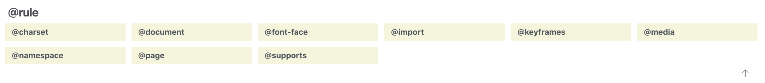
CSS @rules
@font-face
@font-face {
  font-family: 'Open Sans';
  font-style: normal;
  font-weight: 400;
  src: local('Open Sans'), local('OpenSans'), url(http://themes.googleusercontent.com/static/fonts/opensans/v8/cJZKeOuBrn4kERxqtaUH3T8E0i7KZn-EPnyo3HZu7kw.woff) format('woff');
}
@font-face {
[font-family: <family-name>;]?
[src: [ <uri> [format(<string>#)]? | <font-face-name> ]#;]?
[unicode-range: <urange>#;]?
[font-variant: <font-variant>;]?
[font-feature-settings: normal|<feature-tag-value>#;]?
[font-stretch: <font-stretch>;]?
[font-weight: <weight>];
[font-style: <style>];
}
@font-face {
  font-family: 'Graublau Web';
  src:  url('GraublauWeb.eot?') format('eot'),
        url('GraublauWeb.woff') format('woff'),
        url('GraublauWeb.ttf') format('truetype');
}
@import
Allows you to import styles from one style sheet into another.
@import 'style-sheet-name.css';
@import url(../relative/path/to/styles.css);
@import url(http://absolute-path.com/css/some-styles.css);
CSS Filters
& SVG Filters
SVG Filters & CSS
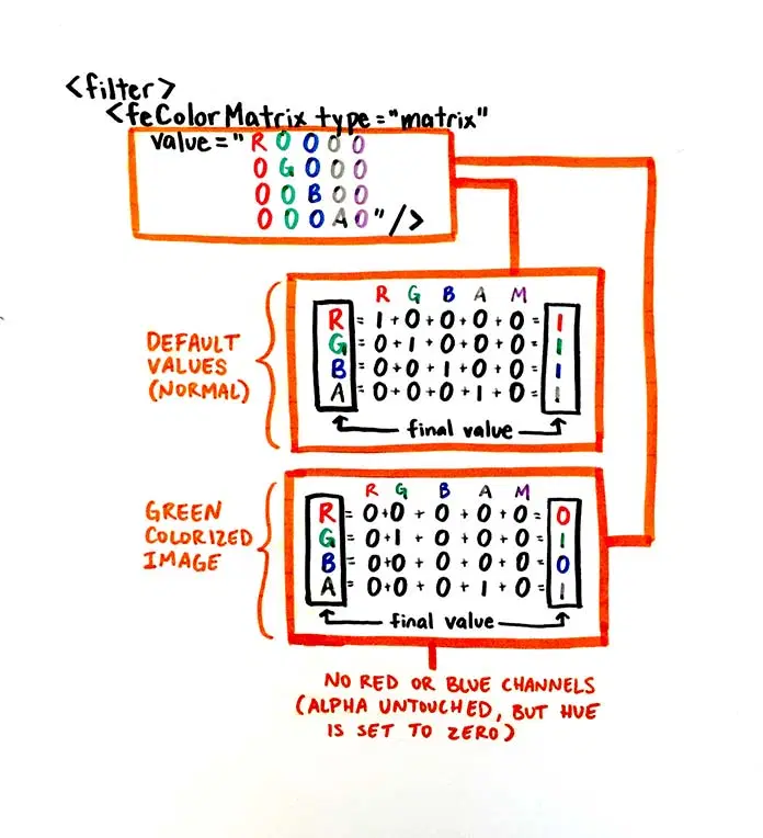
SVG Filters
<div class="share-menu-wrapper">

  <div class="share-menu-item">
    <div class="menu-wrapper menu-item">
      <a href="#" class="menu-link"><i class="fab fa-twitter"></i></a>
    </div>
  </div>

  <div class="share-menu-item">
    <div class="menu-wrapper menu-item">
      <a href="#" class="menu-link"><i class="fab fa-facebook-f"></i></a>
    </div>
  </div>

  <div class="share-menu-item">
    <div class="menu-wrapper menu-item">
      <a href="#" class="menu-link"><i class="fab fa-instagram"></i></a>
    </div>
  </div>

  <div class="share-menu-item">
    <div class="menu-wrapper menu-item">
      <a href="#" class="menu-link"><i class="fab fa-facebook-messenger"></i></a>
    </div>
  </div>

  <div class="share-menu-item">
    <div class="menu-wrapper menu-item">
      <a href="#" class="menu-link"><i class="fab fa-whatsapp"></i></a>
    </div>
  </div>

  <div class="share-menu-toggle">
    <div class="toggle-wrapper">
      <div href="#" class="toggle-link">
        <i class="fas fa-plus"></i>
      </a>
    </div>
  </div>

</div>

<!-- and we have svg filter here on the page -->
<svg xmlns="http://www.w3.org/2000/svg" version="1.1" class="hidden">
  <defs>
    <filter id="liquid-effect">
      <feGaussianBlur in="SourceGraphic" stdDeviation="10" result="blur" />
      <feColorMatrix in="blur" mode="matrix" values="
      1 0 0 0 0
      0 1 0 0 0
      0 0 1 0 0
      0 0 0 15 -8" result="liquid" />
      <feComposite in="SourceGraphic" in2="liquid" operator="atop"/>
    </filter>
  </defs>
</svg>
.share-menu-wrapper {
filter: url('#liquid-effect');
}CSS flex-box
Flexbox training
CSS Grid training
Css Selectors training
Css transform training
css-tricks.com
100dayscss.com/
Thanks
CSS Layout grid and flexbox
Day #1
training #003
training #003
CSS Workshop
By netha


