CSS Intermediate

Fuentes
font-family
What default font to use?
Font Size
em or px or pt ?
Font Weight
Is it the same as bold?
Line height
Text align
Text decoration
Google Fonts
Pseudo-classes
Allow selectors the ability to target a specific state of an element.
selector:pseudoclass {
	property: value;
}
List
- :active
- :checked
- :default
- :dir()
- :disabled
- :empty
- :enabled
- :first
- :first-child
- :first-of-type
- :fullscreen
- :focus
- :hover
- :indeterminate
- :in-range
- :invalid
- :lang()
- :last-child
- :last-of-type
- :left
- :link
- :not()
- :nth-child()
- :nth-last-child()
- :nth-last-of-type()
- :nth-of-type()
- :only-child
- :only-of-type
- :optional
- :out-of-range
- :read-only
- :read-write
- :required
- :right
- :root
- :scope
- :target
- :valid
- :visited
Box Model
Box Model
- Content
- Padding
- Border
- Margin
Box Model

Content-Box
When you set the width and height properties of an element with CSS, you just set the width and height of the content area. To calculate the total width and height of an element, you must also include the padding and borders.
Border-box
When you set the width and height properties of an element with CSS, you set the total width and height of the element, including padding and borders. The content area will shrink to fit within the specified width and height.
selector {
  box-sizing: content-box;
}
selector {
box-sizing: border-box;
}The default value is content-box, but normaly we set border-box because is more natular.
:root {
  box-sizing: border-box;
}

* {
  margin: 0px;
  padding: 0px;
  box-sizing: inherit;
}
Basic CSS rule to set values that maybe will be different between agents. The objetive is have constant behavior.
Outline
A line drawn around an element, outside its borders, to visually emphasize or separate it from other content.
Key differences from borders:
- Position: Outlines are drawn outside the element's borders, while borders are drawn within them.
- Overlap: Outlines can overlap other content, while borders typically do not.
- Dimensions: Outlines do not affect an element's total width or height, unlike borders.
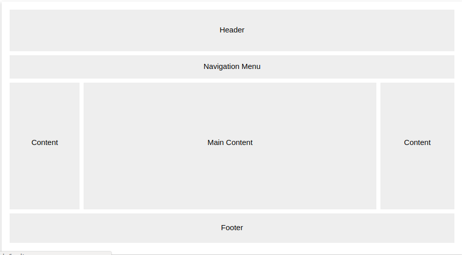
Layouts
Refers to the way HTML elements are arranged and positioned on a webpage. Layout determines how elements are placed relative to each other, how space is distributed, and how elements adjust to the size of the viewport.
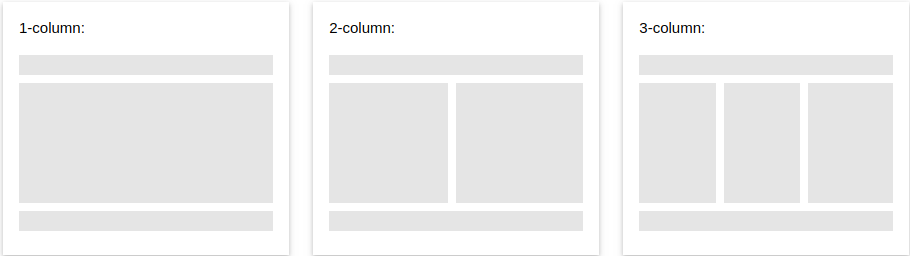
Flow Layout
This is the default layout model. Elements are placed one after the other in the document flow, based on the order they appear in the HTML.
For simple layouts where content flows naturally through the page.
display: block;
display: inline;
display: inline-block;
Flow Layout
In normal flow, inline elements display in the inline direction, that is in the direction words are displayed in a sentence according to the Writing Mode of the document.
Block elements display one after the other, as paragraphs do in the Writing Mode of that document.
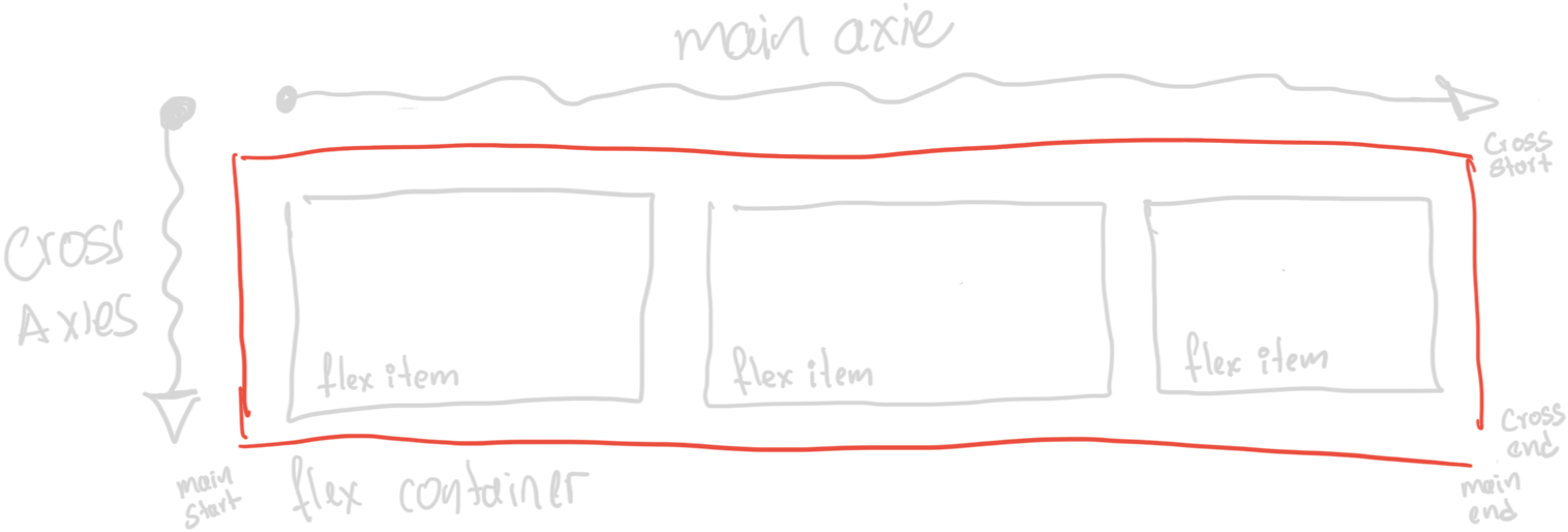
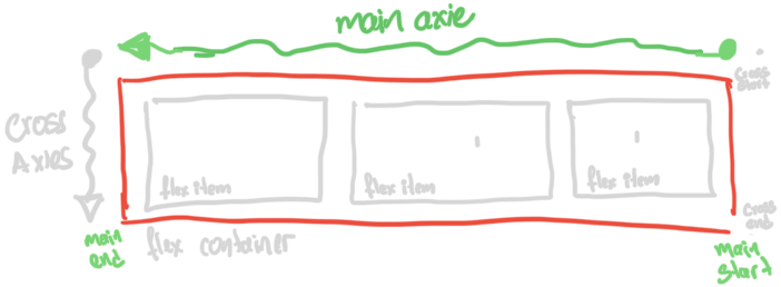
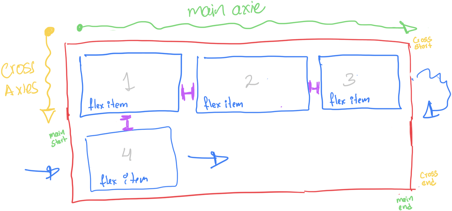
FlexBox
Allows for flexible and efficient distribution of space between elements within a container, even when their size is unknown or dynamic.
For one-dimensional layouts, either in rows or columns.
Is a complete module of CSS
FlexBox
flex container: His responsabilty is to arrange the items in a unimesionl direction.
flex items: Elements to be arrange
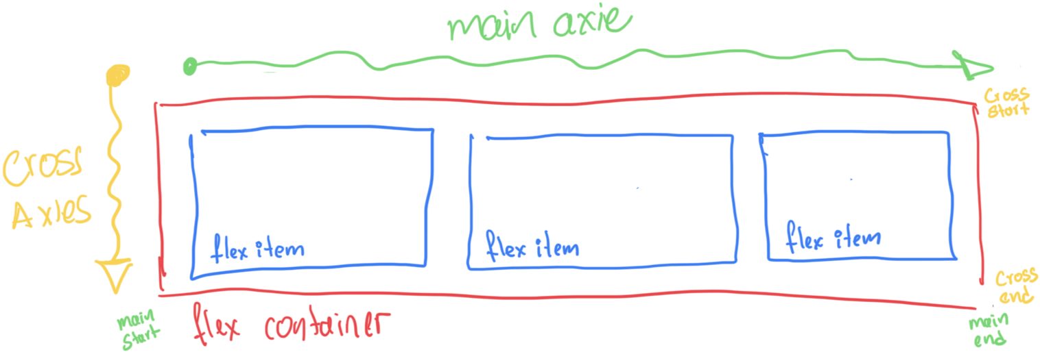
FlexBox
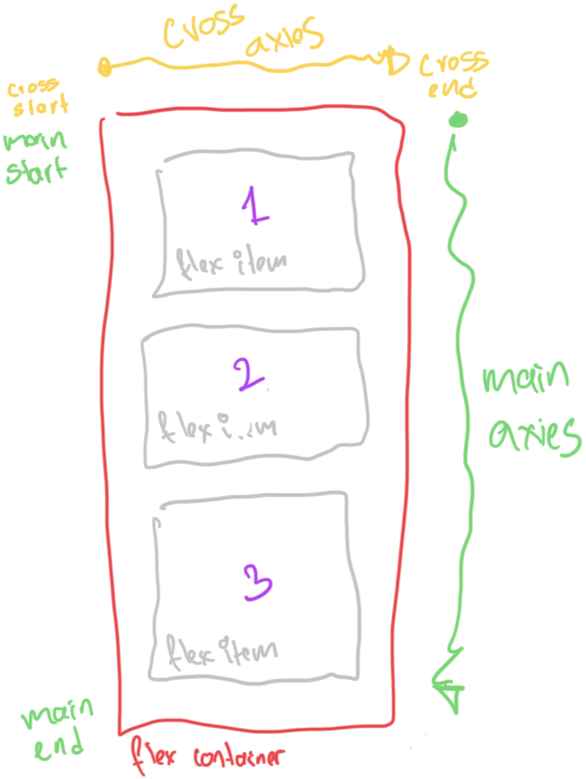
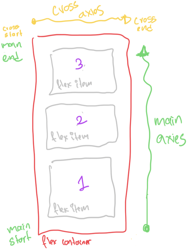
main axis: is the primary axis along which flex items are laid out
cross axis: The width or height of a flex item, whichever is in the cross dimension, is the item’s cross size.
FlexBox
main-start, main-end: The flex items are placed within the container
cross-start, cross-end: Flex lines are filled with items and placed into the container
Properties
Flex container
.container {
  display: flex;
}
.container {
display: inline-flex;
}
Properties
Direction of the flex container
.container {
  display: flex;
  flex-direction: row;
}
.container {
  display: flex;
  flex-direction: row-reverse;
}
Direction of the flex container
.container {
  display: flex;
  flex-direction: column;
}
.container {
display: flex;
flex-direction: column-reverse;
}
Direction of the flex container
.container {
  display: flex;
  flex-direction: row;
  flex-wrap: nowrap | wrap | wrap-reverse;
}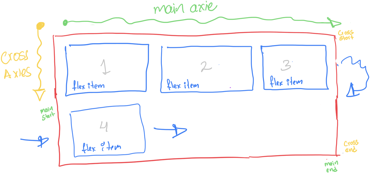
Direction of the flex container
.container {
display: flex;
flex-flow: row wrap;
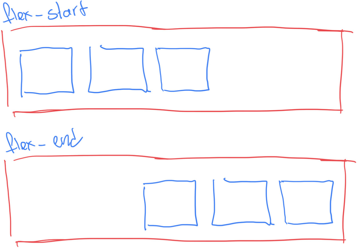
}Justify content
.container {
  display: flex;
  justify-content: flex-end;
}
flex-start | flex-end | center | space-between | space-around | space-evenly | start | end | left | right ... + safe | unsafe
Aling Items
.container {
  display: flex;
  align-items: flex-end;
}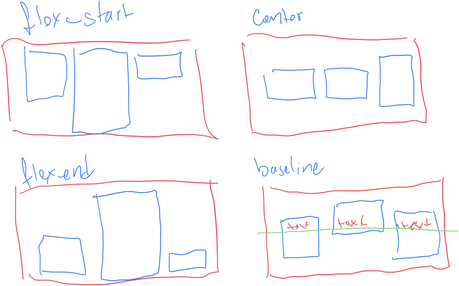
stretch | flex-start | flex-end | center | baseline | first baseline | last baseline | start | end | self-start | self-end + ... safe | unsafe
Gaps
.container {
  display: flex;
  gap: 10px;
  gap: 10px 20px;
  row-gap: 10px;
  column-gap: 20px;
}
items
.item {
  order: 5; /* default is 0 */
  flex-grow: 4; /* default 0 */
  flex-shrink: 3;
  flex-basis:  | auto; /* (default size) default auto */
  flex: none | [ <'flex-grow'> <'flex-shrink'>? || <'flex-basis'> ]
  align-self: auto | flex-start | flex-end
    	| center | baseline | stretch;

}
Properties
FlexBox
Responsive
Mobile First
@media (min-width: 1024px) {

}-
Mobile Small: 320px to 480px
-
Mobile Large: 481px to 767px
-
Tablet: 768px to 1024px
-
Laptop and Large Tablets: 1025px to 1440px
-
Desktop: 1441px and above
Float
- Allows elements to float to the left or right, and the content will wrap around them.
- Mainly for column layouts or for making text wrap around images.
- Properties: float: left, float: right, clear.
- The real use is float a image but is used to content distribution ( prefer use flex and grid)
/*Clear Fix*/
.row::after{
    clear: both;
    content: " ";
    display: block;
}

/*Layout util*/
[class*="col-"] {
    float: left;
    margin-top: 0;
}

.col-1 { width: 8.3333%; }
.col-2 { width: 16.6667%; }
.col-3 { width: 25%; }
.col-4 { width: 33.3333%; }
.col-5 { width: 41.6667%; }
.col-6 { width: 50%; }
.col-7 { width: 58.3333%;}
.col-8 { width: 66.6667%;}
.col-9 { width: 75%;}
.col-10 { width: 83.3333%;}
.col-11 { width: 91.6667%;}
.col-12 { width: 100%;}Float
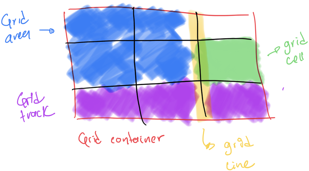
Grid
The CSS grid layout module excels at dividing a page into major regions or defining the relationship in terms of size, position, and layer, between parts of a control built from HTML primitives.
Grid
-
Grid Container: The element on which display: grid is applied. It’s the direct parent of all the grid items.
-
Grid item: The children (i.e. direct descendants) of the grid container.
-
Grid Line: The dividing lines that make up the structure of the grid. They can be either vertical (“column grid lines”) or horizontal (“row grid lines”) and reside on either side of a row or column.
-
Grid cell: The space between two adjacent row and two adjacent column grid lines. It’s a single “unit” of the grid.
-
Grid track: The space between two adjacent grid lines.
-
Grid area: The total space surrounded by four grid lines.
Grid
Grid
.container {
  grid-template-columns: ...  ...;
  /* e.g.
      1fr 1fr
      minmax(10px, 1fr) 3fr
      repeat(5, 1fr)
      50px auto 100px 1fr
  */
  grid-template-rows: ... ...;
  /* e.g.
      min-content 1fr min-content
      100px 1fr max-content
  */
}
Grid
.container {
  grid-template-areas:
    "<grid-area-name> | . | none | ..."
    "...";
}
Grid
.container {
  grid-auto-flow: row | column
    	| row dense | column dense;
}
Grid
Position
-
Static Positioning (static): This is the default position value. Elements are positioned according to the normal document flow. In this example, the .static-box will appear in the normal flow of the container.
-
Relative Positioning (relative): The element is positioned relative to its normal position. The .relative-box is moved 20px down and 20px to the right from where it would normally be positioned in the container.
Position
-
Absolute Positioning (absolute): The element is positioned relative to the nearest positioned ancestor (i.e., an ancestor with a position value other than static). The .absolute-box is placed 10px from the bottom and 10px from the right edge of thecontainer.
-
Fixed Positioning (fixed): The element is positioned relative to the viewport and remains fixed in its position even when the page is scrolled. The .fixed-box will stay at the top-right corner of the viewport.
Position
Homework 1
Write an article about CSS Layout, focusing on multiple-column layouts. Include comparisons to other layout methods, advantages and disadvantages, and illustrate your points with code examples. Write the article with HTML and CSS using Multicolumn Layout
Homework 2
Write an article about CSS Layout, focusing on multiple-column layouts. Include comparisons to other layout methods, advantages and disadvantages, and illustrate your points with code examples. Write the article with HTML and CSS using Multicolumn Layout
Exercise 2
Card
Exercise 3
Panel
[06] [PW] - CSS Intermediate
By Néstor Aldana
[06] [PW] - CSS Intermediate
Propiedades de fuentes y modelo de caja


