CSS Defensive Mindset
— @nirazanbasnet
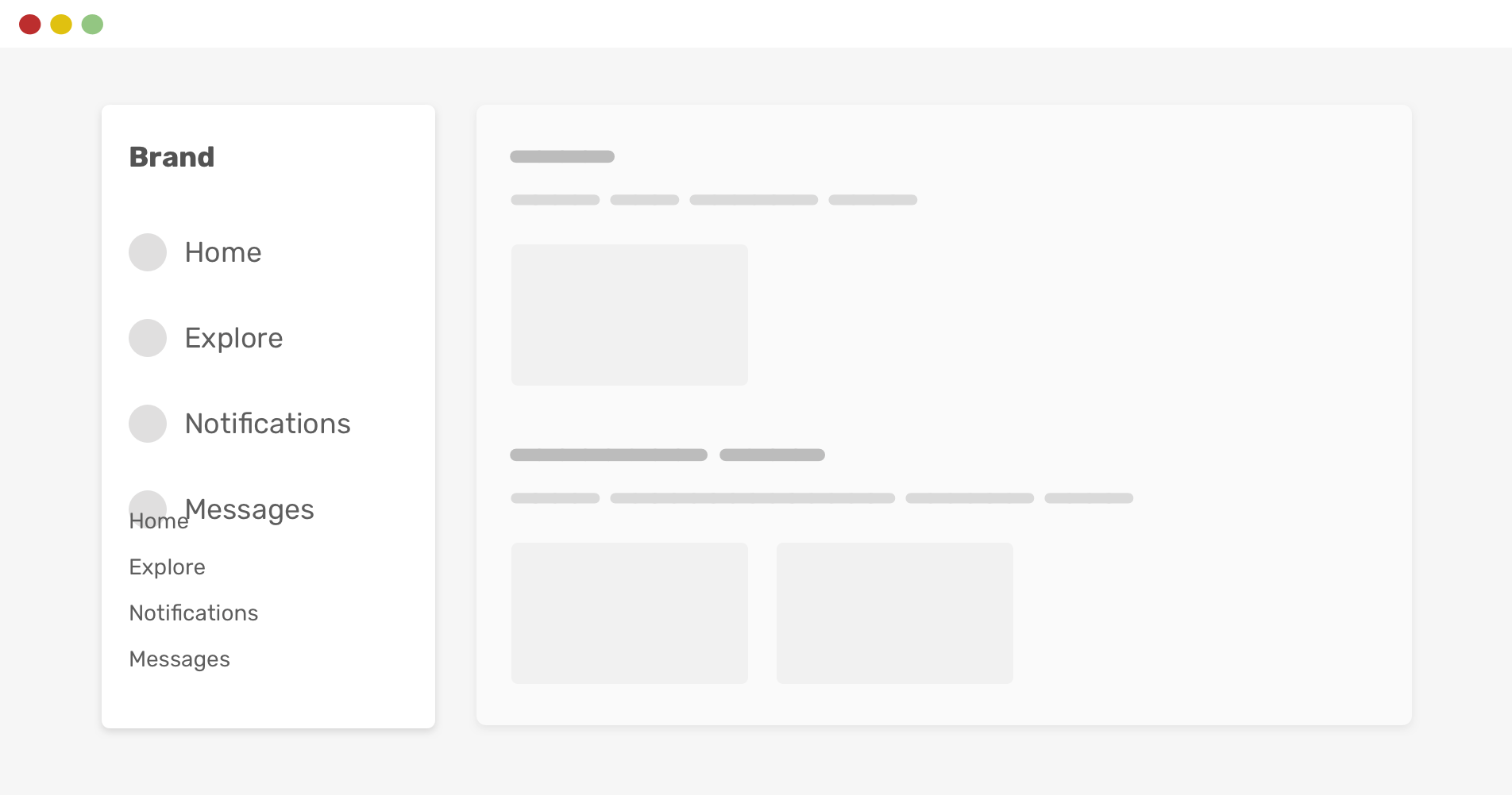
Index
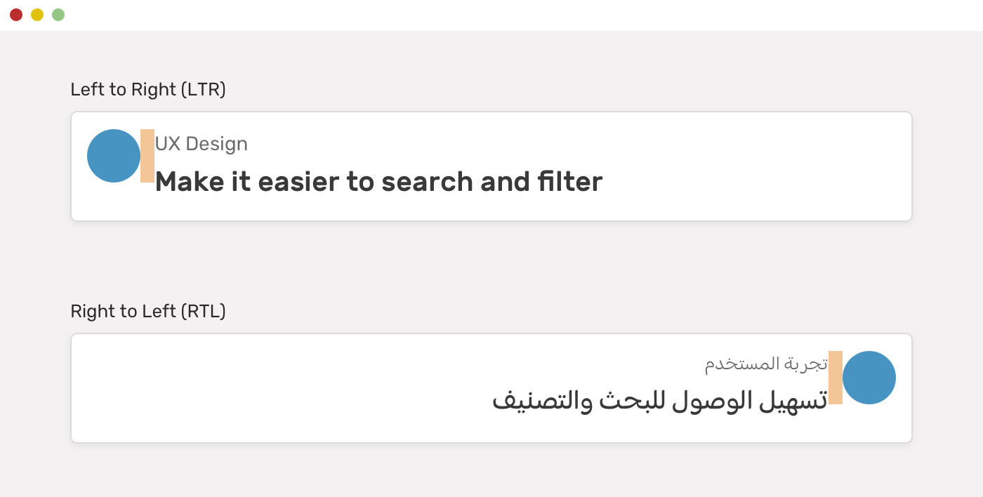
CSS Logical Properties
-
Properties that depend on the direction of the HTML document.
.avatar {
  margin-right: 1rem;
}

html[dir="rtl"] .avatar {
  margin-right: 0;
  margin-left: 1rem;
}
Normal Approach
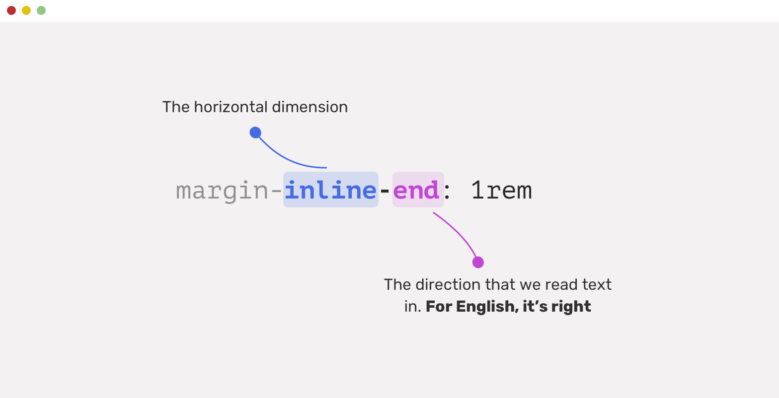
-CSS Logical Properties
.avatar {
  margin-inline-end: 1rem;
}
With Logical Approach
-CSS Logical Properties
How it works?
-CSS Logical Properties
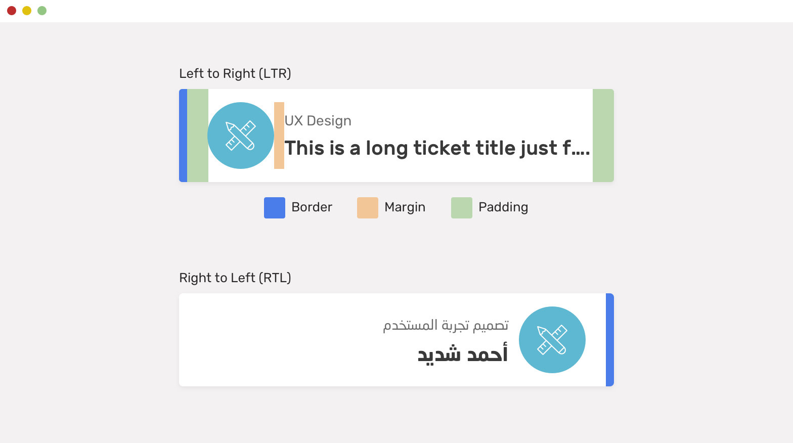
.card {
  padding-inline-start: 2.5rem;
  padding-inline-end: 1rem;
  border-inline-start: 6px solid blue;
}

.card__icon {
  margin-inline-end: 1rem;
}
Example
-CSS Logical Properties
CSS Parent Selector (:has)
-CSS Logical Properties
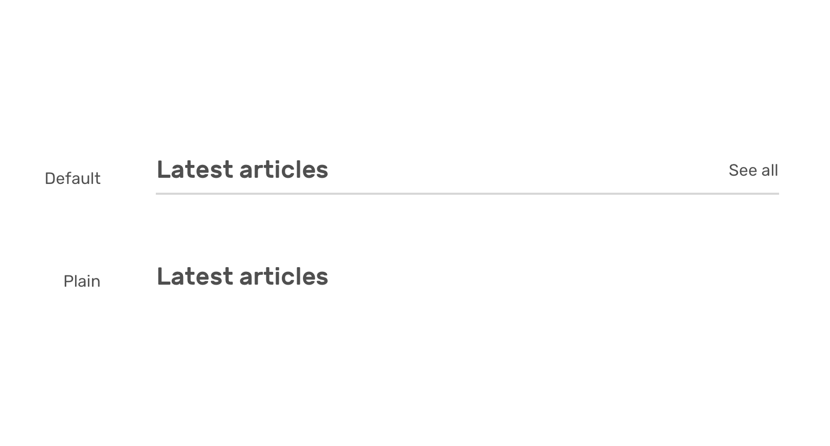
/* HTML */

<section>
    <div class="section-header">
        <h2>Latest articles</h2>
        <a href="/articles/">See all</a>
    </div>
</section>
/* CSS */
.section-header {
display: flex;
justify-content: space-between;
}
/* If there is a link, add the following */
.section-header:has(> a) {
align-items: center;
border-bottom: 1px solid;
padding-bottom: 0.5rem;
}CSS Parent Selector (:has)
-CSS Logical Properties
CSS pseudo-class (:is)
-CSS Logical Properties
ul li,
ol li {}

/* We could write */

:is(ul, ol) li {
  /*    */
}

:is(section, article, aside, nav) :is(h1, h2, h3, h4, h5, h6) {
  color: #BADA55;
}

/* ... which would be the equivalent of: */
section h1, section h2, section h3, section h4, section h5, section h6,
article h1, article h2, article h3, article h4, article h5, article h6,
aside h1, aside h2, aside h3, aside h4, aside h5, aside h6,
nav h1, nav h2, nav h3, nav h4, nav h5, nav h6 {
  color: #BADA55;
}

div:is(.cool, .fun) {
  color: red;
}

/*
<div class="cool">match</div>
<div class="fun">match</div>
<p class="fun">not match</p>
*/- selector list as its argument, and selects any element that can be selected by one of the selectors in that list.
CSS pseudo-class (:where)
-CSS Logical Properties
/*  Selects any paragraph inside a header, main
   or footer element that is being hovered */

:where(header, main, footer) p:hover {
  color: red;
  cursor: pointer;
}

header p {
  color: blue;
}

/* The above is equivalent to the following */
header p:hover,
main p:hover,
footer p:hover {
  color: red;
  cursor: pointer;
}- Selector list as its argument, and selects any element that can be selected by one of the selectors in that list.
The difference between :where() and :is() is that :where() always has 0 specificity, whereas :is() takes on the specificity of the most specific selector in its arguments.
Intrinsic Sizing
-
Two ways of sizing, intrinsic and extrinsic.
-
The sizing of an element depends on its content size.
-
Using fixed values for the width or height of an element.
-
Extrinsic Sizing
.div {
  width: 100px;
}
Min content
-Intrinsic Sizing
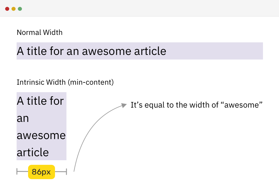
/* HTML */

<h2>A title for an awesome article</h2>
/* CSS */
h2 {
width: min-content;
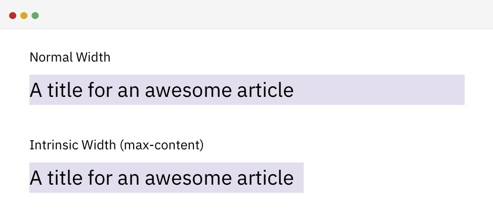
}Max content
-Intrinsic Sizing
/* HTML */

<h2>A title for an awesome article</h2>
/* CSS */

h2 {
  width: max-content;
}
Fit content
-Intrinsic Sizing
/* HTML */

<h2>A title for an awesome article</h2>
/* CSS */

h2 {
  width: fit-content;
}
It’s a combination of using min-content and max-content.
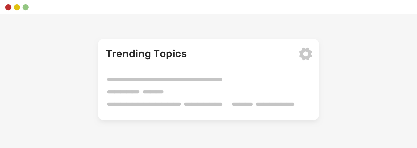
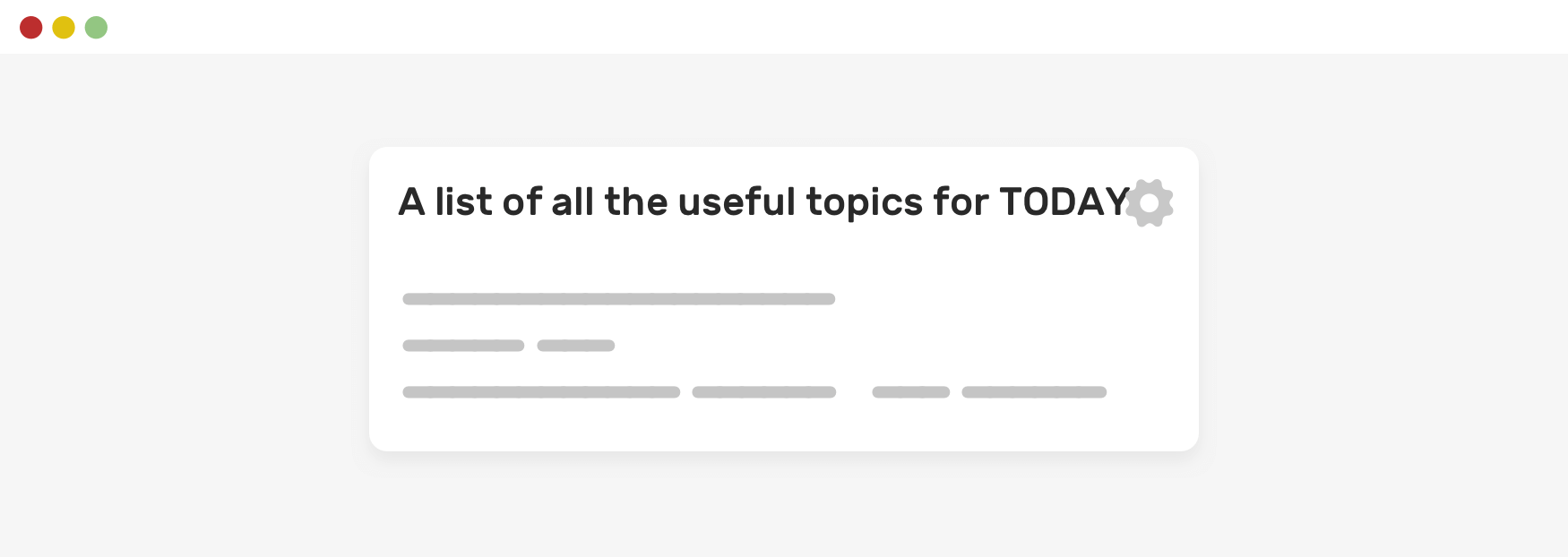
Defensive CSS
-
Avoid a certain CSS issue or behaviors from happening.
Spacing
-Defensive CSS
Spacing
-Defensive CSS
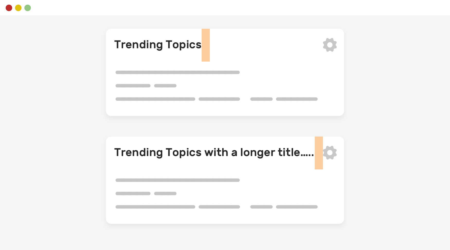
.title {
margin-right: 1rem;
width: 250px;
white-space: nowrap;
overflow: hidden;
text-overflow: ellipsis;
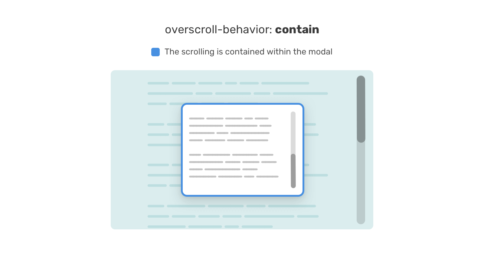
}Lock Scrolling Chaining
-Defensive CSS
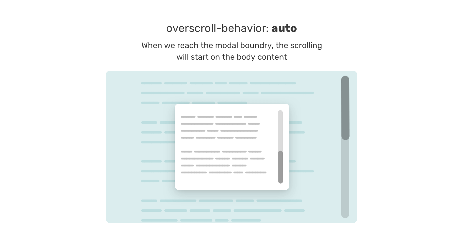
Lock Scrolling Chaining
-Defensive CSS
.modal-content {
    overscroll-behavior-y: contain;
    overflow-y: auto;
}
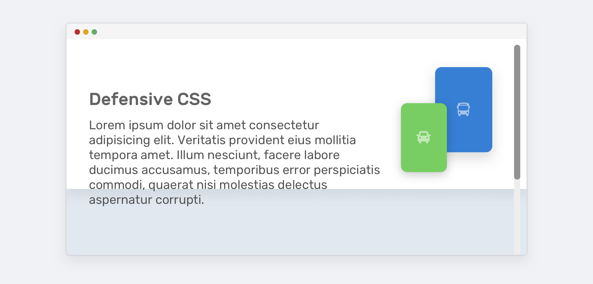
The Fixed Height
-Defensive CSS
.hero {
    height: 350px;
}
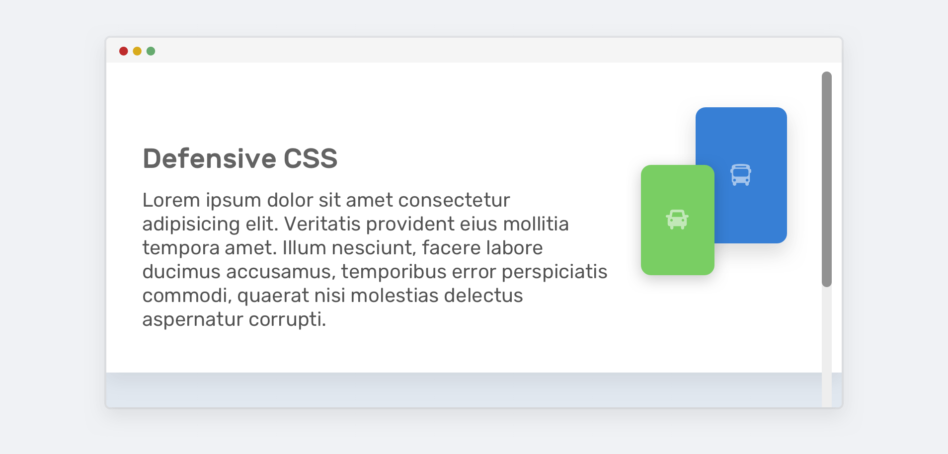
The Fixed Height
-Defensive CSS
.hero {
    min-height: 350px;
}
Vertical Media Queries
-Defensive CSS
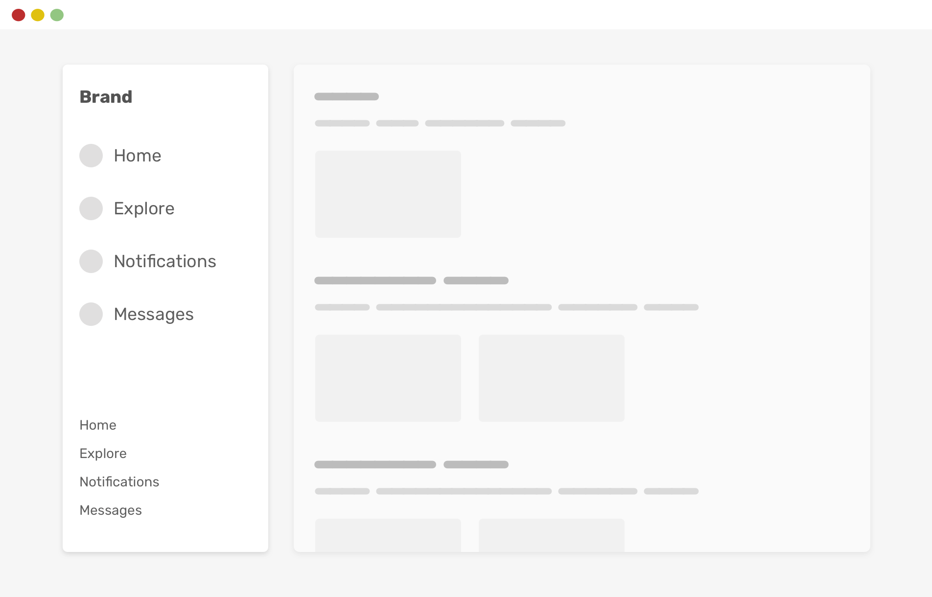
Add position: sticky to the secondary navigation on sidebar
Vertical Media Queries
-Defensive CSS
However, if the browser height is smaller, things will break.
@media (min-height: 600px) {
    .nav-secondary {
        position: sticky;
        bottom: 0;
    }
}
Using Justify-Content: Space-Between
-Defensive CSS
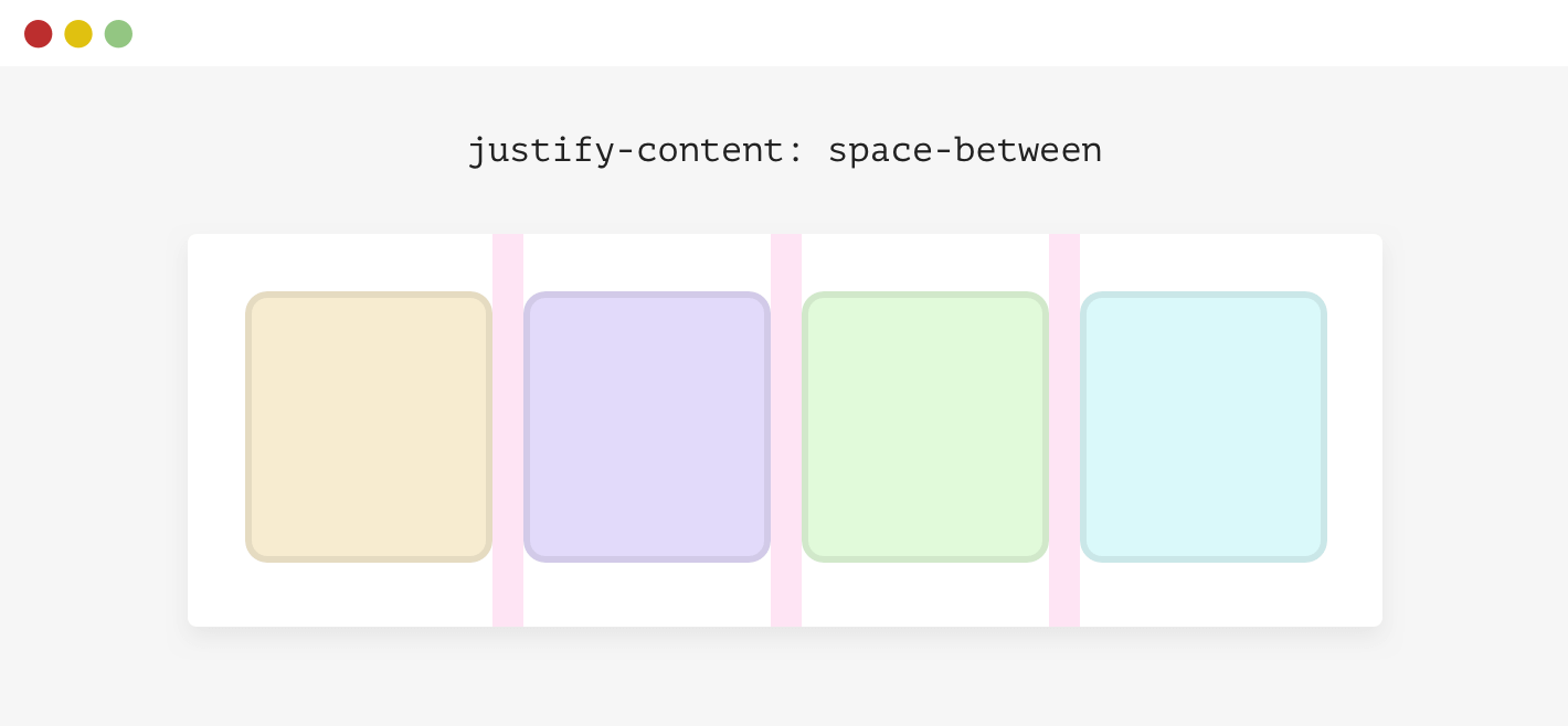
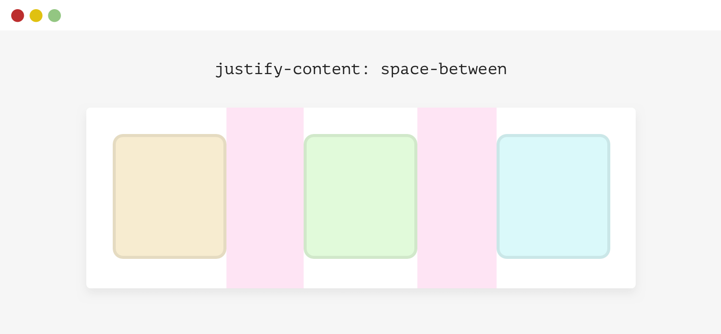
Using Justify-Content: Space-Between
-Defensive CSS
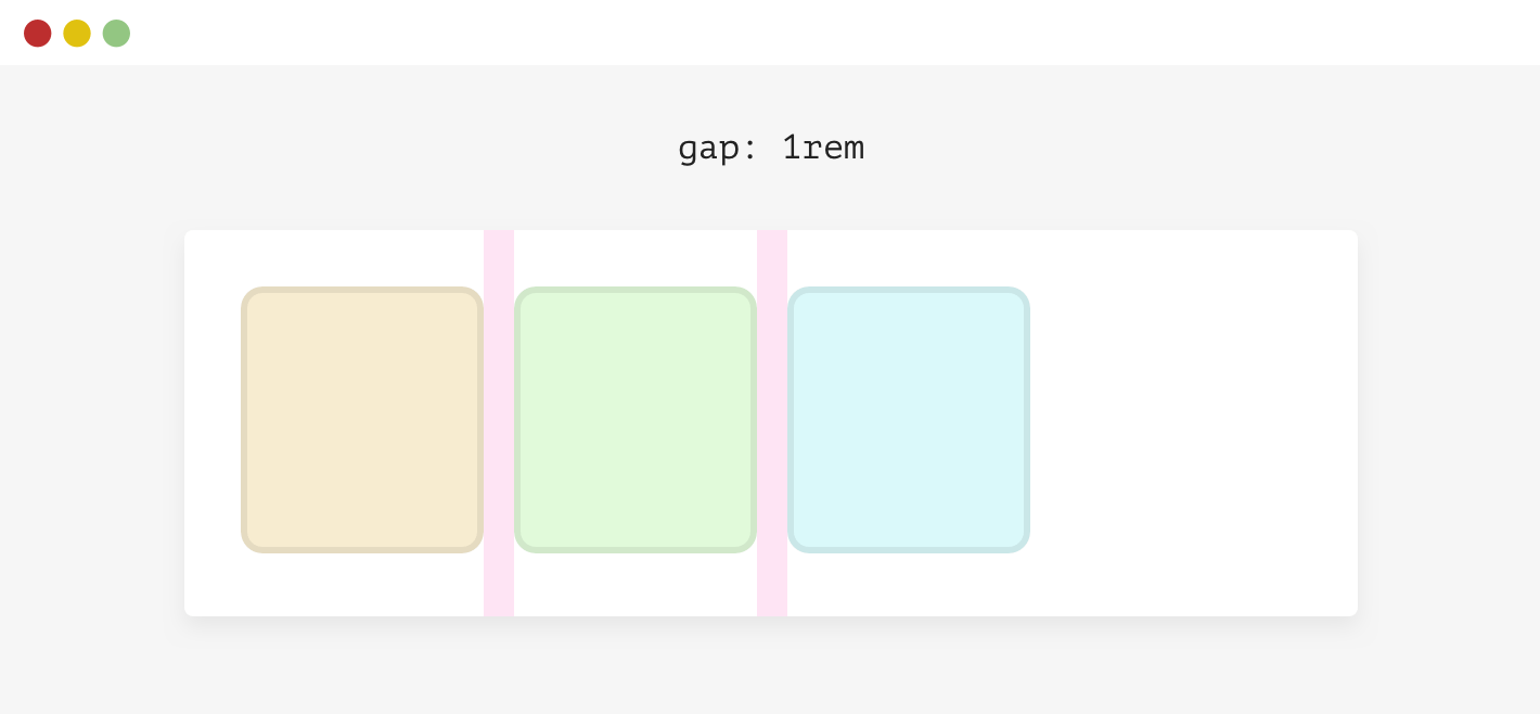
.wrapper {
    display: flex;
    flex-wrap: wrap;
    gap: 1rem;
}
Text Over Images
-Defensive CSS
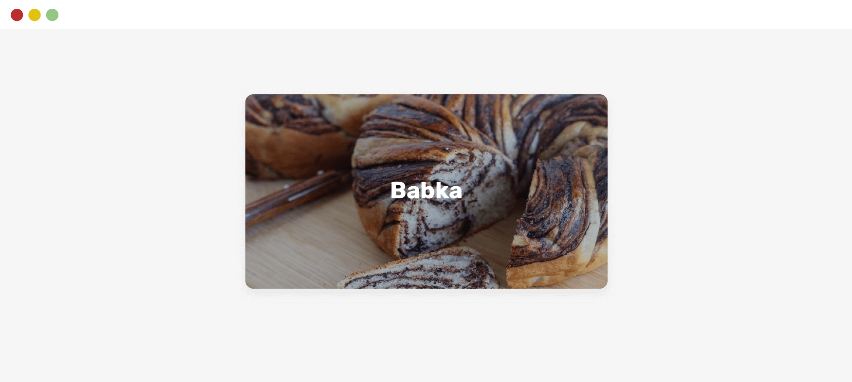
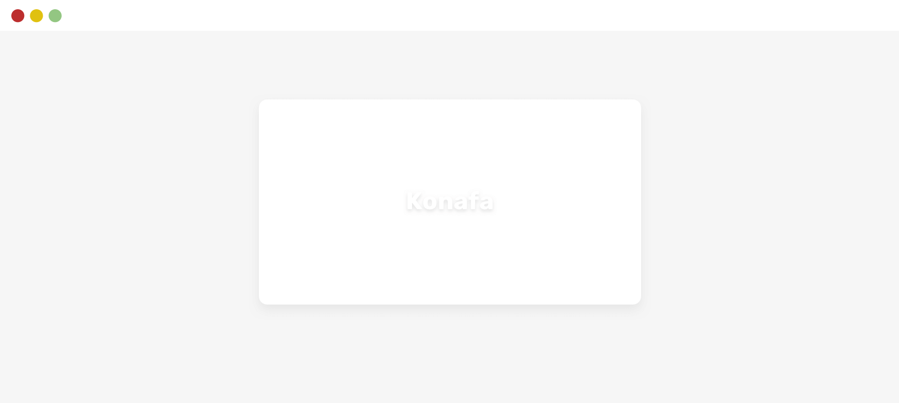
Text Over Images
-Defensive CSS
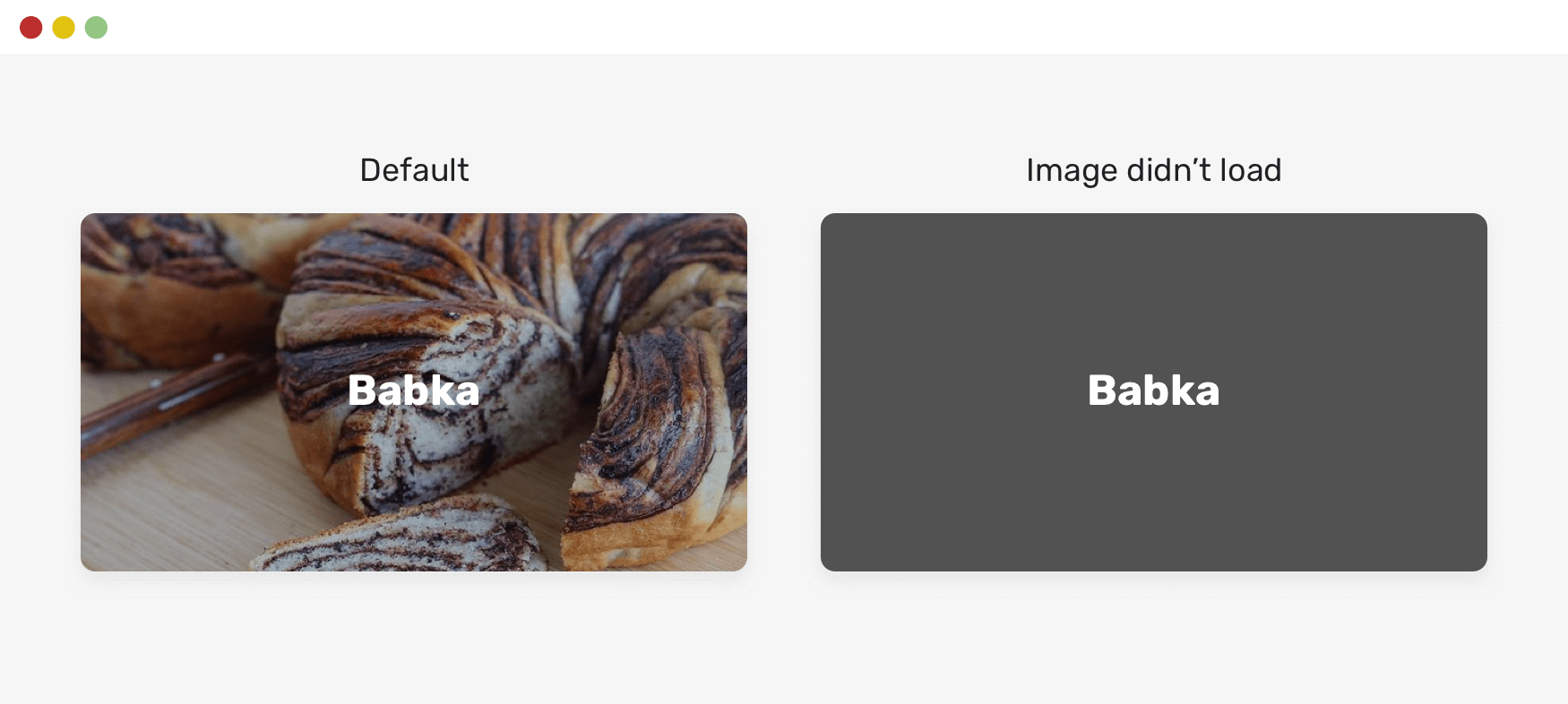
.card__img {
background-color: grey;
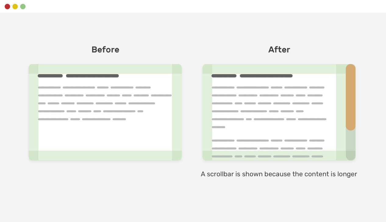
}Scrollbar Gutter
-Defensive CSS
.element {
    scrollbar-gutter: stable;
}
Grouping Selectors
-Defensive CSS
input::-webkit-input-placeholder,
input:-moz-placeholder {
    color: #222;
}
It’s not recommended to group selectors that are meant to work with different browsers.
Bad practice
input::-webkit-input-placeholder {
    color: #222;
}

input:-moz-placeholder {
    color: #222;
}
Instead do this
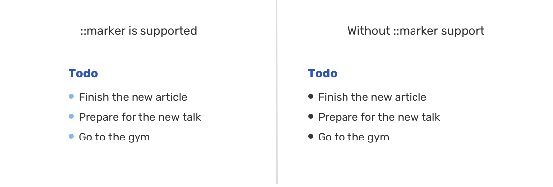
CSS Markers
-Defensive CSS
.list li::marker {
  color: #fcf2db;
  font-size: 1.2em;
}
CSS Clip path
-Defensive CSS
.card__clip {
  background-color: #77cce9;
  clip-path: circle(80px at 50% 50%);
}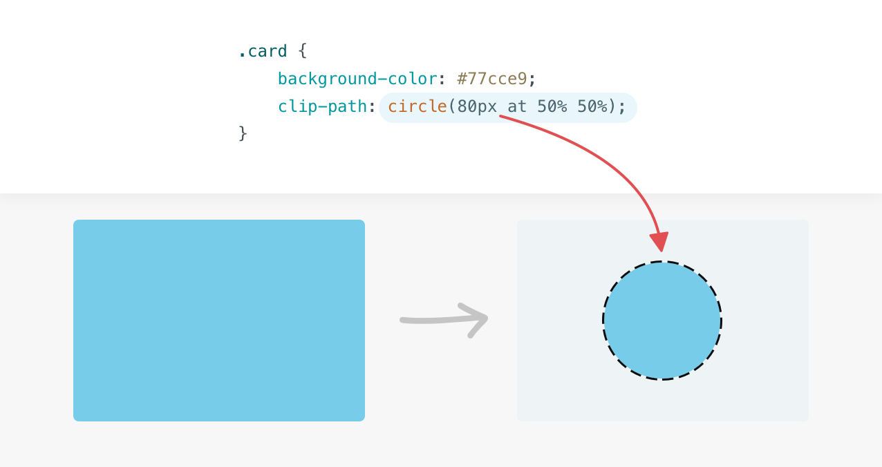
It creates a clipping region where content within it is visible, and content outside it is invisible. Here is a basic example of a circle clip-path
CSS Clip path
-Defensive CSS
Bonus !!
Thank You!
CSS Defensive Mindset
By Nirazan Basnet