CSS Tips & Tricks
Nirajan Basnet
Front-end Engineer, YIPL
-
The content can't shrink to fit the container
-
The container can't expand to fit the content
-
The container doesn't handle overflow gracefully

CSS is the fundamental of any webdesign without it no one make a great website.
Patience
Responsbilties
Creative
Basic Tips
Use CSS Shorthand notation
Background
.main-content {
  background-color: #aeaeae;
  background-image: url(images/bg.png);
  background-repeat: no-repeat;
  background-attachment: scroll;
  background-position: top left;
}

.main-content {
  background: #aeaeae url(images/bg.png) no-repeat 0 0;
}
Font
.main-content {
  font-family: Verdana, Arial, Helvetica;
  font-size: 16px;
  font-weight: bold;
  font-style: italic;
  font-variant: normal;
  line-height: 1.2;
}

.main-content {
  font:italic bold 16px/1.2 Verdana, Arial, Helvetica;
}
Margin & Padding
.main-content {
  margin-top: 0;
  margin-right: 5px;
  margin-bottom: 10px;
  margin-left: 15px;
}


.main-content {
  margin: 0 5px 10px 15px;
}

.main-content {
  margin: 0 auto; (top/bottom right/left)
}

.main-content {
  margin: 10px 20px 15px; (top right/left bottom)
}
Border
.main-content {
border-width: 2px;
border-style: dotted;
border-color: red;
}
.main-content {
border: 2px dotted red;
}
.main-content {
border-right: 2px solid #666;
}
.main-content {
border-width: 3px 2px; (top/bottom right/left)
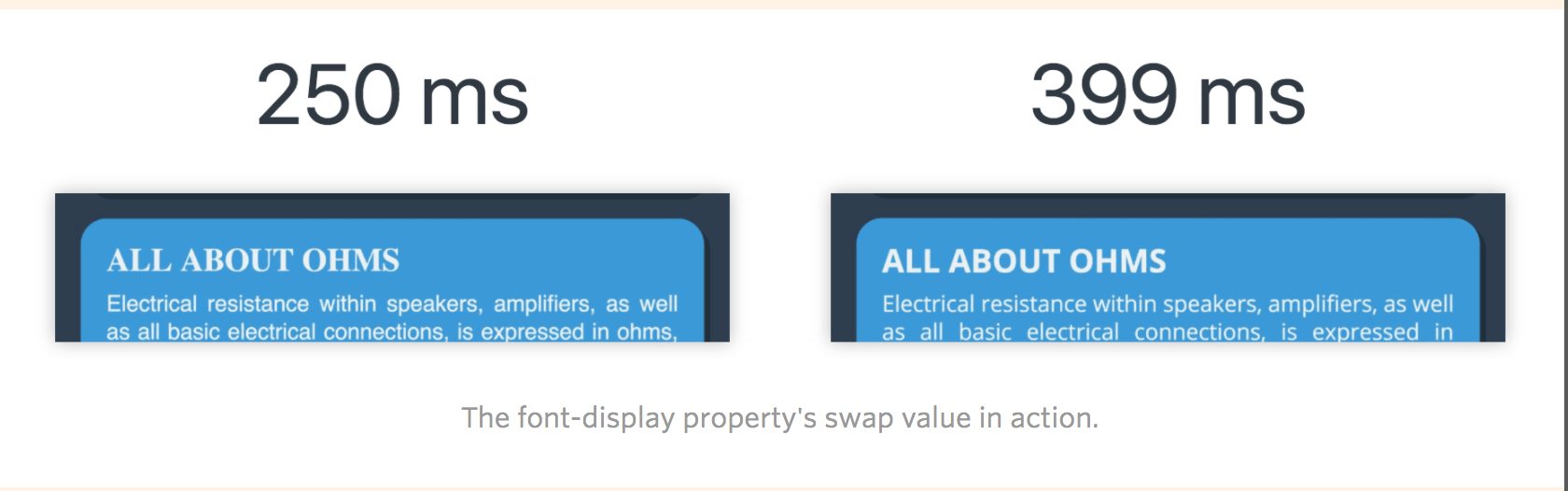
}With font-display Property
New CSS property
It control how fonts display in much the same way that we can with JavaScript-based solutions, only now through a convenient CSS one-liner!
Used inside of a @font-face declaration for your custom fonts
Four number of values: auto, swap, fallback, optional
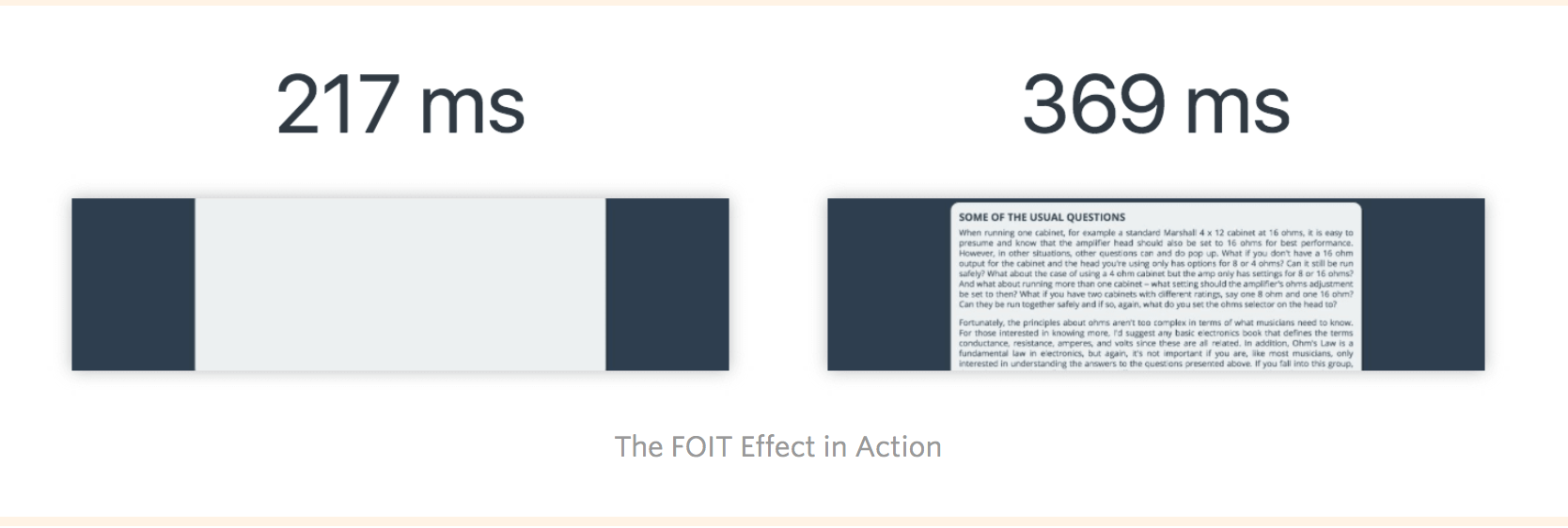
- "Flash of Invisible Text," or FOIT Effect.
Font loading in the browser
Basic syntax - swap
    @font-face {
      font-family: "Open Sans Regular";
      font-weight: 400;
      font-style: normal;
      src: url("fonts/OpenSans-Regular-BasicLatin.woff2") format("woff2");
      font-display: swap;
    }

    p {
      font-family: "Open Sans Regular", "Helvetica", "Arial", sans-serif;
    }
Font smoothing
    body {
    	-webkit-font-smoothing: antialiased;
    	-moz-osx-font-smoothing: grayscale;
    }
Pseudo Selectors Hacks
-
:empty
-
:target (Modal)
-
:hover (Tooltip)
-
:lang
-
:valid, :invalid (Form input)
-
:in-range
-
:fullscreen
-
:placeholder-shown
To center the element
-
table
-
absolute,transform
-
flex
Be Layout Ninja
Mobile First Responsive Design
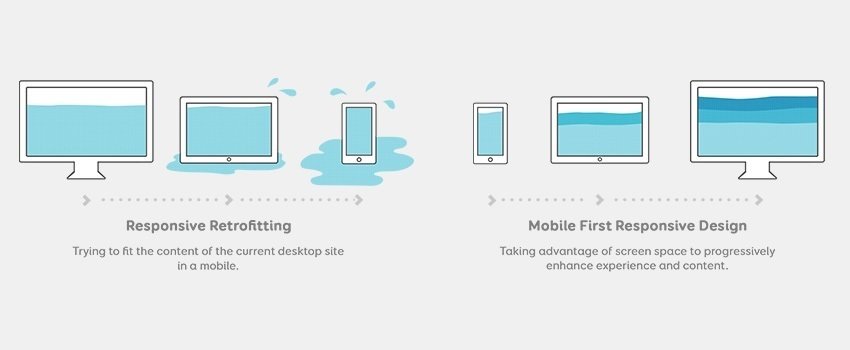
Photo source: Responsive design
An approach to web design which makes web pages render well on a variety of devices and window or screen sizes.
Content, Design and Performance
are necessary to all devices to ensure usability and satisfaction.
/*==========  Mobile First Method  ==========*/

/* Custom, iPhone Retina */
@media only screen and (min-width : 320px) {

}

/* Extra Small Devices, Phones */
@media only screen and (min-width : 480px) {

}

/* Small Devices, Tablets */
@media only screen and (min-width : 768px) {

}

/* Medium Devices, Desktops */
@media only screen and (min-width : 992px) {

}

/* Large Devices, Wide Screens */
@media only screen and (min-width : 1200px) {

}
/*========== Non-Mobile First Method ==========*/
/* Large Devices, Wide Screens */
@media only screen and (max-width : 1200px) {
}
/* Medium Devices, Desktops */
@media only screen and (max-width : 992px) {
}
/* Small Devices, Tablets */
@media only screen and (max-width : 768px) {
}
/* Extra Small Devices, Phones */
@media only screen and (max-width : 480px) {
}
/* Custom, iPhone Retina */
@media only screen and (max-width : 320px) {
}CSS Flexbox Grid
-
New Flexible box layout module in CSS3
-
To improve the items align, directions and order even when they are with dynamic or even unknown size
-
To modify the width or height of its children to fill the available space in the best possible way on different screen sizes

Photo source: Flexbox grid
#display
.container {
    display: flex | inline-flex;
}
#flex-wrap
.container {
    flex-wrap: wrap | no-wrap | wrap-reverse;
}
#justify-content
.container {
    justify-content: flex-end | flex-start | center | space-around | space-between;
}
#align-items
.container {
    align-items: stretch | flex-start | flex-end | center | baseline;
}
Use cases for CSS Calc()
Basic syntax
.main-container {
  width: 90%; /* fallback if needed */
  width: calc(100% - 3em);
}
.sidebar {
float: left;
width: 200px;
}
.main-content {
float: left;
width: calc(100% - 200px);
}#element1, #element2 {
float: left;
width: calc(50% - 30px);
}
#element2 {
margin-left: 60px;
}#element1, #element2 {
width: calc(50% - 2em);
}
#element1, #element2 {
width: calc(50% - 2em - 4px);
border: 2px solid #000;
}#myelement {
width: max(300px, 30%, 30em);
font-size: min(10px, 0.6em);
}Viewport Possibilities
-
Fullscreen Background
-
Responsive font
Transition & Animation
Simple transition
    #element {
      -webkit-transition: all 1s ease-in-out;
      -moz-transition: all 1s ease-in-out;
      -o-transition: all 1s ease-in-out;
      transition: all 1s ease-in-out;
    }
    #element {
        transition: [transition-property] [transition-duration]
                    [transition-timing-function] [transition-delay];
    }
Fade In Example
    #element {
      -webkit-transition: all 1s ease-in-out;
      -moz-transition: all 1s ease-in-out;
      -o-transition: all 1s ease-in-out;
      transition: all 1s ease-in-out;
    }
    #element {
        transition: [transition-property] [transition-duration]
                    [transition-timing-function] [transition-delay];
    }
CSS Icons
Examples
Codepen Examples with animation
Share your work in
- Uplabs
- Codepen
- Write blog in medium
Resources
CSS Tips & Tricks
By Nirazan Basnet