
React Native
Day 2
-
React Native Core Components
-
View, Text, Image, TextInput, Button, ScrollView, FlatList, ListView ...
-
-
Styling in React Native
-
Stylesheets
-
Flexbox layout
-
Margin, padding, colors
-
-
Responsive Design
-
Dimensions, Platform API
-
SafeAreaView
-
-
Hands-On
-
Build a user profile screen with images and lists
-
Add custom styles, flex layouts
-
-
Debugging & Tools
-
Using React Native Debugger/Flipper
-
Emulator/Device testing tips
-
Core Components
In Android development, you write views in Kotlin or Java; in iOS development, you use Swift or Objective-C. With React Native, you can invoke these views with JavaScript using React components. At runtime, React Native creates the corresponding Android and iOS views for those components. Because React Native components are backed by the same views as Android and iOS, React Native apps look, feel, and perform like any other apps. We call these platform-backed components Native Components.

StyleSheet
-
StyleSheetis a built-in API in React Native for creating component styles. -
It helps keep styling organized, efficient, and maintainable.
-
Similar in concept to CSS, but uses JavaScript objects.
Will cover this topic later on in details!
StyleSheet
import React from 'react';
import { View, Text, StyleSheet } from 'react-native';

const styles = StyleSheet.create({
  container: {
    flex: 1,
    justifyContent: 'center',
    alignItems: 'center',
    backgroundColor: '#e6f7ff',
  },
  heading: {
    fontSize: 24,
    fontWeight: 'bold',
    color: '#005f99',
  },
});
View
The most fundamental component for building a UI, View is a container that supports layout with flexbox, style, some touch handling, and accessibility controls. View maps directly to the native view equivalent on whatever platform React Native is running on, whether that is a UIView, <div>, android.view, etc.
View is designed to be nested inside other views and can have 0 to many children of any type.
import { View } from 'react-native';
<View style={{backgroundColor: 'blue', flex: 0.2}} />
Text
A React component for displaying text.
Text supports nesting, styling, and touch handling.
In the following example, the nested title and body text will inherit the fontFamily from styles.baseText, but the title provides its own additional styles.
import { Text } from 'react-native';
<Text numberOfLines={5}>{bodyText}</Text>
TextInput
A foundational component for inputting text into the app via a keyboard. Props provide configurability for several features, such as auto-correction, auto-capitalization, placeholder text, and different keyboard types, such as a numeric keypad.
The most basic use case is to plop down a TextInput and subscribe to the onChangeText events to read the user input. There are also other events, such as onSubmitEditing and onFocus that can be subscribed to.
TextInput
import React from 'react';
import {StyleSheet, TextInput} from 'react-native';
import {SafeAreaView, SafeAreaProvider} from 'react-native-safe-area-context';

const TextInputExample = () => {
  const [text, onChangeText] = React.useState('Useless Text');
  const [number, onChangeNumber] = React.useState('');

  return (
    <SafeAreaProvider>
      <SafeAreaView>
        <TextInput
          style={styles.input}
          onChangeText={onChangeText}
          value={text}
        />
        <TextInput
          style={styles.input}
          onChangeText={onChangeNumber}
          value={number}
          placeholder="useless placeholder"
          keyboardType="numeric"
        />
      </SafeAreaView>
    </SafeAreaProvider>
  );
};
Switch
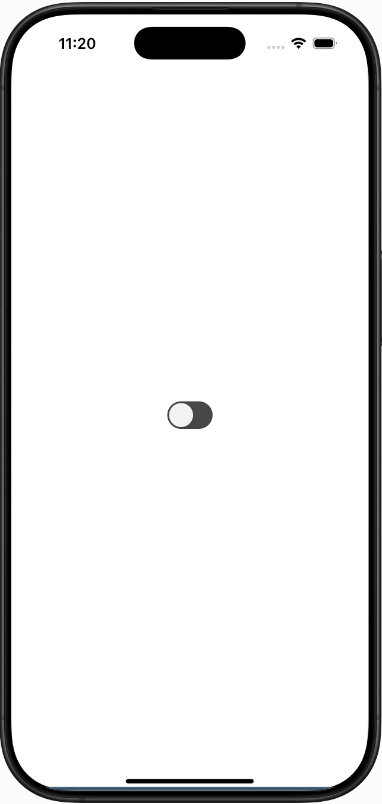
Renders a boolean input.
This is a controlled component that requires an onValueChange callback that updates the value prop in order for the component to reflect user actions. If the value prop is not updated, the component will continue to render the supplied value prop instead of the expected result of any user actions.
Switch
<Switch
  trackColor={{false: '#767577', true: '#81b0ff'}}
  thumbColor={isEnabled ? '#f5dd4b' : '#f4f3f4'}
  ios_backgroundColor="#3e3e3e"
  onValueChange={toggleSwitch}
  value={isEnabled}
/>
ActivityIndicator
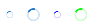
Displays a circular loading indicator.
<SafeAreaProvider>
  <SafeAreaView style={[styles.container, styles.horizontal]}>
  <ActivityIndicator />
  <ActivityIndicator size="large" />
  <ActivityIndicator size="small" color="#0000ff" />
  <ActivityIndicator size="large" color="#00ff00" />
  </SafeAreaView>
</SafeAreaProvider>
StatusBar
Component to control the app's status bar. The status bar is the zone, typically at the top of the screen, that displays the current time, Wi-Fi and cellular network information, battery level and/or other status icons.
https://reactnative.dev/docs/statusbar
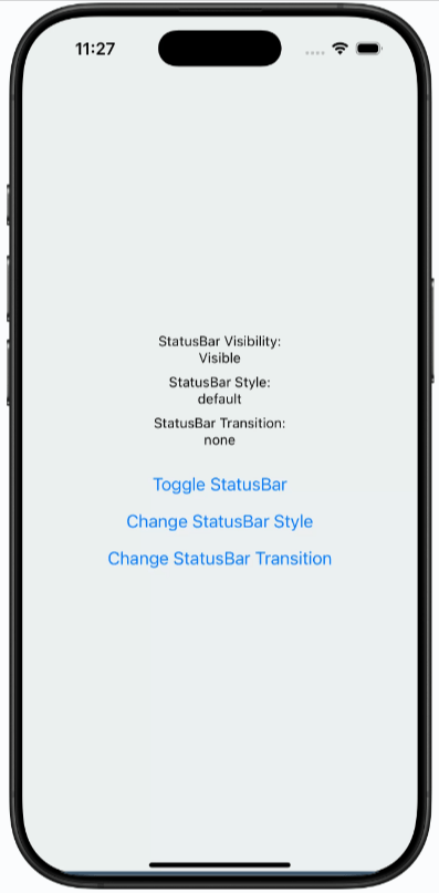
StatusBar
Image
A React component for displaying different types of images, including network images, static resources, temporary local images, and images from local disk, such as the camera roll.
 <Image
   style={styles.tinyLogo}
   source={{
   uri: 'https://reactnative.dev/img/tiny_logo.png',
   }}
 />
Image
A common feature request from developers familiar with the web is background-image. To handle this use case, you can use the <ImageBackground> component, which has the same props as <Image>, and add whatever children to it you would like to layer on top of it.
<ImageBackground source={image} resizeMode="cover" style={styles.image}>
	<Text style={styles.text}>Inside</Text>
</ImageBackground>
Button
A basic button component that should render nicely on any platform. Supports a minimal level of customization.
#Button
<Button title="Press me" onPress={() => Alert.alert('Simple Button pressed')} />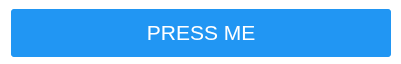
This is a very basic component. For more customized and styled buttons use Pressable
Touchable
-
Enable user interaction via tap, press, or long press.
-
Used for making buttons, clickable cards, lists, and more.
-
Provide visual feedback (opacity, highlight, etc.) when pressed.
Touchable
ComponentKey FeatureTypical Use
| TouchableOpacity | Fades out opacity on press | Custom buttons, icons |
| TouchableHighlight | Shows a background color on press | Cards, list items |
| TouchableWithoutFeedback | No visual feedback | Wrapping custom UI |
| Pressable (newer) | Highly customizable, detects various states | Most new use cases |
Touchable
import React from 'react';
import { TouchableOpacity, Text, Alert, StyleSheet } from 'react-native';

export default function App() {
  return (
    <TouchableOpacity
      style={styles.button}
      onPress={() => Alert.alert('Button Pressed!')}>
      <Text style={styles.text}>Press Me</Text>
    </TouchableOpacity>
  );
}

const styles = StyleSheet.create({
  button: {
    backgroundColor: '#2196F3',
    padding: 16,
    borderRadius: 8,
  },
  text: {
    color: '#fff',
    fontWeight: 'bold',
    fontSize: 18,
  },
});
Pressable
Pressable is a Core Component wrapper that can detect various stages of press interactions on any of its defined children.
<Pressable onPress={onPressFunction}>
  <Text>I'm pressable!</Text>
</Pressable>
Pressable

Lists and ScrollView
-
Mobile screens are small, but data can be large!
-
ScrollView: For small/medium content that needs scrolling.
-
FlatList & SectionList: For rendering large, dynamic lists efficiently.
Lists and ScrollView
Typical Use Cases:
-
Scrollable forms and articles (ScrollView)
-
Infinite feeds, chat messages, large data sets (FlatList)
-
Grouped contacts, menus, sections (SectionList)
ScrollView
-
Allows you to display content that overflows the screen vertically or horizontally.
-
Best for: small lists, static content, forms.
import { ScrollView, Text } from 'react-native';

export default function App() {
  return (
    <ScrollView>
      <Text>Item 1</Text>
      <Text>Item 2</Text>
      {/* ...add more items */}
    </ScrollView>
  );
}
Don’t use ScrollView for hundreds of items—it renders everything at once!
FlatList
-
Highly optimized for large lists.
-
Only renders items currently on-screen.
-
Supports pull-to-refresh, separators, headers, and more.
import { FlatList, Text } from 'react-native';

const data = [
  { key: '1', title: 'Apple' },
  { key: '2', title: 'Banana' },
  // ...more items
];

export default function App() {
  return (
    <FlatList
      data={data}
      renderItem={({ item }) => <Text>{item.title}</Text>}
    />
  );
}
SectionList
-
Renders grouped lists (with section headers).
-
Useful for menus, contacts, FAQs.
import { SectionList, Text } from 'react-native';

const DATA = [
  { title: 'Fruits', data: ['Apple', 'Banana'] },
  { title: 'Vegetables', data: ['Carrot', 'Lettuce'] },
];

export default function App() {
  return (
    <SectionList
      sections={DATA}
      renderItem={({ item }) => <Text>{item}</Text>}
      renderSectionHeader={({ section }) => (
        <Text style={{ fontWeight: 'bold' }}>{section.title}</Text>
      )}
      keyExtractor={(item, index) => item + index}
    />
  );
}
Modal
The Modal component is a basic way to present content above an enclosing view.
  <Modal
  animationType="slide"
  transparent={true}
  visible={modalVisible}
  onRequestClose={() => {
  Alert.alert('Modal has been closed.');
  setModalVisible(!modalVisible);
  }}>
    <View style={styles.centeredView}>
      <View style={styles.modalView}>
      <Text style={styles.modalText}>Hello World!</Text>
      <Pressable
      style={[styles.button, styles.buttonClose]}
      onPress={() => setModalVisible(!modalVisible)}>
      <Text style={styles.textStyle}>Hide Modal</Text>
      </Pressable>
    </View>
  </View>
  </Modal>
SafeAreaView
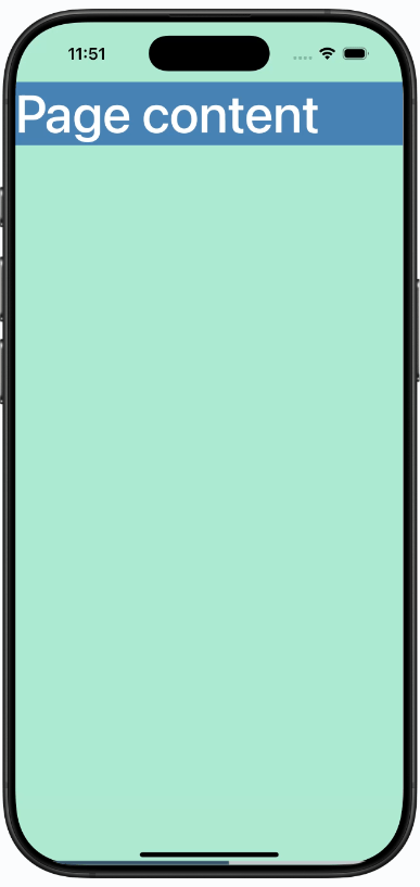
The purpose of SafeAreaView is to render content within the safe area boundaries of a device. It is currently only applicable to iOS devices with iOS version 11 or later.
SafeAreaView renders nested content and automatically applies padding to reflect the portion of the view that is not covered by navigation bars, tab bars, toolbars, and other ancestor views. Moreover, and most importantly, Safe Area's paddings reflect the physical limitation of the screen, such as rounded corners or camera notches (i.e. the sensor housing area on iPhone 13).
SafeAreaView
import React from 'react';
import {StyleSheet, Text, SafeAreaView, View}
from 'react-native';

const App = () => {
  return (
    <View style={styles.container}>
      <Text style={styles.text}>Page content</Text>
    </View>
  );
};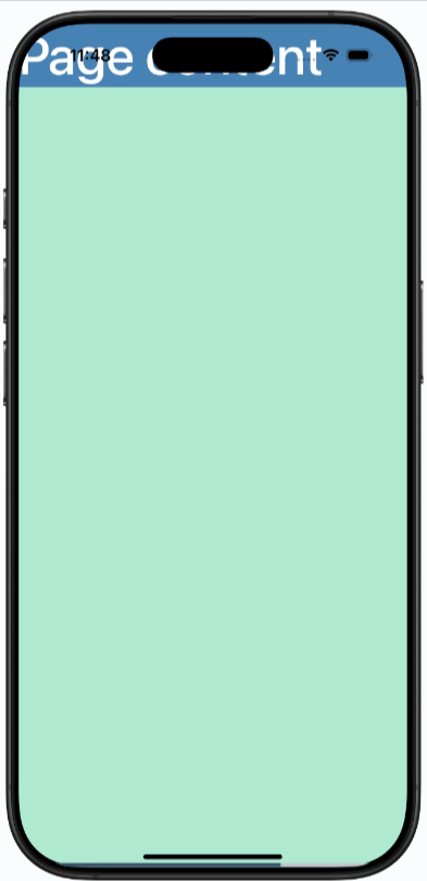
Content overlaps notch area
SafeAreaView
import React from 'react';
import {StyleSheet, Text, SafeAreaView, View}
from 'react-native';

const App = () => {
  return (
    <SafeAreaView style={styles.container}>
      <Text style={styles.text}>Page content</Text>
    </SafeAreaView>
  );
};
React Native – Day 2
By noinputsignal


