


Juan Romero-Luis
Science Communication & UX Researcher
Teacher Juan Romero Luis
Apr 10, 2024
Unit 5
bit.ly/BWD23U5
bit.ly/BWD23U5
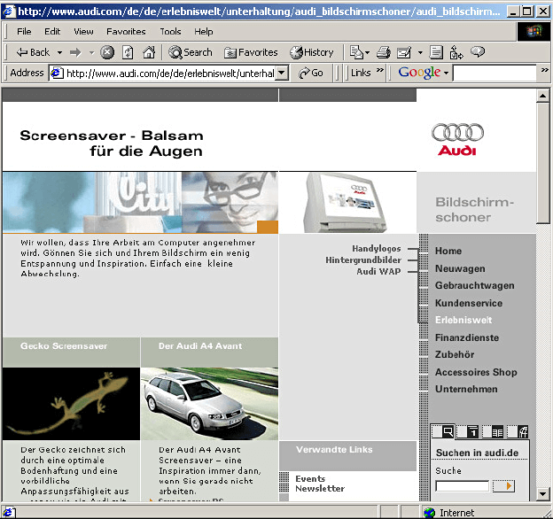
What is responsive design?
Responsive web design is a design approach that aims to make websites look and function well on a variety of devices, including desktops, laptops, tablets, and mobile phones. It relies on flexible layouts, flexible images, and CSS media queries.
N
Source: webdesigmuseum.org.
<!DOCTYPE html>
<html>
	<head>
		<meta name="viewport" content="width=device-width, initial-scale=1.0">
    </head>
	<body>
	   <!-- The content of the document... -->
	</body>
</html>
width=device-width part sets the page width to follow the screen-width of the device, which varies.initial-scale=1.0 part sets the initial zoom level when the page is first loaded by the browser.N
N
🎯 Quick activity: playing with the viewport meta tag
<meta name="viewport" content="width=device-width, initial-scale=1.0">
Teacher Juan Romero Luis
Apr 11, 2024
Unit 5
bit.ly/BWD23U5
N
Do NOT use large fixed-width elements. For instance, an image displayed at a width wider than the viewport can cause horizontal scrolling. Ensure to adjust this content to fit within the viewport width.
Do NOT let the content rely on an absolute viewport width (eg. px) to render well. It is better to use relative units.
Use CSS media queries to apply different styling for small and large screens. (we’ll se that in a few classes).
8.33%16.66%25%33.33%41.66%58.33%66.66%75%83.33%91,66%100%50%<header>
(100%)
<aside>
(25%)
<main>
(75%)
ensures the padding and border of an element are included in its total width and height, rather than added on, which can often cause layout issues.
* {
  box-sizing: border-box;
}
allows elements to be positioned horizontally next to each other, instead of stacking vertically which is the default behavior of block-level elements.
.column1 {
  float: left;
  width: 50%;
}

.column2 {
  float: right;
  width: 50%;
}
<!DOCTYPE html>
<html>

<head>
  <meta name="viewport" content="width=device-width, initial-scale=1.0">
  <link href="https://fonts.googleapis.com/css2?family=Montserrat:ital,wght@0,100..900;1,100..900&display=swap" rel="stylesheet">
  <link rel="stylesheet" type="text/css" href="styles.css">

</head>

<body>

  <header>
    <img width="393" height="43" alt="udit logo" src="https://udit.es/wp-content/uploads/2022/12/Logo-udit.svg">
  </header>

  <main>
    <main>
      <aside class="menu">
        <ul>
          <li>The Teacher</li>
          <li>The Subject</li>
          <li>The Students</li>
          <li>The Break</li>
        </ul>
      </aside>

      <section>
        <h1>The teacher</h1>
        <p>Lorem ipsum dolor sit amet, consectetur adipiscing elit, sed do eiusmod tempor <span>your  teacher is awesome </span> incididunt ut labore et dolore magna aliqua. Ut enim ad minim. Lorem ipsum dolor sit amet, consectetur adipiscing elit, sed do eiusmod tempor incididunt ut labore et dolore magna aliqua.
        </p>
      </section>
    </main>
</body>

</html>
* {
  box-sizing: border-box;
}

.col-1,
.col-2,
.col-3,
.col-4,
.col-5,
.col-6,
.col-7,
.col-8,
.col-9,
.col-10,
.col-11,
.col-12 {
  float: left;
  padding: 15px;
}

.col-1 {
  width: 8.33%;
}
.col-2 {
  width: 16.66%;
}
.col-3 {
  width: 25%;
}
.col-4 {
  width: 33.33%;
}
.col-5 {
  width: 41.66%;
}
.col-6 {
  width: 50%;
}
.col-7 {
  width: 58.33%;
}
.col-8 {
  width: 66.66%;
}
.col-9 {
  width: 75%;
}
.col-10 {
  width: 83.33%;
}
.col-11 {
  width: 91.66%;
}
.col-12 {
  width: 100%;
}


/* Set the font to "Montserrat" in the whole document (first check if the font is correctly linked in the HTML page, otherwise it might not work) */


/* Go to the HTML page and add classes to the elemnts to set the grid you considere necessary for this page */


/* Create a solid border of 1px to identify the limits of the header. Then add padding to the header if you think it needs it*/


/*Remove lists bullet points, and set margin and padding to 0, to remove the default margin and padding (to do it you need to target to the unordered list, not the list items) */


/*Change the layout of the menu lists items. You will need to add padding, margin (probably only bottom) and set the color and background color (make it look like UDIT identity. Add a box shadow if you have time */


/*Change background color of list of the menu on hover state*/


/* Set all span elements to bold. Rememeber that you'd need to change the font weight to 700 to do that. If you don't know why ask your teacher*/
📝 Deliverable 5.1: My first grid-based page
Create an HTML page with the following code
Create a CSS document with the following code and link it to the HTML
Follow the instructions included in the CSS document
Teacher Juan Romero Luis
Apr 17, 2024
Unit 5
bit.ly/BWD23U5
bit.ly/BWD23U5
QU5.1
Review about introduction to responsive
web design and viewpoint meta tag
Final project submission:
Final exam:
Project presentation:
User persona missing in most of your deliverables
Some of the projects are too ambitious (functionality)
Please, do not include teacher instructions in the final deliverable
Not clear objectives
(clarify difference between objectives of the project and the actual web)
is technique used to allow the application of different style rules to different devices based on their characteristics, such as screen size, resolution, and orientation.
@media screen and (max-width: 600px) {
  body {
    background-color: lightblue;
  }
}
@media screen and (max-width: 900px) and (min-width: 600px) {
  body {
    background-color: purple;
  }
}
@media only screen and (orientation: landscape) {
  body {
    background-color: lightblue;
  }
}
You can create multiple media queries for different viewport widths, which are known as breakpoints.
/* Extra small devices (phones, 600px and down) */
@media only screen and (max-width: 600px) {...}

/* Small devices (portrait tablets and large phones, 600px and up) */
@media only screen and (min-width: 600px) {...}

/* Medium devices (landscape tablets, 768px and up) */
@media only screen and (min-width: 768px) {...}

/* Large devices (laptops/desktops, 992px and up) */
@media only screen and (min-width: 992px) {...}

/* Extra large devices (large laptops and desktops, 1200px and up) */
@media only screen and (min-width: 1200px) {...}
🎯 Quick activity: practicing with media queries
<!DOCTYPE html>
<html>

<head>
  <meta name="viewport" content="width=device-width, initial-scale=1.0">
  <link href="https://fonts.googleapis.com/css2?family=Montserrat:ital,wght@0,100..900;1,100..900&display=swap" rel="stylesheet">
  <link rel="stylesheet" type="text/css" href="styles.css">

</head>

<body>

  <header>
    <section class="logo"><img width="393" height="43" alt="udit logo" src="https://udit.es/wp-content/uploads/2022/12/Logo-udit.svg">
    </section>

  </header>

  <main>
    <main>
      <aside class="col-3 menu">
        <ul>
          <li>The Teacher</li>
          <li>The Subject</li>
          <li>The Students</li>
          <li>The Break</li>
        </ul>
      </aside>

      <section class="col-6">
        <h1>The teacher</h1>
        <p>Lorem ipsum dolor sit amet, consectetur adipiscing elit, sed do eiusmod tempor <span>your teacher is awesome </span> incididunt ut labore et dolore magna aliqua. Ut enim ad minim. Lorem ipsum dolor sit amet, consectetur adipiscing elit, sed do eiusmod tempor incididunt ut labore et dolore magna aliqua.
        </p>
      </section>
      <aside class="col-3">
        <div class="info">
          <h2>The university</h2>
          <p> Lorem ipsum dolor sit amet, consectetur adipiscing elit.</p>
          <h2>The Campus</h2>
          <p> Lorem ipsum dolor sit amet, consectetur adipiscing elit.</p>
        </div>
      </aside>
    </main>
    <footer class="col-12">
      <p> This is the footer</p>
    </footer>
</body>

</html>
* {
  box-sizing: border-box;
  font-family: "Montserrat", sans-serif; /*setting the font */
  margin: 0; /* removing default margin to all items */
}

/*Setting the grid values for Desktop view*/
.col-1, .col-2, .col-3, .col-4, .col-5,.col-6, .col-7, .col-8, .col-9, .col-10, .col-11, .col-12 {  float: left;  padding: 15px; }

.col-1 {  width: 8.33%;}
.col-2 {  width: 16.66%;}
.col-3 {  width: 25%;}
.col-4 {  width: 33.33%;}
.col-5 {  width: 41.66%;}
.col-6 {  width: 50%;}
.col-7 {  width: 58.33%;}
.col-8 {  width: 66.66%;}
.col-9 {  width: 75%;}
.col-10 {  width: 83.33%;}
.col-11 {  width: 91.66%;}
.col-12 {  width: 100%;}

/* Creating a solid border of 1px to identify the limits of the header. Then add padding to the header if you think it needs it*/
header {
  padding: 15px;
  border: 1px solid black;
}

/*Removieng lists bullet points, and set margin and padding to 0, to remove the default margin and padding (to do it you need to target to the unordered list, not the list items) */
.menu ul {
  list-style-type: none;
  margin: 0;
  padding: 0;
}
section.menu {
  display: flex;
  flex-direction: row;
}

/*Changing the layout of the menu lists items. You will need to add padding, margin (probably only bottom) and set the color and background color (make it look like UDIT identity. Add a box shadow if you have time */
.menu li {
  padding: 8px;
  margin-bottom: 7px;
  background-color: black;
  color: #ffffff;
  box-shadow: 0 1px 3px rgba(0, 0, 0, 0.12), 0 1px 2px rgba(0, 0, 0, 0.24);
}

/*Change background color of list of the menu on hover state*/
.menu li:hover {
  background-color: grey;
}

/* Set all span elements to bold. Rememeber that you'd need to change the font weight to 700 to do that. If you don't know why ask your teacher */

span {
    font-weight: 700;
}

/* Setting footer where it belongs */
footer {
  color: white;
  background-color: black;
  text-align: center;
}

/*Setting css to the aside info */

aside .info {
  background-color: black;
  color: white;
  text-align: center;
  padding: 15px;
}
📝 Deliverable 5.2: Changing the grid for mobile version
Create an HTML file with this conten
Create a CSS file liked to the HTML page
Open the HTML in your browser and change the viewpoint width to see how it behaves.
Consider a solution to make all elements occupy 100% width (or the full 12-column width) on screens no larger than 600px in width.
@media only screen and (max-width: 600px) { … }
Teacher Juan Romero Luis
Apr 18, 2024
Unit 5
bit.ly/BWD23U5
Ceating responsive images in CSS involves ensuring that your images can adjust in size to fit a variety of screen sizes.
/* The image will not scale up beyond its original size */
img {
  max-width: 100%;
  height: auto;
}
/* The image will scale up to fit its container width and, thus, could scale up beyond its original size */
img {
  width: 100%;
  height: auto;
}
reating responsive images in CSS involves ensuring that your images can adjust in size to fit a variety of screen sizes.
.hero {
  background-image: url("images/background.jpg");
  background-color: #cccccc;
  background-position: center;
  background-repeat: no-repeat;
  background-size: cover;
}
.hero {
  background-image: url("images/background.jpg");
  background-color: #cccccc;
  background-position: center;
  background-repeat: no-repeat;
  background-size: cover;
}
is used to set the background color of an element.
.hero {
  background-image: url("images/background.jpg");
  background-color: #cccccc;
  background-position: center;
  background-repeat: no-repeat;
  background-size: cover;
}
sets the initial position. Possible values are top, bottom, left, right, and center, percentages (% the top left corner is 0% [horizontal] 0% [vertical]) or absolute values (0px 0px).
.hero {
  background-image: url("images/background.jpg");
  background-color: #cccccc;
  background-position: center;
  background-repeat: no-repeat;
  background-size: cover;
}
controls how a background image is repeated or tiled in an element's background. Possible values are repeat, repeat-x, no-repeat, space, and round.
N
.hero {
  background-image: url("images/background.jpg");
  background-color: #cccccc;
  background-position: center;
  background-repeat: no-repeat;
  background-size: cover;
}
specify the size of the background images. Possible values are auto, length (50px 100px), percentage (50% 100%), cover, and contain.
N
🎯 Step by step activity. Be quite and pay attention to your teacher.
By Juan Romero-Luis


