CSS Grid
Ovidiu Olea
ING {DEV}SCHOOL
-
What is CSS Grid?
-
Basic concepts of grid
-
Media Queries
-
Four reasons to use Grid
-
Grid Garden
-
Q&A
Agenda:
What is CSS Grid?
CSS grid layout is a new method in CSS that allows you to create complex responsive web layouts more easily and consistently.
FlexBox
CSS Grid
Basic concepts
-
Two dimensional system
-
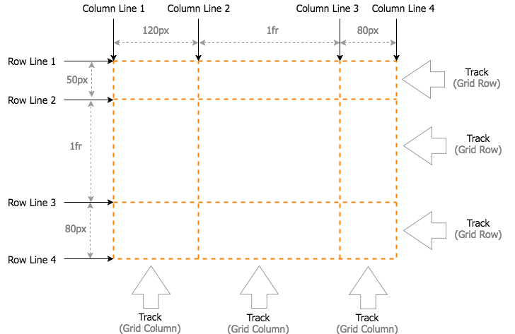
Grid Lines
-
Grid Track
-
Grid Cell
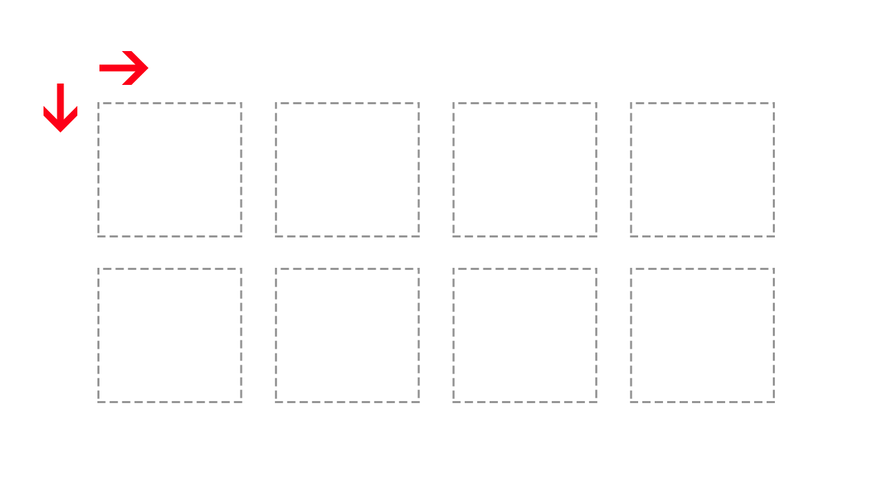
Two dimensional system
Basic concepts
Basic concepts
Grid Lines
The dividing lines that make up the structure of the grid. They can be either vertical ("column grid lines") or horizontal ("row grid lines") and reside on either side of a row or column. Here the yellow line is an example of a column grid line.

Grid Track
The space between two adjacent grid lines. You can think of them like the columns or rows of the grid. Here's the grid track between the second and third row grid lines.

Basic concepts
Grid Cell
The space between two adjacent row and two adjacent column grid lines. It's a single "unit" of the grid. Here's the grid cell between row grid lines 1 and 2, and column grid lines 2 and 3.

Basic concepts
Basic concepts
Grid Properties
- grid-template
- grid-template-columns
- grid-template-rows
- grid-template-areas
- grid-gap
- grid-column-gap
- grid-row-gap
- justify-items
- align-items
- grid-column-start
- grid-column-end
- grid-column
- grid-row
- justify-self
- align-self
Properties for the Parent
(Grid Container)
Properties for the Children
(Grid Items)
Grid template columns / rows
Grid Properties
The element on which display: grid is applied. It's the direct parent of all the grid items. In this example .grid-container is the grid container.
<div class="grid-container">
     <header>Header</header>
     <nav>Nav</nav>
     <main>Main</main>
     <div class="sidebar">Sidebar</div>
     <footer>Footer</footer>
 </div>
.grid-container {
display: grid;
grid-template-columns: 120px 1fr 80px;
grid-template-rows: 50px 1fr 80px;
}
.grid-container > * {
border: 2px solid #ffa94d;
border-radius: 5px;
background-color: #ffd8a8;
padding: 1em;
color: #d9480f;
text-align:center;
}
Grid Properties
Grid Properties
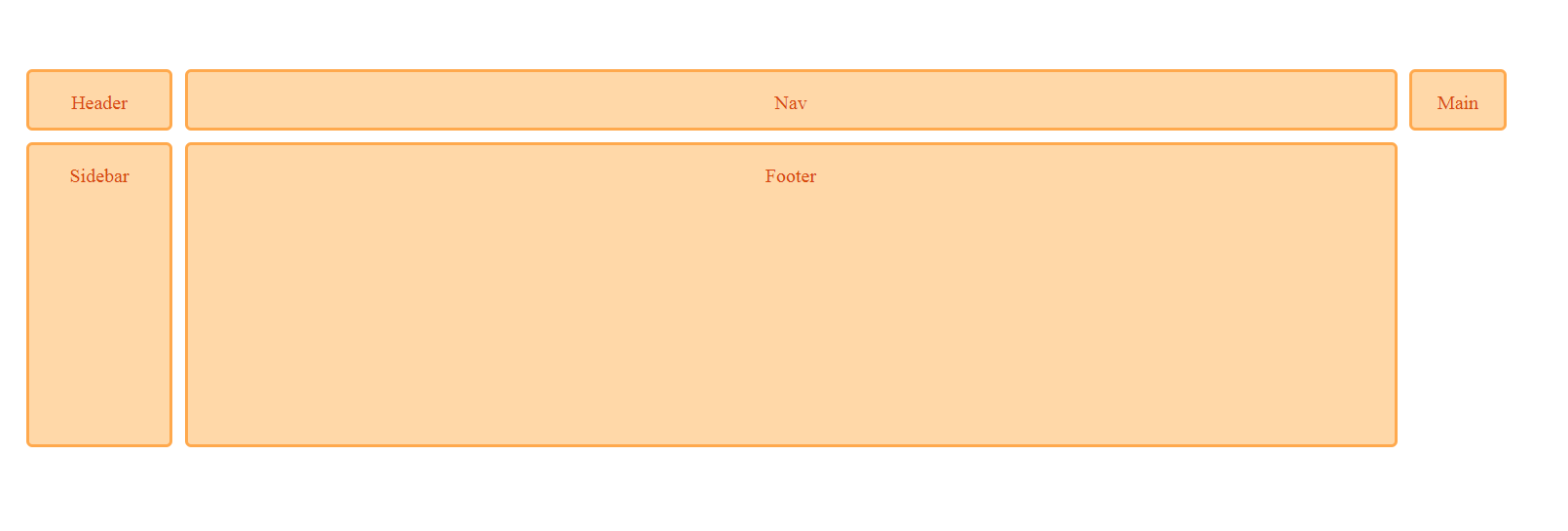
grid-column / grid-row
header {
    grid-column: 2;
    grid-row:1;
}
nav {
    grid-column: 1;
    grid-row:2;
}
main {
    grid-column: 2;
    grid-row:2;
}
.sidebar {
    grid-column:3;
    grid-row:2;
}
footer {
    grid-column:2;
    grid-row:3;
} 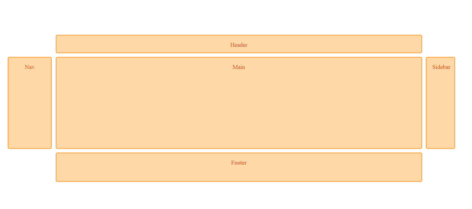
Grid Properties
header {
    grid-column: 2;
    grid-row:1;
    grid-column-start:1;
    grid-column-end:4;
}
nav {
    grid-column: 1;
    grid-row:2;
}
main {
    grid-column: 2;
    grid-row:2;
}
.sidebar {
    grid-column:3;
    grid-row:2;
}
footer {
    grid-column:2;
    grid-row:3;
    grid-column-start:1;
    grid-column-end:4;
  }
grid-column-start / end - grid-row-start/end
Grid Properties
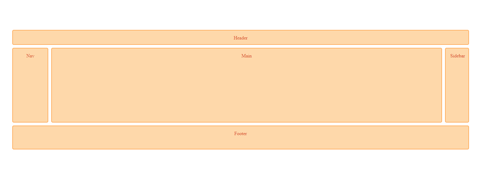
Grid-areas property
.grid-container {
  display: grid;
  grid-template-columns: 120px 1fr 80px;
  grid-template-rows: 50px 1fr 80px;
  grid-template-areas:
    "header header header"
    "nav content sidebar"
    "footer footer footer";
}

header {
  grid-area:header;
}
nav {
  grid-area:nav;
}
main {
  grid-area:content;
}
.sidebar {
  grid-area: sidebar;
}
footer {
  grid-area:footer;
}
The grid-area property can be used to assign a name to a grid item. Named grid items can then be referenced to by the grid-template-areas property of the grid container. See example.
Grid Properties
Shorthand properties & repeat() function
.grid-container {
    grid-template: grid-template-rows / gird-template-columns;
}
Grid Properties
.grid-container {
    grid-template: 50px 1fr 80px / 120px 1fr 80px;
}
The repeat() CSS function represents a repeated fragment of the track list, allowing a large number of columns or rows that exhibit a recurring pattern to be written in a more compact form.
.grid-container {
    display:grid;
    grid-template-columns: 30px 30px 30px;
    grid-template-rows: 20px 20px 20px;
}
.grid-container {
display:grid;
grid-template-column: repeat(3, 30px);
grid-template-row: repeat(3, 20px);
}Grid Properties
Shorthand properties & repeat() function
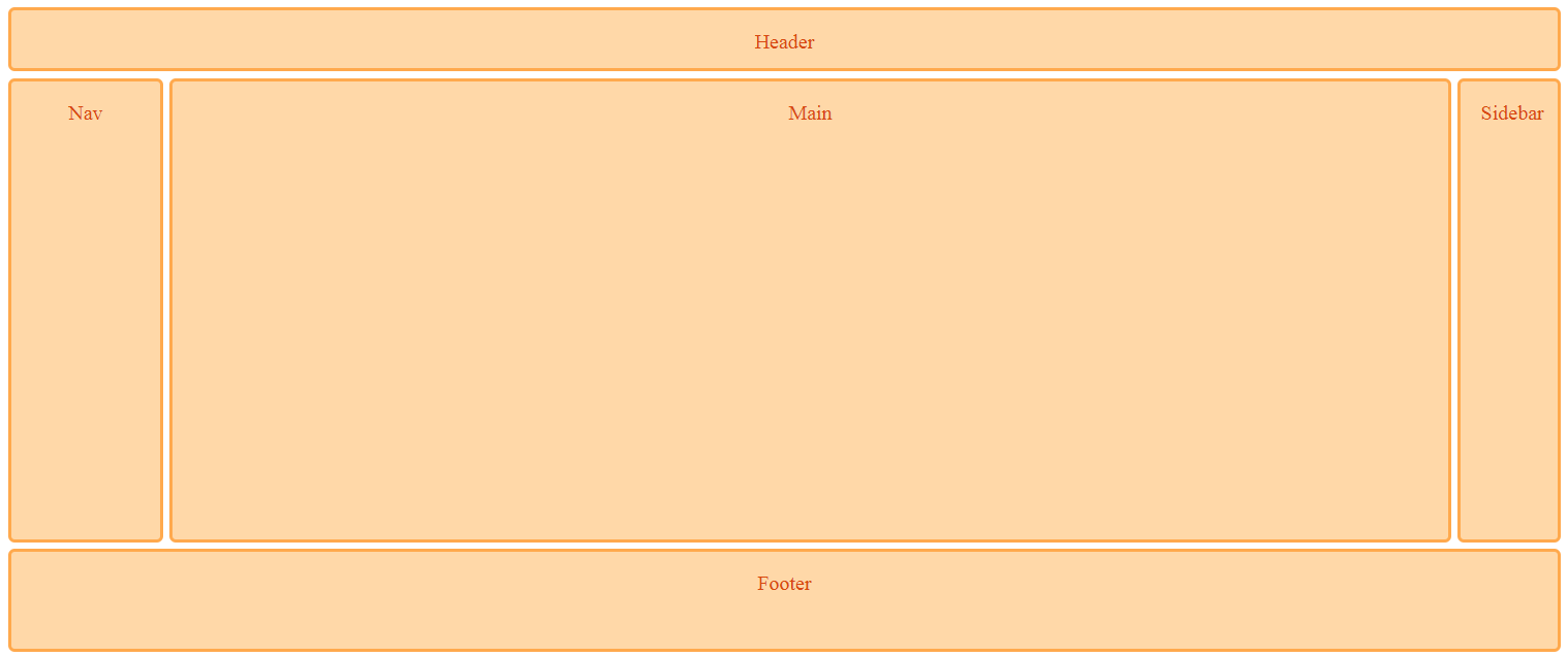
Media query is a CSS technique introduced in CSS3.
It uses the @media rule to include a block of CSS properties only if a certain condition is true.
header {
  grid-area:header;
}
nav {
  grid-area:nav;
}
main {
  grid-area:content;
}
.sidebar {
  grid-area: sidebar;
}
footer {
  grid-area:footer;
}

@media (max-width: 700px) {
   .grid-container {
  display: grid;
  grid-template-columns: 120px 1fr 80px;
  grid-template-rows: 50px 1fr 80px;
  grid-template-areas:
    "header header header"
    "nav content sidebar"
    "footer footer footer";
 }
}
What is a Media Query
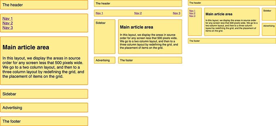
A responsive layout with 1 to 3 fluid columns using grid-template-areas
Clarity - Grids bring order to a layout making it easier for visitors to find and navigate through information.
Four Reasons to use Grid
Efficiency - Grids allow designers to quickly add elements to a layout because many layout decisions are addressed while building the grid structure.
Economy - Grids make it easier for other designers to work and collaborate on the design as they provide a plan for where to place elements.
Consistency - Grids lead to consistency in the layout of pages across a single site or even several sites creating a structural harmony in the design.
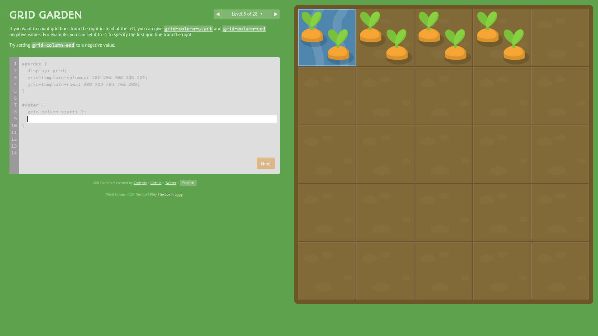
Grid Garden
Grid Garden:
Q&A
Thank You!
ING Dev School Presentation
By ovidiuo


