Flexbox Layout Module
Ovidiu Olea
Agenda:
- What is FlexBox?
- Flexbox Properties
- Demo
- Q & A
- Flexbox concepts
What is flexbox?
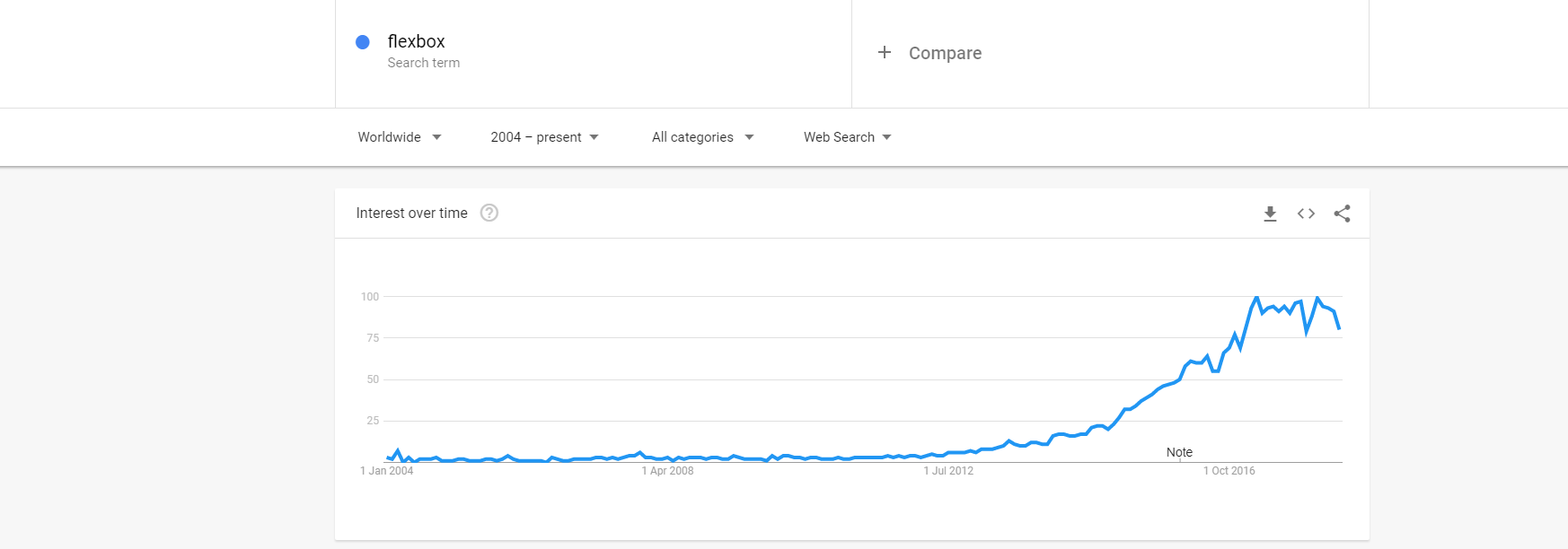
Flexbox module is a new method in CSS3 that allows you to create complex responsive web layouts.
Flexbox concepts
- was designed as a one-dimensional layout model (either as a row or as a column)
- main axis & cross axis
- flex container
The main idea behind the flex layout is to give the container the ability to alter its items' width/height (and order) to best fill the available space
Flexbox concepts
Main axis & Cross axis
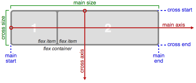
When working with flexbox you need to think in terms of two axes, the main axis and the cross axis.
The main axis is defined by the flex-direction property, and the cross axis runs perpendicular to it.
Flexbox concepts
Main axis & Cross axis
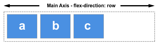
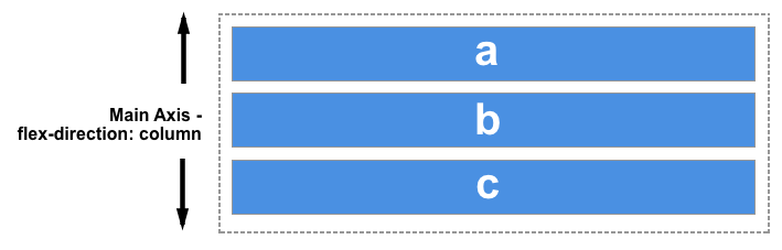
The main axis is defined by flex-direction, which has four possible values:
- row
- row-reverse
- column
- column-reverse
Flexbox concepts
Main axis & Cross axis
- row or row-reverse, main axis will run along the row in the inline direction.
Flexbox concepts
Main axis & Cross axis
- column or column-reverse , main axis will run from the top of the page to the bottom , in the block direction.
Flexbox concepts
Cross axis
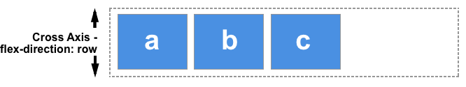
- cross axis runs perpendicular to the main axis, if flex-direction (main axis) is set to row or row-reverse the cross axis runs down the columns.
Flexbox concepts
Cross axis
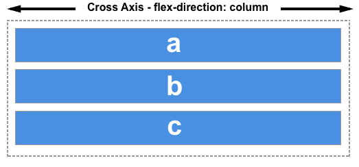
If your main axis is column or column-reverse then the cross axis runs along the rows.
Main axis & Cross axis
Flexbox concepts
Flexbox properties
Parent Properties
Children Properties
- flex-direction
- flex-wrap
- justify-content
- order
- flex-grow
- flex-shrink
- flex-basis
- align-items
- flex (shorthand property)
- flex-flow (shorthand property)
- align-self
Parent property
flex-direction property, defines the direction items are placed in the container, and accepts the following values:
- row: Items are placed the same as the text direction.
- row-reverse: Items are placed opposite to the text direction.
- column: Items are placed top to bottom.
- column-reverse: Items are placed bottom to top
.flex-container {
    display: flex;
    flex-direction: row | column;
    background-color: blue;
}

.flex-container > div {
    background-color:#f1f1f1;
    width: 100px;
    margin:10px;
    text-align: center;
    line-height: 75px;
    font-size: 30px;
}
row
row-reverse
column
column-reverse
Parent property
flex-wrap property, specifies whether the flex items should wrap or not and accepts the following values:
- nowrap: Every item is fit to a single line.
- wrap: Items wrap around to additional lines.
- wrap-reverse: Items wrap around to additional lines in reverse.
.flex-container {
    display: flex;
    flex-wrap: wrap;
    background-color: blue;
}

.flex-container > div {
    background-color:#f1f1f1;
    width: 100px;
    margin:10px;
    text-align: center;
    line-height: 75px;
    font-size: 30px;
}
wrap
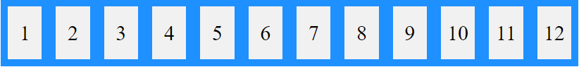
nowrap
wrap-reverse
Parent property
flex-flow property is a shorthand property for setting both the flex-direction and flex-wrap properties.
.flex-container {
    flex-flow: flex-direction flex-wrap;
}
.flex-container {
display: flex;
flex-flow: row wrap;
background-color: Blue;
}
.flex-container > div {
background-color: #f1f1f1;
width: 100px;
margin: 10px;
text-align: center;
line-height: 75px;
font-size: 30px;
}Parent property
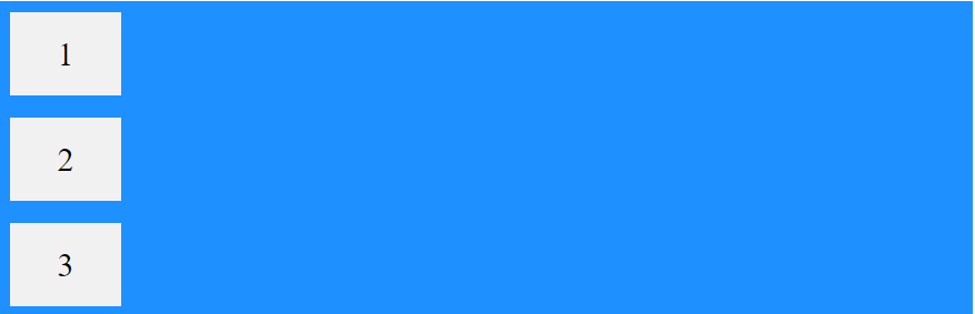
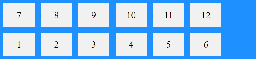
justify-content property, let you align items horizontally and accepts the following values:
- flex-start: Items align to the left side of the container.
- flex-end: Items align to the right side of the container.
- center: Items align at the center of the container.
- space-between: Items display with equal spacing between them.
- space-around: Items display with equal spacing around them.
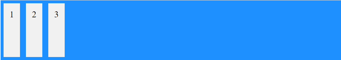
<div class="flex-container">
      <div>1</div>
      <div>2</div>
      <div>3</div>
 </div>


.flex-container {
    display: flex;
    background-color: blue;
    justify-content: center;
}

.flex-container > div {
    background-color:#f1f1f1;
    margin:10px;
    padding:20px;
    font-size:30px;
}
center


flex-end
flex-start
space-around
space-between
Parent property
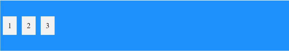
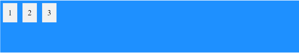
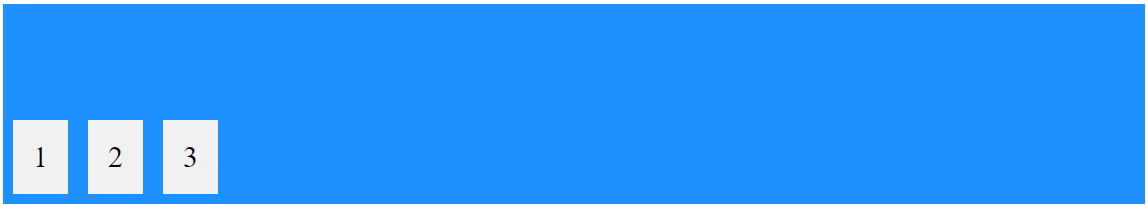
align-items property, let you align items vertically and accepts the following values:
- flex-start: Items align to the top of the container.
- center: Items align at the vertical center of the container.
- flex-end: Items align to the bottom of the container.
- stretch: Items are stretched to fit the container.
.flex-container {
    display: flex;
    background-color: dodgerblue;
    align-items:center;
}

.flex-container > div {
    background-color:#f1f1f1;
    margin:10px;
    padding:20px;
    font-size:30px;
}
center
flex-start
flex-end
stretch
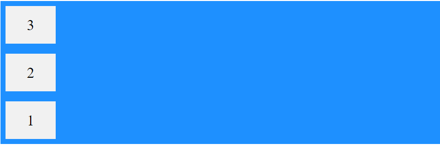
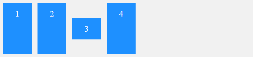
Children property
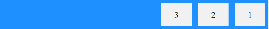
order property specifies the order of the flex items.
.item {
    order: <number>;
}
<div class="flex-container">
<div style="order: 3">1</div>
<div style="order: 2">2</div>
<div style="order: 4">3</div>
<div style="order: 1">4</div>
</div>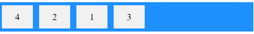
order
Children property
flex-grow property specifies how much a flex item will grow relative to the rest of the flex items.
.item {
  flex-grow: <number>;
}
<div class="flex-container">
<div>7</div>
<div>6</div>
<div style="flex-grow:2">8</div>
</div>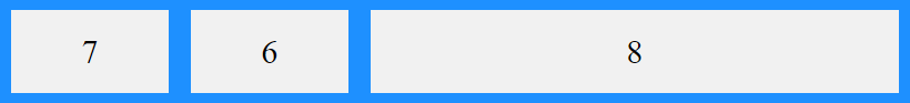
Children property
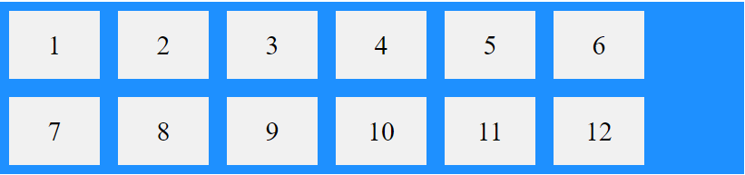
flex-shrink property specifies how much a flex item will shrink relative to the rest of the flex items.
.item {
  flex-shrink: <number>;
}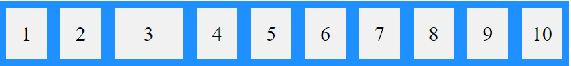
<div class="flex-container">
            <div>1</div>
            <div>2</div>
            <div style="flex-shrink:2">3</div>
            <div>4</div>
            <div>5</div>
            <div>6</div>
            <div>7</div>
            <div>8</div>
            <div>9</div>
            <div>10</div>
  </div>
Children property
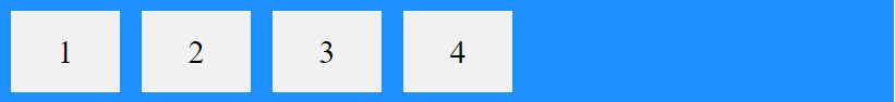
flex-basis property specifies the initial length of a flex item.
.item {
  flex-basis: <number>;
}
<div class="flex-container">
<div>1</div>
<div>2</div>
<div style="flex-basis: 400px">3</div>
<div>4</div>
</div>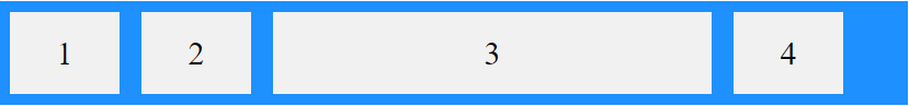
Children property
flex property is a shorthand property for the flex-grow, flex-shrink, and flex-basis properties.
.item {
  flex: flex-grow  flex-shrink  flex-basis;
}
<div class="flex-container">
<div>1</div>
<div>2</div>
<div style="flex: 0 0 200px">3</div>
<div>4</div>
</div>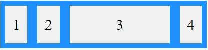
Third flex item not growable (0), not shrinkable (0), and with an initial length of 200 pixels:
Children property
align-self property specifies the alignment for the selected item inside the flexible container.
<div class="flex-container">
        <div>1</div>
        <div>2</div>
        <div style="align-self: center">3</div>
        <div>4</div>
</div>
DEMO
Q&A
Thank You!
Flexbox
By ovidiuo
Flexbox
Flexbox Layout Module


