


Patrick Lid Monslaup
Technical manager & developer for Knowit Experience Bergen. Looking for a new job? Check out http://knowit.no/karriere
Patrick Monslaup
Knowit Experience Bergen
patrick.monslaup@knowit.no
slides.com/patricklidmonslaup/flex
Filer til workshop: se slack eller
http://www.mediafire.com/file/665v9ua4900pm0g/flexbox-the-right-way.zip
Easy way to create flexible layouts using css
.flex-container {
    display: flex;
    flex-flow: row wrap;
    justify-content: space-between;
}
.icon {
    flex-basis: 140px; // width: 140px;
    height: 140px;
}
slides.com/patricklidmonslaup/flex
Defines how elements should flow and align
Defines its sizing and rules for growth.
.flex-container {
    display: flex;
}
.flex-container > .flex-element {
    flex-grow: 1;
    flex-shrink: 0;
    flex-basis: 100px;

    // forkortes som "flex: 1 0 100px"
}
    flex-direction: column-reverse;
    flex-wrap: nowrap;
    // flex-flow: column-reverse nowrap;
}
slides.com/patricklidmonslaup/flex
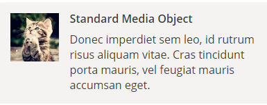
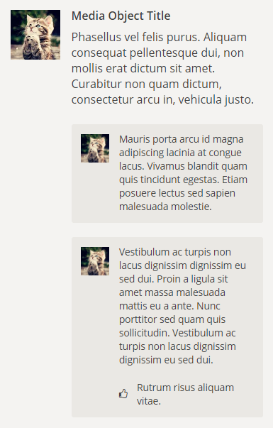
<div class="comment">
  <img class="comment__image"
       src="" alt="">
  <div class="comment__body">…</div>
</div>
.comment {
display: flex;
align-items: flex-start;
}
.comment__image {
margin-right: 1em;
}
.comment__body {
flex: 1;
}slides.com/patricklidmonslaup/flex
slides.com/patricklidmonslaup/flex
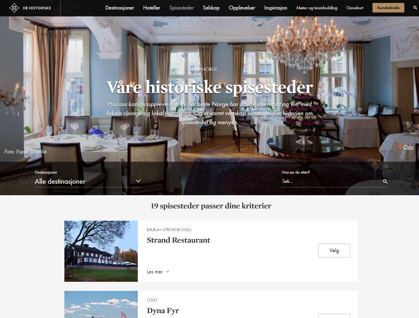
From dehistoriske.no
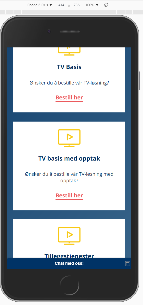
From tafjord.no
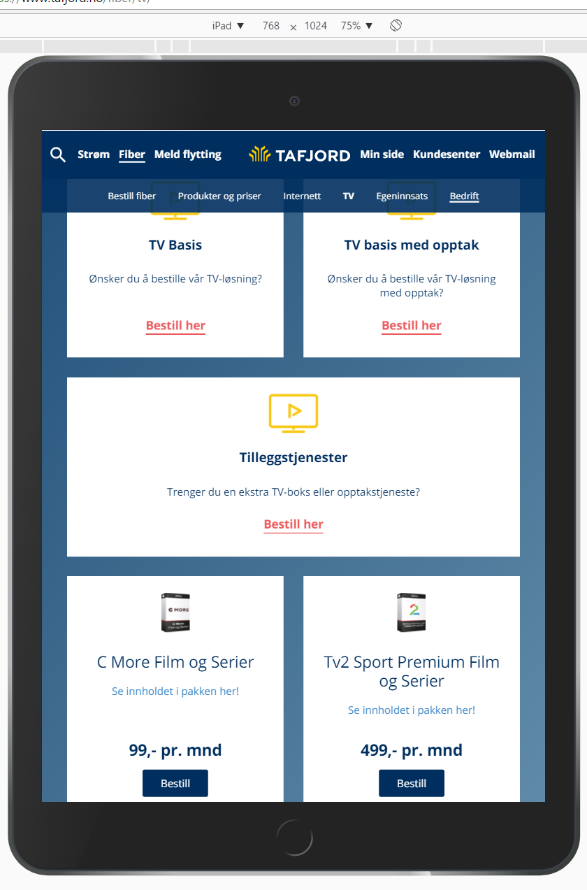
From tafjord.no
.banner--right {
.banner__content {
order: 1;
}
.banner__image__container {
order: 2;
}
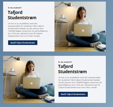
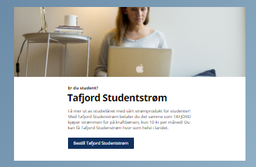
}From tafjord.no
.banner {
  flex-flow: column nowrap;
}
.banner {
position: relative;
}
.banner__image__container {
position: absolute;
left: 0; right: 0;
top: 0; bottom: 0;
}| Declaration | Correct meaning | IE10 |
|---|---|---|
| (none) | flex: 0 1 auto | flex: 0 0 auto |
| flex: 1 | flex: 1 1 0% | flex: 1 0 0px |
| flex: auto | flex: 1 1 auto | flex: 1 0 auto |
| flex: initial | flex: 0 0 auto | flex: 0 0 auto |
https://github.com/philipwalton/flexbugs
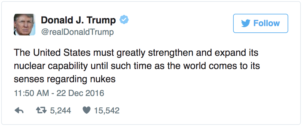
Help trump make tweets great again
Ignore typography, colors, margins etc. Focus on making the layout with flex.
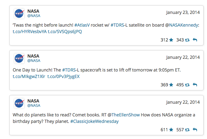
Help nasa fight budget cuts. They need show several tweets in a grid, and want to change the design by moving the date and like, share, and repost buttons.
Product cards are an integral part of most sites these days, and customers have come to expect smooth sizing.
By Patrick Lid Monslaup
Flexing with Patrick is a crash course in mastering flexbox, with focus on useful patterns which you'll benefit from in any web project.


