Question 5
Part 3: What choices did you make during the production stages of your product in order to appeal to your audience?
Front page
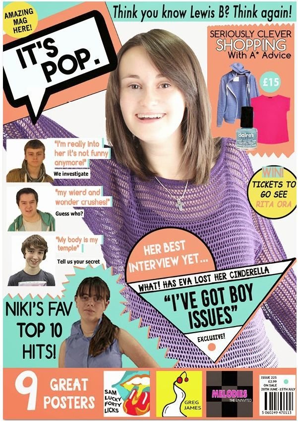
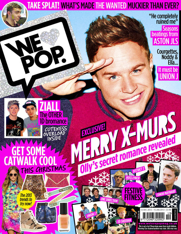
The model
I chose to use her as the main model for my front page because she was young and female. I wanted to use a young female model because in my secondary target audience research I found the magazine was aimed at "teen""girls". So by my magazine representing this social group my audience could relate to the model and so want to read the magazine.
Also, I made the model pose in this position to show she was confident so "self expression". I found this was part of a professional pop magazine in my secondary target audience research and I wanted to reflect this onto my magazine.
Lastly, there is no camera angle on the image so to make the audience and the magazine look equal so synthetically personalising my magazine to the audience. I did this to make my audience feel equal therefore wouldn't feel inferior so making them want to read it.
Colour scheme
I made my colour scheme pink/peach, black, white and blue. I did this because in my contextual research I found most professional magazines used a colour scheme so I did the same to make mine look professional. I chose to use these colours because in my primary audience research 100% of my feedback said that the bright colours linked with the pop genre so I did the same to make my magazine look even more poppy.
"Yes because the colours are bright"
"Yes because they're bright and young"
"Yes because they 'pop of the page' bright and colourful"
Do the colours link to the genre? Why?
Conventions
I didn't challenge any conventions of a professional pop magazine because 6/8 people I asked from my primary audience research said they would read it showing there was nothing putting readers off reading the magazine so I did the same. The only issue with 2 of the people I asked said it wasn't their type of music magazine.
"Yes because I'm interested in music"
"No because it's not my type of music"
"Yes because it as my favorite singers"
Would this magazine appeal to you? Why?
Fonts
I used a range of curved and straight edged fonts on my front page. I did this because in my primary audience research when asked "What font do you think links best to the genre? Curved or edgy?" 4 people said curved 1 person said both and 5 said edged. This shows readers feel split between the two and either could be used so I used both to satisfy the audience.
Mast head
From my primary research I found half of my feedback said they only knew what genre the magazine was from the mast head saying "pop" in it. So I did the same to my mast head so to tell readers instantly what genre my magazine was to make it easy for them to find out.
"Pop because of the title"
"Pop because the images are of pop singers"
"Genre - pop because of mast head"
What genre do you think this magazine is? Why?
Sell lines
In my primary audience research they also said they wanted to read about mainly gossip and shopping so I tried to put these in sell lines on my front page. I did this to try to please readers and to make them interested in the magazine as it's things they would want to read about.
"Gossip because I like to know about celeb's lives"
"Gossip because it interests me"
"Shopping - get a bargain"
What sell lines would draw you in to read the magazine? Why?
Layout
I chose to make my layout look spontaneous and messy because in my genre research I found they do this too and I didn't want to challenge this as in my primary research 1/4 of my feedback said they liked the layout so I tried to keep it like a professional pop magazine layout.
"The layout"
"Images - familiar to the reader"
"The puffs are cartooney"
What is your favourite element on the page? Why?
Rough cut
From my rough cut feedback I acted upon:
"more content on pages"
"wonky edges"
"nothing stands out"
"too much pink"
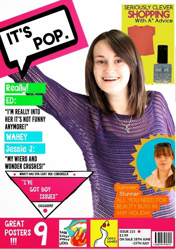
To begin, from my rough cut I added 2 more sell lines (an extra boy sell line and win sell line) to fill the white space as 60% of people fed back about that so it was a major issue I needed to fix which I did. Also, one person said my edges were too wonky so I spent time going around each edge (mainly around the main sell line) and straightening it to make the page look clean and professional. They also said nothing stood out on the page. To over come this I wanted my main sell line to stand out so I made it bigger. Lastly, one other person said there was too much pink on the page which could overpower the whole page so I toned the pink down to a more peachy colour and complimented that with blue.
Content page
Models
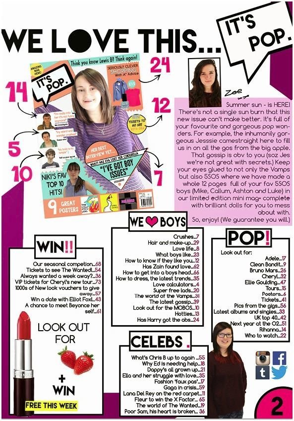
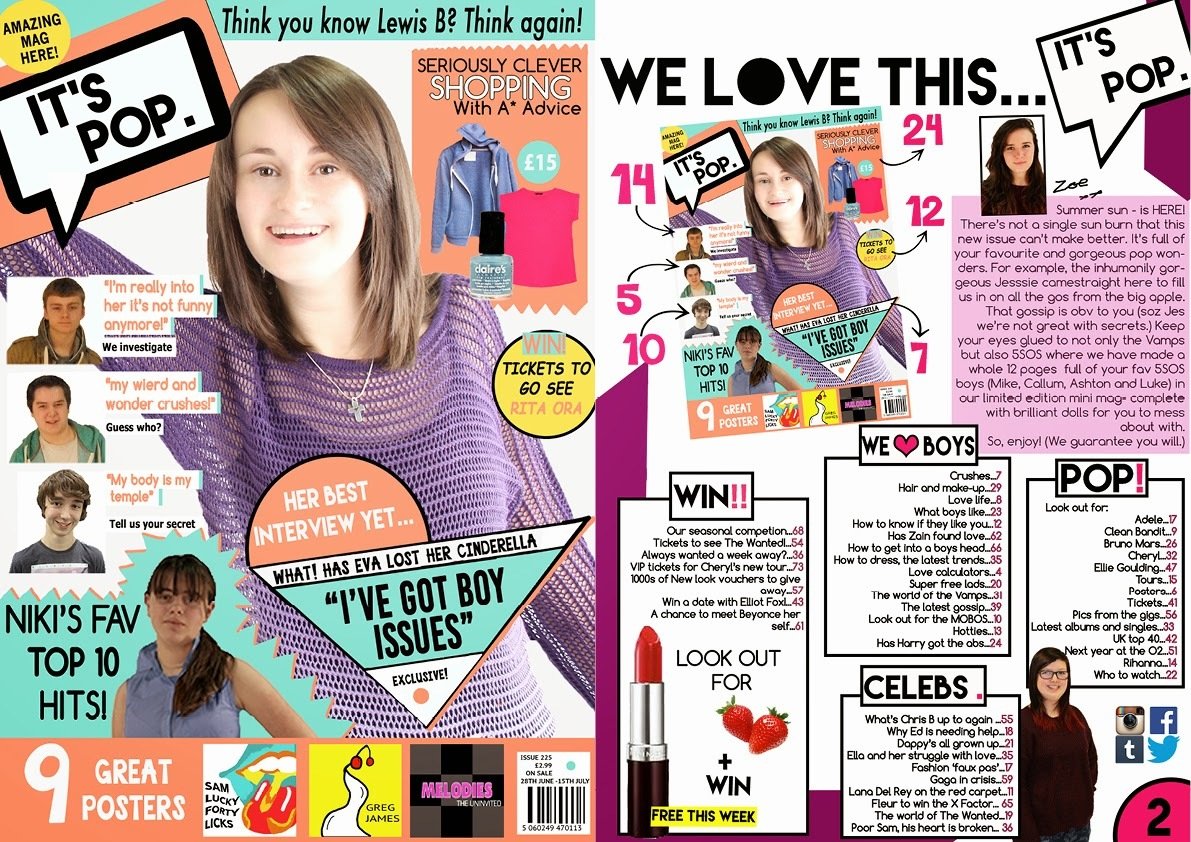
I decided to use these models for my magazine because they were young and female. I wanted to use a young female model because in my secondary target audience research I found the magazine was aimed at "teen""girls". So by my magazine representing this social group my audience could relate to the model and so want to read the magazine.
I made the bottom model wear the red jumper because I found in my secondary audience research that reader were interested in "fashion and beauty" so to accommodate for that interest I made the model wear a stylish jumper to make my readers feel happy.
Colour scheme
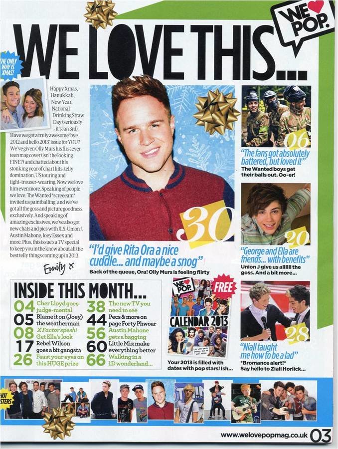
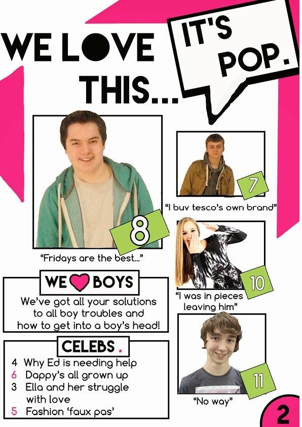
For this page I used 4 colours for my colour scheme however this time they were: purple, black, white and pink. I wanted to change the main colour in the scheme because in my textual analysis I found the house style changes slightly as well so I did the same to make my magazine professional.
Text
Peach/ pink, black, white and blue - purple, pink, black and white
Pink, white, black - green, blue, black and white
Yellow is the house style being changed
Conventions
In "Top of the Pops" magazine they use this format for their page and I used it. I wanted to use this layout and not "We love Pop"'s because I thought it was more effective plus I could add page numbers around my front page with out making it look unprofessional.
Another convention of a magazine I followed was having a closed frame image of the editor along side the editor's note. I did this because I thought it made the page look more creditable and professional. I didn't open frame the image because I think it would then have drawn less attention to the editor which I didn't want.
Fonts
I used a range of curved and straight edged fonts on my front page. I did this because in my primary audience research when asked "What font do you think links best to the genre? Curved or edgy?" 4 people said curved 1 person said both and 5 said edged. This shows readers feel split between the two and either could be used so I used both to satisfy the audience.
Sections
In my textual analysis research I found pop magazines split their articles into sections. I did the same because I thought it structured the page better plus it was easier for readers to find what they were looking for.
Rough cut
I acted upon from my rough cut feedback:
"more content on pages"
"more than 11 pages"
"logo too big"
"too much left space"
To overcome needing more content on the page I added 2 more sections (Win!! and POP!), a editors note and changed my images to the front page and a small one of a model. I changed the images from my rough cut to how it is now because I felt this layout was more effective in catching the eye. In my sections I then added more article headings because the feedback was right and to make my magazine more professional it needed more pages. To make space for all my content I needed to make the mast head smaller allowing the title to be one line so making room for more content on the page to overcome the left over space.
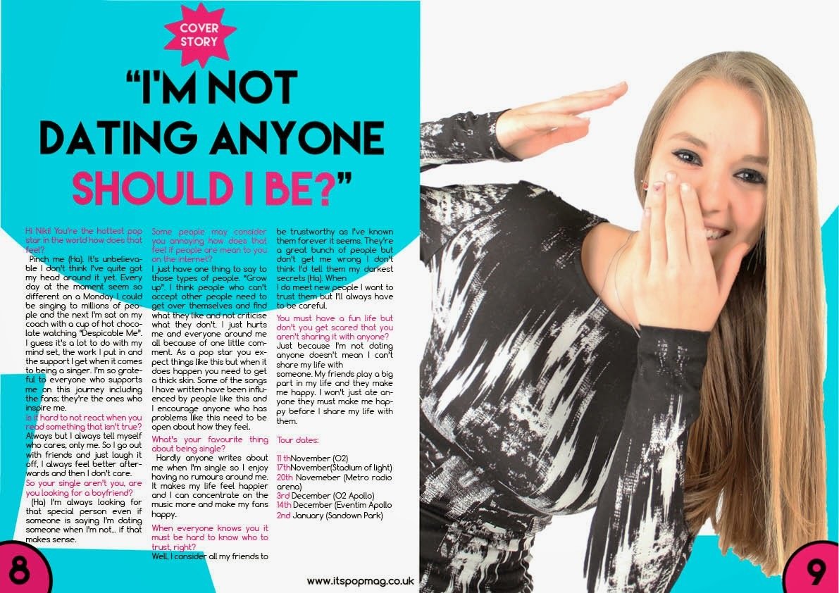
Double page spread
Models
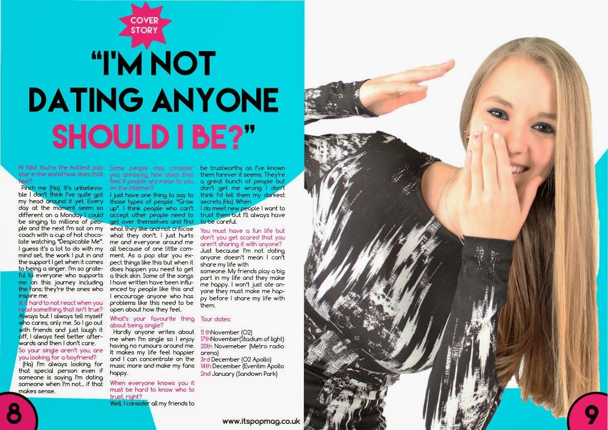
I decided to use these models for my magazine because they were young and female. I wanted to use a young female model because in my secondary target audience research I found the magazine was aimed at "teen""girls". So by my magazine representing this social group my audience could relate to the model and so want to read the magazine.
I made her pose in a happy position because I found in my secondary audience research that professional pop magazines target audiences about "self discovery, self expression". So I wanted to do the same in mine but I wanted to make audiences feel happy so I made my model smile and laugh for the picture.
I dressed the model in this black and white stylish dress because I found in my secondary audience research that readers like "fashion and beauty" so to accommodate for their interest I made the model look stylish.
Colour scheme
On this page my colour scheme was: black, pink, white and blue. I chose to use these colours because I found in my contextual research that the double page spread house style changes from the previous pages so I did the same to follow the convention plus I think it makes the magazine more interesting as all the page are different so making different readers happy as there will be a colour that all readers will like.
Conventions
I wanted to use the convention of having the article on the left with an image on the right taking up the whole of the right hand side. I did this because I liked how the model's facial expression created the tone to the page. That emphasis on her mood was good because in my primary audience research 100% of people thought the magazine created a fun and happy tone and my model did this.
Fonts
I used a range of curved and straight edged fonts on my double page spread. I did this because in my primary audience research when asked "What font do you think links best to the genre? Curved or edgy?" 4 people said curved 1 person said both and 5 said edged. This shows readers feel split between the two and either could be used so I used both to satisfy the audience.
Rough cut
From my rough cut feedback I changed:
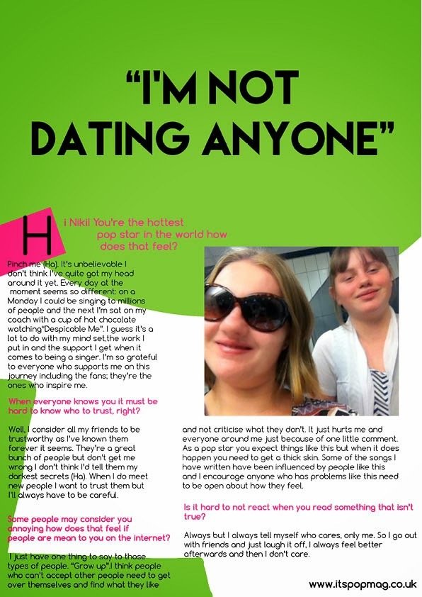
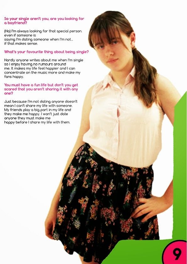
"too much green"
"tacky images"
Too overcome having too much green I changed the colour to something less harsh and made it blue which I think was better as it complimented my model better as well. Lastly, to improve the images I changed it to one big, high quality image instead of two; I think this worked better because it followed conventions better.
Question 5
By philippa