

Alexander Vassbotn Røyne-Helgesen PRO
Lover of life, technologist at heart
Manager, Front-end Developer @ Bekk
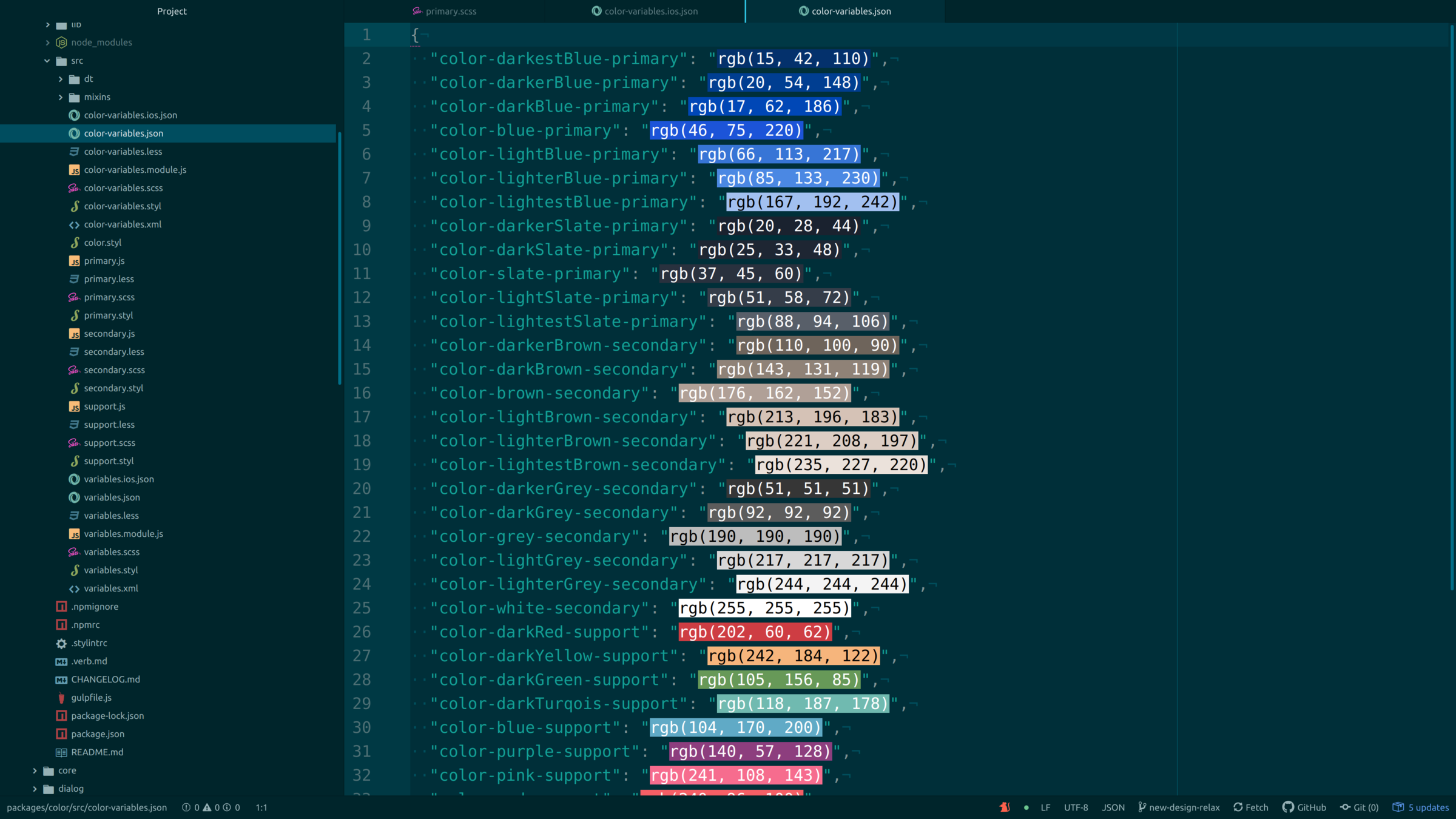
... is a central location to store design related information such as colors, fonts, animations and so on. These raw values can then be transformed and be formatted to fit the needs of any platform.
With design tokens, you can capture low-level values and then use them to create the styles for your product or app. You can maintain a scalable and consistent visual system for UI development.
props:
  - minLarge:
    name: minLarge
    value: '90rem'
    type: unit
    comment: 1440px
  - minExtraLarge:
    name: minExtraLarge
    value: '120rem'
    type: unit
    comment: 1920px
  - onePixel:
    name: onePixel
    value: '0.0625rem'
    comment: 1px
    type: unit
global:
  category: misc
$ npm i theo@import 'primary.less' /* Aliased with build system*/
a {
color: @color-darkestBlue-primary; /* #0F2A6E */
}import React from 'react';
import primaryColors from '@relax/colors/src/primary.js'
const Button = ({...props}) => (
<button
type="button"
onClick={...}
onKeyPress={...}
style={{
backgroundColor: primaryColors.darkestBlue.rgb
}}
>
{title}
</button>
)import React from 'react';
import { colorDarkerSlatePrimary, colorLightestBrownSecondary } from '@relax/colors/src/color-variables.module.js'
const Tile = ({...props}) => (
<div
style={{
backgroundColor: colorDarkerSlatePrimary,
color: colorLightestBrownSecondary
}}
>
{children}
</div>
)import React from 'react';
import styled from 'styled-components';
import { colorDarkerSlatePrimary, colorLightestBrownSecondary } from '@relax/colors/src/color-variables.module.js'
const TileContainer = styled.div`
backgroundColor: ${colorDarkerSlatePrimary},
color: ${colorLightestBrownSecondary}
`;
const Tile = ({...props}) => (
<TileContainer>
{children}
</div>
)$ npx @guybrush/if-boilerplate-react folderName$ npm i html-sketchapp-cli@require 'core.styl'
/**
* @package {package} buttons - Buttons
* @doc ../docs/buttons.md
* @section
* @sectionof Guidelines.Components
*/
/**
* @doc ../docs/usage.md
* @section
* @sectionof Guidelines.Components.Buttons
*/# Buttons
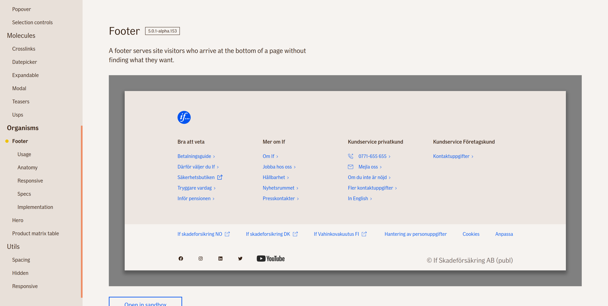
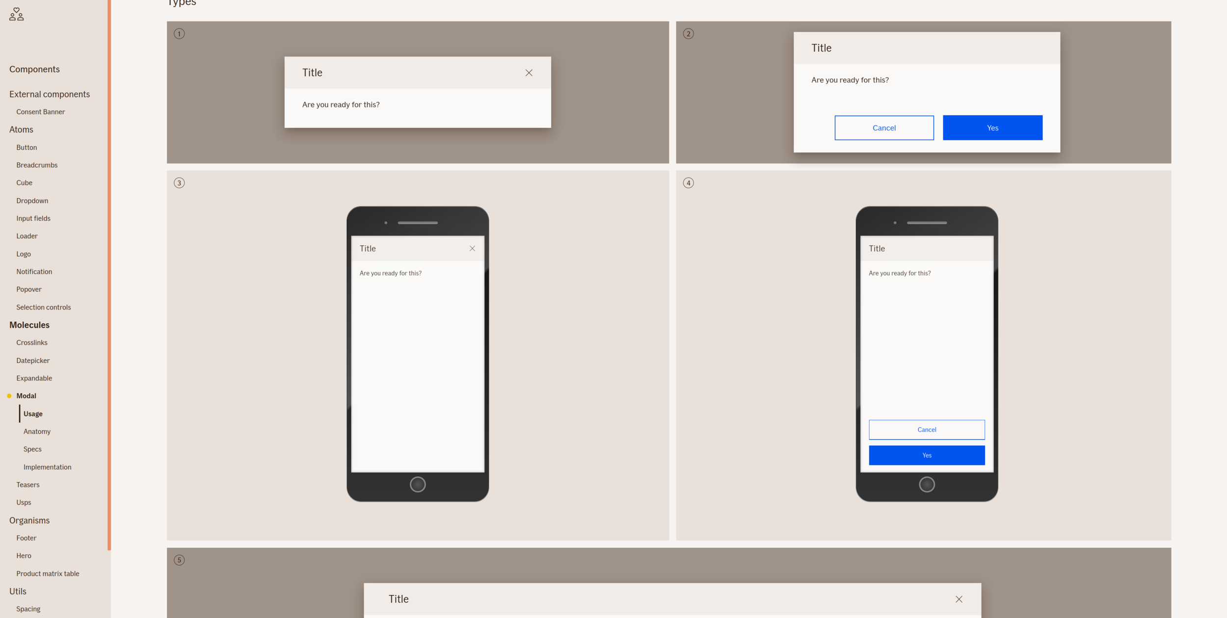
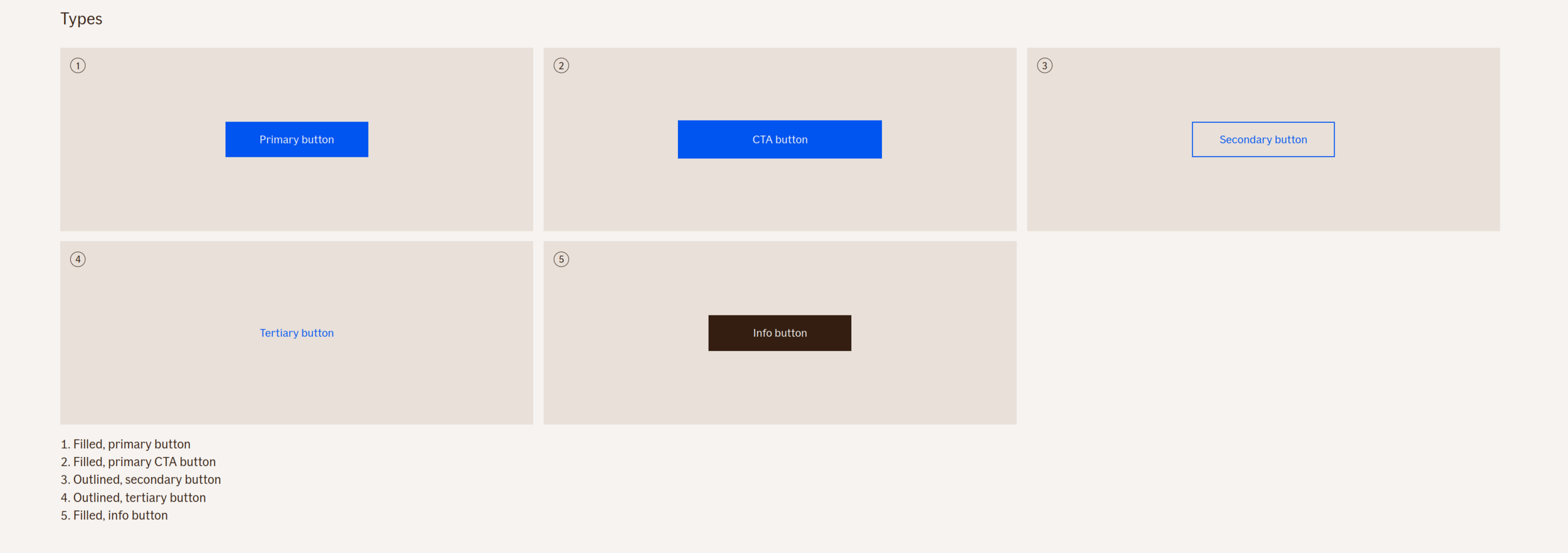
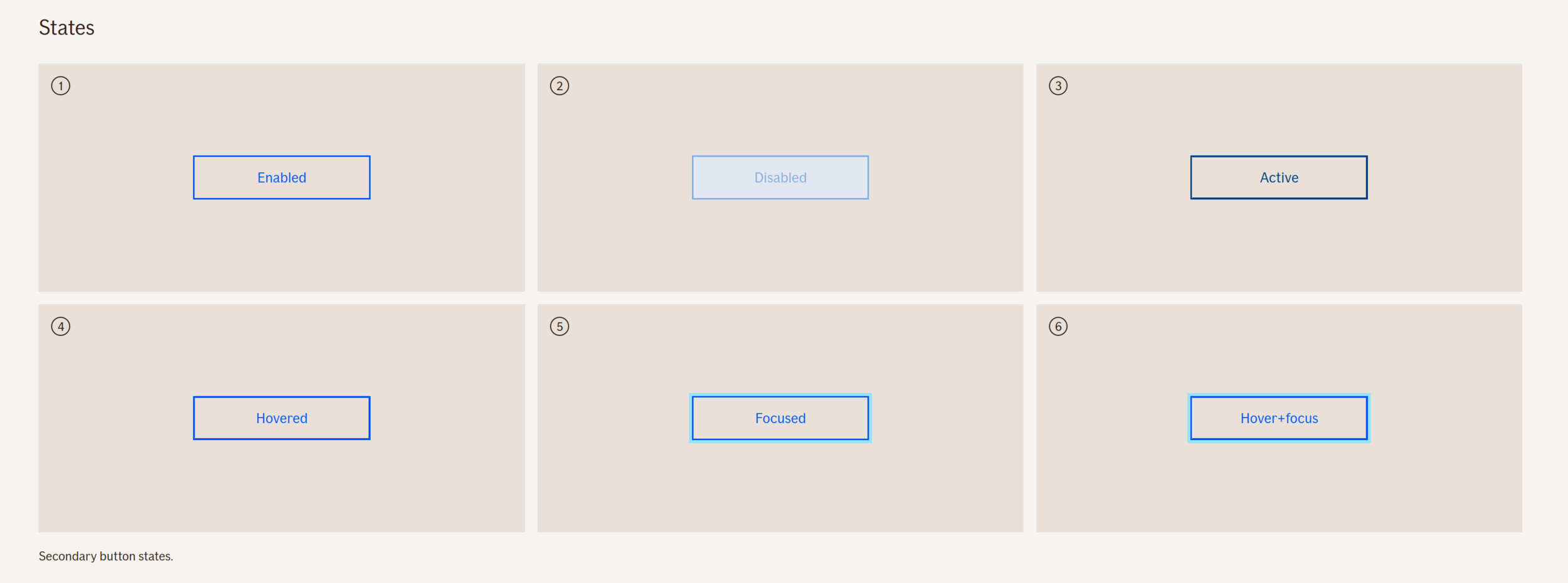
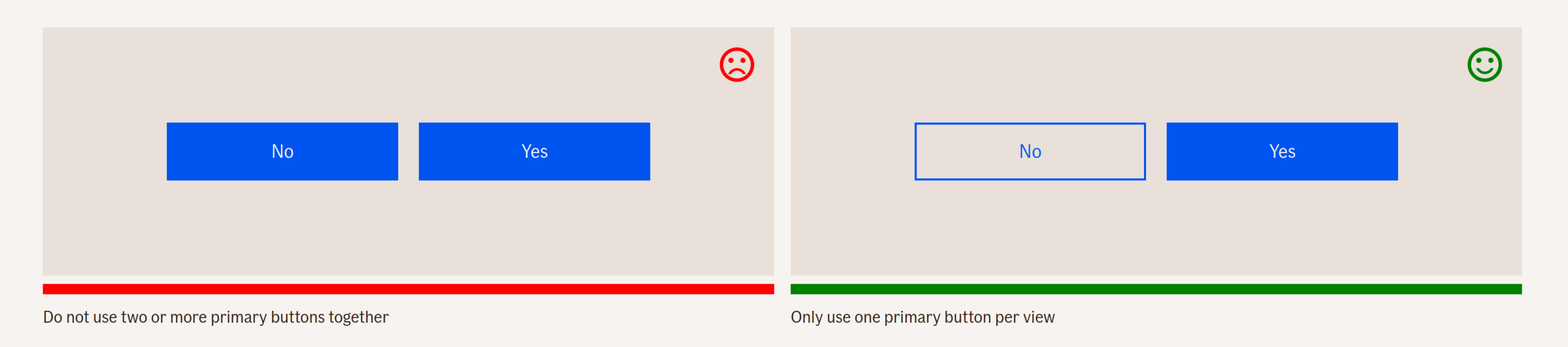
Buttons express what action will occur when the user clicks or touches it. Buttons are used to initialize an action, either in the background or foreground of an experience.
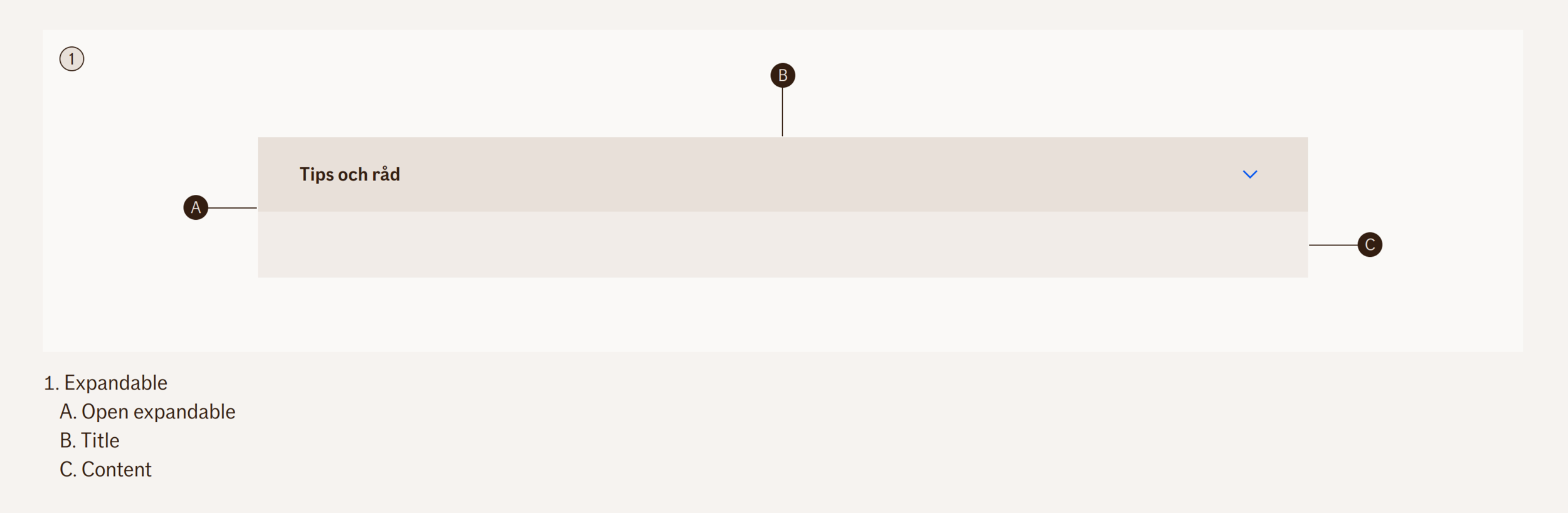
<figure class="sg figure sample">
<sg-example>
<div class="relax-card">
<div class="relax-card-header">
Edit customer
</div>
<div class="relax-card-content">
Do you want to save?
<div>
<button type="button" class="relax-button">Cancel</button>
<button type="button" class="relax-button relax-button--primary">Save</button>
</div>
</div>
</div>
</sg-example>
</figure>
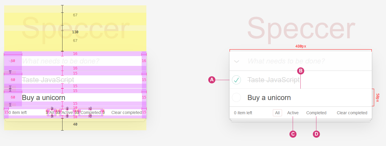
$ npm i livingcss$ npm i speccer$ratio = 7
getCorrectContrastColor($bgcolor)
if(contrast($bgcolor, $white).ratio > $ratio){
color $white
} else if(contrast($bgcolor, $darkerGrey).ratio > $ratio){
color $darkerGrey
} else {
color $darkerSlate
}
:root {
  --animation-duration: 250ms;
  --transition-duration: 250ms;
}

/* Contextually shorten duration length */
@media screen and (prefers-reduced-motion: reduce), (update: slow) {
  :root {
    --animation-duration: 0.001ms !important;
    --transition-duration: 0.001ms !important;
  }
}

@media screen and (prefers-reduced-motion: reduce), (update: slow) {
  /* Remove duration for all unknown animation when a user requests a reduced animation experience */
  * {
    animation-duration: var(--animation-duration);
    animation-iteration-count: 1 !important;
    transition-duration: var(--animation-duration);
  }
}Manager, Front-end Developer @ Bekk
By Alexander Vassbotn Røyne-Helgesen
A talk about how we make design systems at If


