hello 👋
Ria
ux engineer


ux design
front end
💻
🎨

design systems
with
design
systems
w/
🛑✋
DISCLAIMER

TWO WORDS ABOUT
design systems


flat
inheritance
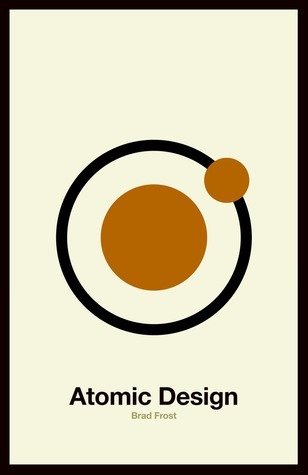
Methodology for thinking of our UIs as thoughtful hierarchies.
— Brad Frost

WHAT IS
Emotion?
CSS-in-JS
01
It works like this…
const buttonStyles = {
    color: S.GREY_COLORS.WHITE,
    backgroundColor: S.UI_COLORS.ACTION,
    '&:hover': {
        backgroundColor: S.UI_COLORS.ACTION
    },
}
emotion.sh
import React from 'react'
import { css } from '@emotion/core'


const Button = () => (
    <button css={buttonStyles}>Hello</button>
)
emotion.sh
<head>
    <style data-emotion="css">
        .css-urzaya-buttonStyles{color:"#FFFFFF;background-color:#808080;}
        /*# sourceMappingURL=… */
    </style>
</head>
emotion.sh
02
syntax
// String literals

const stylesUno = css`
      color: ${S.UI_COLORS.ACTION};
      font-size: 1.4rem;

    `


// Object styles

const stylesDos = css({
      color: S.UI_COLORS.ACTION,
      fontSize: '1.4rem',
})
emotion.sh
import React from 'react'
import { css } from '@emotion/core'
import styled from '@emotion/styled'

// CSS Prop

const ButtonUno = () => (
    <button css={buttonStyles}>Hello</button>
)


// Styled

const ButtonDos = styled.button({
    buttonStyles
})
emotion.sh
import React from 'react'
import { css } from '@emotion/core'

// Props

const BackgroundImage = props => (
    <div
        css={{
            backgroundUrl: props.backgroundUrl
        }}
        { ...props }
    />
)
emotion.sh

THE
workflow
Flow of building a design system,
now with Emotion

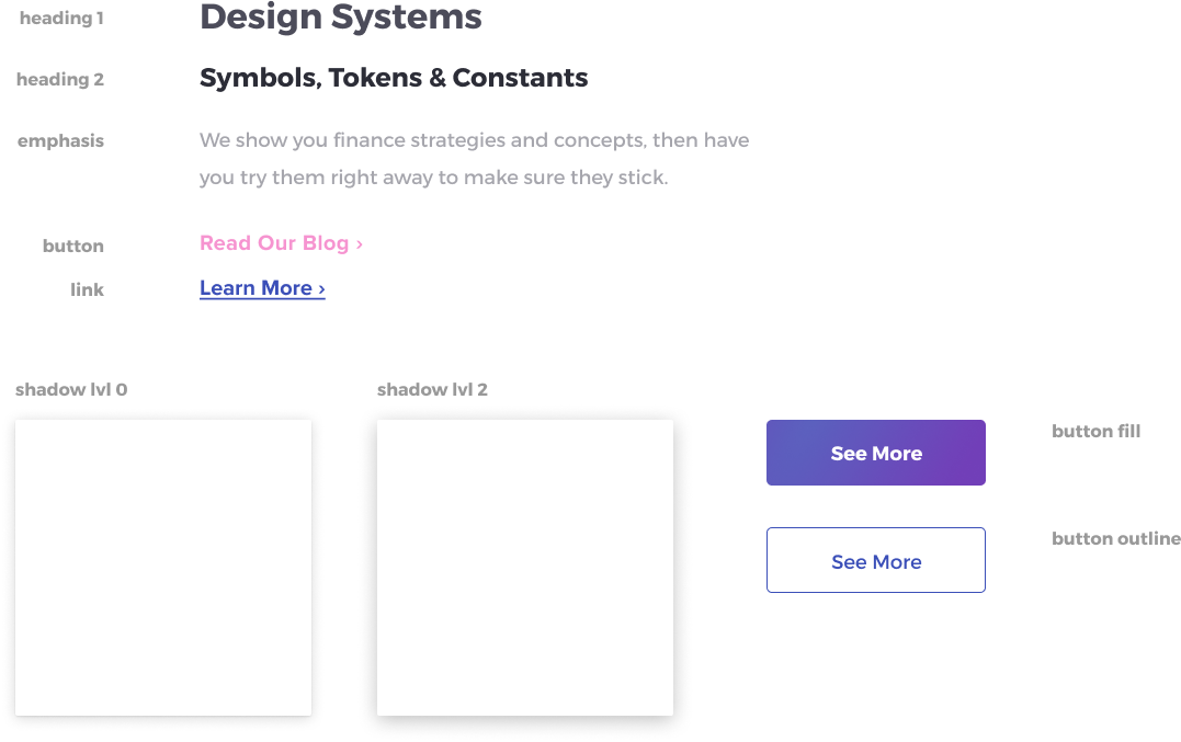
symbols
(tokens, constants, etc.)
#1
.
.
.
.
└── styles
    ├── symbols
    │   ├── color
    │   ├── layout
    │   ├── line
    │   ├── motion
    │   ├── plane
    │   ├── scale
    │   └── typography
    ├── blocks
    ├── global
    ├── elements
    ├── components
    ├── constructs
    ├── views
Symbols/...
// Lots of maps!

export const COLOR_THEME = {
    PRIMARY: '#7043E0', // Ultraviolet
    SECONDARY: '#2CB0FC', // Modern Sky
    DARK: '#4C2E9A', // Deep Ocean
    LIGHT: '#E0F5FF' // Ether,
}
COLOR_THEME.DEFAULT = COLOR_THEME.PRIMARY

export const COLOR_UI = {
    ALERT: '#F2C94C', // Mustard
    ACTION: '#2CB0FC', // Modern Sky
    ERROR: '#EB5757', // Tomato
    INFO: '#56B9F2', // Blueberry
    SUCCESS: '#6FCF97' // Limeade,
}
COLOR_UI.DEFAULT = COLOR_UI.ACTION

export const GRADIENT = {
    ACCENT: calcGradient(135, COLOR_THEME.PRIMARY, COLOR_THEME.SECONDARY)
}
GRADIENT.DEFAULT = GRADIENT.ACCENT
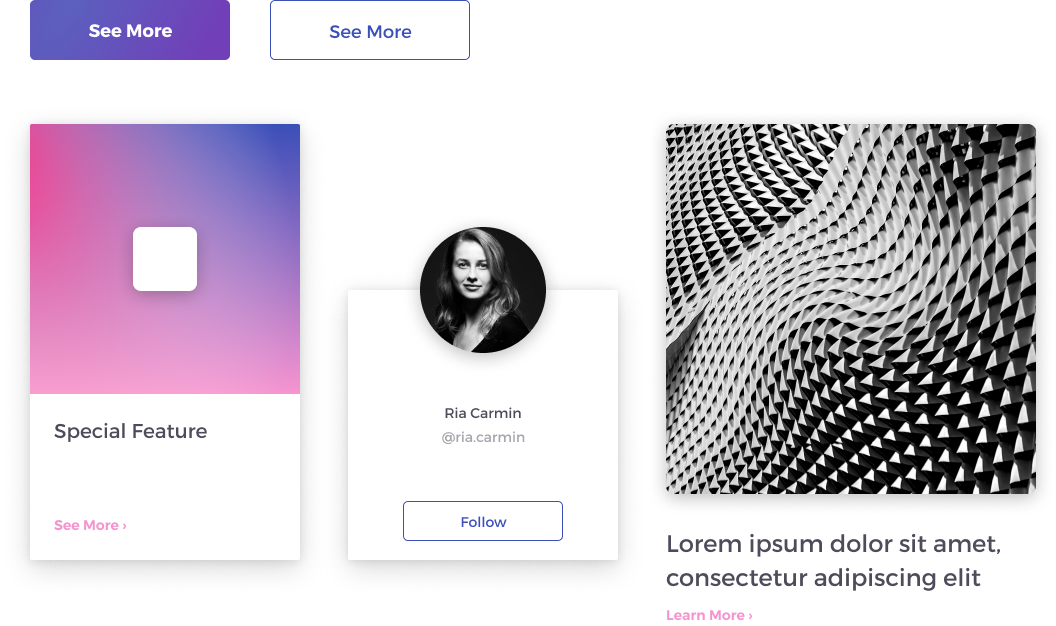
Symbols/color
blocks
#2
.
.
.
.
└── styles
    ├── symbols
    ├── blocks
    │   └── form
    │   └── interactive
    │   └── layout
    │   └── media
    │   └── table
    │   └── text
    ├── global
    ├── elements
    ├── components
    ├── constructs
    ├── views
Blocks/...
// Look like…

import S from 'Symbols'

const { getFontScale } = S

export const paragraph = {
    fontFamily: S.TYPOGRAPHY_TEXT_FONT,            // (1) Using Symbols
    ...getFontScale(1)                             // (2) Calculating values
}                                                  //     with symbols

export const title = {
    fontFamily: S.TYPOGRAPHY_HEADING_FONT,
    fontWeight: S.TYPOGRAPHY_FONT_WEIGHT_REGULAR,
    ...getFontScale(5)
}

export const interactiveBase = {
    cursor: 'pointer',
    transition: S.MOTION_DEFAULT_TRANSITION,

    '&:disabled': {
        cursor: 'not-allowed',
        opacity: 0.5
    }
}

export const link = {
    ...interactiveBase,
    fontFamily: S.TYPOGRAPHY_TEXT_FONT,
    textDecoration: 'none',
    color: S.COLOR_UI.ACTION,
    '&:hover': {
        color: lighten(0.1, S.COLOR_UI.ACTION)
    }
}
Blocks/text
global
#3
// Normalize + theme

import { Global, css } from '@emotion/core'


export const GLOBAL_STYLES = {
    ['*']: {
        boxSizing: 'border-box'
    },
    html: {
        lineHeight: 1.15,
        WebkitTextSizeAdjust: '100%',
        fontSize: S.SCALE_BASE,
        fontFamily: S.TYPOGRAPHY_TEXT_FONT,
        color: S.COLOR_TEXT,
        height: '100%',
        position: 'relative',
        backgroundColor: S.COLOR_BACKGROUND,
        margin: 0,
        padding: 0
    }
    // (1) Add global styles
}

// (2) Import <GlobalStyles /> into your app
const GlobalStyles = () => <Global styles={css(GLOBAL_STYLES)} />


// <style data-emotion="css-global">…</style> (3) Added in the <head>
styles/global/index.js
elements
#4
.
.
.
.
└── styles
    ├── symbols
    ├── blocks
    ├── global
    ├── elements
    │   └── button
    │       └── index.js
    │       └── notes.md // (optional & nice to have)
    │       └── story.js
    │       └── styles.js
    │       └── test.js // (optional & nice to have)
    ├── components
    ├── constructs
    ├── views
Elements/...
import { css } from '@emotion/core'
import S from 'Symbols'

// (1) Iterate on maps

const SIZES = {
    SMALL: calcSpace(5),
    MEDIUM: calcSpace(6),
    LARGE: calcSpace(8)
}
SIZES.DEFAULT = SIZES.MEDIUM

const makeSizeModifier = size =>
    css({
        height: size
    })

// (2) Check props to attach

const styles = new Set()
if (props.hasOwnProperty('size') && !!props['size']) {
    styles.add(makeSizeModifier(props['size'])
}

// (3) Pass styles to component’s css={} prop
Elements/button/styles.js
// (1) Style precedence!


const styles = css([
    base,
    modifier1,
    modifier2,
    modifier3,
    theme,
])

// (2) Overwritten properties will be removed
//     from CSS
Elements/button/styles.js
components
#5
// Composability

const base = css({
    img: {
        width: '100%'
    }
})

const Source = ({ srcSet, media }) => <source srcSet={srcSet} media={media} />

const Picture = ({ src, srcSets, className }) => (
    <picture css={base}>
        {srcSets.map(({ srcSet, media }) => (
            <Source key={srcSet} srcSet={srcSet} media={media} />
        ))}
        <img src={src} />
    </picture>
)
Elements/picture/index.js
// (2) Build on <Picture /> element

const SIZES = {
    SMALL: calcSpace(6),
    MEDIUM: calcSpace(8),
    LARGE: calcSpace(10)
}
SIZES.DEFAULT = SIZES.MEDIUM

const makeSizeModifier = size =>
    css({
        img: {
            height: size,
            width: size
        }
    })

const base = css({
    img: {
        borderRadius: '50%'
    }
})

export const constructStyles = props => {
    const styles = new Set([base])
    styles.add(makeSizeModifier(SIZES.DEFAULT))
    styles.add(getCssFromMap(props, 'size', SIZES, makeSizeModifier))
    return Array.from(styles)
}
Components/avatar/index.js
import React from 'react'
import { withSpacing } from 'Utilities/spacing'
import { withStyles } from 'Utilities/styles'
import { constructStyles } from './styles'
import Picture from 'Elements/picture'


const Avatar = ({ className, src, srcSets }) => (
    <Picture className={className} src={src} srcSets={srcSets} />
)

export default withSpacing(withStyles(Avatar)(constructStyles))

// NOTE: withStyles is an HOC that constructStyles with props
Components/avatar/index.js
constructs
views
…
#6 / 7
@RiaCarmin
the end 🙇♀️
Design Systems with Emotion
By Ria Carmin
Design Systems with Emotion
Using Emotion to build a design system in React.


