CSS Layouts and Flexbox
- Ritesh Ranjan
CSS BOX MODEL

EVERYTHING IS BOX
Every element in web design is a rectangular box.
Box Model
Every box have
- Height
- Width
- Padding
- Border
- Margin
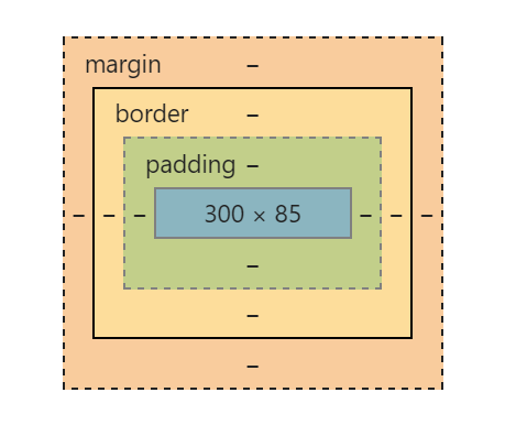
How the size of the box is calculated ?
Width
width + padding-left + padding-right + border-left + border-right
height + padding-top + padding-bottom + border-top + border-bottom
Height
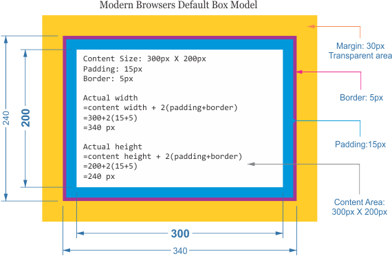
What About Margins ?
Margin is unique
Doesn't affect the size of the box but affects other content interacting with the box,
What if these values are not declared ?
Padding and Border
- Browser Default (Not always 0)
- Depends on elements (e.g ol, ul)
- Apply CSS reset to nullyfy
Height
Default is auto
It takes up the height of the content
What about width ?
This is when things get little Complicated
Block Element + static or relative positioning
Width : 100%,
Padding and border will push inwards instead of outward.
When width is set
The padding will push the box outward as normal.
The default width of a block element box isn't really 100%
Absolute Boxes with No Width
Width is only as wide as it needs to be to hold the content.
Floated Boxes With No Width
Same as absolute positioned with no width
Take away
For Floated and Absolute positioned block elements set the correct width.
Fixing Width Calculation
box-sizing
Width Calculation
width + padding + border = actual visible/rendered width of an element's box
What IE<=6 Did right ?
The "quirks" box model
width = actual visible/rendered width of an element's box
box-sizing
box-sizing: content-box; /*Default*/
box-sizing: border-box; /* like quirks box*/
CSS Positioning
Absolute, Relative, Fixed
One More : static (default)
position: relative
Probably the most confusing and misused.
Without positioning attributes (top, left, bottom or right) same as static
With position attributes say top:10px, shifts 10px down from its natural position - NOT VIEW PORT
The ability to use z-index.
Absolutely positioned child within that block.
Absolute
Position attributes are relative to the next parent element with relative (or absolute)
Not affected by other elements and it doesn't affect other elements.
It break normal flow of arrangement of blocks.
It's overuse or improper use can limit the flexibility of your site.
position: fixed
Element is positioned relative to the viewport, or the browser window.
Misuse can cause serious problems in responsive sites.
floats
Natural flow of arrangement of elements in web page.
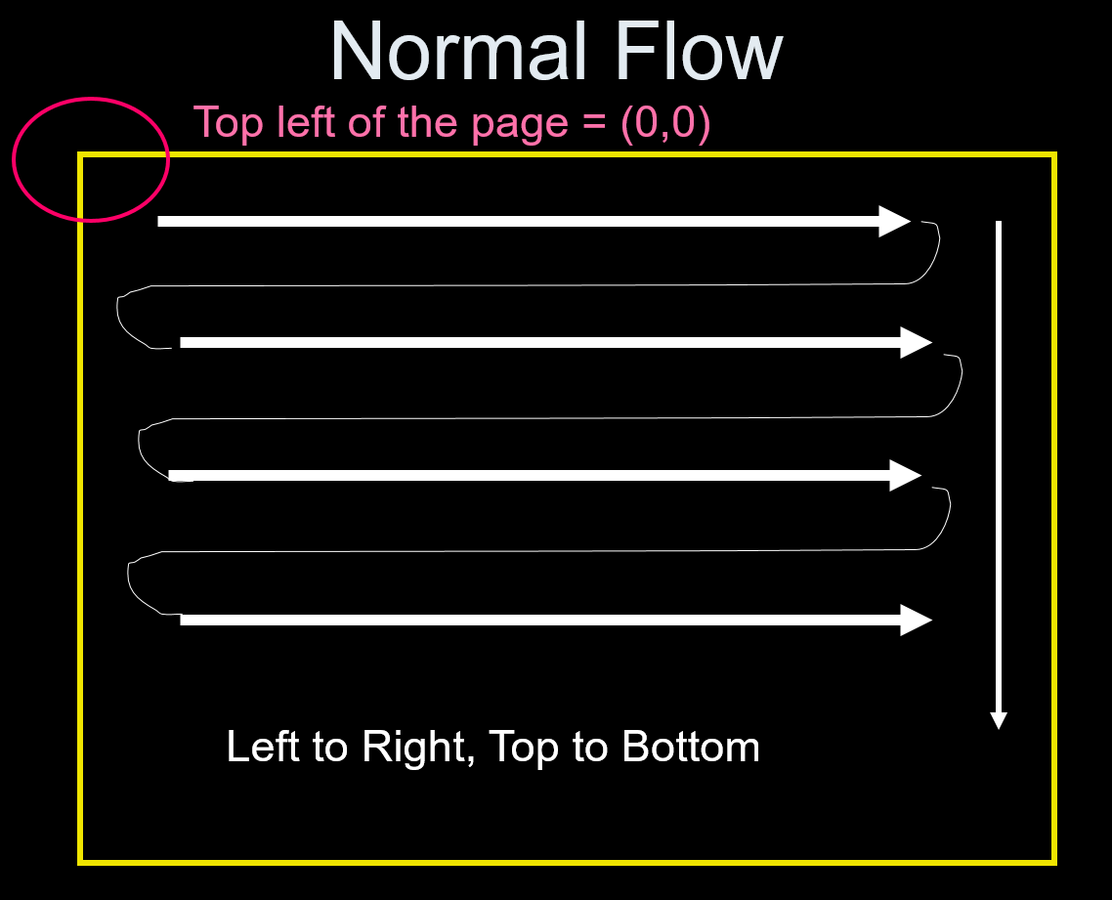
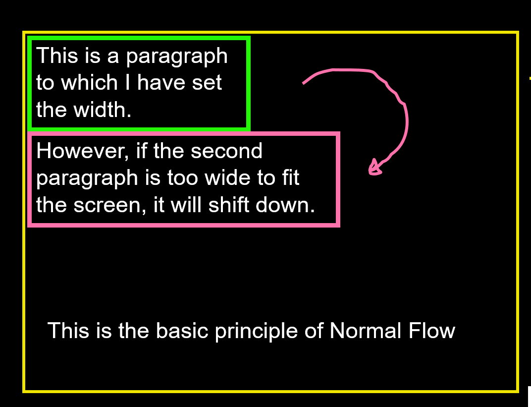
Interrupt the Flow
- Absolute
- Relative
- Fixed
- Float
Valid values of float
- left
- right
- none
- inherit
Float use
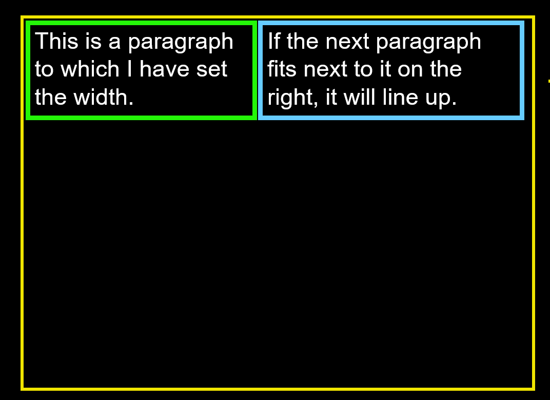
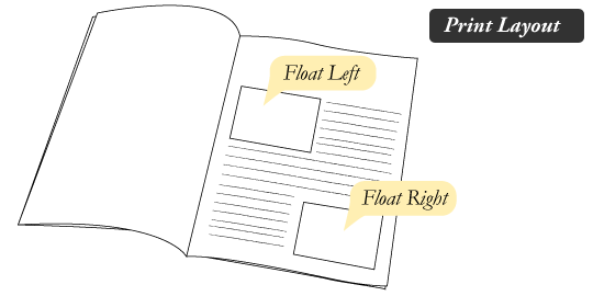
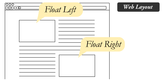
Just like the images in the print layout where the text flows around them.
Floated elements remain a part of the flow of the web page.
Floats can be used to create entire web layouts.
Clearing the Float, but Why ?
The Great Collapse !!
Lets Fix It
Clear the float after the floated elements in the container but before the close of the container.
.clearfix {
  clear: both;
}
Techniques for Clearing Floats
The Empty Div Method
<div style="clear: both;"></div>BUT !! No contextual meaning
There purely for presentation !
The Overflow Method
The overflow property isn't specifically for clearing floats
Be careful not to hide content or trigger unwanted scrollbars.
Use Pseudo Element
.clearfix:after {
   content: " ";
   display: block;
   height: 0;
   clear: both;
}
Thinking in Terms of Grid
Think layout made of "Columns" and "Rows"
Lets Do Some Exercise!
Let's start with a simple 2 column layout
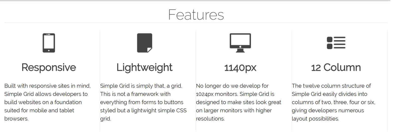
Divide your layout into columns and rows
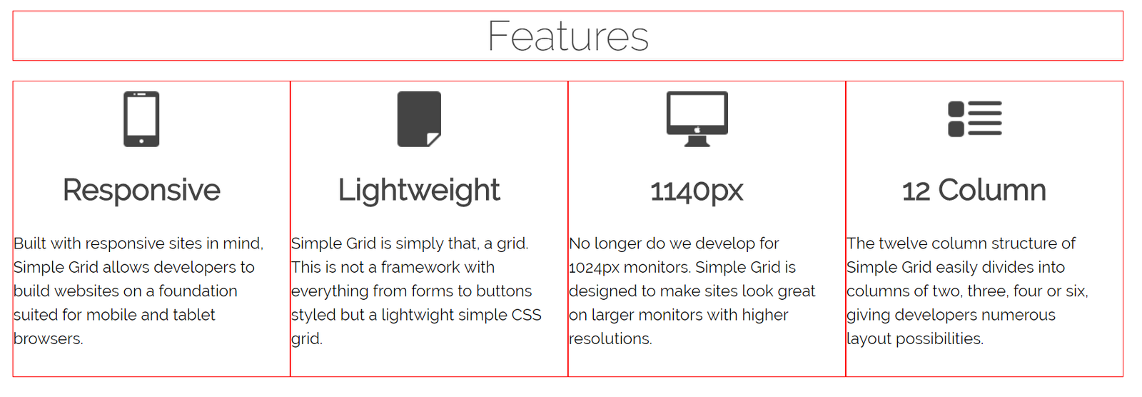
Grid CSS Frameworks
Bootstrap
960
Foundation
SKELETON
What about being responsive?
With Grid Layout is becomes easy to target mobile devices.
Flexbox
Aims at
providing a more efficient way to lay out, align and distribute space
Container
Give the container the ability to alter its items' width/height (and order) to best fill the available space
Let's see some examples
Let's see some of the flex properties
.container {

  display: flex; /* or inline-flex */

  flex-direction: row | row-reverse | column | column-reverse;

  flex-wrap: nowrap | wrap | wrap-reverse;

  justify-content: flex-start | flex-end | center
                    | space-between | space-around;

  align-content: flex-start | flex-end | center
                    | space-between | space-around | stretch;

  align-items: flex-start | flex-end | center | baseline | stretch;

}
.item {
	order: <integer>;

	flex-grow: <number>;/* default 0 */

	flex-shrink: <number>; /* default 1 */

        flex-basis: <length> | auto; /* default auto */

	flex: none | [ <'flex-grow'> <'flex-shrink'>?
                    || <'flex-basis'> ];

	align-self: auto | flex-start | flex-end
                    | center | baseline | stretch;
}
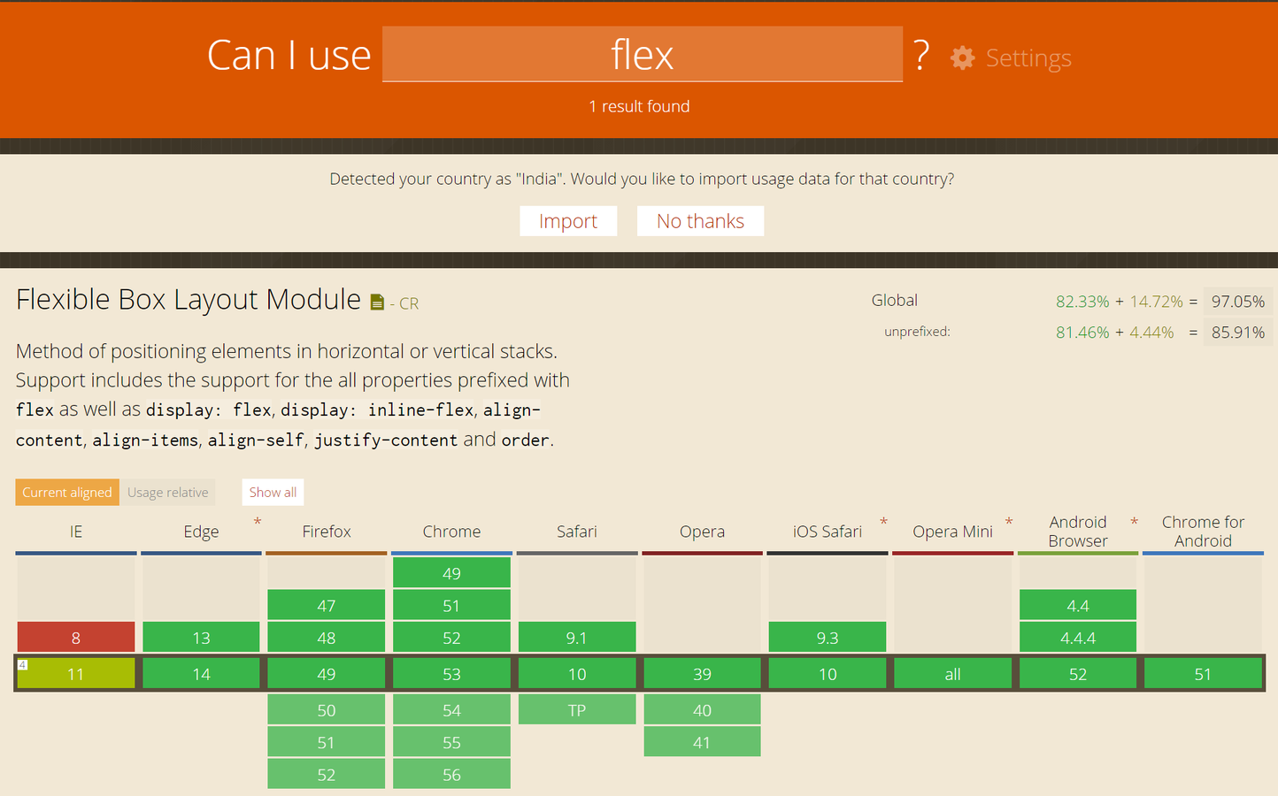
Flexbox Support
caniuse.com
Vertical Alignment

Why it don't work
vertical-align:: middle;;
Applies to
inline-level and table-cell elements.
vertical-align on block level elements and gives no results
A small div inside a larger div
vertical-align will not help you center the smaller
What about Aligning Block Elements ?
Line-Height Method
<div id="parent">
    <div id="child">Text here</div>
</div>
#child {
line-height: 200px;
}CSS Table Method
<div id="parent">
    <div id="child">Text here</div>
</div>
#parent {display: table;}
#child {
display: table-cell;
vertical-align: middle;
}Absolute Positioning and Negative Margin
<div id="parent">
    <div id="child">Text here</div>
</div>
#parent {position: relative;}
#child {
position: absolute;
top: 50%;
left: 50%;
height: 30%;
width: 50%;
margin: -15% 0 0 -25%;
}Equal Top and Bottom Padding
<div id="parent">
    <div id="child">Text here</div>
</div>
#parent {
padding: 5% 0;
}
#child {
padding: 10% 0;
}Questions ?
CSS Layouts and Flexbox
By ritesh ranjan
CSS Layouts and Flexbox
1. CSS Box Model – Do you know the difference between border-box and Content-box ? 2. CSS Positioning – When to use float ? 3. Thinking in Terms of Grid – When do you need a layout grid like 960 4. Making responsive – because Mobile! 5. Demystifying Flexbox 6. How the heck I do vertical alignment – Why “vertical-align: middle” does not work :P .
- 184


