Design
-
Describe UI and UX
-
Create a Visual Hierarchy
-
Implement a font
-
Implement a color theme
-
Identify the design style of a site
Objectives
A plan created to show the look and function of a product before it is made.
Design
Why is it important?
If you can't figure out how to use a product, it isn't you who is dumb, it is the design
Optimize product for effective and enjoyable use.
According to the definition of usability, it is a quality attribute of the UI, covering whether the system is easy to learn, efficient to use, pleasant, and so forth. Again, this is very important, and again total UX is an even broader concept." - Nielsen/Norman
User Experience
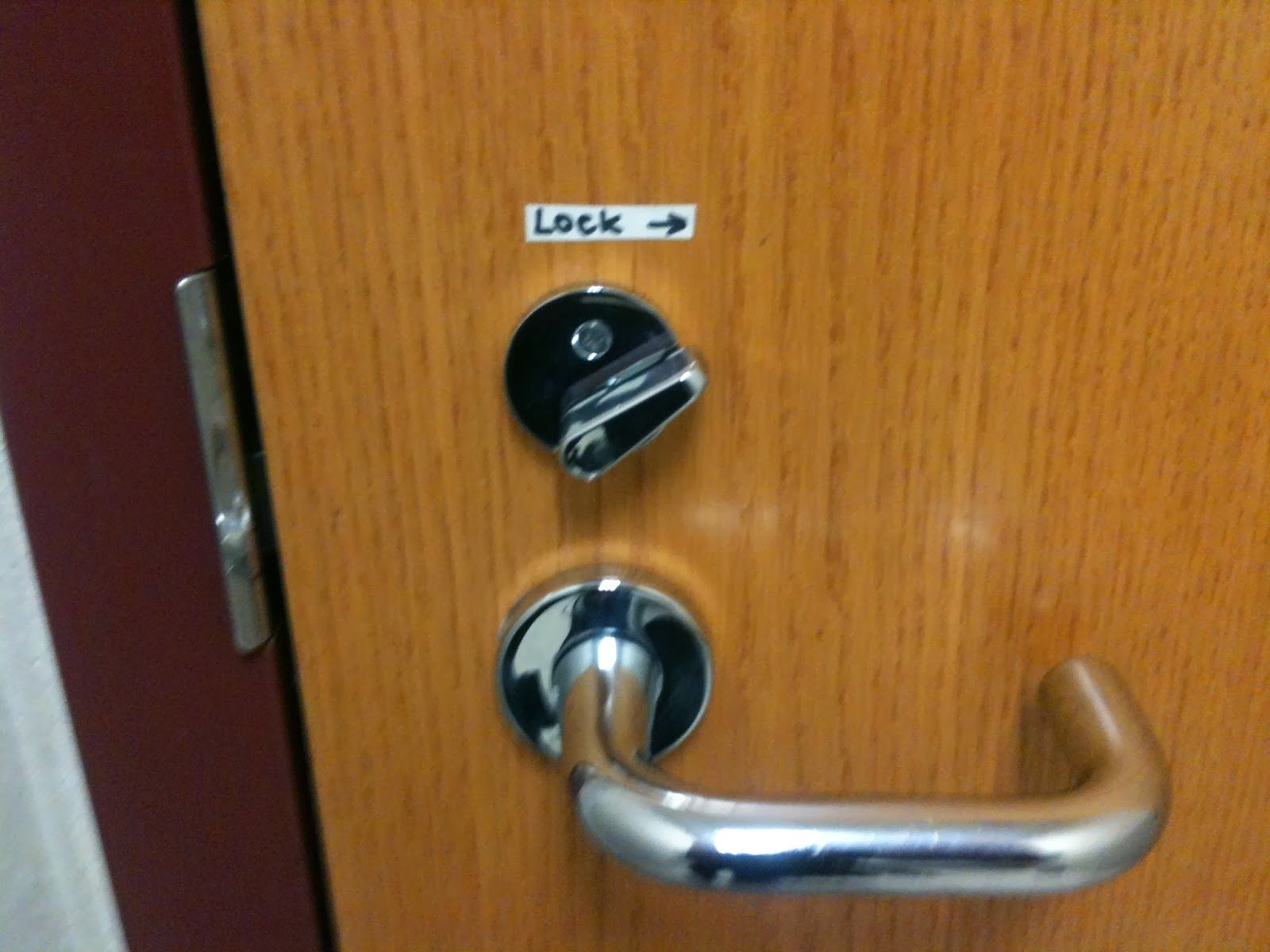
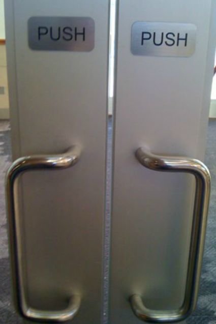
Also known as "Krug's First Law," this is the most important principle of usability.
Don't make me think
Things that cause people to think:
- Cute/clever names ("Brew Views" instead of "Images")
- Verbose labels ("Employment Opportunities" instead of "Jobs")
- Non-obvious actions (links that aren't underlined)
One of the ways you can encourage users to "not think" is to follow conventions. This might include standard use of:
- Icons (eg. hamburger for menu)
- Controls (eg. play button turns into pause while playing)
- Location (eg. title on the top left)
- Metaphors (eg. shopping cart)
Conventions
- Purpose - What's clear purpose to fulfill a need?
- Simplicity - Am I wasting the user's time?
- Clarity - Are the next steps intuitive?
- Consistency - Are my look, feel, and interactions similar?
- Predictability - Is my site predictable?
- Satisfaction gained by user
Optimize the look and feel to bring the user experience to life using layout, images, fonts, colors, and interactions.
User Interface
-
Clarity
-
language, flow, hierarchy and metaphors for visual elements
-
-
Concision
-
Staying Brief while remaining clear
-
-
Familiarity
-
How familiar is the interface, even on first use. Affordances
-
-
Responsiveness
-
Should not feel sluggish. No jank.
-
10 Qualities of UI
-
Consistency
-
All interfaces among your product should feel the same. Branding
-
-
Aesthetics
-
Needs to look good to make the experience feel better
-
-
Efficiency
-
Interface should feel like a shortcut for the user
-
-
Forgiveness
-
Do not punish the user for making mistakes or slips.
-
-
Learnability
-
An interface’s ability to teach the user.
-
-
Visibility
-
Can the user find what they need?
-
Thermostat Activity
People believe that you can heat a room faster by setting the thermostat to a higher temperature than you really want, as if the thermostat was a valve for the heating system that lets more heat into the room the higher you set it. In fact, the thermostat is simply an on/off switch for the heat. It turns on as long as the room temperature is below the thermostat setting, and turns off when the thermostat setting is reached.
Design a Thermostat
Visual Hierarchy
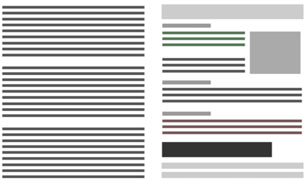
- The more important something is, the more prominent it should be
- Things that are related logically should be related visually
- Nesting indicates what owns what
- Break pages into clearly defined areas
- Make things it obvious which things the user can interact with
- Write text to be scannable
- Be generous with headings
- Keep paragraphs short
- Use bulleted lists
- Highlight key terms
Rules
Colors
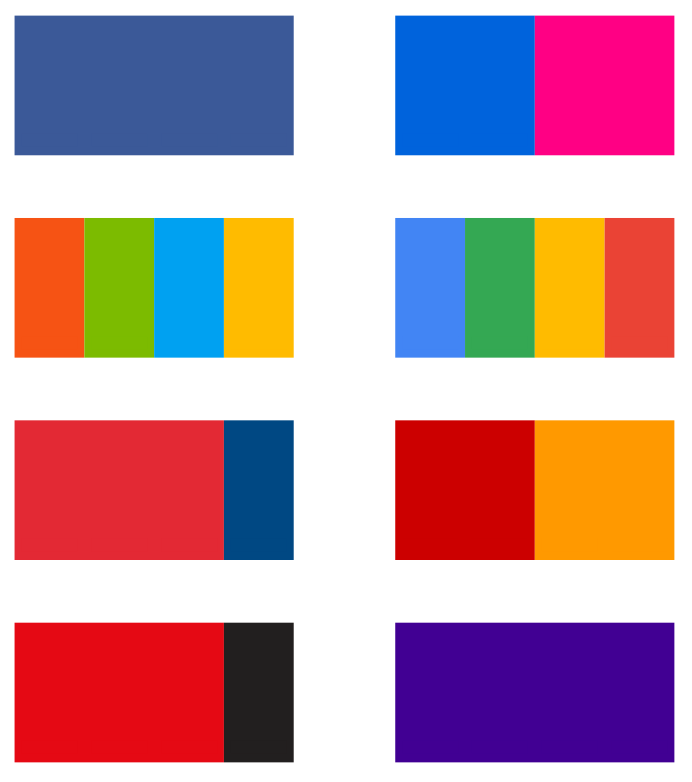
Importance
- Branding - unifying style
- Direct or redirect attention
- Add dimension with texture and patterns
- Limit to use around five different colors
Typography
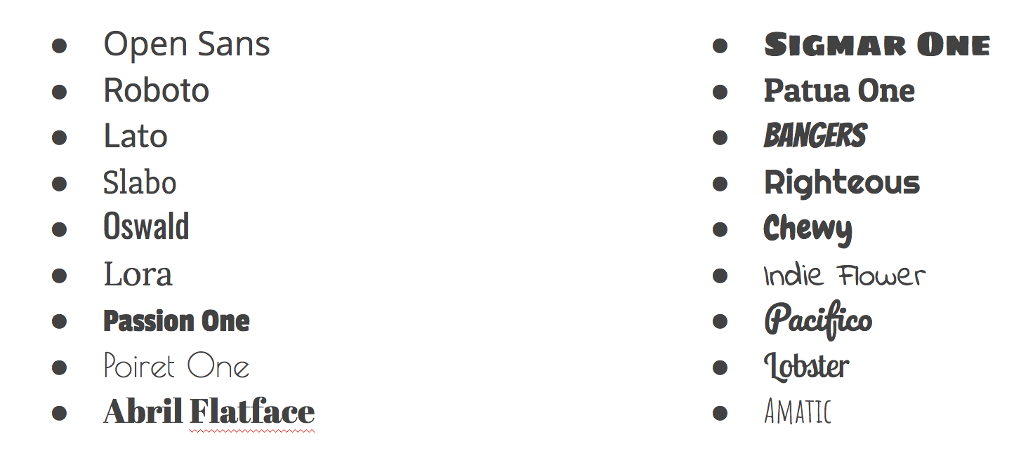
Importance
- Branding - unifying style
- Visual Layout - Hierarchy and importance
- Guidance through site
- Limit to two font families: one for highlight and one for readability
Popular Styles
-
Skeuomorphic Design
-
Flat Design

-
Describe UI and UX
-
Create a Visual Hierarchy
-
Implement a font
-
Implement a color theme
-
Identify the design style of a site
Review
Design
By Roberto Ortega


