MAQUETACIÓN
DIVINA
Rubén Bernárdez
@rubenbpv

THE NEXT LEVEL
¿Qué hemos aprendido?
Notación BEM
.block {}
.block__element {}
.block--modifier {}
.site-search {} /* Block */
.site-search__field {} /* Element */
.site-search--full {} /* Modifier */Namespaces & sufijos responsivos
<div class="theme-live">

  <div class="o-media  user  user--premium  u-margin-bottom@tablet">

    <img src="" class="o-media__img  user__photo  avatar" />

    <p class="o-media__body  user__bio  u-font-h3">...</p>

  </div>

</div>
¿Qué hemos aprendido?
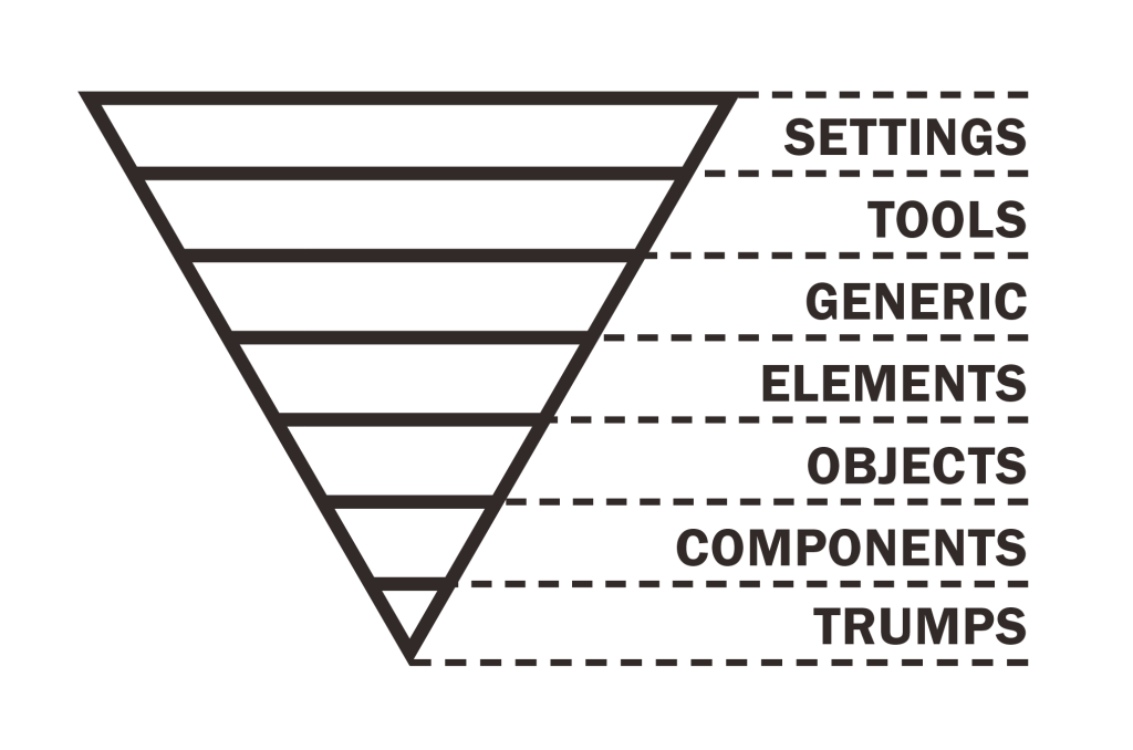
Arquitectura ITCSS
¿Qué hemos aprendido?
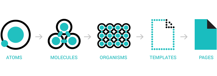
Atomic design
¿Qué hemos aprendido?
Flexbox


¿Qué hemos aprendido?
Aún hay margen de MEJORA
Tamaños de fuente
desktop
39px
móvil
31px
Tamaños de fuente
- Definir la escala.
- Definir los tamaños de fuente en cada breakpoint.
- Aplicarlo en código SASS.
Tamaños de fuente
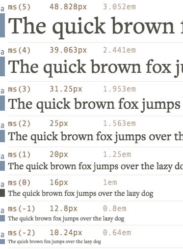
1. Definir la escala
http://www.modularscale.com
Tamaños de fuente
2. Definir los tamaños de fuente en cada breakpoint
| xs | sm | md | lg | |
|---|---|---|---|---|
| xsmall | -2 | -2 | -2 | -1 |
| small | -1 | -1 | -1 | 0 |
| normal | 0 | 0 | 0 | 1 |
| large | 1 | 1 | 1 | 2 |
| h4 | 2 | 2 | 3 | 3 |
| h3 | 2 | 3 | 4 | 4 |
| h2 | 3 | 4 | 5 | 5 |
| h1 | 3 | 5 | 6 | 6 |
| big1 | 4 | 6 | 8 | 9 |
| big2 | 4 | 7 | 10 | 11 |
Tamaños de fuente
3. Configurando SASS
// breakpoints de bootstrap
$grid-breakpoints: (
  xs: 0,
  sm: 576px,
  md: 768px,
  lg: 992px,
  xl: 1200px,
  xxl: 1400px,
);

// breakpoints para typi
$breakpoints: (
  xs: map-get($grid-breakpoints, xs),
  sm: map-get($grid-breakpoints, sm),
  md: map-get($grid-breakpoints, md),
  lg: map-get($grid-breakpoints, lg),
  xl: map-get($grid-breakpoints, xl),
  xxl: map-get($grid-breakpoints, xxl)
);

// -----------------------------------

$line-height-base: 1.5;
$headings-line-height: 1.1;

// Escala de tipografías
$modularscale: (
  base: 16px,
  ratio: 1.25
);

// Nombre de tamaños de letra y sus comportamientos
$typi: (
  xsmall: (
    null: (ms(-2), $line-height-base),
    lg: (ms(-1), $line-height-base),
  ),
  base: (
    null: (ms(0), $line-height-base),
  ),
  normal: (
    null: (ms(0), $line-height-base),
    lg: (ms(1), $line-height-base),
  ),
  large: (
    null: (ms(1), $line-height-base),
    lg: (ms(2), $line-height-base),
  ),
  h4: (
    null: (ms(2), $headings-line-height),
    md: (ms(3), $headings-line-height),
  ),
  h3: (
    null: (ms(2), $headings-line-height),
    sm: (ms(3), $headings-line-height),
    md: (ms(4), $headings-line-height),
  ),
  h2: (
    null: (ms(3), $headings-line-height),
    md: (ms(4), $headings-line-height),
  ),
  h1: (
    null: (ms(4), $headings-line-height),
    md: (ms(5), $headings-line-height),
  ),
  big1: (
    null: (ms(7), $headings-line-height),
  )
);| xs | sm | md | lg | |
|---|---|---|---|---|
| xsmall | -2 | -2 | -2 | -1 |
| small | -1 | -1 | -1 | 0 |
| normal | 0 | 0 | 0 | 1 |
| large | 1 | 1 | 1 | 2 |
| h4 | 2 | 2 | 3 | 3 |
| h3 | 2 | 3 | 4 | 4 |
| h2 | 3 | 4 | 5 | 5 |
| h1 | 3 | 5 | 6 | 6 |
| big1 | 4 | 6 | 8 | 9 |
| big2 | 4 | 7 | 10 | 11 |
npm install modularscale-sass -D
npm install typi -D
Tamaños de fuente
3. Usar las herramientas configuradas SASS
.search-box {
    @include typi('normal');
}

.title1 {
    @include typi('h1');
}
.search-box {
font-size: 1rem;
line-height: 1.5;
}
@media all and (min-width: 992px) {
.search-box {
font-size: 1.25rem;
line-height: 1.5;
}
}
.title1 {
font-size: 2.4375rem;
line-height: 1.1;
}
@media all and (min-width: 768px) {
.title1 {
font-size: 3.0625rem;
line-height: 1.1;
}
}SASS
CSS
$line-height-base: 1.5;
$headings-line-height: 1.1;

$modularscale: (
  base: 16px,
  ratio: 1.25
);

$typi: (
  normal: (
    null: (ms(0), $line-height-base),
    lg: (ms(1), $line-height-base),
  ),
  h1: (
    null: (ms(4), $headings-line-height),
    md: (ms(5), $headings-line-height),
  )
);
Ritmo Vertical
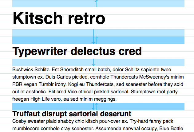
line height
2x
1x
Ritmo Vertical
$spacing: (
  tiny:   vr(0.25),
  small:  vr(0.5),
  base:   vr(1),
  medium: vr(2),
  large:  vr(3),
  huge:   vr(4)
);
.form-block {
padding: spacing(base);
margin-bottom: spacing(medium);
}@function spacing($key) {
@if map-has-key($spacing, $key) {
@return map-get($spacing, $key);
}
@error 'Unknown spacing "#{$key}"';
@return null;
}
@function -spacing($key) {
@return - spacing($key);
}1. config
funciones de utilidad
2. uso
Para 16px y line-height: 1.5;

vr(1) = 1 * 16 * 1.5 = 24px = 1.5rem
vr(2) = 2 * 16 * 1.5 = 48px = 3rem
Ritmo Vertical
.u-margin-top {
  margin-bottom: 1.5rem !important;
}

.u-margin-bottom {
  margin-bottom: 1.5rem !important;
}

.u-margin-bottom-medium {
  margin-bottom: 3rem !important;
}
...
@each $size in map-keys($spacing) {
$directions: ('-top', '-right', '-bottom', '-left');
@each $direction in $directions {
.u-margin#{$direction}-#{$size} {
margin#{$direction}: map-get($spacing, $size) !important;
}
}
}Generándolos automáticamente en base a nuestra configuración.
Estilos de utilidad para nuestro ritmo vertical
Sistema de themes
Sistema de themes
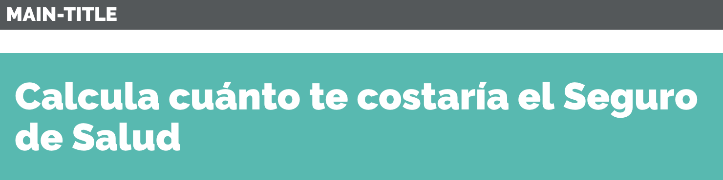
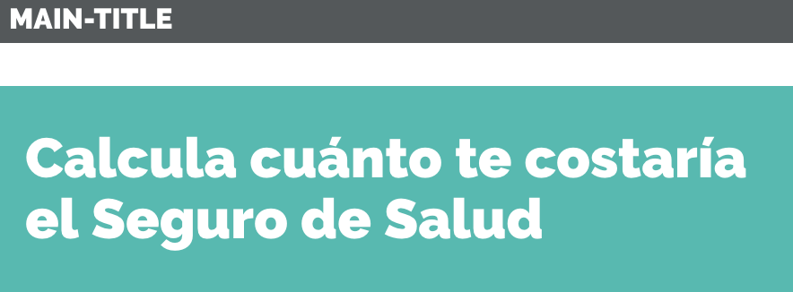
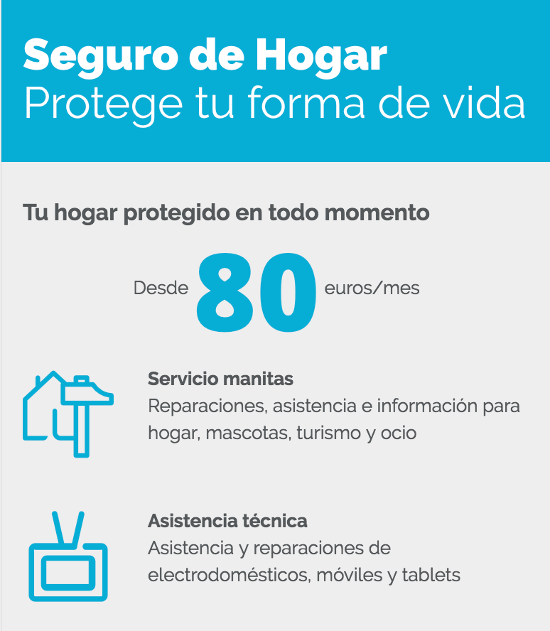
<div class="theme-home">
  <div class="main-title">
    Seguro de Hogar

    <span class="u-font-normal">
      Protege tu forma de vida
    </span>
  </div>

  ...

  <p>
    Desde
    <strong class="u-theme-color u-font-large">
      80
    </strong>
    €/mes
  </p>

  ...
</div>
Sistema de themes
<div class="theme-home">
  <div class="main-title">
    Seguro de Hogar

    <span class="u-font-normal">
      Protege tu forma de vida
    </span>
  </div>

  ...

  <p>
    Desde
    <strong class="u-theme-color u-font-large">
      80
    </strong>
    €/mes
  </p>

  ...
</div>
.main-title {
padding: 2rem;
...
}@mixin theme-base($base-color) {
.main-title {
background-color: $base-color:
}
.u-theme-color {
color: $base-color;
}
...
}
.theme-home {
@include theme-base(#ed8b00);
}
.theme-life {
@include theme-base(#ff2e63);
}_main-title.scss
_themes.scss
Estilos de .main-title separados :(
Sistema de themes
.main-title {
  padding: 2rem;

  @include theme-property('background-color','color');

  // o

  @include theme-background-color;
}
.u-theme-color {
@include theme-property('color','color');
// o
@include theme-color;
}_main-title.scss
_utilities.themes.scss
.main-title {
  padding: 2rem;
}

.theme-home .main-title {
  background-color: #57bab1;
}

.theme-life .main-title {
  background-color: #00aed6;
}

...

.theme-home .u-theme-color {
  color: #54585a;
}

.theme-life .u-theme-color {
  color: #57bab1;
}

...
OUTPUT
Sistema de themes
$themes: (
  health: (
    color: #57bab1,
    calc-bg: url('../health/bg.jpg')
  ),
  life: (
    color: #00aed6,
    calc-bg: url('../life/bg.jpg')
  ),
  saving: (
    color: #eb8f73,
    calc-bg: url('../saving/bg.jpg')
  ),
  legal: (
    color: #e7da26,
    calc-bg: url('../legal/bg.jpg')
  )
);
@mixin theme-property($property, $option) {
@each $theme, $options in $themes {
$option-value: map-get($options, $option);
.theme-#{$theme} & {
#{$property}: $option-value;
}
}
}
@mixin theme-color() {
@include theme-property('color', 'color');
}
@mixin theme-background-color() {
@include theme-property(
'background-color', 'color');
}
configuración
mixins
include-media
npm install include-media -D
$breakpoints: (
  xs: 0,
  sm: 576px,
  md: 768px,
  lg: 992px,
  xl: 1200px,
  xxl: 1400px,
);

// breakpoint aliases
$mobile-large: '>=sm';
$tablet: '>=md';
$desktop: '>=lg';
$desktop-large: '>=xl';
$only-mobile: '<md';
.box {
border: 1px solid #aaa;
@include media-breakpoint-down(md) {
padding-top: 1rem;
}
}.box {
border: 1px solid #aaa;
@media (max-width: $screen-xs-max) {
padding-top: 1rem;
}
}bootstrap 3
bootstrap 4
.box {
  border: 1px solid #aaa;

  @include media($only-mobile) {
    padding-top: 1rem;
  }
}
include-media
configuración
Componentes + utilities = WIN
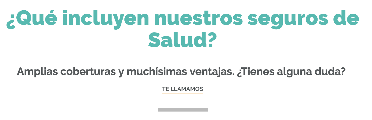
<h2 class="u-theme-color u-text-center u-font-black u-font-h2 u-margin-bottom">
  ¿Qué incluyen nuestros seguros de Salud?
</h2>

<p class="u-font-bold u-text-center u-font-large u-margin-bottom-small">
  Amplias coberturas y muchísimas ventajas. ¿Tienes alguna duda?

  <br>

  <a href="#" class="link">
    Te llamamos
  </a>
</p>

<div class="separator"></div>
<h2 class="title1 u-margin-bottom">
¿Qué incluyen nuestros seguros de Salud?
</h2>
<p class="subtitle u-margin-bottom-small">
Amplias coberturas y muchísimas ventajas. ¿Tienes alguna duda?
<br>
<a href="#" class="link">
Te llamamos
</a>
</p>
<div class="separator"></div>Componentes + utilities = WIN
Linter

- Vela por el formato del código y algunas buenas prácticas.
- Integración con el IDE y en el flujo de tareas de gulp
Página de componentes
- Para cuando no hay guía de diseño y componentes.
- Ayuda a la revisión rápida de la visualización de nuestros componentes.
- Roadmap: snapshot testing
REM's
- Tamaño relativo al configurado en el navegador, por defecto 16px.
- Para todo, excepto, media queries.
.estilo {
  width: rem(32px);
}
.estilo {
width: 2rem; <!-- 2 * 16 -->
}SASS
CSS
Configuración del Chrome
Grid de bootstrap vs CSS Grid

<div class="container">
  <div class="row">
    <div class="col-4">1</div>
    <div class="col-3">2</div>
    <div class="col-3">3</div>
    <div class="col-2">4</div>
  </div>
</div>
.col-2, .col-3, .col-4 {
position: relative;
width: 100%;
min-height: 1px;
padding-right: 15px;
padding-left: 15px;
}
.col-2 {
flex: 0 0 16.666667%;
max-width: 16.666667%;
}
.col-3 {
flex: 0 0 25%;
max-width: 25%;
}
.col-4 {
flex: 0 0 33.333333%;
max-width: 33.333333%;
}.container {
margin-right: auto;
margin-left: auto;
padding-right: 15px;
padding-left: 15px;
width: 100%;
}
.row {
display: flex;
flex-wrap: wrap;
margin-right: -15px;
margin-left: -15px;
}Solución Bootstrap 4
Solución CSS Grid
<div class="row">
  <div>1</div>
  <div>2</div>
  <div>3</div>
  <div>4</div>
</div>
.row {
display: grid;
grid-template-columns: 4fr 3fr 3fr 2fr;
}CSS Grid
Gracias :)
Maquetación Divina
By rubenbp


