Flex - Day3
CONTENT
- Breaking the Application into Components
- Event life cycle
- Custom Events
- Data group
1. Breaking the Application into Components
Why to break to Components
- To organise the code into various files rather than writing all in one file.
- Extending the feature of existing components to add new features.
Why organise code ?
- The main application file will be longer for large application and makes more difficult to build, debug and maintain.
- It will be very difficult for a team to work on one large application page.
- Components let you divide the application into modules, which you can develop and maintain separately.
- With careful planning, these components can become a reusable suite of application functionality.
Why to extend existing components?
Procedure to create custom components
- Create a new MXML Component.
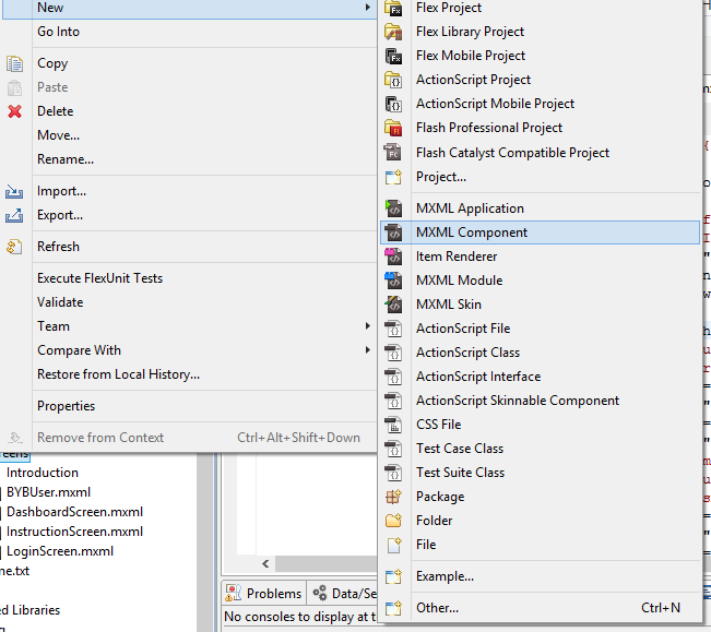
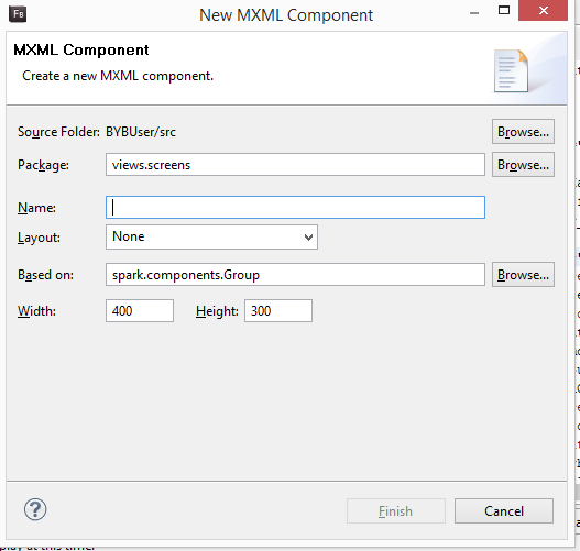
- Mention the root component on which your custom component extends(or based on).
Example
<?xml version="1.0" encoding="utf-8"?>
<s:Application xmlns:fx="http://ns.adobe.com/mxml/2009"
			   xmlns:s="library://ns.adobe.com/flex/spark"
			   xmlns:mx="library://ns.adobe.com/flex/mx"
			   minWidth="955" minHeight="600">
	<fx:Script>
		<![CDATA[
			import mx.controls.Alert;
			protected function buttonbar1_clickHandler(event:MouseEvent):void
			{
				if(tabBB.selectedIndex == 0)
				{
					this.currentState = 'listView';
				}
				else
				{
					this.currentState = 'detailsView';
				}
			}
		]]>
	</fx:Script>

	<s:states>
		<s:State name="listView"/>
		<s:State name="detailsView"/>
	</s:states>

	<s:layout>
		<s:VerticalLayout verticalAlign="middle" horizontalAlign="center"/>
	</s:layout>

	<s:ButtonBar id="tabBB" click="buttonbar1_clickHandler(event)" requireSelection="true">
		<s:dataProvider>
			<s:ArrayCollection>
				<fx:String>List</fx:String>
				<fx:String>Details</fx:String>
			</s:ArrayCollection>
		</s:dataProvider>
	</s:ButtonBar>

	<s:List id="myList" width="100%" height="100%"
			includeIn="listView">
		<s:dataProvider>
			<s:ArrayCollection>
				<fx:String>Item 1</fx:String>
				<fx:String>Item 2</fx:String>
			</s:ArrayCollection>
		</s:dataProvider>
	</s:List>

	<s:VGroup id="details" height="100%" width="100%" includeIn="detailsView">
		<s:HGroup width="100%" height="100">
			<s:Label text="Item 1 details"/>
		</s:HGroup>
		<s:HGroup width="100%" height="100">
			<s:Label text="Item 2 details"/>
		</s:HGroup>
	</s:VGroup>

</s:Application>
Cont.
<?xml version="1.0" encoding="utf-8"?>
<s:List width="100%" height="100%"
	xmlns:fx="http://ns.adobe.com/mxml/2009"
	xmlns:s="library://ns.adobe.com/flex/spark"
        xmlns:mx="library://ns.adobe.com/flex/mx">
	<s:dataProvider>
		<s:ArrayCollection>
			<fx:String>Item 1</fx:String>
			<fx:String>Item 2</fx:String>
		</s:ArrayCollection>
	</s:dataProvider>
</s:List>
<?xml version="1.0" encoding="utf-8"?>
<s:VGroup height="100%" width="100%"
xmlns:fx="http://ns.adobe.com/mxml/2009"
xmlns:s="library://ns.adobe.com/flex/spark"
xmlns:mx="library://ns.adobe.com/flex/mx">
<s:HGroup width="100%" height="100">
<s:Label text="Item 1 details"/>
</s:HGroup>
<s:HGroup width="100%" height="100">
<s:Label text="Item 2 details"/>
</s:HGroup>
</s:VGroup>List Component
Details Component
Modified Code
<?xml version="1.0" encoding="utf-8"?>
<s:Application xmlns:fx="http://ns.adobe.com/mxml/2009"
			   xmlns:s="library://ns.adobe.com/flex/spark"
			   xmlns:mx="library://ns.adobe.com/flex/mx"
                           xmlns:components="components.*"
			   minWidth="955" minHeight="600">
	<fx:Script>
		<![CDATA[
			import mx.controls.Alert;
			protected function buttonbar1_clickHandler(event:MouseEvent):void
			{
				if(tabBB.selectedIndex == 0)
				{
					this.currentState = 'listView';
				}
				else
				{
					this.currentState = 'detailsView';
				}
			}
		]]>
	</fx:Script>

	<s:states>
		<s:State name="listView"/>
		<s:State name="detailsView"/>
	</s:states>

	<s:layout>
		<s:VerticalLayout verticalAlign="middle" horizontalAlign="center"/>
	</s:layout>

	<s:ButtonBar id="tabBB" click="buttonbar1_clickHandler(event)" requireSelection="true">
		<s:dataProvider>
			<s:ArrayCollection>
				<fx:String>List</fx:String>
				<fx:String>Details</fx:String>
			</s:ArrayCollection>
		</s:dataProvider>
	</s:ButtonBar>

	<components:ListComponent width="100%" height="100%"
			includeIn="listView"/>

	<components:DetailsComponent width="100%" height="100%"
			includeIn="detailsView"/>
</s:Application>
Custom component
package views.screens
{
	import spark.components.Button;

	public class MYButton extends Button
	{
		public function MYButton()
		{
			super();
			this.label = "Click Me";
			this.setStyle("chromeColor","0xff0000");
		}
	}
}
Custom button with background color red and label as "Click Me".
2. Event life cycle
MXML Components
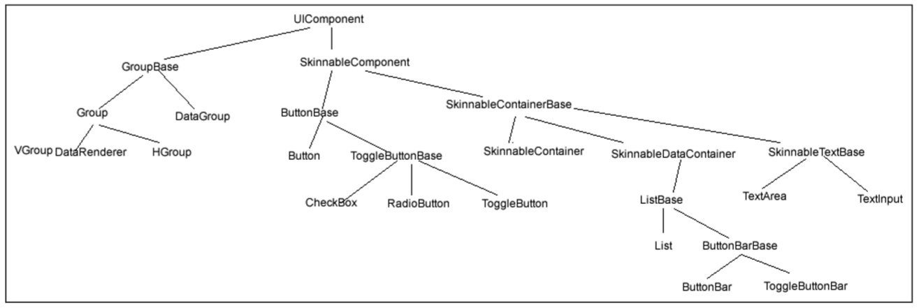
MXML Components
Cont.
The event flow is conceptually divided into three parts:
- The capture phase comprises all the components on the trip from the base application to the parent of the event’s target. In other words, everything from the application to the target, not including the target itself.
- The target phase occurs when the event reaches the target.
- The bubbling phase comprises all the components encountered on the return trip from the target back to the root application.
Cont.
<?xml version="1.0" encoding="utf-8"?>
<s:Application xmlns:fx="http://ns.adobe.com/mxml/2009"
			   xmlns:s="library://ns.adobe.com/flex/spark"
			   xmlns:mx="library://ns.adobe.com/flex/mx"
        		   minWidth="955" minHeight="600">
	<fx:Script>
		<![CDATA[
			import mx.controls.Alert;
			protected function clickHandler(event:Event):void
			{
                            var msg:String = event.target.toString()+" clicked";
                            Alert.show(msg);
			}
		]]>
	</fx:Script>
        <s:Panel id="panel" click="clickHandler(event)">
            <s:Group id="group" click="clickHandler(event)">
                <s:Button id="button" label="Click me"
                        click="clickHandler(event)"/>
            <s:Group>
        </s:Panel>
</s:Application>
Cont.
If a user clicks the Button, Flash Player dispatches an event object into the event flow. The object’s journey starts at the Application, moves down to the Panel, moves to the Group, and finally gets to the Button. The event object then “bubbles” back up to Application, moving again through the Group and Panel on its way up.
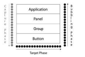
In this example, the capture phase includes the Application, Panel, and Group during the initial downward journey. The target phase comprises the time spent at the Button. The bubbling phase comprises the Group, Panel, and Application containers as they are encountered during the return trip.
3. Creating custom events
Why do we need custom events
Sometimes you need to pass data with events.
Makes code easier to read and maintain.
How do we create custom events
- Create a new custom event class which extends flash.events.Event class
- Inside the class definition, create a properties to hold data.
- Change the constructor to accept these properties also.
- Override the Clone method. In this method, you will return a new instance of the Custom event with the same properties.
Cont.
package events
{
  import flash.events.Event;

  public class ActionChangeEvent extends Event
  {
      public var actionName : String;
      public function ActionChangeEvent(type:String,actionName:String,bubbles:Boolean=false
                                        ,cancelable:Boolean=false)
      {
	super(type, bubbles, cancelable);
	this.actionName=actionName;
      }
      override public function clone():Event
      {
	return new ActionChangeEvent(type,actionName,bubbles,cancelable);
      }

   }
}
4. Data Group
Cont.
DataGroup is a new component introduced in Flex 4 that is responsible for turning data items like Strings and Objects into visual elements. The process of turning boring old data items into a visual representation is called item rendering. DataGroup is the lightest weight component that deals with item rendering. It has no concept of selection. A List provides selection functionality.
1. The Data Provider
This is an array of the data items to render. This takes an ArrayCollection, ArrayList, or any other IList.
2. The Item Renderer
Each data item is passed to an item renderer class which returns a visual representation of that data. You can define your own item renderer by subclassing the ItemRenderer class. Some examples of this will follow in later posts.
Cont.
3. The Layout
This defines how each renderer will be laid out on the screen. Here we use a vertical layout, but Flex 4 ships with four choices: HorizontalLayout/VerticalLayout/TileLayout/BasicLayout.
4. useVirtualLayout :
With virtual layout, the container reuses item renderers so that it only creates item renderers for the currently visible children of the container. As a child is moved off the screen, possible by scrolling the container, a new child being scrolled onto the screen can reuse its item renderer.
Cont.
<s:DataGroup itemRenderer="PersonRenderer"
             dataProvider="{userData}"
             verticalCenter="0" horizontalCenter="0">
    <s:layout>
        <s:VerticalLayout useVirtualLayout = 'true'/>
    </s:layout>
</s:DataGroup>
<?xml version="1.0" encoding="utf-8"?>
<s:ItemRenderer xmlns:fx="http://ns.adobe.com/mxml/2009"
xmlns:s="library://ns.adobe.com/flex/spark">
<fx:Script>
<![CDATA[
[bindable]
public var userObject : User;
override public function set data(value:Object):void {
this.userObject = User(value);
}
]]>
</fx:Script>
<s:Label text="{userObject.fname} {userObject.lname}"/>
</s:ItemRenderer>Cont.
Flex Training Day 3
By Sameer Agrawal


