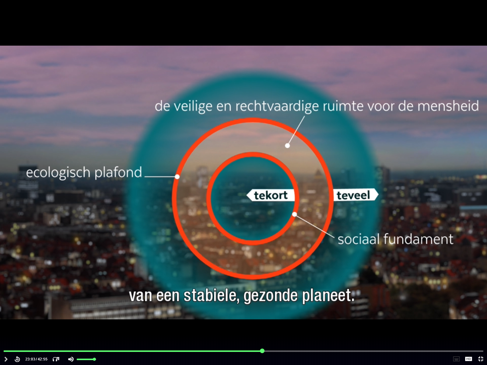
DATAVISUALISATION
The human mind processes visual information 60,000 times faster than text and 83% of human learning is visual, as opposed to auditory or verbal.
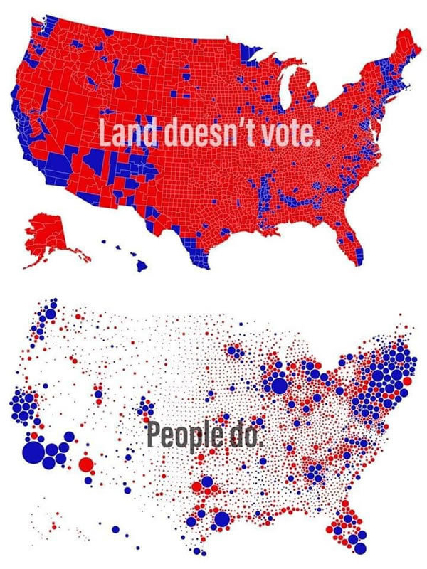
COLOUR
does matter

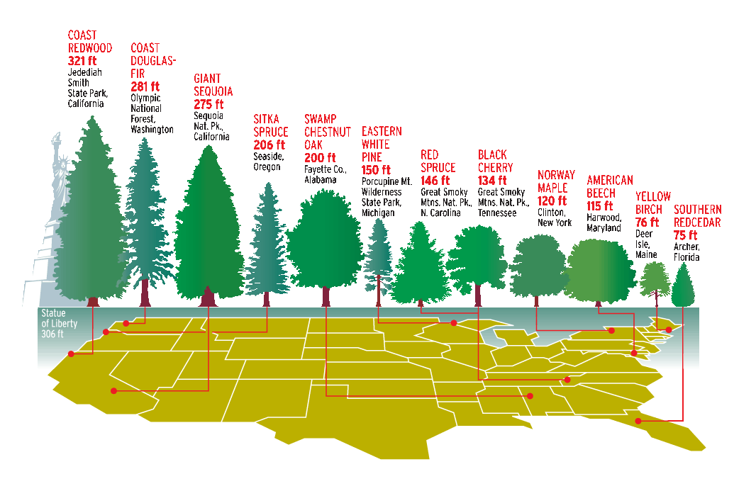
SIZE
people don't like numbers
STORYTELLING
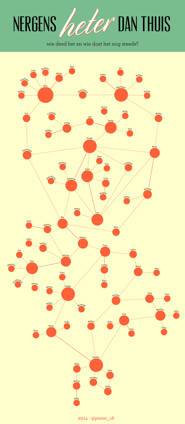
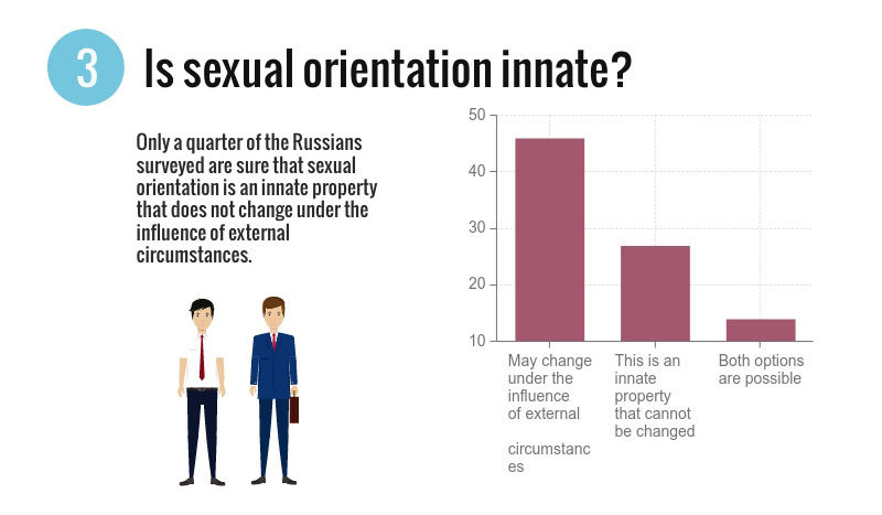
the logic of a headline
Validity of routine medical procedures (based on Meyer, Finn 2001)
OR
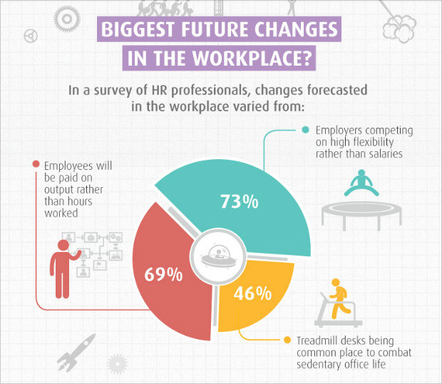
What employees and employers want to work on
OR
Top 5 health concerns
MISTAKES
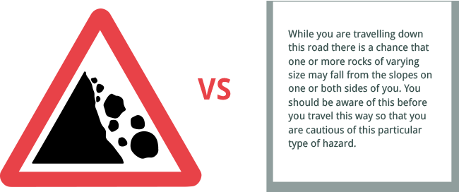
2. The wrong chart
To choose the right type of chart, just ask yourself if you want to:
-
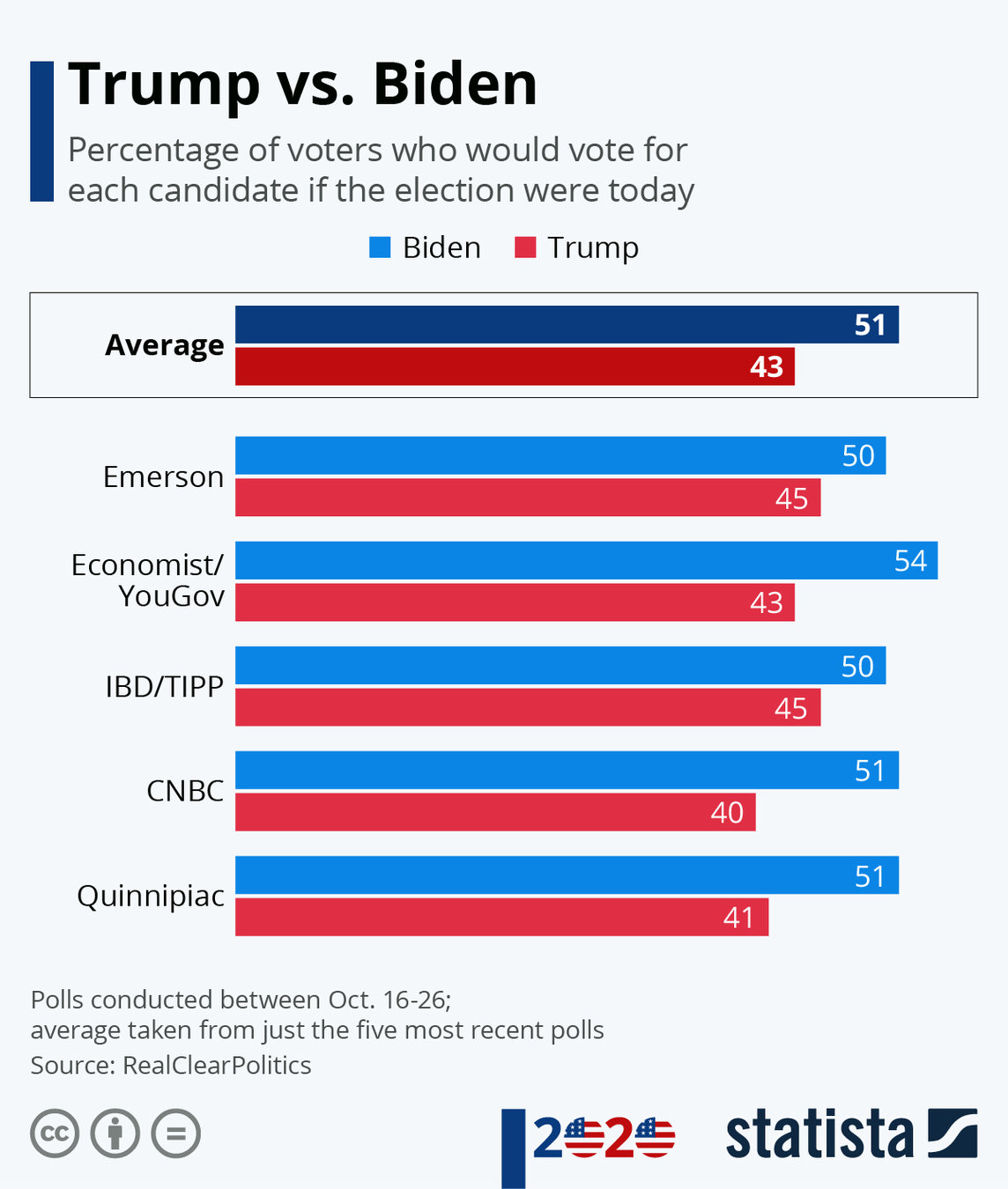
Compare values:
- Bar chart
- Line chart
-
Show the individual parts that make up a whole:
- Pie chart
- Stacked bar
- Stacked column
-
Understand how the data is distributed:
- Scatter plot
- Line chart
- Bar chart
-
Analyze trends:
- Line chart
- Bar chart
-
Comprehend the relationship between data sets:
- Line chart
- Scatter plot
- Bubble chart
2. Too many data
copy paste data <> organize info

3. Visualy inconsistent
4. Context (use a clear legend)
Do not forget to mention the source!
TOOLS

De student en zijn portefeuille
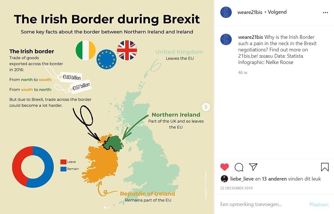
3. Interactive images
via Genially or Interactive image
*basis = your own infographic (e.g. Illustrator)

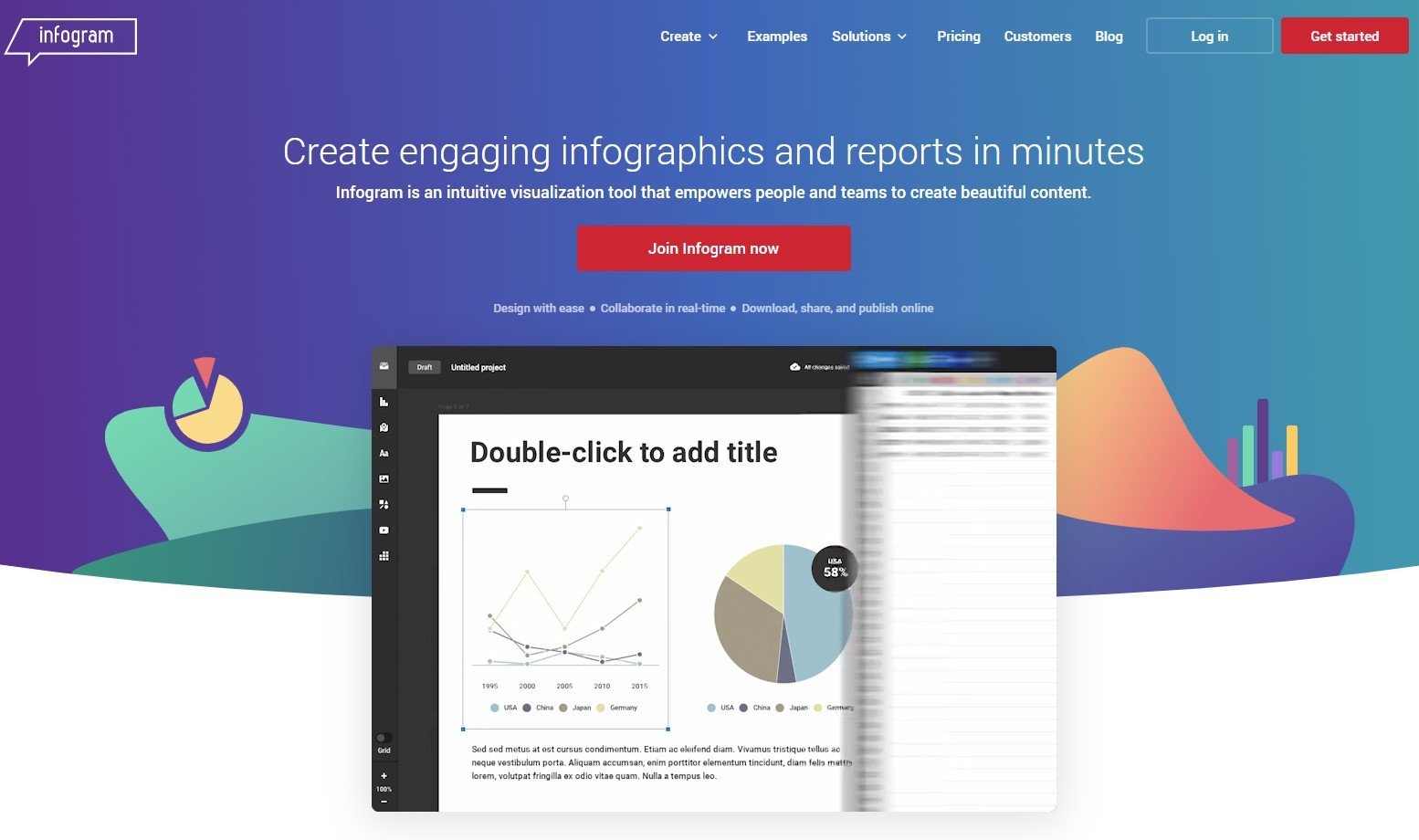
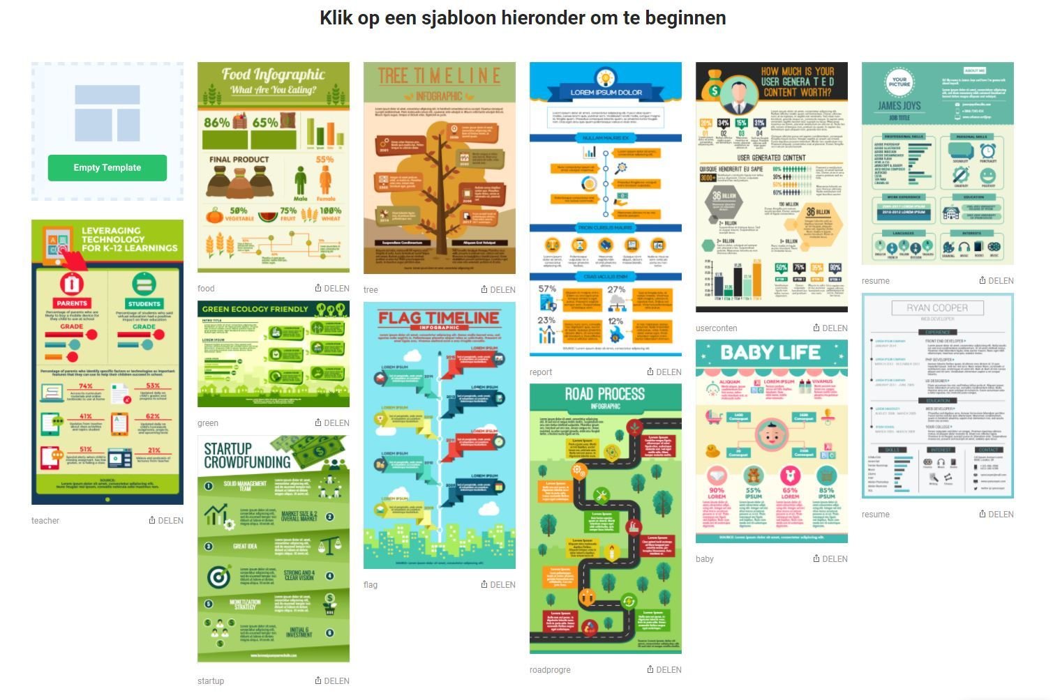
4. Basic infographics
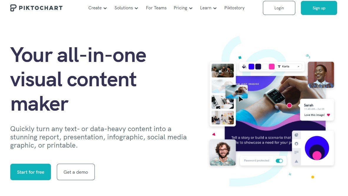
via Infogram or easel.ly or piktochart

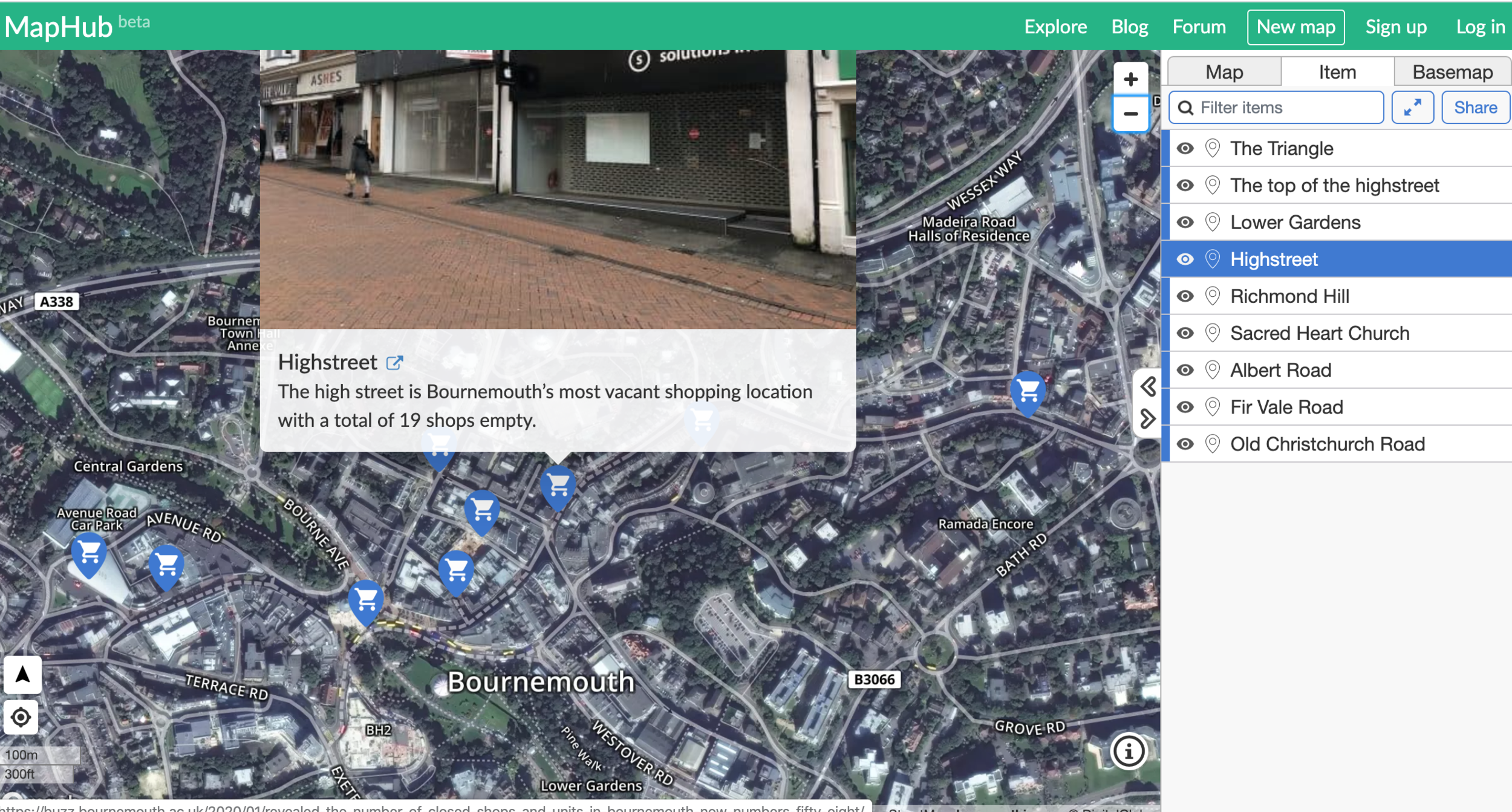
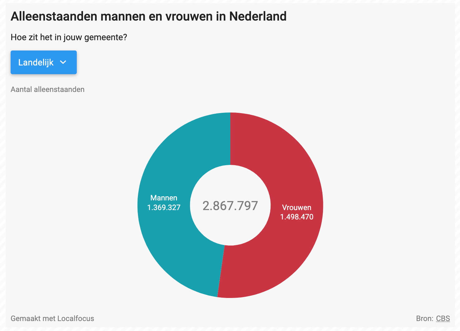
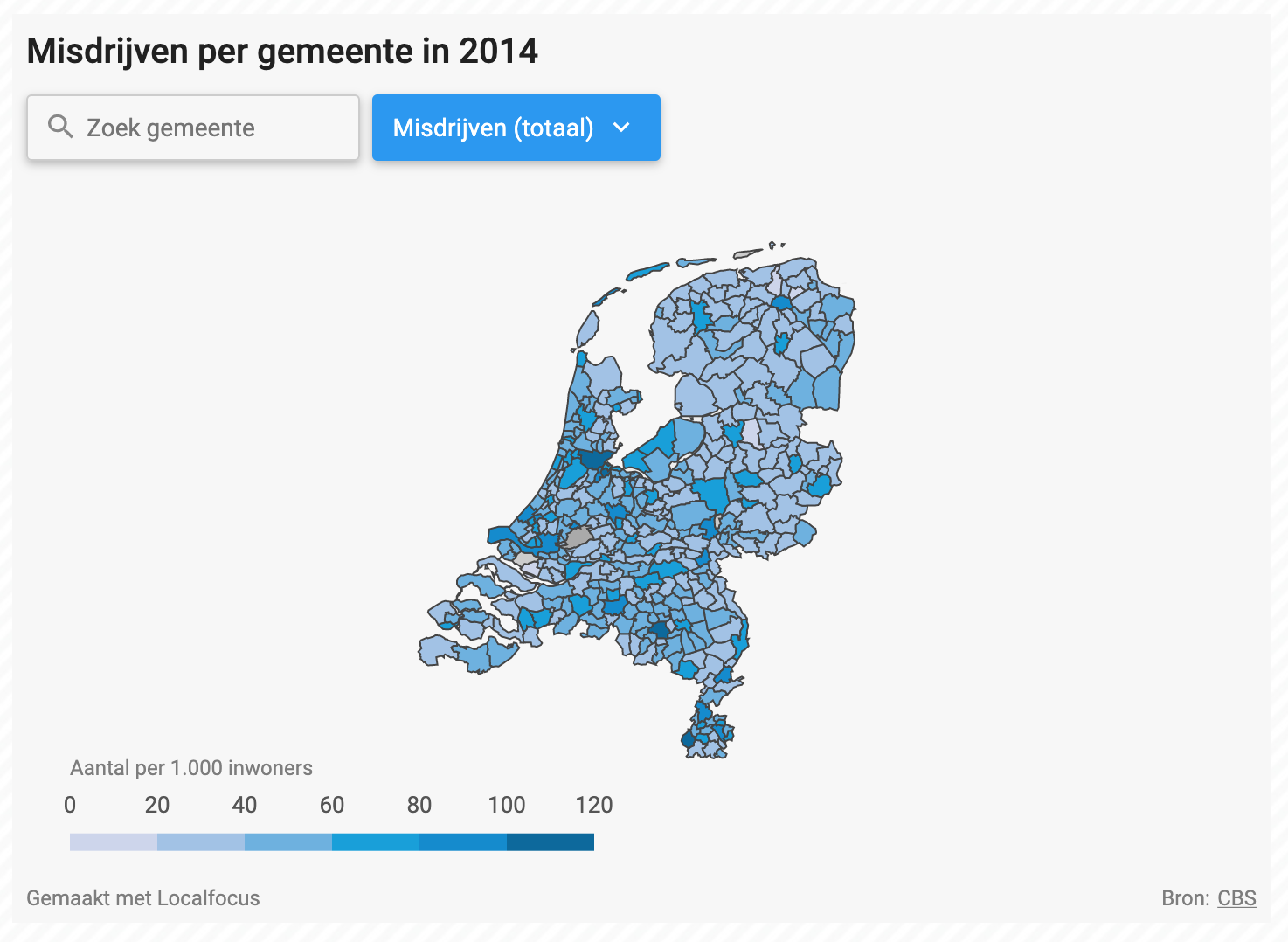
5. Interactive maps and infographics
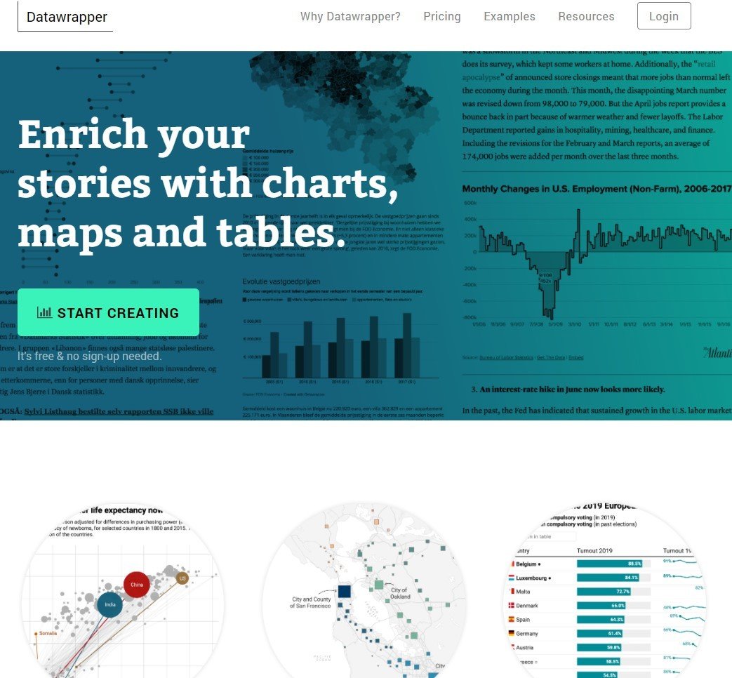
via LocalFocus or datawrapper or Flourish

Need more tools?
-
SPJ Journalist's Toolbox
-
Journalism Tools door @ezraeeman (OpenVRT)
-
Storylab (info is not recent)
-
Koninklijk Instituut voor de Tech&Tools (Fontys)
- Explainer video via Powtoon
- Tips from the New York Times to start your own infographic brainstorm
ASSIGNMENT
Work in Illustrator AND/OR
Experiment with a plug & play tool
to visualise a dataset
* choose your own level of difficulty
* test the tool (on WordPress) before you start
Existing or
new feature
* it's your choice
One idea
DATAVISUALISATION
By Sandra Busselot
DATAVISUALISATION
3IJOU


