CSS


Responsive Web Design
<body>
<div data-grid>
<div class="col-10 medium-split-3 large-split-6"></div>
<div class="col-10 medium-split-3 large-split-6"></div>
<div class="col-10 medium-split-3 large-split-6"></div>
</div>
<script src=EQCSS.js></script>
</body>
The best to add a <script> after your content, before the end of your <body> tag
scope
support for IE
<script src="EQCSS-polyfills.js"></script>
{selector} is a CSS selector targeting one or many elements. Ex: #id or .class
{condition} is composed of a measure and a value.
{css} can contain: Any valid CSS rule. (Ex: #id div { color: red })
@element {selector} and {condition} [ and {condition} ] { {css} }
Element Queries can be based on more than just the width or height of the browser as well, you can change styles in a number of different conditions (such as min-width, max-width, min-height and max-height), like how many lines of text or child elements an element contains.
FONT
FONT
/* ----------- Laptops ----------- */
@media screen and (min-device-width: 1200px) and
(max-device-width: 1600px) and
(-webkit-min-device-pixel-ratio: 1) {
h2 {
text-align: center;
font-size:200%;
}
}
/* ----------- Iphone6 ----------- */
@media only screen and (min-device-width: 375px) and
(max-device-width: 667px) and
(-webkit-min-device-pixel-ratio: 2) {
h2 {
text-align: center;
font-size: 200%;
}
}
FONT
FONT
@element '[content-box]' and (max-width: 200px) {
$this h2 {
text-align: center;
font-size: 200%;
}
}
@element '[content-box]' and (max-width: 400px) {
$this h2 {
text-align: center;
font-size: 200%;
}
}
Element Query Conditions
WIDTH-BASED CONDITIONS
min-width in px | %
max-width in px | %
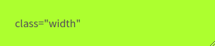
@element ".minwidth" and (min-width: 300px) {
.minwidth {
background: greenyellow;
}
}
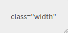
@element ".maxwidth" and (max-width: 300px) {
.maxwidth {
background: greenyellow;
}
}
HEIGHT-BASED CONDITIONS
min-height in px | %
max-height in px | %
@element ".maxheight" and (min-height: 200px) {
.maxheight {
background: greenyellow;
}
}
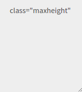
@element ".maxheight" and (max-height: 200px) {
.maxheight {
background: greenyellow;
}
}
COUNT-BASED CONDITIONS
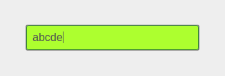
@element ".mincharacters" and (min-characters: 35) {
.mincharacters {
background: greenyellow;
}
}
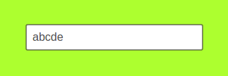
@element ".maxcharacters" and (max-characters: 35) {
.maxcharacters {
background: greenyellow;
}
}
min-characters
max-characters
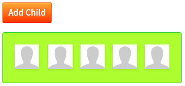

@element ".minchildren" and (min-children: 5) {
.minchildren {
background: greenyellow;
}
}
@element ".maxchildren" and (max-children: 5) {
.maxchildren {
background: greenyellow;
}
}
min-children
max-children
@element ".minlines" and (min-lines: 5) {
.minlines {
background: greenyellow;
}
}
@element ".maxlines" and (max-lines: 5) {
.maxlines {
background: greenyellow;
}
}
min-lines
max-lines

SCROLL-BASED CONDITIONS
min-scroll-y
max-scroll-y
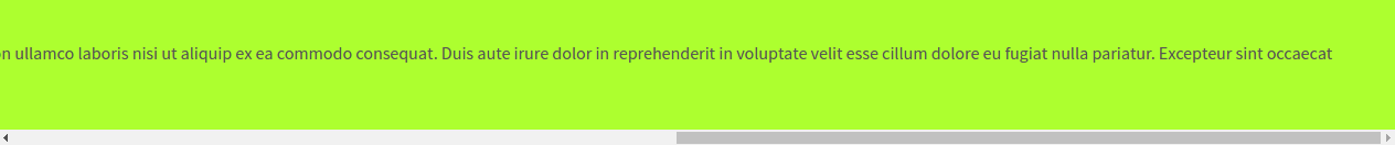
@element ".min-scroll-y" and (min-scroll-y: 50%) {
.min-scroll-y {
background: greenyellow;
border-color: limegreen;
}
}
min-scroll-x
max-scroll-x
@element ".min-scroll-x" and (min-scroll-x: 50%) {
.min-scroll-x {
background: greenyellow;
border-color: limegreen;
}
}
META SELECTORS
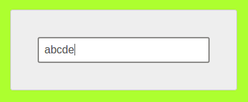
@element ".this-selector input" and (min-characters: 5) {
$this {
background: greenyellow;
}
}
@element ".parent-selector input" and (min-characters: 5) {
$parent {
background: greenyellow;
}
}
@element ".root-selector input" and (min-characters: 5) {
$root {
background: greenyellow;
}
}
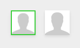
@element ".next-selector" {
$next {
border: 2px solid limegreen;
}
}
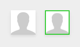
@element ".prev-selector" {
$prev {
border: 2px solid limegreen;
}
}
OPENING THE PORTAL BETWEEN JAVASCRIPT AND CSS
@element "strong" {
$this:after {
content: ' eval("new Date().getFullYear()")';
}
}
@element "em" {
$this:after {
content: ' eval("window.innerWidth+' x '+window.innerHeight")';
}
}
deck
By sasiporn


