


Kristofer Giltvedt Selbekk
I'm a full stack engineer that just happens to love React, CSS and front end in general
Basic stuff and cool stuff
By Kristofer Selbekk / Bekk / 2015
Table layouts |
|||
|
Navigation
|
Remember when every web page looked like this?It was not a very fun experience. |
Here's a random picture too. |
|
"Cascading Style Sheets (CSS) is a style sheet language used for describing the look and formatting of a document written in a markup language." - Wikipedia
"Lets you define a set of styles to a set of elements" - Me
selector {
    property: value;
}span {
color: dark-gray;
}A type of element
.big {
   font-size: 150%;
}
A class of elements
A specific element
#order-info {
    line-height: 120%;
    color: teal;
}.important,
.blushing {
color: red;
}Make one block of styles apply to different selectors
h1, h2, h3, h4, h5 {
    border-bottom: 1px solid green;
}
As many as you want, actually!
table .big {
    font-size: 130%;
}
Any descendants
table > .big {
    font-size: 120%;
}
Direct descendants
All elements
* {
    padding: 0;
    margin: 0;
}.nav-link + .spacer {
height: 10px;
}Next sibling
.nav-link ~ h3 {
    margin-bottom: 10px;
}
Previous sibling
<!-- html -->

<h3>Nav title</h3>
<a href="#" class="nav-link">Link</a>
<div class="spacer"></div>
<h3>Another nav title</h3>
<div class="spacer"></div>Select based on the "state" of the selector
Pseudo-simple to use
a {
    color: blue;
}

a:hover, a:focus {
    text-decoration: underline;
}

a:visited {
    color: purple;
}Attribute selectors
input[type=email] {
    background-color: #eee;
}
More pseudo-selectors
.order:first-of-type {
    font-size: 200%;
}

tbody tr:nth-of-type(odd) {
    background: #eee;
}
More: bit.ly/bring-selectors
How CSS resolves conflicting selectors
What is being shown?
<!-- html -->

<div class="hippie-colors" id="my-hippie-div">
    What color will I be?
</div>
/* CSS */
div.hippie-colors {
background-color: cyan;
color: pink;
}
div#my-hippie-div {
background-color: yellow
color: green;
}Count 'em up and add them
Inline: 1-0-0-0
ID: 0-1-0-0
Class / Attribute / Pseudo: 0-0-1-0
Element: 0-0-0-1
Examples:
a {
    /* Specificity: 1 */
}

a:hover {
    /* Specificity: 1 + 10 = 11 */
}

a.big {
    /* Specificity: 1 + 10 = 11 */
}

a.big:hover {
    /* Specificity: 1 + 10 + 10 = 21 */
}

#order-button {
    /* Specificity: 100 */
}A few tricks
Why it means trouble
Tips
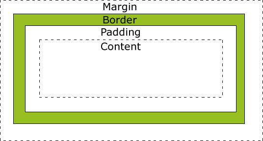
Use box-sizing: border-box; (IE8+)
or
wrap in a container
Let me teach you how to layout
Every element has a default!
<!-- block level elements -->

<div>...</div>
<h1>...</h1>
<p>...</p>

<!-- inline elements -->

<em>...</em>
<strong>...</strong>
<a>...</a>And every element can be overridden!
a.nav-link {
    display: block;
}

div.wannabe-span {
    display: inline;
}Available values:
display: block;         /* Block level element */
display: inline;        /* Inline element */
display: inline-block;  /* Inline element with width & height */
display: table;         /* Behave like a table */
display: none;          /* Pretend like i'm not here */

display: flex;          /* The future */
...and lots more @ bit.ly/bring-display
display: block;
When you want a block of content
When you want to float
When you want a width and height
display: inline;
When you want an element to behave like a chunk of text
When you don't care about the width
display: inline-block;
When you want display: inline; but want a width
When you don't want to float
display: table | table-cell;
When you want to center vertically
display: flex | inline-flex;
When you are in the future and they have decided on the behavior
More at bit.ly/bring-flexbox
display: none;
When you want to pretend an element isn't there
Tip:
visibility: hidden;
And when to use them
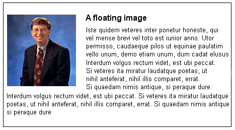
Originally meant to make text wrap around images, like this:
But is instead used for layouts, which leads to trouble
Syntax
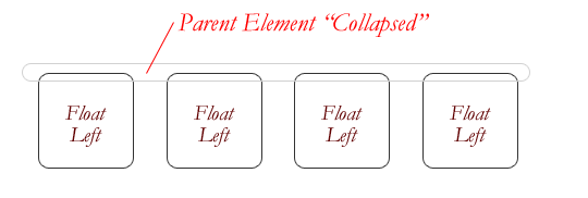
float: left | right | none;Clearing
clear: left | right | both | none;Controls the behavior of floats
Rarely work as "expected"
Introducing Clearfix™
.clearfix:before,
.clearfix:after {
    content:"";
    display:table;
}
.clearfix:after {
    clear:both;
}
.clearfix {
    zoom: 1;
}Other ways of clearing floats:
/*  With a specific <div class="clearfix"> element
    after your floated elements
 */

.clearfix {
    clear: both;
}

/* Or on the element containing the floats */

.container {
    overflow: auto;
}Hard to use
Typically not used as intended
Inconsistencies between browsers
Same behavior as floats, no clearing!
But requires a hack in IE 7
.float {
    display: inline-block;
    *display: inline;
    *zoom: 1;
}When a regular layout doesn't work
When you want to escape the rest of the page
Available values
position: static; /* Default */
position: relative; /* Stay in flow */
position: absolute; /* Relative to nearest positioned container */
position: fixed; /* Relative to viewport */

position: sticky; /* Future */
Place with top, right, bottom, left
Different styles for different viewports
Example
.container {
    width: 800px;
    margin-left: auto;
    margin-right: auto;
}

@media only screen and (max-width : 320px) {
    .container {
        width: 100%;
        margin: 10px 0;
    }
}
More at bit.ly/bring-mediaqueries
Amazing effects if used correctly
Used for user feedback
Downgrades well
Example
.order {
    background-color: #fff;
    transition: all 0.5s ease-out;
}

.order.selected {
    background-color: #eee;
}
Tip: use ease-out!
Great with transitions
Create great effects that renders well
Use with caution!
Example
.order {
    transform: rotate(-3deg);
}

.order:nth-of-type(odd) {
    transform: rotate(3deg);
}

.instagram-order {
    filter: sepia(.5);
}Tutorial at bit.ly/bring-text-selection-color
::selection {
  background: #ffb7b7; /* WebKit/Blink Browsers */
}
::-moz-selection {
  background: #ffb7b7; /* Gecko Browsers */
}Tutorial at bit.ly/bring-text-selection
.unselectable {
    -webkit-user-select: none;  /* Chrome all / Safari all */
    -moz-user-select: none;     /* Firefox all */
    -ms-user-select: none;      /* IE 10+ */

    /* No support for these yet, use at own risk */
    -o-user-select: none;
    user-select: none;
}
Viewport units
Tutorial at bit.ly/bring-viewport-units
.fullscreen {
    width: 100vh;
    height: 500px; /* fallback for old people */
    height: 100vh;
}Because CSS is code, too!
Basic rules to live by
Write reusable classes
Minimize use of #ids
Write small files and concatenate
Refactor when needed
Change HTML? Clean up CSS!
By Kristofer Giltvedt Selbekk


