Planning My Ancillary Products
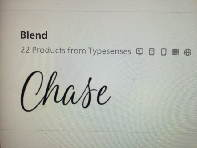
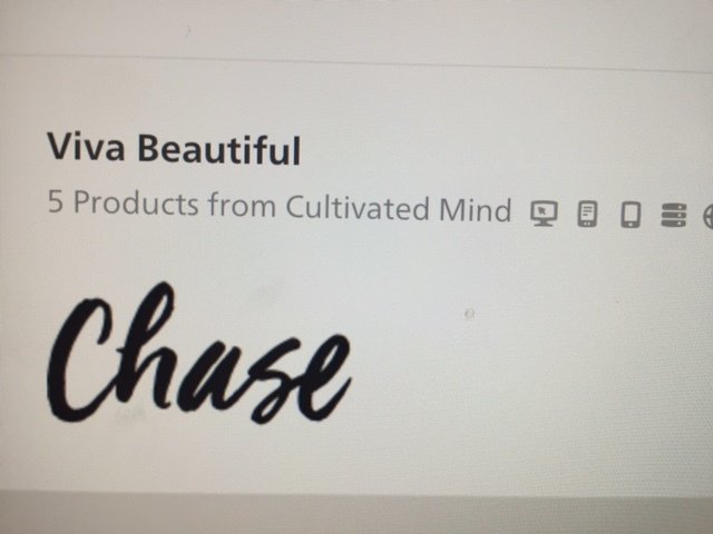
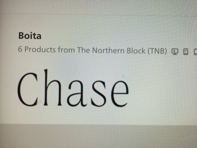
Album Name Font Style
For the album name I wanted the font to differentiate from the font the artists name will be. Therefore I chose a more swirly, feminine font to make it more visually interesting. Additionally, I got inspiration from one of Lorde's album covers.
The final font that I will be using on my digi-pak and advert.
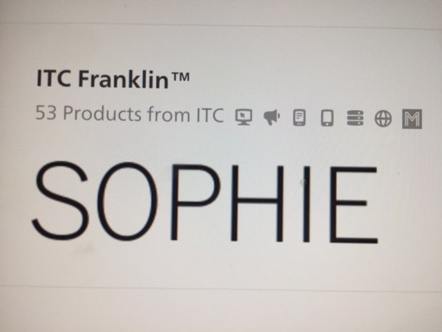
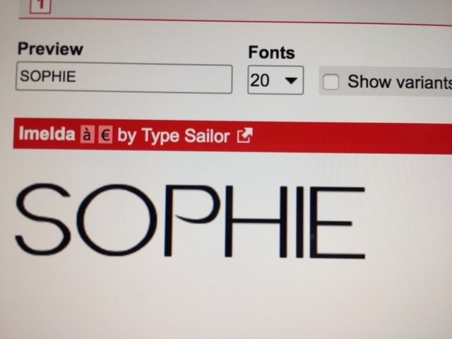
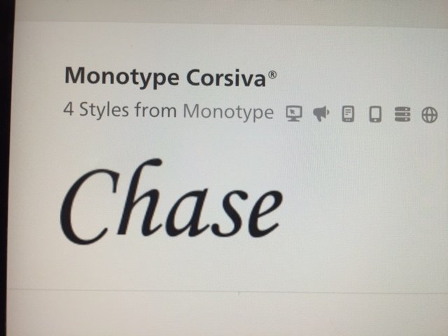
Artists Name Font Style
The font style of the artists name is typical of the Indie Pop genre therefore it allows the connotations of the genre to be represented to the reader. Through research the connotations of the Indie Pop genre shows the artists font style to be simple, edgy and bold.
The final font that I will be using on my digi-pak and advert.
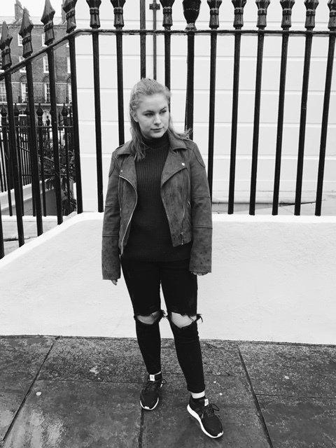
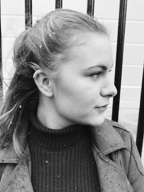
Tester Shots


These angles of the artist will be shown on the outer font and back covers of the digi-pak. Sophie's outfit, hair and make-up will remain the same. Also the location, which will be in front of the railings.
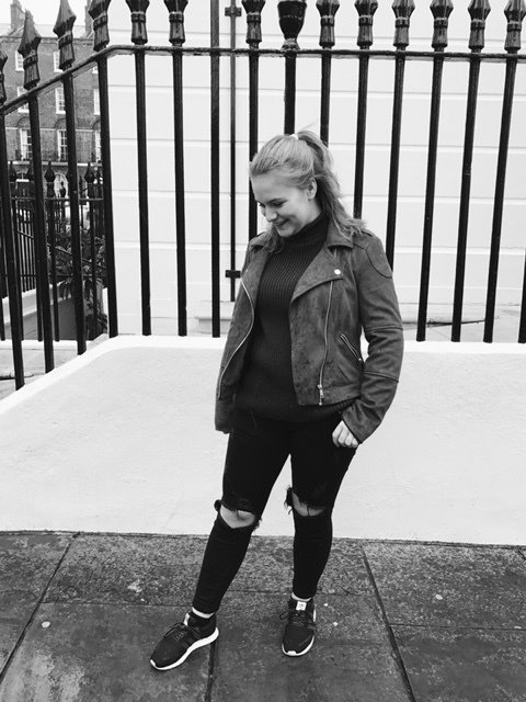
Tester Shots
These angles of the artist will be on the inside panels of the digi-pak. Sophies outfit will remain the same and also the location will be the same.

Planning My Ancillary
By Selina Dennis


