#FramerLondon
sponsors

Silvia
freelance, Munich
#framerlondon
3 years!
- @ustwo, @lastminute, @facebook, @google, @microsoft, @carwow, @trainline, @deliveroo, @wearehive, @farfetch, @pivotal
- 500+ members
- Looking for speakers on motion design, illustrations, service design, typography. Looking for venues
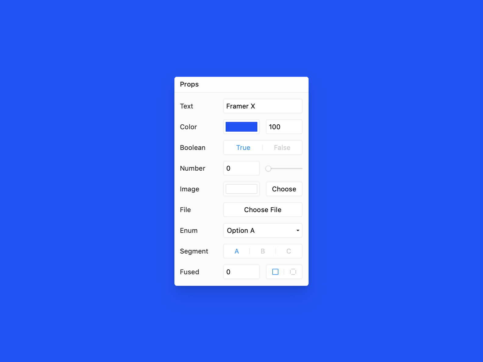
Embedding your code-based design system in Framer X
import * as React from "react";
import { PropertyControls, ControlType } from "framer";
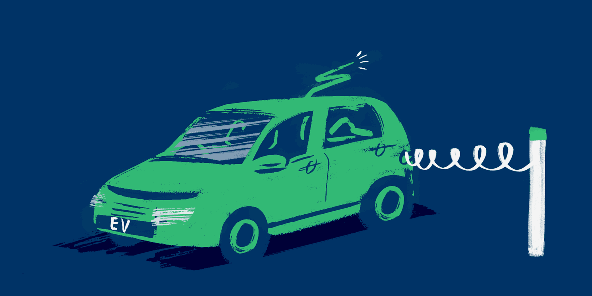
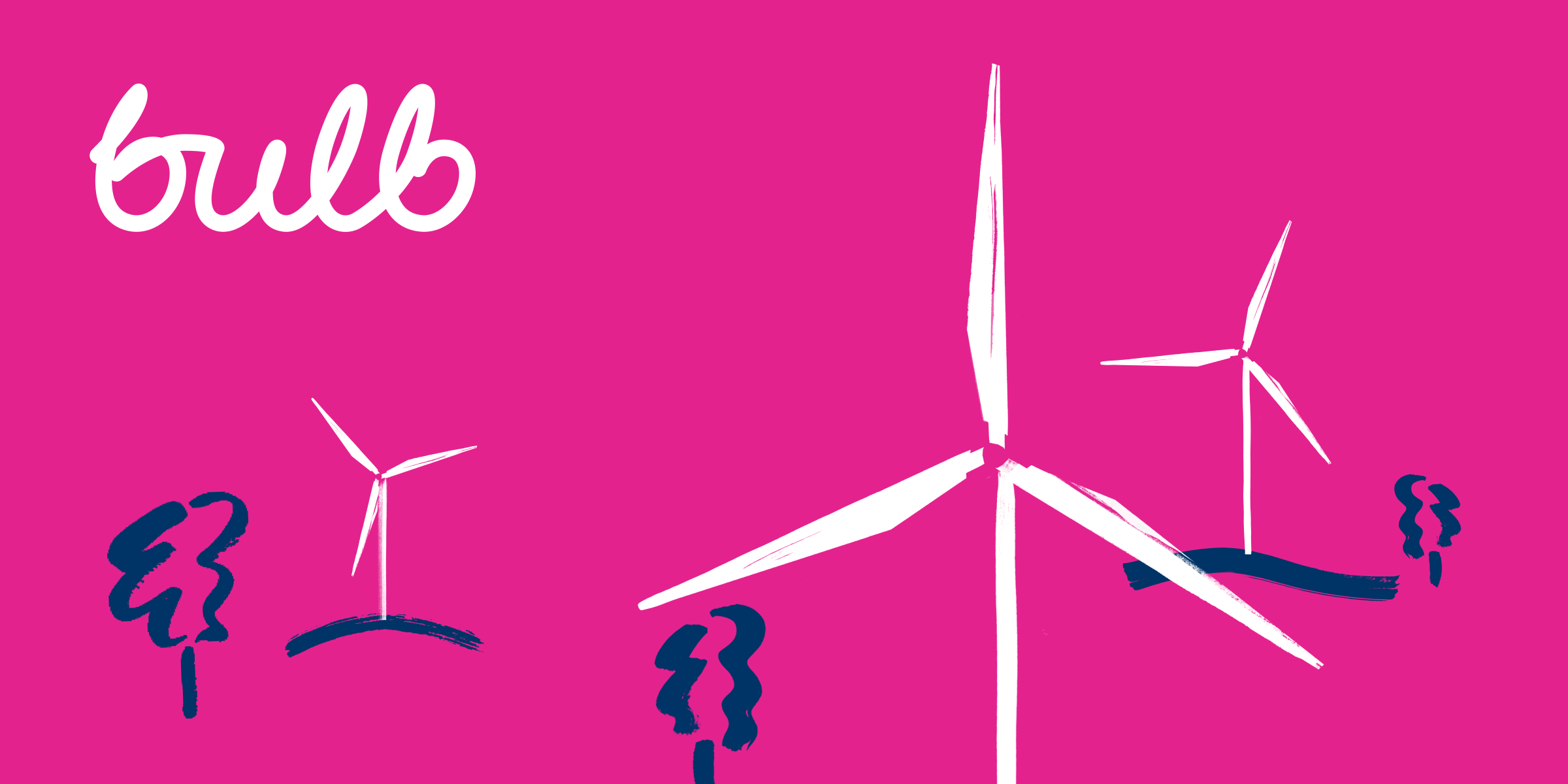
import { Button } from "@bulb/design/";
export class NewButton extends React.Component {
render() {
return (
<Button >
some text
</Button>
);
}
}
import * as React from "react";
import { PropertyControls, ControlType } from "framer";
import { Button } from "@bulb/design/";

interface Props {
  text: string;
}

export class NewButton extends React.Component {
  static defaultProps = {
    text: "Click me"
  };

  static propertyControls: PropertyControls<Props> = {
    text: { type: ControlType.String, title: "Button label" }
  };

  render() {
    const { text } = this.props;
    return (

        <Button >
          {text}
        </Button>

    );
  }
}
import * as React from "react";
import { PropertyControls, ControlType } from "framer";
import { Checkbox } from "@bulb/design";

interface Props {
  text: string;
  checked: boolean;
}

export class checkbox extends React.Component {
  static defaultProps = {
    text: "check me",
    checked: false
  };

  static propertyControls: PropertyControls<Props> = {
    text: { type: ControlType.String, title: "Label" },
    checked: { type: ControlType.Boolean, title: "Checked" }
  };

  render() {
    const { text, checked } = this.props;
    return (
      <Checkbox
        checked={checked}
        label={text}

      />
    );
  }
}
import * as React from "react";
import { PropertyControls, ControlType } from "framer";
import { SvgIcon } from "@bulb/design/styles/Iconography";

interface Props {
  name: string;
  color: string;
  width: number;
  height: number;
}

export class icon extends React.Component {
  static defaultProps = {
    name: "warning",
    color: "#000"
  };

  static propertyControls: PropertyControls<Props> = {
    name: { type: ControlType.String, title: "Icon name" },
    color: { type: ControlType.Color, title: "Color" }
  };

  render() {
    const { name, width, height, color } = this.props;

    return (
      <SvgIcon
        width={this.props.width}
        height={this.props.height}
        name={name}
        color={color}
      />
    );
  }
}
import * as React from "react";
import { PropertyControls, ControlType } from "framer";
import { Dropdown } from "@bulb/design/modules/Dropdown";

interface Props {
  name: string;
  color: string;
  width: number;
  height: number;
  errorMessage:string;
  options: [];
  status:string;
}

export class DropDown extends React.Component {
  static defaultProps = {
    status:"unknown"
  };

static propertyControls: PropertyControls<Props> = {
  label: { type: ControlType.String, title: "Label" },
  errorMessage: { type: ControlType.String, title: "Error Message" },
  options: {
    type: ControlType.Array,
    propertyControl: { type: ControlType.String },
    defaultValue: ["example"]
  },
  status: {
      type: ControlType.SegmentedEnum,
      title: "Status",
      options: ["unknown", "invalid", "valid"],
      optionTitles: ["default", "error", "success"]
    }
};

  render() {
    const { status, label, errorMessage, options, labelHeading } = this.props;

    return (
      <Dropdown label={label} status={status} onChange={(e) => console.log(e.target.value)} errorMessage={errorMessage}>
     {options.map(o => <option>{o}</option>)}  </Dropdown>
    );
  }
}
Framer London November
By Sergey Voronov


