Conventions of a Double Page Spread.
Text
By Sheriden Salmons.

A Main Image/DirectAddress
A main image can be used for direct address, as the photographer is aiming to achieve an engagement with the audience of the magazine. Normally the main image and the text relate.
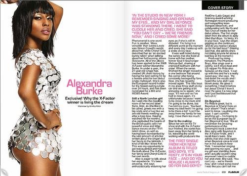
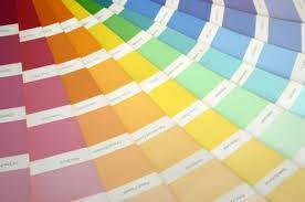
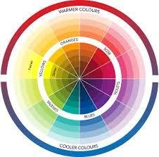
Colour Scheme.
Colour schemes can go either way; the colours can either go with the colours on the front of the magazine however they could follow a different scheme completely to reflect the own content that is being talked about.
By-Lines.
By-lines are used so that the audience can see who has written the text, taken the images

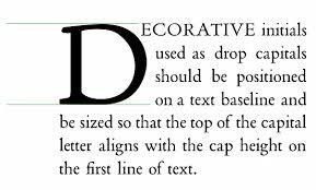
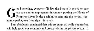
Drop Capital
Drop Capital is important as it introduces the start of the article. Also the very first paragraph has a Drop Capital, as the introducing letter.
Captions
Double page spreads have captions on who has taken the images and who has written the article that has been produced.
Headline
The Headline is used to make the double page spread article stand out so that the target audience will read the the article.
Title Text
Lorem ipsum dolor sit amet, consectetur adipiscing elit. Morbi nec metus justo. Aliquam erat volutpat.
Conventions of a double-page spread.
By sheriden
Conventions of a double-page spread.
This slide is to illustrate the conventions that are used in a double page spread from a listings magazine. This also convey's what type of conventions I need to include in my double page spread based on my media brief.