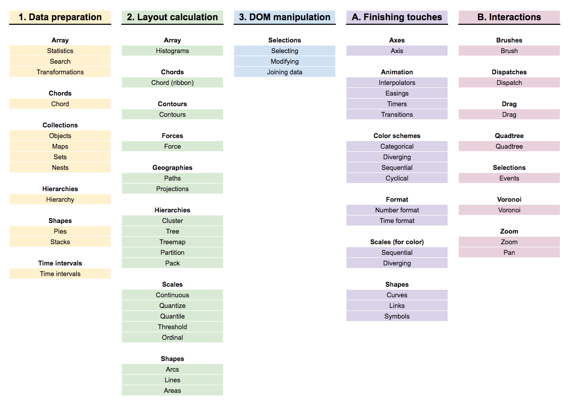
Creative
Data visualizations
Shirley Wu
(an idealized lol)
dataviz workflow
get data → explore data → design → code/make
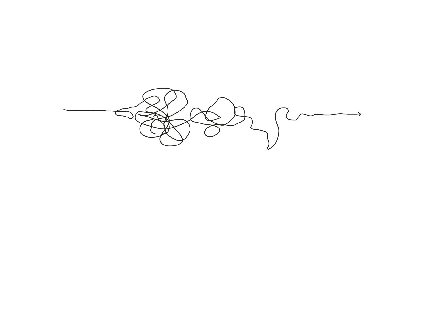
(my actual lol)
dataviz workflow
↑
get data
↑
explore
data
↑
design
🔄
↑
code/make

so over the years, I've refined a process and collected tools to reduce the time it takes to finish a project
but everyone's process is a little bit different. I offer my process as a starting point, but feel free to experiment and see what works for you.
let's get started →
get data
collect your own data
✨
find pre-existing data
Notebooks/phones
Excel
APIs
↓
more intimately understand dataset
get data
collect your own data
find pre-existing data
look for outliers, missing values, duplicates
↘ ↙
start with a curiosity!
↘ ↙
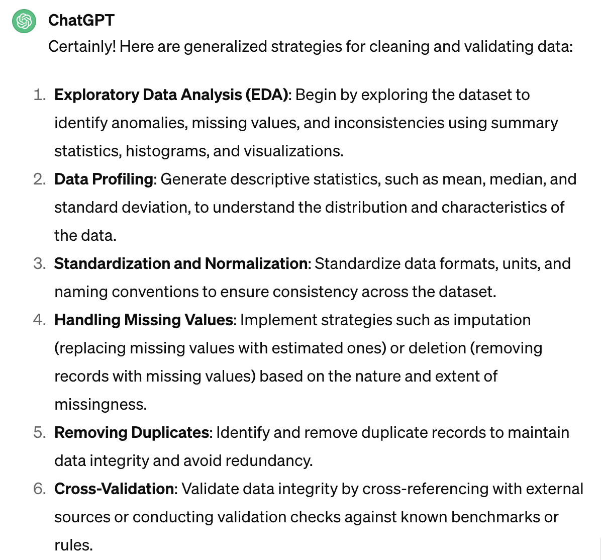
clean & validate your data
Excel
R, Python
Charts
ChatGPT
explore data
- List data attributes
- Ask questions
- Explore the data
explore data:
data types
- Categorical (movie genres)
- Ordinal (t-shirt sizes)
- Quantitative (ratings/scores)
- Temporal (dates)
- Spatial (cities)
exercise
List all the attributes,
ask all the questions!
explore data:
some basic Chart types
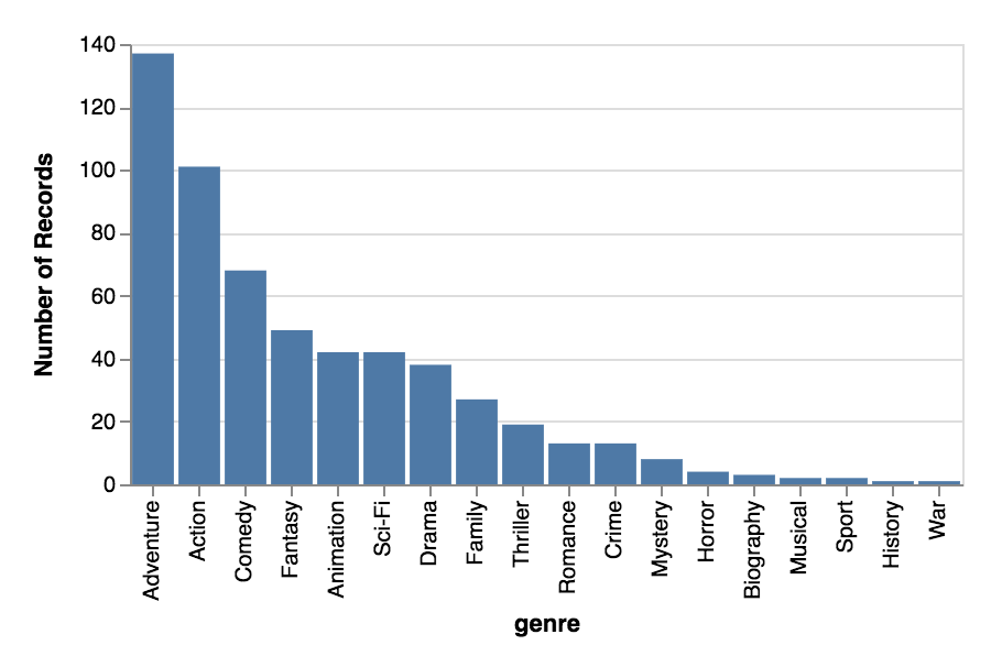
Bar chart
For categorical comparisons
Domain: categorical
Range: quantitative
EXPLORE DATA:
some basic Chart types
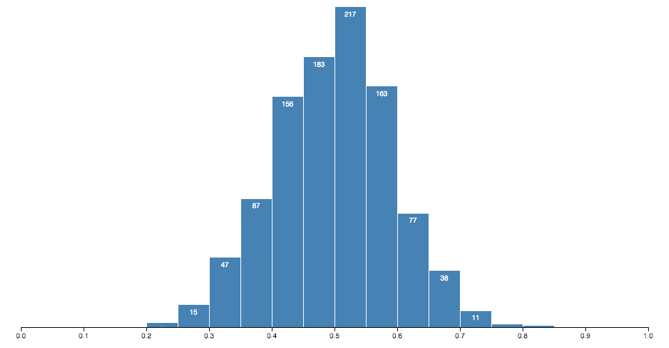
Histogram
For categorical distributions
Domain: quantitative bins
Range: frequency of quantitative bin
EXPLORE DATA:
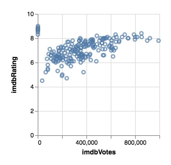
some basic Chart types
Scatterplot
For correlation
2 categories, and the relationship between their quantitative values
EXPLORE DATA:
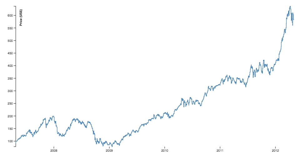
some basic Chart types
Line chart
For temporal trends
Domain: temporal
Range: quantitative
EXPLORE DATA:
tools
how to choose charts:
charting tools:
Excel
R, Python
⚠️ ChatGPT
exercise
Brainstorm some charts
to answer the questions.
Quickly sketch them
and how you'd map the data.
explore data:
advice for bigger datasets
- Check for missing data, and the validity of the data
- Focus on one question at a time (it's very easy to get sidetracked with a tangent)
- If there IS an interesting tangent, make a note for later
- If the question leads to a dead-end, explore another question or the tangent you found earlier
- Don't be afraid to go out and look for additional data to aid your exploration
- Sometimes, no interesting pattern IS very interesting
data to design
- Concentrate on the takeaways to communicate across
- What does that mean in terms of the data? (Individual or aggregate elements? Which attributes?)
- Map the relevant data to visual elements
Design:
marks & channels
Map individual or
aggregate data
elements to marks.
Map data attributes
to channels.
Design:
marks

Visualization Analysis and Design. Tamara Munzner, with illustrations by Eamonn Maguire. A K Peters Visualization Series, CRC Press, 2014.
Design:
channels
Visualization Analysis and Design. Tamara Munzner, with illustrations by
Eamonn Maguire. A K Peters Visualization Series, CRC Press, 2014.

Quantitative
- Position
- Size
- Color
Categorical
- Shape
- Texture
- Color
Temporal
- Animation
Design:
marks & channels
Visualization Analysis and Design. Tamara Munzner, with illustrations by
Eamonn Maguire. A K Peters Visualization Series, CRC Press, 2014.

mark
bar
channels
x: category
y: quant
mark
point
channels
x: quant
y: quant
mark
point
channels
x: quant
y: quant
color: category
mark
point
channels
x: quant
y: quant
color: category
size: quant
Design:
channel effectiveness
Visualization Analysis and Design. Tamara Munzner, with illustrations by
Eamonn Maguire. A K Peters Visualization Series, CRC Press, 2014.

Design:
marks & channels
-
One-to-one mapping of data to channel
-
Multiple mappings of channel to mark (x, y, size, color usually)
-
Do not EVER map multiple data attributes to the same channel
readability
Titles, descriptions, and legends
to explain the visualization
Axes and annotations
to describe the data
Resource:
Visual metaphors
Simulated Dendrochronology of U.S. Immigration 1790-2016
United States gun death data visualization
(cw: gun deaths)
Poppy Field - Visualising War Fatalities
(cw: war, death)
exercise
Create a more refined sketch, keeping in mind marks, channels, and visual metaphors
Design:
Advice
- Always keep your audience in mind, and what you are trying to communicate
- Most of these are guidelines, not strict rules—but be intentional when you choose not to follow them
- Always test your intuition by asking for feedback
design to code
-
Break it down! What do you need to draw the marks? What do you need to calculate the channels?
-
To draw marks: SVG (or HTML5 Canvas)
-
To calculate channels: D3 scales, shapes, and layouts (or straight-up math!)
SVG Elements
rect
x: x-coordinate of top-left
y: y-coordinate of top-left
width
height
circle
cx: x-coordinate of center
cy: y-coordinate of center
r: radius
text
x: x-coordinate
y: y-coordinate
dx: x-coordinate offset
dy: y-coordinate offset
text-anchor: horizontal text alignment
Hi!
path
d: path to follow
Moveto, Lineto, Curveto, Arcto
code:
D3 api
For translating raw data to what SVG needs to draw
Take output of layout calculations and draw SVG elements
Sometimes all you need are scales to get from data to screen space
Often times, you may need specific layouts.
These output x/y positions


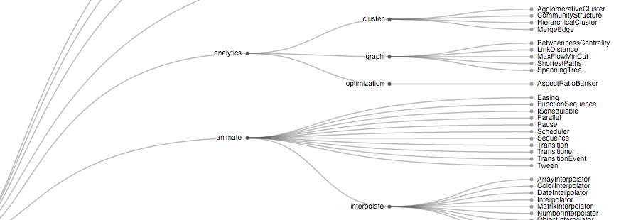
And these generate path commands

Great dataviz-specific interactions
more svg for
context & aesthetics
- Patterns
- Gradients
- Text on a path
- SVG filters
(blurs, drop-shadows) - Clipping & masking


code:
advice
code:
d3 alternatives
↰
← great for interactivity
← great for prototyping
resources
Books:
The Functional Art by Alberto Cairo
Online:
Data Visualization Society
Information is Beautiful Awards
Creative data visualizations (2024)
By Shirley Wu