Building custom
data visualizations
Shirley Wu
My Fem workshops
Coming from React:
Data Visualization
for React Developers
↓
Intro to D3
↓
Building Custom
Data Visualizations
From elsewhere:
Intro to D3
↓
Building Custom
Data Visualizations
↓
(maybe)
Data Visualization
for React Developers
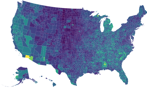
custom data visualizations can be categorized into two broad categories:
EXPOSITORY
VS.
EXPLORATORY
expository
- static dataset
- explore data for story
- communicate story to audience
exploratory
- dynamic dataset
- interview stakeholders
- build tool for stakeholders to explore the data
examples:
New York Times, The Pudding, The Washington Post, etc.
examples:
scientific visualizations, internal business tools at Netflix, Uber, Airbnb, etc.
expository

Data: top 10 blockbusters every year for the last two decades
Goal: come up with a design and implement it together
(Yay participation!)
Data exploration
with Observables
and Vega-Lite
↓
Design with
and Gestalt Laws
↓
Code with
and D3 shapes, layouts
↓
Finish with
data exploration
data exploration:
How to use observables
| To load external libraries: | d3 = require('d3') |
| To write text: | md ` ... ` |
| To set global variable: | globalVar = ... |
| To write a block of javascript code: | { ... } |
| To create an SVG element: | { const svg = DOM.svg(width, height) ... return svg; } |
data exploration:
data types
- Categorical (movie genres)
- Ordinal (t-shirt sizes)
- Quantitative (ratings/scores)
- Temporal (dates)
- Spatial (cities)
data exploration

data exploration:
some basic Chart types
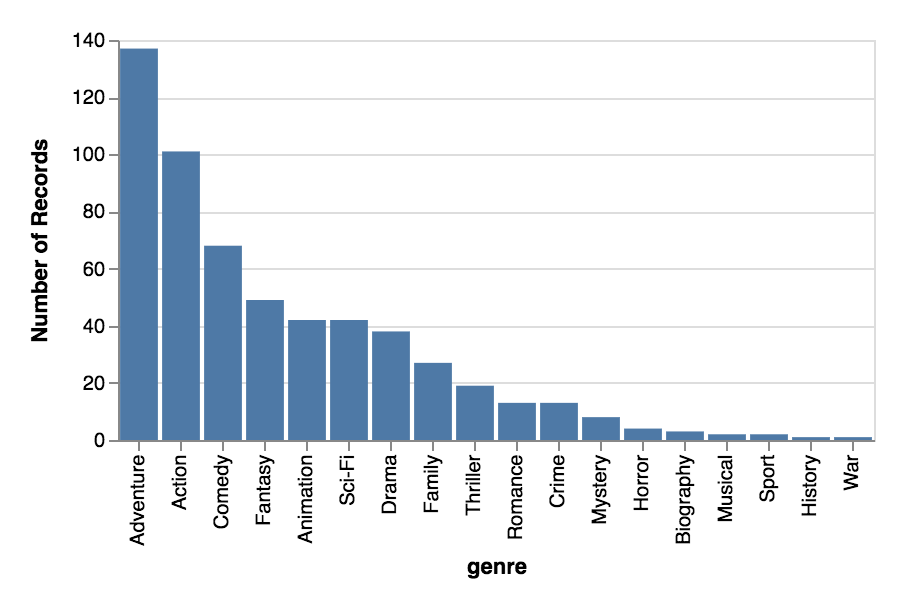
Bar chart
For categorical comparisons
Domain: categorical
Range: quantitative
data exploration:
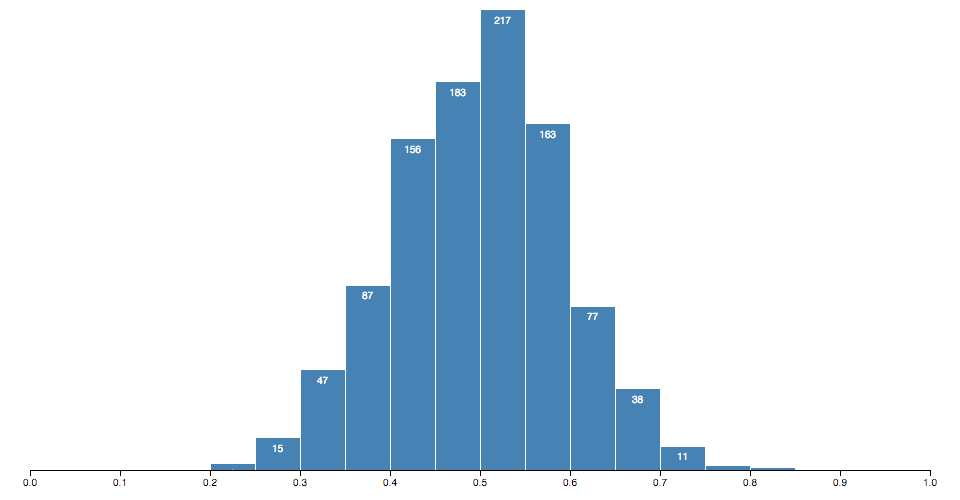
some basic Chart types
Histogram
For categorical distributions
Domain: quantitative bins
Range: frequency of quantitative bin
data exploration:
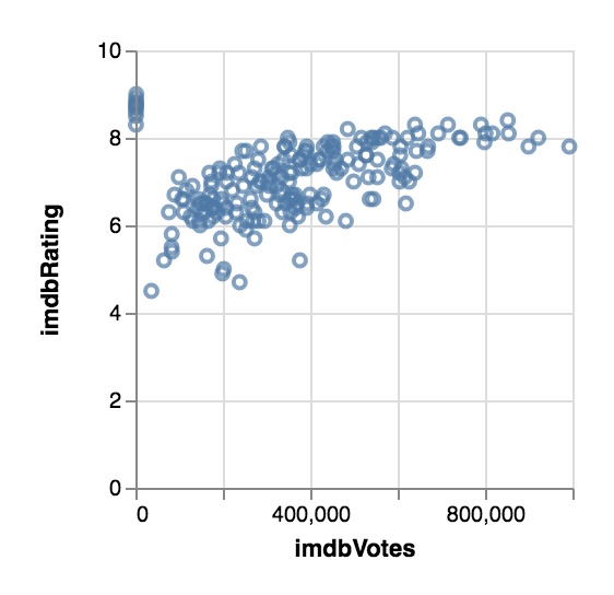
some basic Chart types
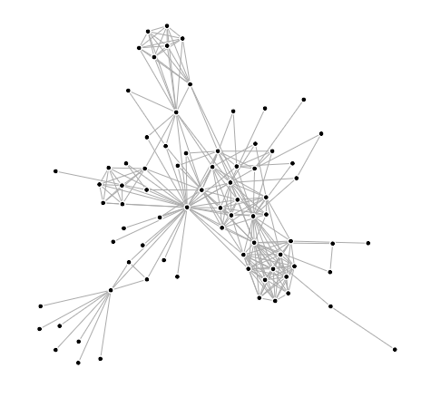
Scatterplot
For correlation
2 categories, and the relationship between their quantitative values
data exploration:
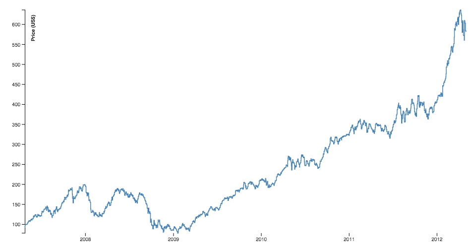
some basic Chart types
Line chart
For temporal trends
Domain: temporal
Range: quantitative
data exploration:
vega-lite
A grammar of
interactive graphics
- Data source
- Mark (tick, bar, point, line, etc.)
- Encoding (x, y, color, etc.)
- For each encoding: type, field
data exploration
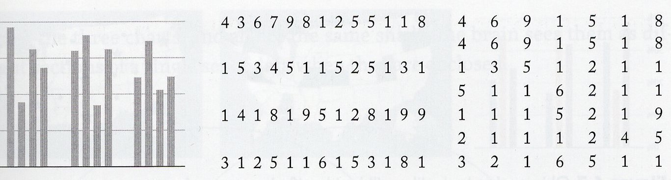
Brainstorm some charts
to answer the questions.
data exploration:
exercise (together)

data exploration:
advice
- Check for missing data, and the validity of the data
- Focus on one question at a time (it's very easy to get sidetracked with a tangent)
- If there IS an interesting tangent, make a note for later
- If the question leads to a dead-end, explore another question or the tangent you found earlier
- Don't be afraid to go out and look for additional data to aid your exploration
- Sometimes, no interesting pattern IS very interesting
Translate from
data to design
- Concentrate on the takeaways to communicate across
- What does that mean in terms of the data? (Individual or aggregate elements? Which attributes?)
- Map the relevant data to visual elements
Design:
marks & channels
Map individual or
aggregate data
elements to marks.
Map data attributes
to channels.
Design:
marks

Visualization Analysis and Design. Tamara Munzner, with illustrations by Eamonn Maguire. A K Peters Visualization Series, CRC Press, 2014.
Design:
channels
Visualization Analysis and Design. Tamara Munzner, with illustrations by
Eamonn Maguire. A K Peters Visualization Series, CRC Press, 2014.

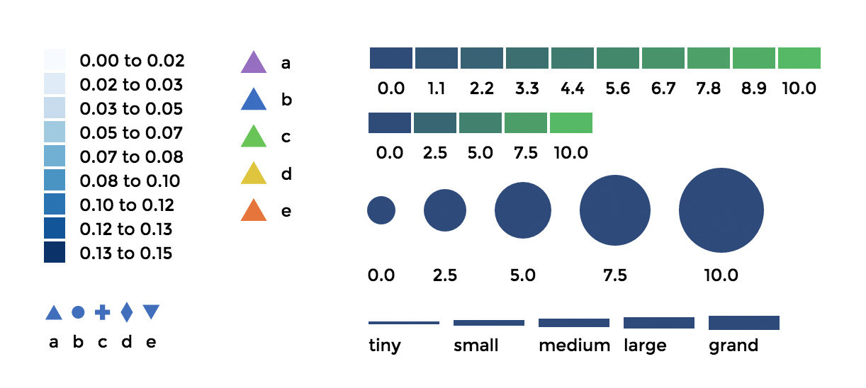
Quantitative
- Position
- Size
- Color
Categorical
- Shape
- Texture
- Color
Temporal
- Animation
Design:
marks & channels
Visualization Analysis and Design. Tamara Munzner, with illustrations by
Eamonn Maguire. A K Peters Visualization Series, CRC Press, 2014.

mark
bar
channels
x: category
y: quant
mark
point
channels
x: quant
y: quant
mark
point
channels
x: quant
y: quant
color: category
mark
point
channels
x: quant
y: quant
color: category
size: quant
Design:
channel effectiveness
Visualization Analysis and Design. Tamara Munzner, with illustrations by
Eamonn Maguire. A K Peters Visualization Series, CRC Press, 2014.

Design:
marks & channels
-
One-to-one mapping of data to channel
-
Multiple mappings of channel to mark (x, y, size, color usually)
-
Do not EVER map multiple data attributes to the same channel
Design:
Gestalt laws of grouping
the human mind naturally
groups individual elements
into patterns
↓
use in data visualization to
save processing time
Design:
Gestalt laws of grouping
Proximity
Put related objects near each other
(The Functional Art, Ch. 6 by Alberto Cairo)
Design:
Gestalt laws of grouping
Similarity
Indicate like objects (helpful if they can't be placed close to each other)

(The Functional Art, Ch. 6 by Alberto Cairo)
Design:
Gestalt laws of grouping
Enclosure
Helpful when creating visualizations with multiple sections

(The Functional Art, Ch. 6 by Alberto Cairo)
Design:
remix & overlay
"You don’t always need to start from scratch, remix what’s out there already"
- Nadieh Bremer

But make sure they're the right visuals to communicate your message!
design:
exercise
Sketch all the things!
- What is your main message(s)?
- What marks will you use? Do they represent individual data points, or aggregate?
- What channels will your marks use? How do they support your message?

code:
design to code
-
Break it down! What do you need to draw the marks? What do you need to calculate the channels?
-
To draw marks: SVG (or canvas)
-
To calculate channels: D3 scales, shapes, and layouts (or straight-up math!)
SVG Elements
rect
x: x-coordinate of top-left
y: y-coordinate of top-left
width
height
circle
cx: x-coordinate of center
cy: y-coordinate of center
r: radius
text
x: x-coordinate
y: y-coordinate
dx: x-coordinate offset
dy: y-coordinate offset
text-anchor: horizontal text alignment
Hi!
path
d: path to follow
Moveto, Lineto, Curveto, Arcto
code:
D3 api
For translating raw data to what SVG needs to draw
Take output of layout calculations and draw SVG elements
Sometimes all you need are scales to get from data to screen space
Often times, you may need specific layouts.
These output x/y positions


And these generate path commands

Great dataviz-specific interactions
Code:
exercise (TOGETHER)
Implement the designs!

Each curve represents a movie
-
x: release date
-
y: box office relative to mean
readability
Titles, descriptions, and legends
to explain the visualization
Axes and annotations
to describe the data
READABILITY:
axes & legends
d3-legend by Susie Lu
READABILITY:
Annotations
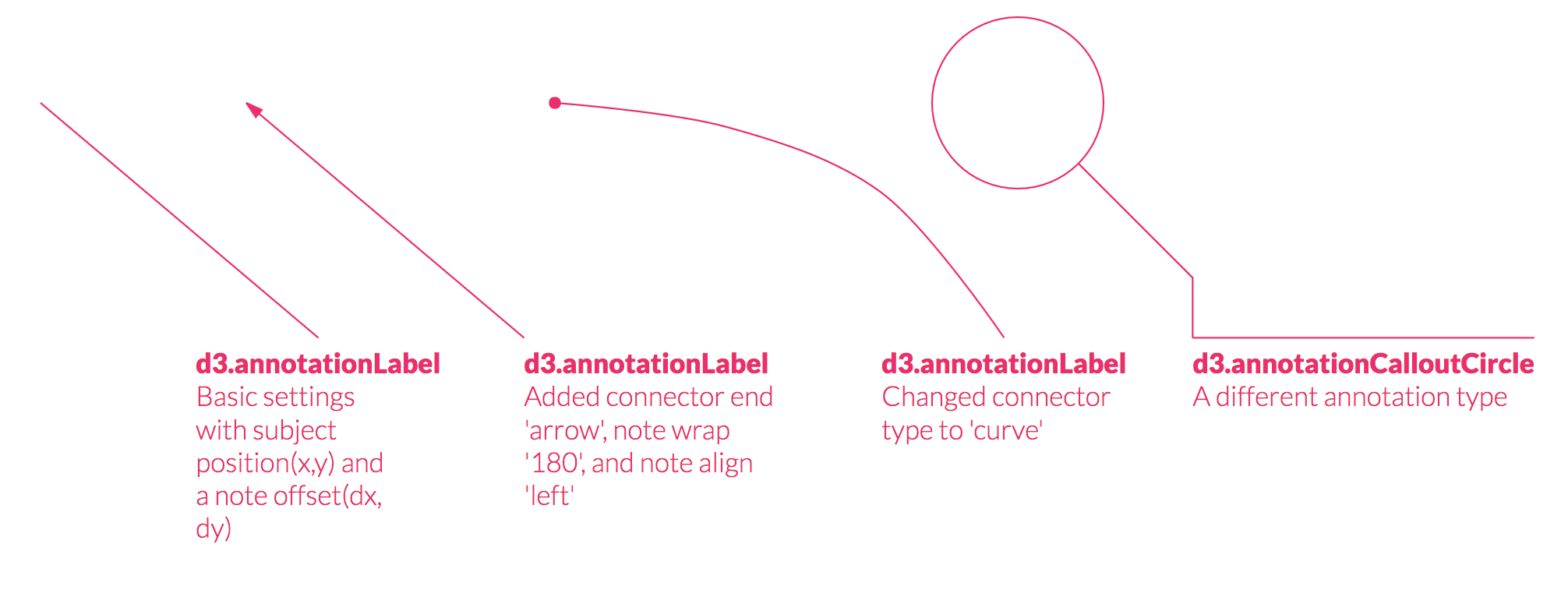
d3-annotation by Susie Lu
READABILITY:
exercise (TOGETHER)
Implement the designs!
- Add axes
- Add legends
- Add annotations

more svg for
context & aesthetics
- Patterns
- Gradients
- Text on a path
- SVG filters
(blurs, drop-shadows) - Clipping & masking


more svg:
exercise (TOGETHER)
Implement the designs!
- Add textures for holidays
- Add dropshadow to movies

interactions
D3:
hover, click, and
other simple interactions
D3 & React (or similar):
- Update after user manipulation of underlying data
- Link multiple visualizations
- Exploratory tools (filtering, aggregating)
final
visualization

exploratory
Process (at Netflix with Susie & Elijah):
- Initial meeting with stakeholders to figure out most important questions
- Meeting with data engineers
- Mock-up in sketch, sandbox with Semiotics, see shape of data
- Prototype, iterate with stakeholders
exploratory
Advice (from Netflix):
- Different data sources, often SQL queries → plan for queries that take longer (important for interactions)
- Questions for stakeholders:
- What's the business question they're trying to answer?
- How do the metrics they're comparing fall into a decision?
exploratory
Advice, cont.:
- Level of aggregation that's most effective for decision making:
- Get it to ~7 things that are granular and meaningful enough
- If not, top 10 of a default
- Gain trust and credibility within org
- Have to compete with tables of data (detailed but hard to read)
- People will get to a state you never designed for, so think through edge cases
resources
Books:
The Functional Art by Alberto Cairo
Visual Analysis and Design by Tamara Munzner
Online:
The little of visualization design
Information is Beautiful Awards
Thank you's
Lisa Rost
Nadieh Bremer
Susie Lu
Elijah Meeks
Beta-testers
Kristin Henry
Micah Stubbs
Radames Ajna
Santhosh Soundararajan
Nathan Harris
Dylan Wootton


Front-end Masters: Building Custom Data Visualizations
By Shirley Wu