UI component libs in Wix
wix-style-react (and more)
About Me 🙋♂️
Moshe Kerbel
FED
2 years in Wix
<Components/>


Topics for today
- The Components company and Wix's Design Systems
- Learn how to use wix-style-react
- Testing and Drivers
- New UI Order
- Other Componet Libraries
Our Misson:
Build components and empower others, in order to improve dev velocity and maintain standards
React Components
for Developers
Write React Application
Editor Elements
for Wix Users
Create a Wix site
Why do we need component libraries?
- Prevent repeated development
- Keep consistent designs and behavior
- Maintain standards across (e.g. Accessibility, SSR)
- Create new products fast
tl;dr - Quality, Consistency and Velocity
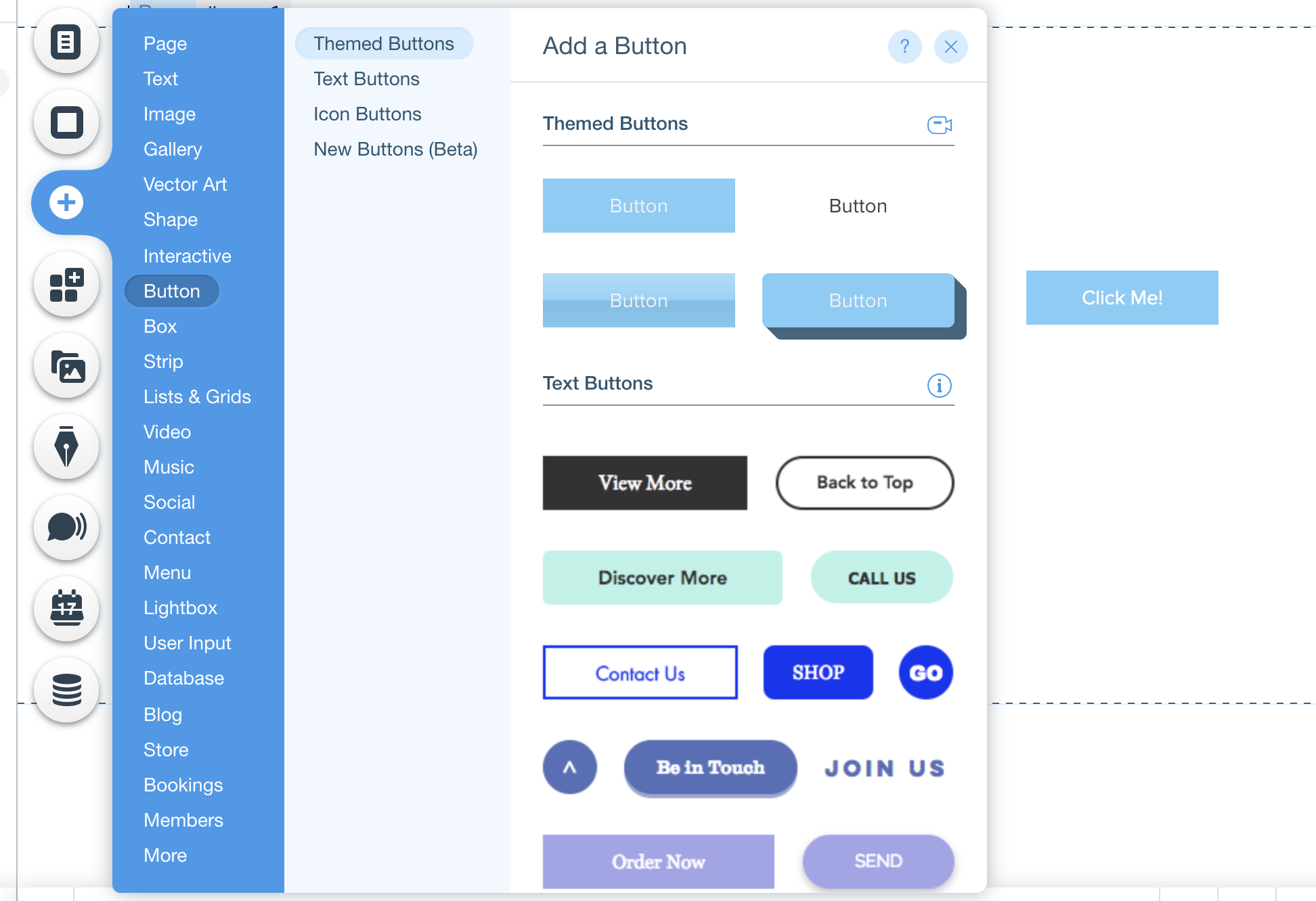
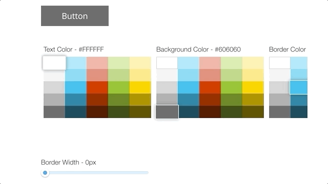
wix-style-react
A Kit of reusable, Interconnected React components that conform to the UX Backoffice Design System
wix-style-react
Our design system offers
Visual style, accessible UI components, UX patterns
Released as
React components via npm and Sketch symbols
Documented at
https://wix-style-react.com
Produced by
A system team and community contributors
In order to serve
Wix dashboard and complimentary products (tens of products)
History and statistics
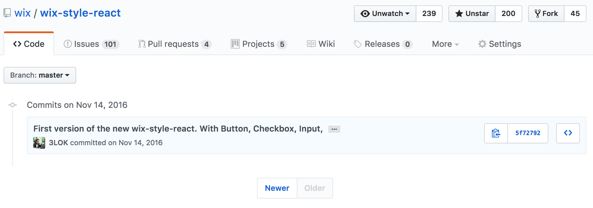
- >100 components
- > 3000 commits
- > 4000 Issues and PRs
- ~200 contributors
- >4000 releases
-
1. Foundation
-
2. Layout
-
3. Inputs
-
4. Selection
-
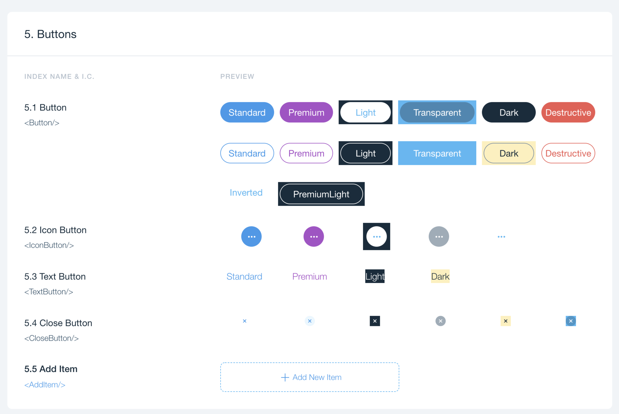
5. Buttons
-
6. Navigation
-
7. Tooltips
-
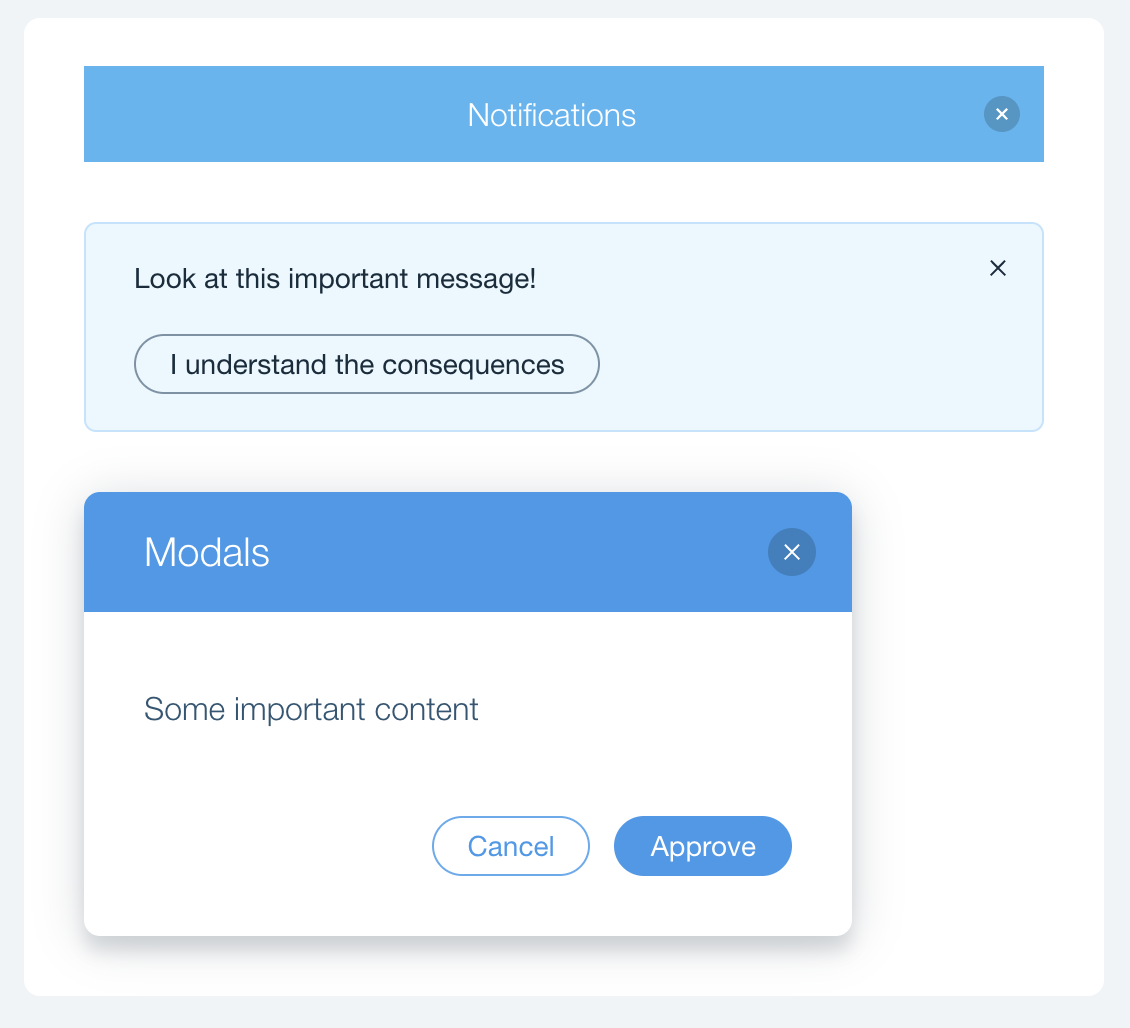
8. Notification Bars
-
9. Modals
-
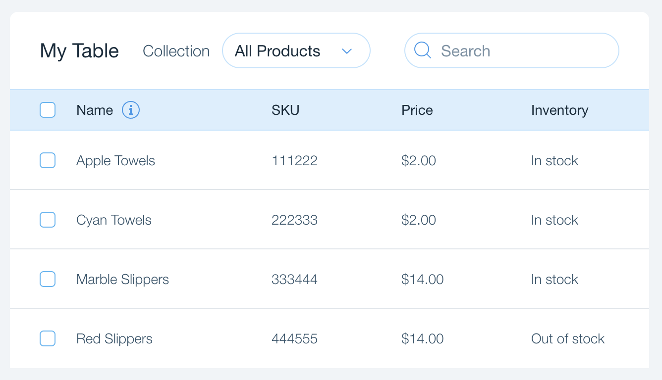
10. Tables
-
11. Other
-
12. Content Widgets
Components Families
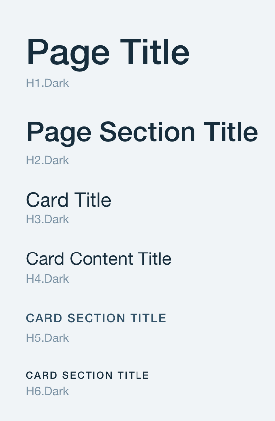
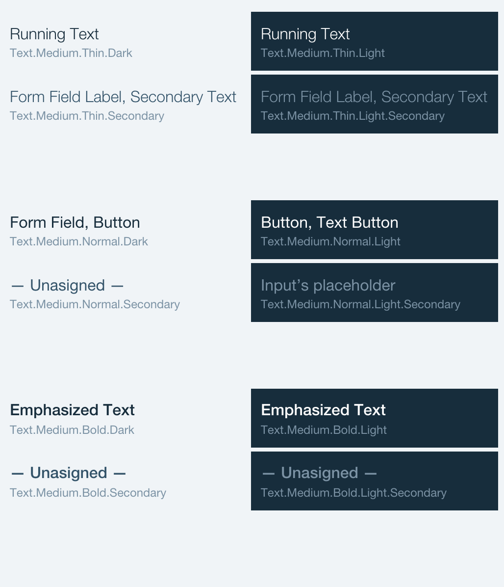
Typography
heading, text
Basic Building Blocks
inputs, selection, buttons...

Notifications
notifications, helpers, modals
Data and Content
Table
Grid System
12 column Grid with Cards
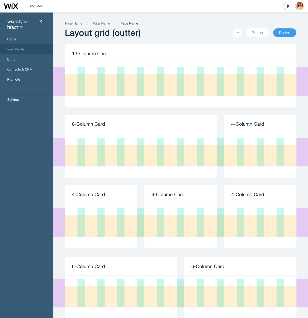
Page Layout
Real life use cases
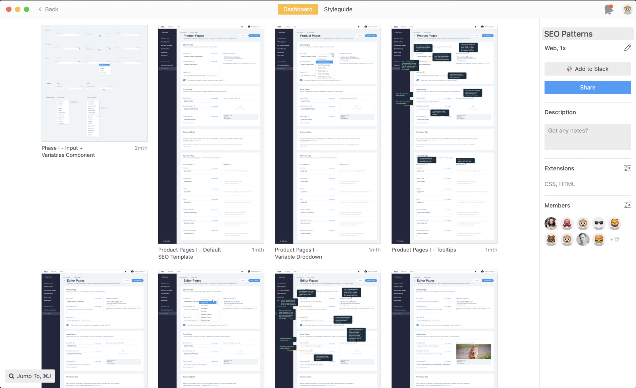
Business Manager
Guineapig
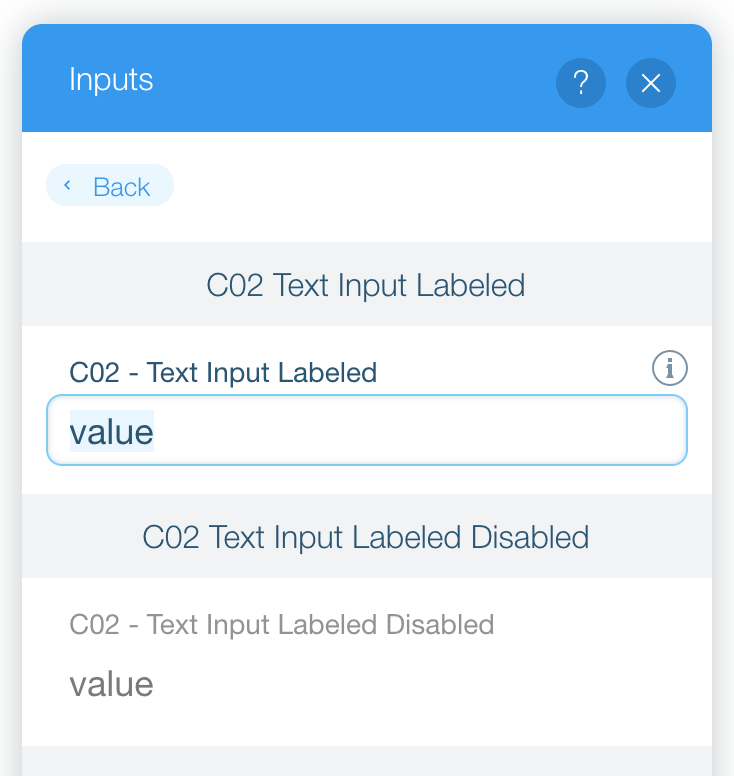
Documentation
Common Docs Pages
- Cheatsheet
- Playground
- Components
- Examples (Usage/Description)
- API
- Testkit
- Inventory (Partial)
Task #1
Learn the basics
Learn about:
- Layout
- Cards
- Basic inputs
Getting Started Tutorial
Tips and Tricks
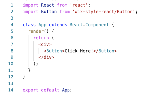
Tip #1 - How to import
Single Entry (Tree-shakable)
import {Button, Layout, Card} from 'wix-style-react';
Compound components
import {Card} from 'wix-style-react';
render(<Card.Header/>)
Tip #2 - Layout
Use Page and Grid of Cards for consistent UI layouts
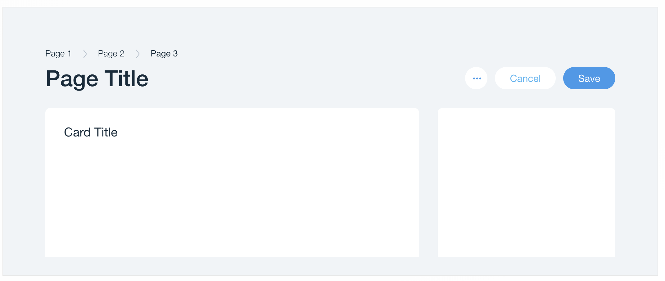
Confused about all the layout possibilities?
This doc will help you
Tip #3 - Spacing
Not everything sits on the outer Grid components
However, the design system is 6px based system
Need to space two items? use margins
6px 12px 18px
6*1px 6*2px 6*3px
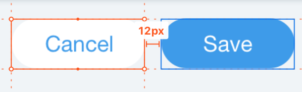
<Box/> component for the rescue!
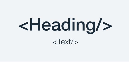
Tip #4 - Typography
From Design to Code
Designing Screens
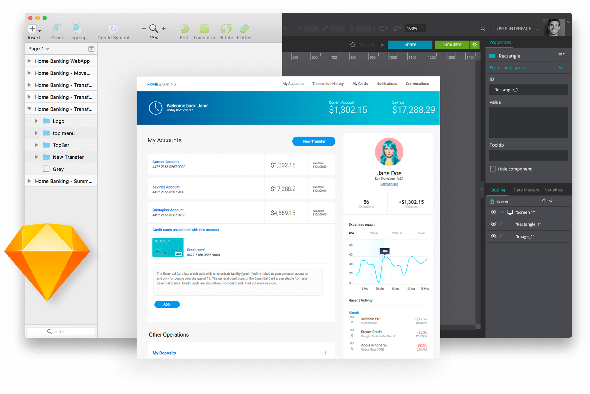
- Designers use Sketch to design screens (like Photoshop)
- Designers use Symbols to group elements (like components)
- 3.1 Text Input
- 4.5 Toggle
- 8.3 Section Helper
Sharing design

Zeplin - powerful specs!
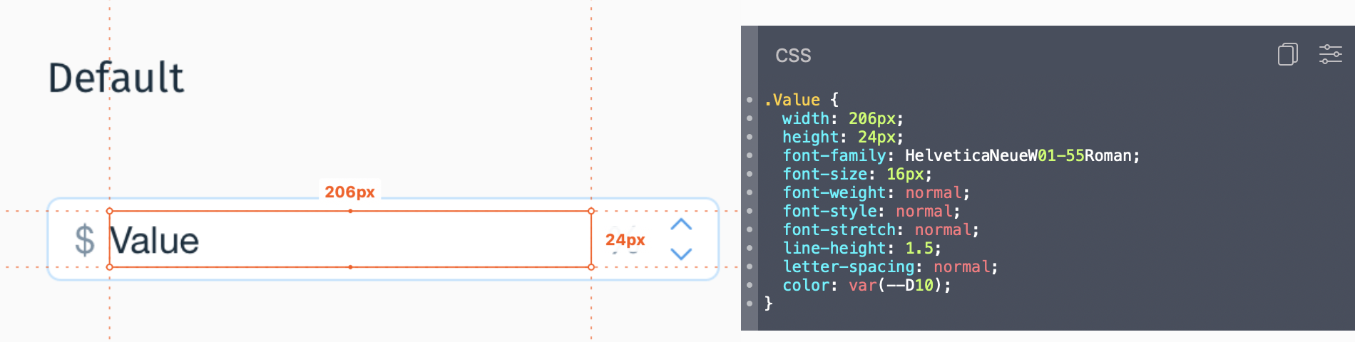
- Zeplin is awesome when developing UI components
- Zeplin isn't so awesome when developing screens...
I want Input Component, not "width: 260px"
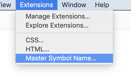
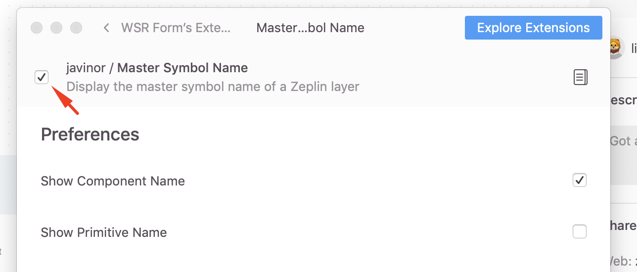
Screen 🖼 => Symbol 🎨
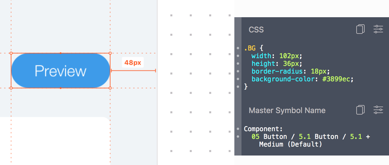
But that's not enough...
Which component is 5.1 Button - Medium?
Symbol 🎨 => Component <🧩/>
5.1 Button Medium is <Button size="medium"/> !
Using Master Symbol Name
Task #2
Create an app with wix-style-react
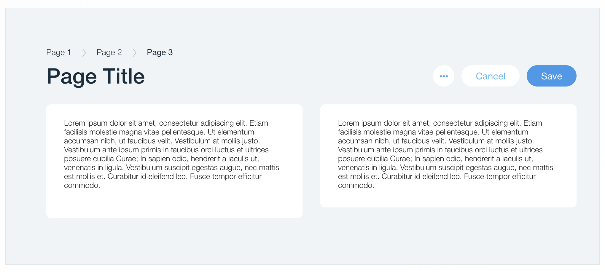
Page Anatomy
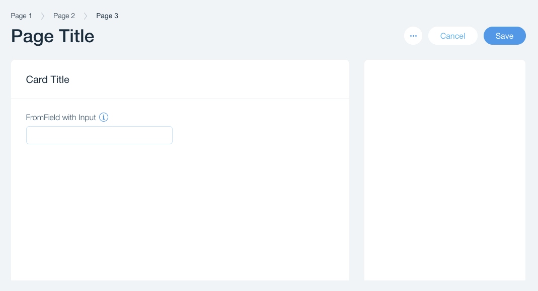
<Page/>
<Page.Header/>
<Breadcrumbs/> <PopoverMenu/> <Button/>
<Layout/>
<Cell/>
<Card/>
<Card.Header/>
<Card.Content/>
<FormField/>
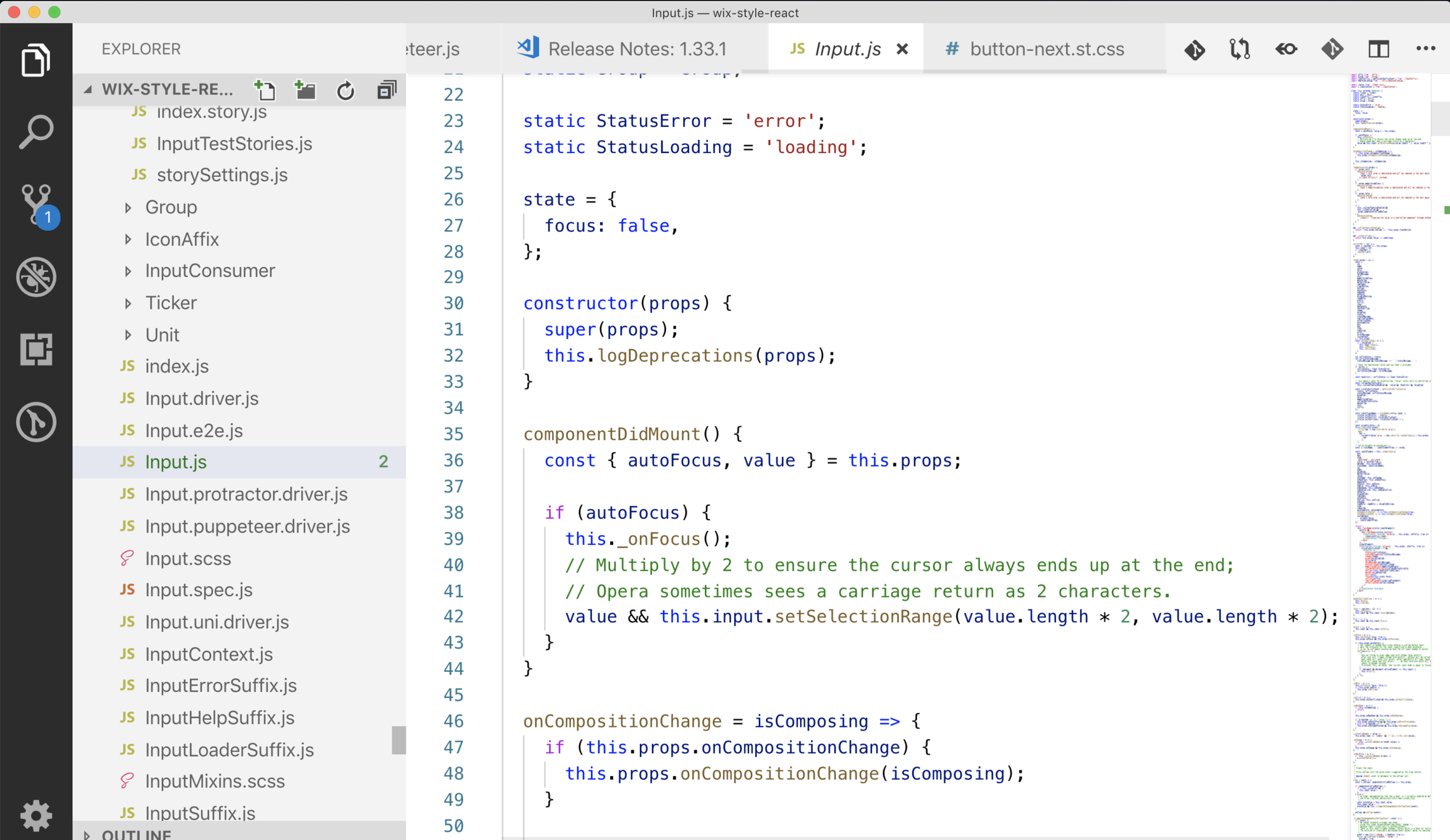
<Input/>
Zeplin Specs (App, Web) | Exercise and Solution | Demo
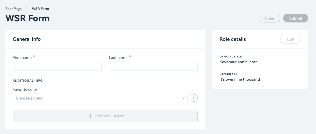
WSR Form
Testing
We've got you covered!
-
Components are thoroughly tested!
- Functionality and behavior 🧪
- Styles visual testing (using Applitools eyes 👁)
- The library supplies Testkit for the consumers of the components to interact with.
Testkits and Drivers? 🚗
Drivers are Interfaces to interact with the component in a testing environment
-
Encapsulation - Implementation details are not exposed.
-
Readable Tests - describe "what" is done instead of "how" it is done.
-
Code reuse - use the same widget driver across tests.
- Easier Refactors.
Example - Signup form
Without Driver
document.querySelector('#email').value = 'my-email@wix.com';
document.querySelector('#passowrd').value = '12345';
document.querySelector('#submit-button').click();
With driver
const driver = new SignUpDriver();
driver.typeEmail('my-email@wix.com')
driver.typePasword('12345')
driver.submitFrom();
Component Driver Abstraction
Example:
Select the 3rd item from a dropdown list:
Bad:
- click()
- pressKeyDown()
- pressKeyDown()
- pressKeyDown()
- pressKey('Enter')
Good:
- selectOption(index)
More Examples:
- getValue()
- isDisabled()
- getSelectedId()
Using WSR Drivers
- Add a dataHook to mark the element
<Input dataHook="my-input"/>
- Use the Testkit to locate element and get the driver:
import { inputTestkitFactory } from 'wix-style-react/dist/testkit';const inputDriver = inputTestkitFactory({
wrapper: baseElement,
dataHook: 'my-input',
});
-
Use the driver to interact with the component
await inputDriver.enterText('hello world');
Live Demo
- Use
- Explore
- Test
Testing Frameworks/Platforms
-
We support enzyme Puppeteer and dom
import { inputTestkit } from 'wix-style-react/dist/testkit/enzyme';
import { inputTestkit } from 'wix-style-react/dist/testkit/puppeteer';
import { inputTestkit } from 'wix-style-react/dist/testkit'
This wide platform support is achieved using Unidriver
Testing Pitfalls
-
Driver functions are asynchronous
await buttonDriver.isButtonDisabled();
-
Some drivers return other drivers
const {driver, inputDriver} = dropdownTestkitFactory({
wrapper: baseElement,
dataHook: 'my-dropdown',
});
-
Some testkit docs might be missing in the storybook - See the actual implementation in the source code
Componetns testing resources
-
Using WSR Drivers
-
Creating drivers APIs just like WSR components
- Better Testing with Component Drivers (Gabriel Grinberg)
Task #3
Test your app
Tests tasks
Test using vanilla drivers (in JSDOM env)
- Fill the form and expect the "Submitted Info" section to be displayed.
- Fill the form without a required field and expect it not to be displayed
- Bonus: Clear the form
You can fork wsr-form and use the "for-tests branch"
Life as a developer
🙆♀️ 🙆♂️
Your day flow 😉
- Get a Zeplin spec for your project
- You know which components to use
- Implement and test
- Repeat

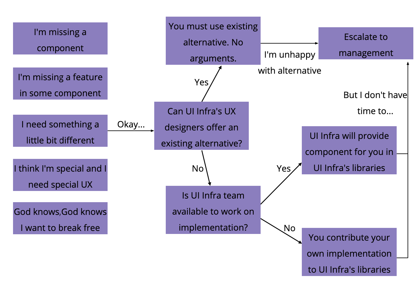
Your actual day flow 😔
- Get a Zeplin for your project
- Try to figure out which components to use
- Find only some of them in the storybook
- Implement
- Identify some issues
- Missing features in the component
- Missing components
- Different styles or sizes in the Zeplin
-
Hack your way around
- Do CSS overrides
- Build Custom UI components
Your correct day flow 😇
- Get a Zeplin for your project
- Consult with your UX which components to use
- Implement
- Identify some issues
- Insist not to develop new components locally / override css for your project.
-
Stop and check:
- My design looks different from wix-style-react?
- contact the UX for a solution - I see some bug / I need a feature.
- go to #wix-style-react
- My design looks different from wix-style-react?
How to file an issue
For UX issues or requests, ask your UX guy to fill this form:
https://docs.google.com/forms/d/e/1FAIpQLSfmdWT7dZDq2joLArVYeKSLYa2P9OkpwLJ-59OMsw6uphgjMA/viewform
For React components issues and discussions:
slack: #wix-style-react
Who's responsible to fix / add?
- UI Infra team
- Other developers
- You
New UI Order (UX and Dev)
Other libraries
(we're almost done....)
tl;dr Wix Component libs
- wix-style-react - Business Manager, backoffice, premium, composers, much more...
- wix-ui-adi - ADI Panels
- wix-ui-tpa - TPAs and Out-of-Iframe components
- wix-base-ui - Editor Panels
- wix-ui-santa - The ecosystem for integrating React components to Wix Editor/Viewer/Corvid
The Editor panels components and controls
The ADI panels components and controls
TPAs and Out-of-Iframe components
The ecosystem for integrating React components to Wix Editor/Viewer/Corvid

✍🏻 Design
🤔 Code
💪🏻 Use
Questions?
Ask anything!
Team, components, workflow, contribution...
Thank you!
About Me 🙋♂️
Shlomi Toussia-Cohen
FED
5 years in Wix
<Components/> R&D Manager
Formerly a Guild Master
Kickstart 4.0 FED Course Manager
🏍 ⛷ 😴
UI components in Wix
By Shlomi Toussia Cohen
UI components in Wix
wix-style-react, components, teskits and other ui-libs


