WatchCovidly
Team: Codepreneurs
- Sumit Raj - Senior Solutions Architect @GeoSpark
- Nitin Tiwari - Senior Backend Engineer @GeoSpark
Problem
- Lots of website showing numbers and statistics and for a common person who is already traumatized, information processing is not easy
- Feel of consuming the information was missing. How can you process an excel sheet having 30,000 rows having 5 MB?
- Scrolling through it or even searching is a pain because of similar names and locality.
- How would you know the severity of your location or your parents/relatives location?
Proposed Solution
- Plot the data on map so that consuming information is easy for even a 5 year old and for a 50 year old.
- Creates more awareness to flatten the curve than just seeing the number curve going up by letting them search for other's location.
- Fast search based on autocomplete.
- No need to search your location, just share and WatchCovidly does the rest for you.
How we did it?
Step 1: Download the public data in xls sheet.
Step 2: Data cleaning to remove noise in the data like rows not having any information or very vague information.
Step 3: Reverse geocode using Google APIs. (Address to lat/lon)
Step 4: Store the lat/lon data in MongoDB using geojson format
Step 5: Build an API to search the data and get filtered results given a lat/lon and a radius.
Step 6: Build an Interface to search location and plot results for that location.
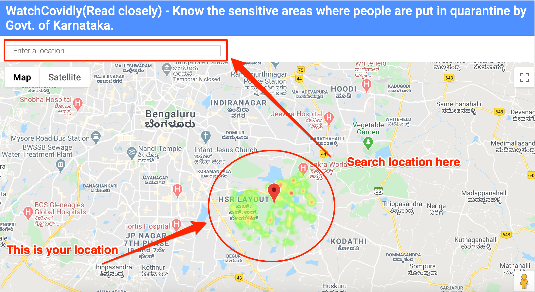
How does the solution look?
Technologies Used
- Python
- Django
- MongoDB
- Linux Hosting
- Heroku
- Google APIs
- Jquery/Bootstrap/HTML/CSS
What's next?
- Ingest more public data by government of the updated xls sheets
- Tie-up with the government of other states and request them to share the data to expand it to other states of India
- Currently it's done for Bangalore, India but if the data is shared the same system can be used by anyone in the world.
- Remove data from the visualization of people whose quarantine period is over and they are not infected.


Demo Link
WatchCovidly
By sumit12dec


