Question 2
How effective is the combination of your main product and ancillary texts?
By Natalya Zossimova
Initial Ideas and Changes
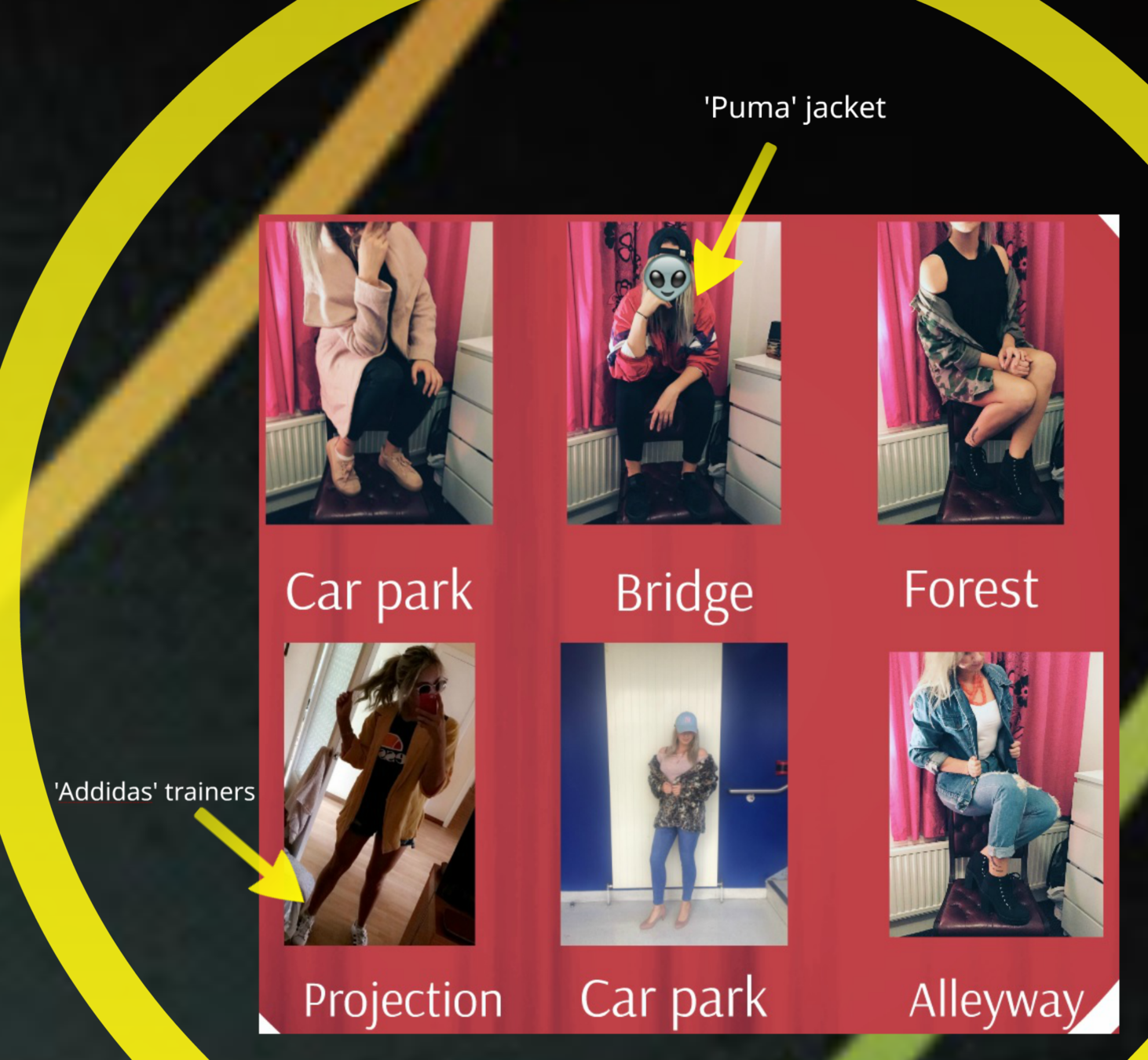
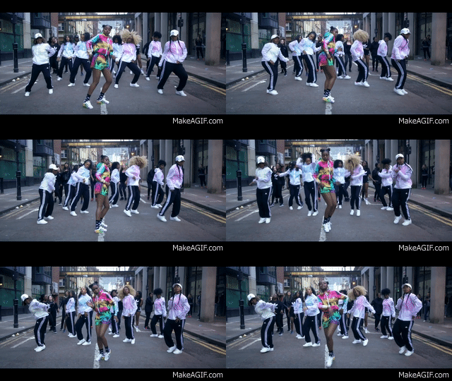
Our intial ideas were to include synergy between various sports brands, including 'Puma', 'Nike' and 'Addidas '. By doing so, the artist would be promoting the brands and showing the audience that she is trend with the latest fashion. We see this often in real media products; for example artist, Nadia Rose, uses various sports brands in her 'Skwod' music video.
Brands
Original Costumes:
'Nadia Rose - Skwod':
Initial Ideas and Changes
However, during production we decided as a group, to make alternations with the branding synergy. We decided all the sport branding didn't work as they distracted the audience from production and selling the artist. Consequently, we changed some of the costumes.
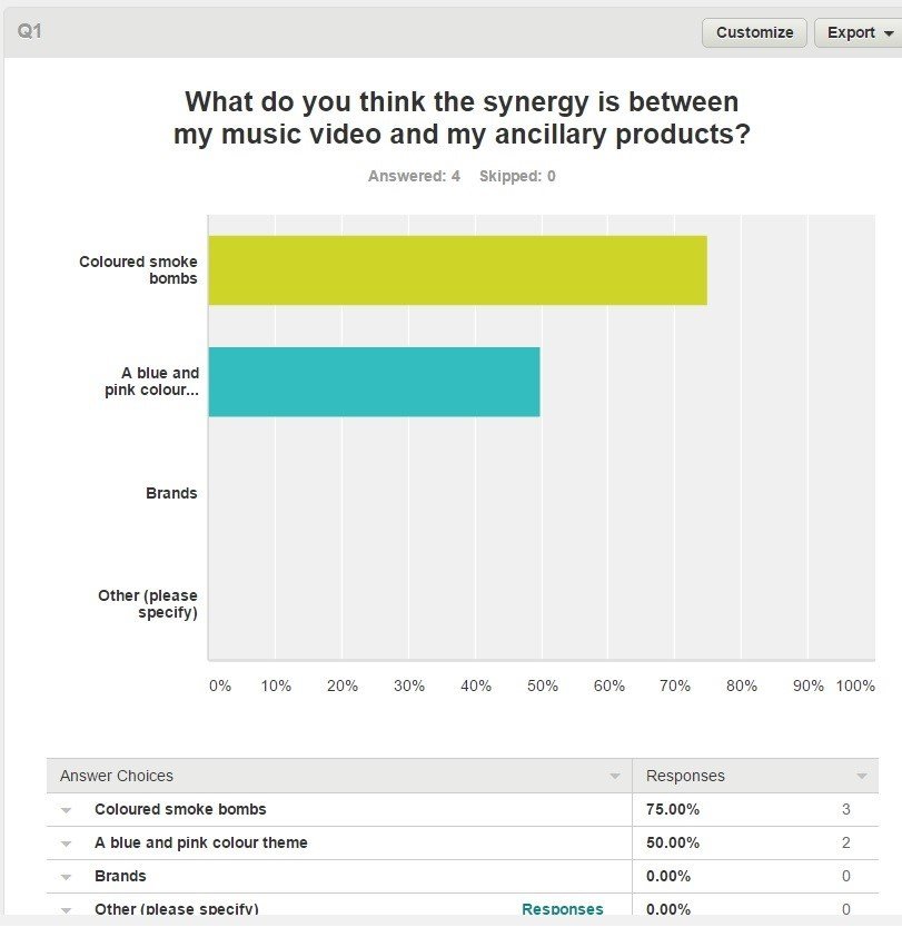
We had asked people, representative of our target audience, to watch the rough cut and to answer a survey. Our results showed, our target audience thought the synergy between all products were the colour schemes and the use of smoke bombs, rather than the use of brands..
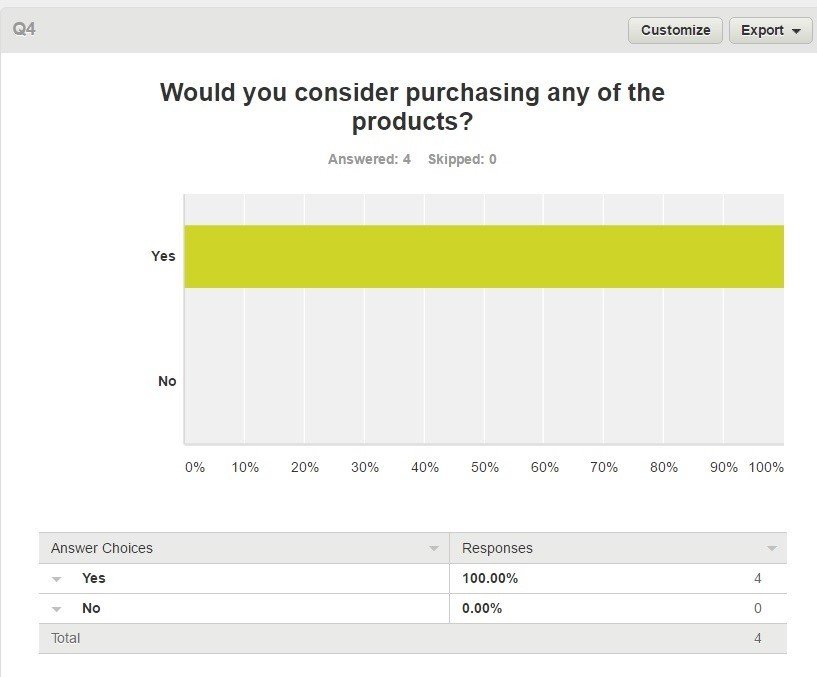
Target audience research from 'Survey Monkeys':
Smoke Bombs & Colour Schemes
However, during post-production, we saw the blue and pink smoke bombs played a crucial element in synergy, and therefore we decided to eliminate the colour black.
The smoke bombs synergy, can be seen throughout our main product and in both my ancillary texts.
The theme colours are an crucial element which allows the audience to familiarise themselves with the artist brand. We had selected the colours - pink, blue and black, because they originally symbolised an urban-pop theme. These colours were planned to be featured on the costumes (including make-up), typography, props (blue/pink smoke bombs) and, in particular, on the ancillary products.
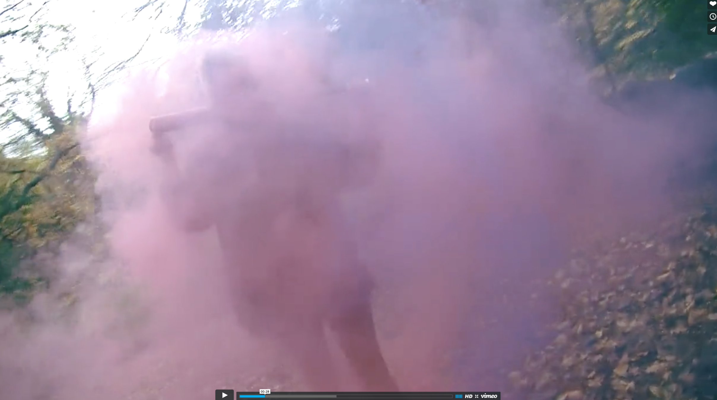
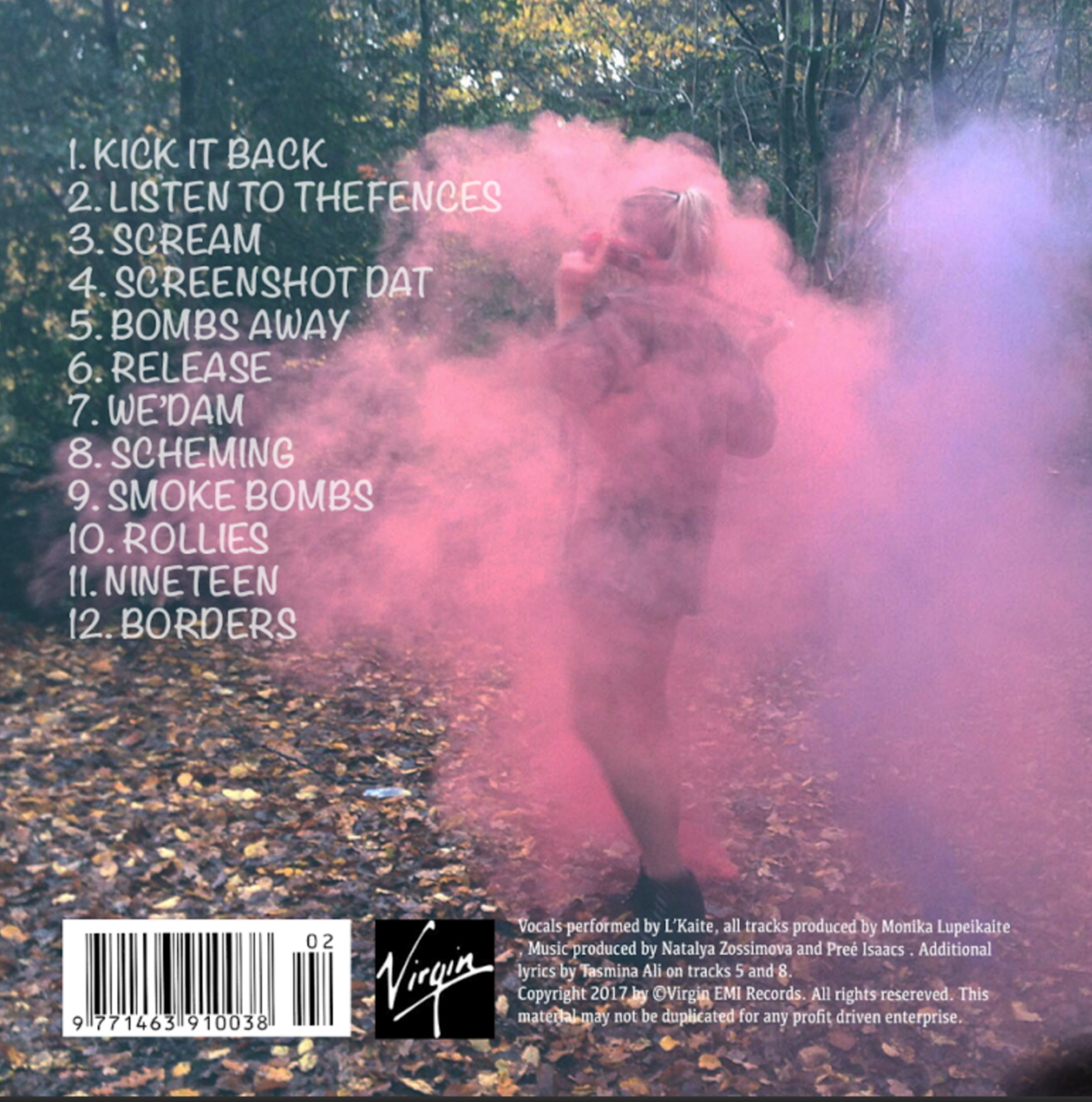
Coloured Smoke Bombs Synergy with the Main Product and Ancillary Texts:
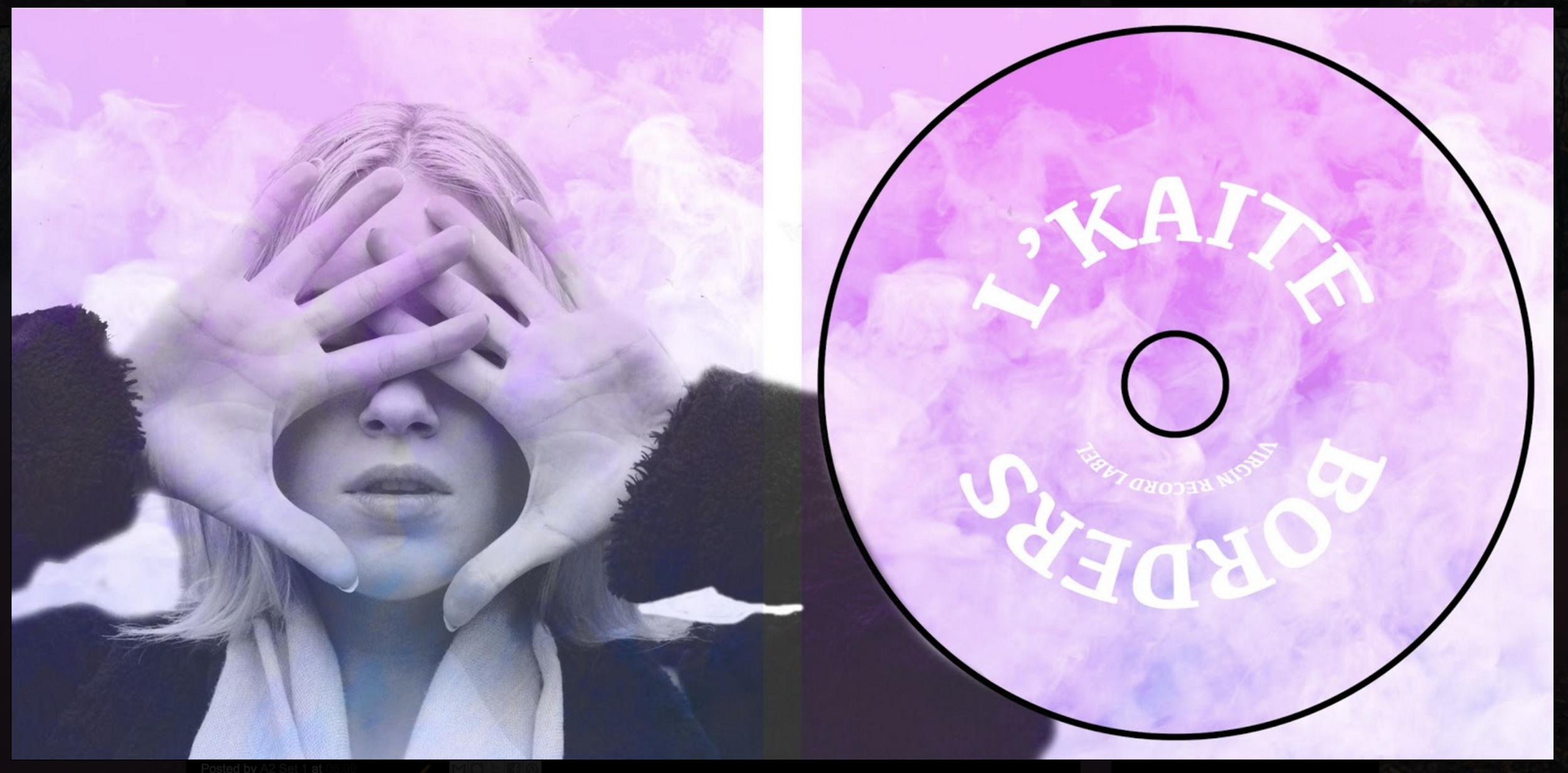
Digipak - Inner Pannels
Again, there has been a consistency with the use of smoke bombs. Here, I have overlapped the artist's face with the smoke bomb effect to create synergy with the other products.
The pink, purple, blue colour scheme has been used on the inner panels of the digipak, as well as the outer panels and the other products to create synergy. Thus, the target audience will be able to make a link between the products.
Digipak - Outer Panels
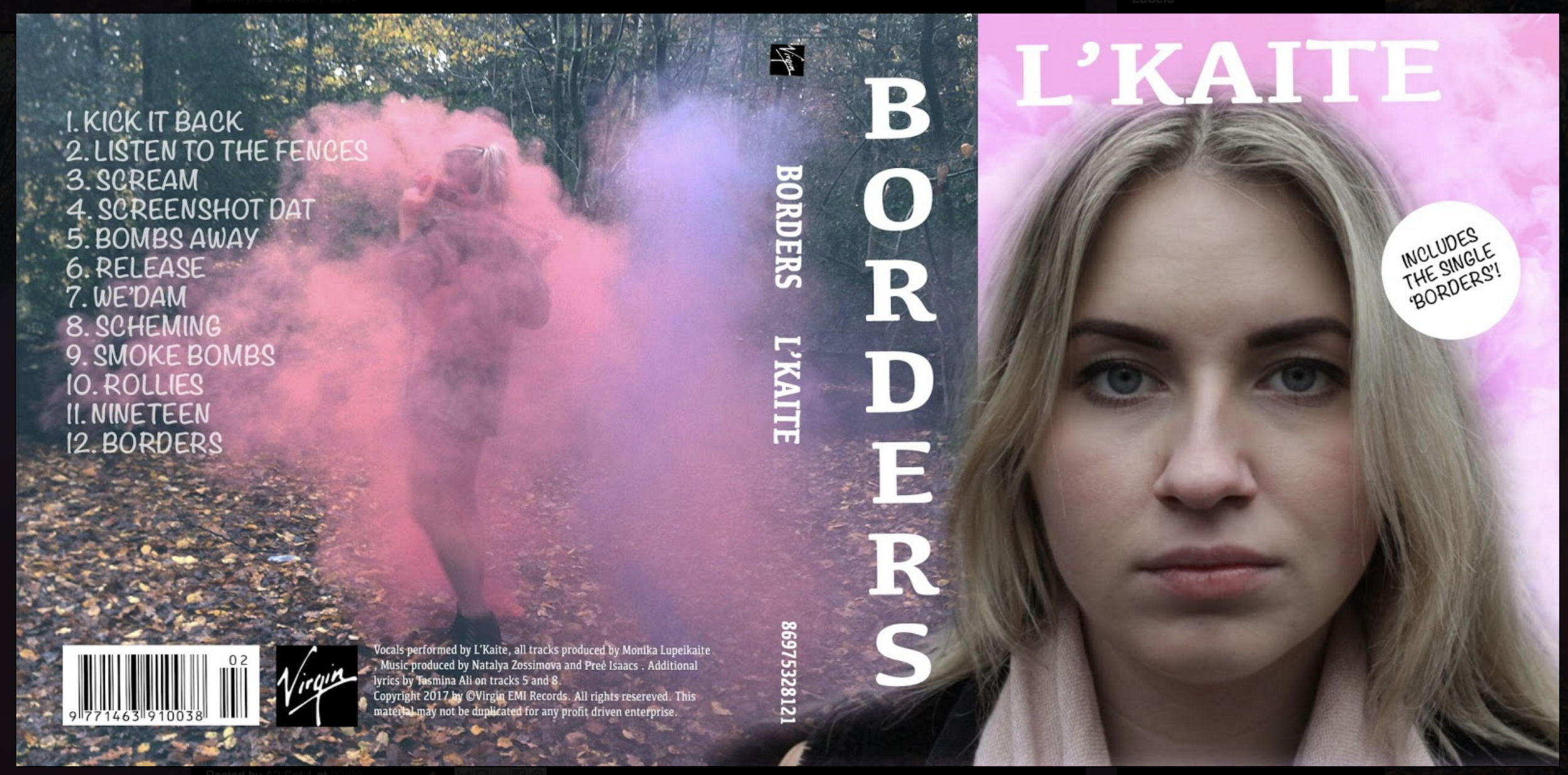
I have used smoke bombs as the synergy with all my products. Here, I have used the effect of the smoke bombs on the digipak. The use of smoke bombs in the music video, would become recognisable with the audience, as they would have familiarise themselves with the smoke bombs displayed in the ancillary products.
The name of the artist and the album name have been placed next to the artist's face on the digipak panel. This allows the audience to identify the artist and the artist's brand.
Website
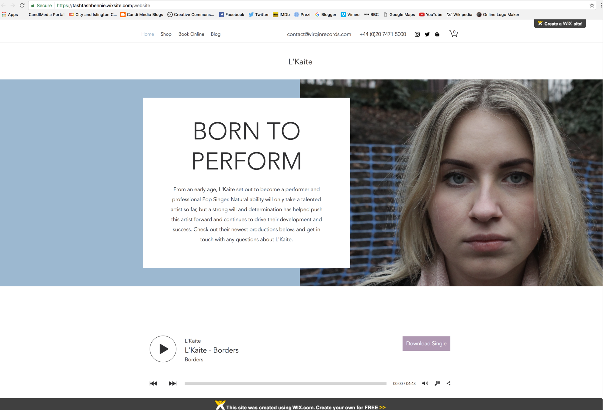
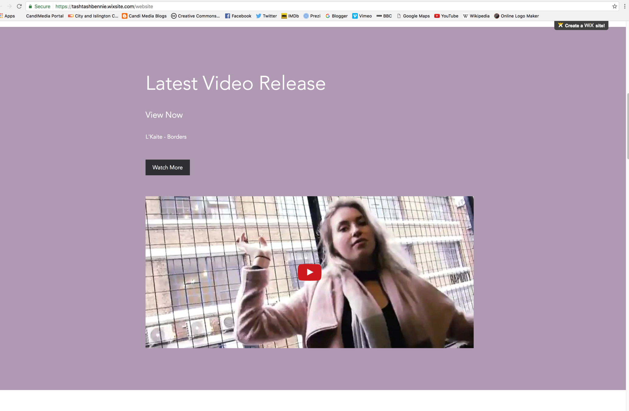
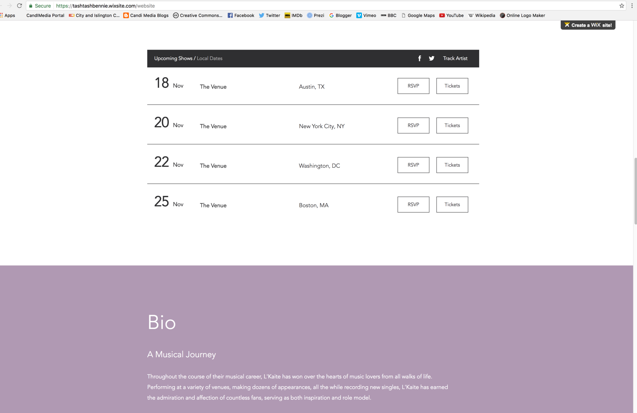
On the website, I have selected the same colour scheme as on my digipak and music video. The use of pink, purple and blue colours are also reflective of the colours of the smoke bombs.
I have selected to use the image of the artist's face to allow the audience to recognise the linked ancillary products, which also use a close-up of the artists's face.
I have included the main product on the website, to allow the audience to consume it. In some aspects, this is a direct use of synergy.
Website
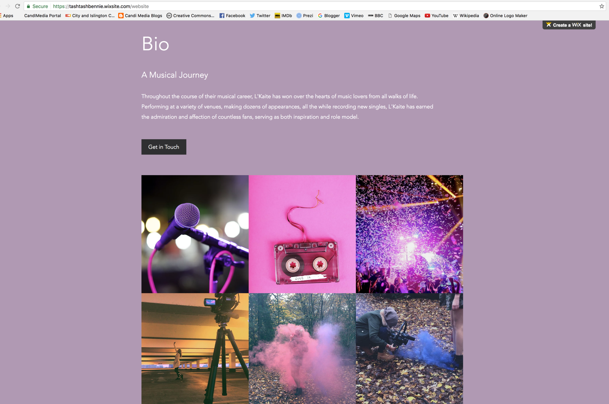
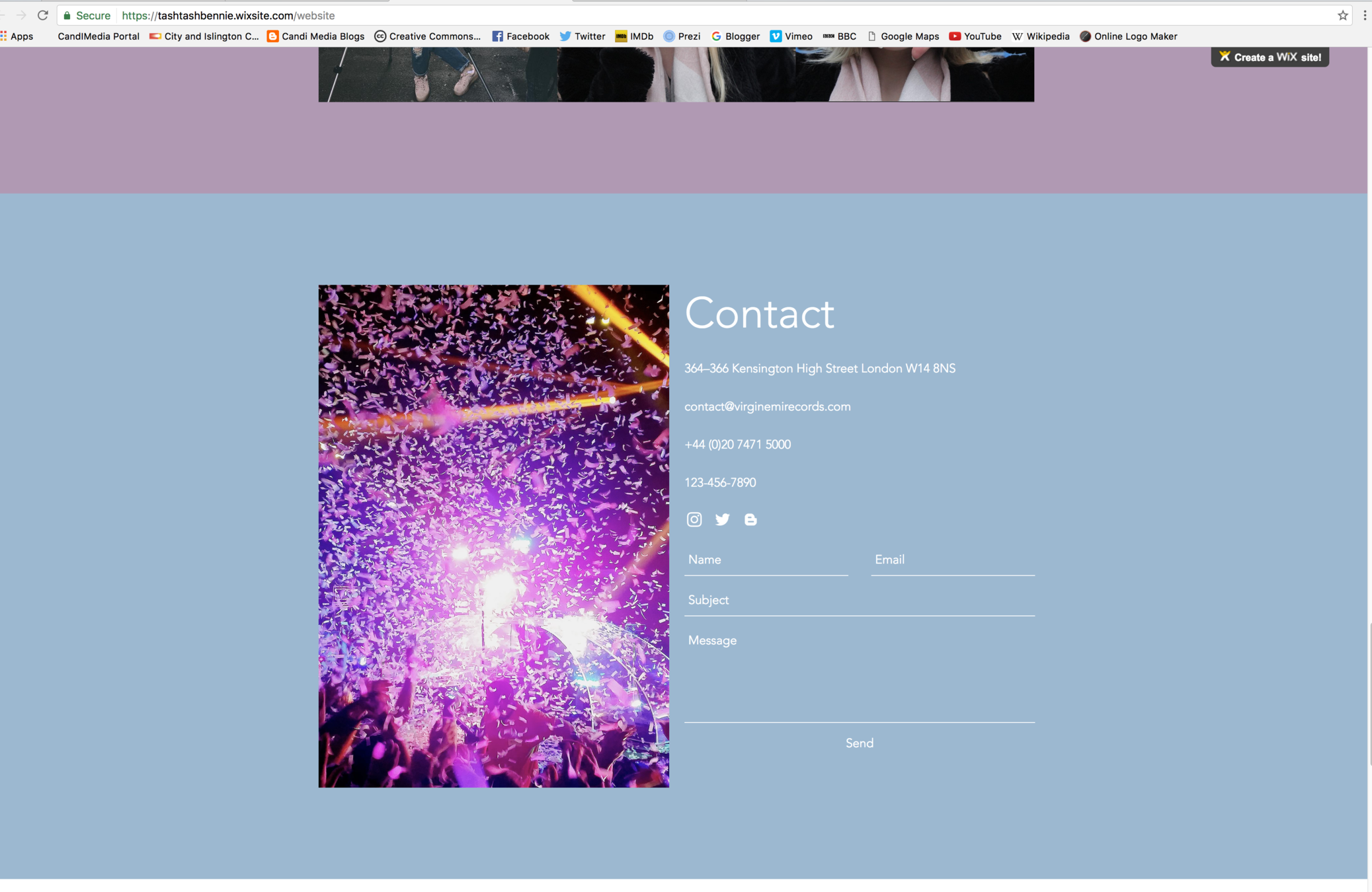
The series of images on the website show the artists interests. These images induce a microphone, showing she is a talented singer, and an image of an explosive smoke bomb. Again, both these images show synergy with the ancillary products.
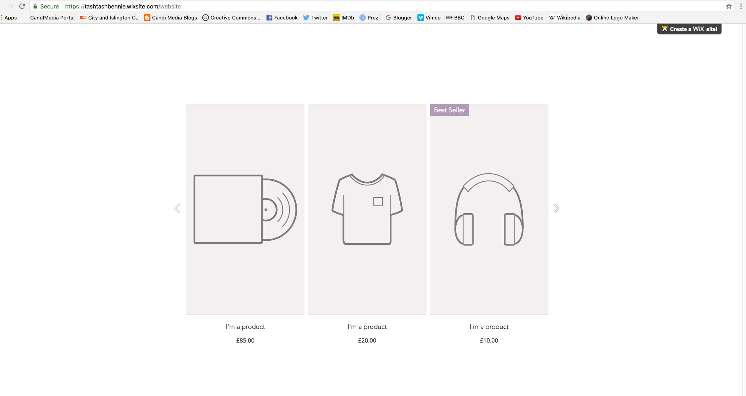
I have used merchandise to sell the artist's other products. On this page, one can buy her album, clothing and a pair of head phones, to be able to listen to her music.
The use of font colour has been consistent throughout the main product and the ancillary products. I have specifically used white, so that it stands out against the pink, purple and blue backgrounds.
Music Video
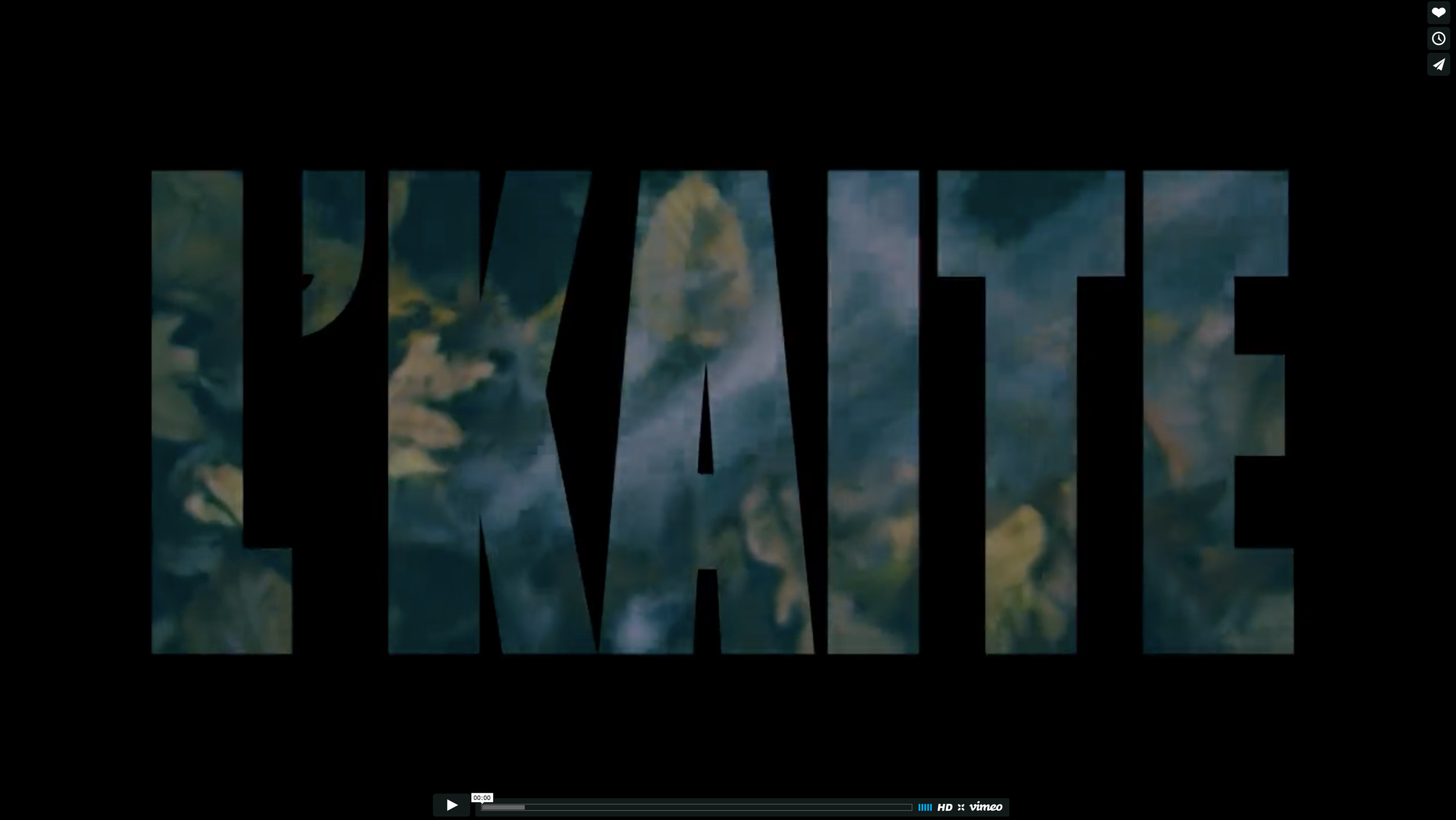

'L'KAITE' - the artist's name appears at the beginning of the music video to establish the artist. The title continues to appear on the ancillary products, in the same recognisable font and size.
The use of purple, pink and blue smoke bombs appear in the music video, and are seen in the ancillary products to create synergy.
The artist is wearing the same costume; the pink scarf and black coat, in this base track as on the ancillary texts. This makes it easier for the audience to recognise the artist than if she was in a different costume.
Synergy Link in Real Media Texts
Ella Eyre is a established British artist that uses synergy in all of her products. She does this by using a clear brown and maroon colour scheme. Similarly, I have also used a colour scheme but in purple, pink and blue to create synergy.
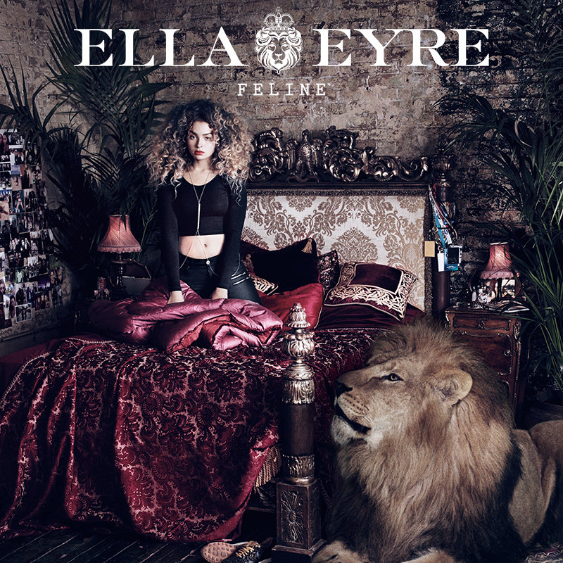
Website:
Front cover of album:
Music video:
Conclusion
Overall, I believe my main product and ancillary texts are successful because they link well by the use of colours and smoke bombs. I am pleased that as a group, we made alternations to the synergy, changing the synergy from the branding to the smoke bombs.
I can confirm my target audience would be attracted to my products and would consider purchasing my products, by the evidence shown in the 'SurveyMonkey'. The results suggest 100% of my target audience would consider purchasing my products.
Question 2
By tashzossi