Effectivity of promotional package (Synergetic links)
During the creation of our media texts, we ensured that all three texts work synergistically; each media text contains similar aspects that help promote the other through using similar images and the same font; in order to be easily recognizable, thus helping our specific demographic audience to be attracted to the other texts within the promotional package. Within our ancillaries, it contains images of the countryside, with the three main people involved in the music promo. The countryside emphasis helps to express ideas that the artist is open minded and doesn’t create music for a glamorous life but rather because it is his hobby. This is linked to indie genre music, where the artist/band involved often pulls focus away from themselves to signify that they care only for their music and the deeper meaning provided within. Our ancillaries with the music promo all work synergistically, through the music video containing the narrative about two characters in their wrong settings, mostly set in the countryside. Our poster and digipak work with this music promo by presenting the settings in which the music promo is filmed but also presenting the characters; in the poster they are shown in the middle of the frame with the vocalist to draw more attention and in the digipak, they are found designed as pop art images on separate panels, which are shown to the right. As a result, the three texts work together as the ancillaries create ideas of what might the music promo contain. A presentation of the artist within the middle of the frame on the poster subverts the general ideology of indie not focusing on themselves.
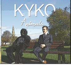

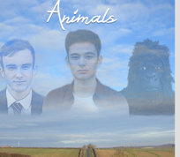
The music promo is amplification, promoting the artist as a quite creative individual due to the unusual concept of the narrative. The deeper meaning behind the narrative also portrays the artist as knowledgeable. The poster and digipak is a mixture of simplicity with a slight artistic approach, this adheres to indie genres as they tend to stick to realism. It is simplistic as we chose not to exaggerate the effects, where we just placed a simple plain image in the background of the poster and also general photos of the countryside on the digipak. It is however slightly artistic, especially with the inside panels of the digipak, with integrated pop art effects on each character and the vocalist. The background images of the countryside, expresses the artist as a person who is conscious of the environment and surroundings. The design of our ancillaries were influenced by our music promo as the music promo does not contain much post production effects, with just some alterations in filters and colour balances. It is however slightly creative just as the ancillaries, as towards the end we added multiple graphic matches to indicate that the gorilla is actually a reflection of the human.
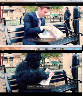
As a whole, the poster works well in introducing the actors and the vocalist. The background also relates well to the concept of the song. We believe that the deeper meaning behind the song is about the process of finding yourself. The lyrics of ‘Maybe we’re like animals’, suggests that we do not know where we are heading in life, this relates well to our background image of the long stretch road, which connotes ideas of a journey, this also synergistically links with the music promo as the audience see at multiple times where the characters are walking along a road in a desolate area to signify the same idea as what the poster suggests.
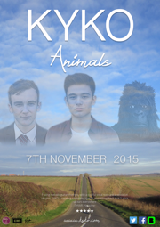
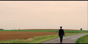
The presentation of the two characters and the vocalist may be unclear at first, especially with the inclusion of the gorilla character; however, this may be an effective way to gain audience interest as this wish to see the meaning behind it. This poster synergistically links with the other texts through the font of the title but also with the composition of the characters matching it to the beginning of the music promo but also relates to the digipak inside cover, which is shown on the right. The titles work well in providing a bold font that captivates audiences. A poster should contain features that interests the audience and must be bold and eye catching. I think we have succeeded in fulfilling this by providing complementary colours; the while bold title sits on a darker background, which results in the luminous title.
As mentioned before the digipak is effective as it follows the placement of the characters on the inside cover. Also it includes a similar setting of a countryside area that fits in with the location we filmed in.
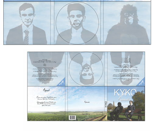
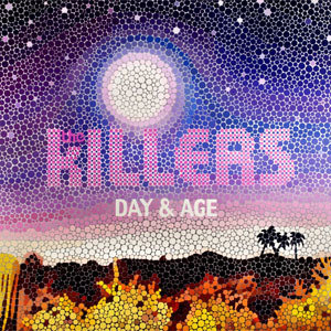
The titles fit with the poster well and it is effective by creating an effect that it is behind the tree, this brings a more artistic approach which can then lead to catching the attention of passing individuals. For the digipak, I have integrated a colour halftone filter. I felt this had made it quirkier and also adheres to the genre of indie, where they tend to provide a slight artistic approach, such as the Killers album. This effect however was not added to the poster due to we felt it became over edited, this may affect the synergy to the slightest degree. Overall we have followed the main conventions within the digipak, providing a main image with the main titles. Also by providing extra information for the audience to be persuaded to buy the product. In the poster, we have adhered to a conventional music promo, through adding reviews, a main image with the main titles and information. Also we have provided the date of the album release and social media icons which are quite common in music promos to promote themselves further.

deck
By Terence Burns
deck
- 273

