CSS layout principles
Table of Contents
- Box model
- Display
- Position
- Layout
- Block
- Inline block
- Float
- Flex
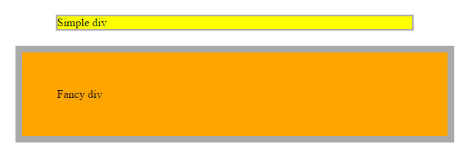
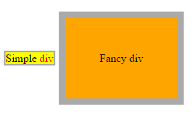
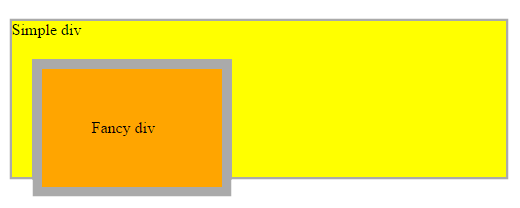
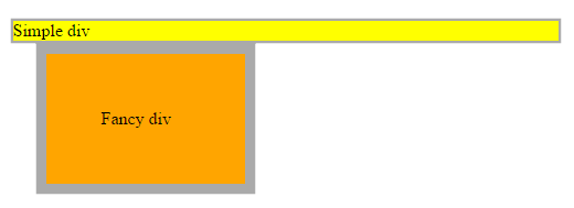
Box model
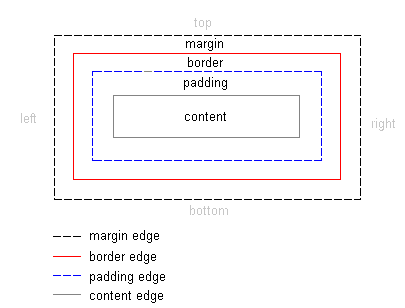
Box model
//html
<div class="simple">Simple div</div>
<div class="fancy">Fancy div</div>

//css
div {
  width: 500px;
  margin: 20px auto;
  border: solid #aaa;
}

.simple {
  background: yellow;
}

.fancy {
  padding: 50px;
  border-width: 10px;
  background: orange;
}
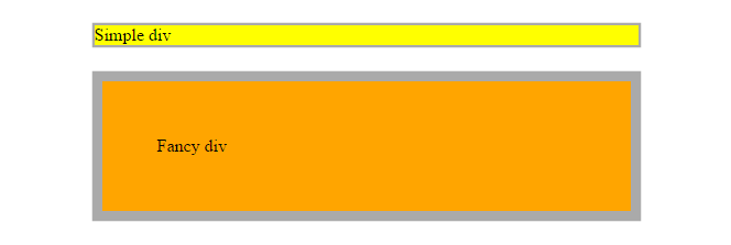
Box sizing
The box-sizing property is used to alter the default CSS box model used to calculate width and height of the elements
box-sizing: content-box|border-box|initial|inherit;* {
-webkit-box-sizing: border-box;
-moz-box-sizing: border-box;
box-sizing: border-box;
}altijd gerbuiken? =>
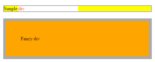
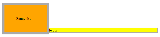
Box sizing
//html
<div class="simple">Simple div</div>
<div class="fancy">Fancy div</div>

//css
div {
  box-sizing: border-box;
  width: 500px;
  margin: 20px auto;
  border: solid #aaa;
}

.simple {
  background: yellow;
}

.fancy {
  padding: 50px;
  border-width: 10px;
  background: orange;
}
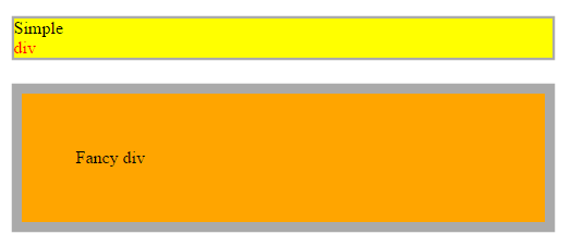
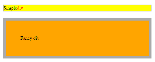
Display
The display CSS property specifies the type of rendering box used for an element. In HTML, default display property values are taken from behaviors described in the HTML specifications or from the browser/user default stylesheet.
display: none | inline | block | list-item | inline-list-item | inline-block |
inline-table | table | table-cell | table-column | table-column-group |
table-footer-group | table-header-group | table-row | table-row-group |
flex | inline-flex | grid | inline-grid | run-in | ruby | ruby-base | ruby-text |
ruby-base-container | ruby-text-container | contents
Block
| Displays an element as a block element (like <p>) |
//html
<div class="simple">Simple <span>div</span></div>
<div class="fancy">Fancy div</div>

//css
div {
  box-sizing: border-box;
  width: 500px;
  margin: 20px auto;
  border: solid #aaa;
}

span{
  display: block;
  color: red;
}

.simple {
  background: yellow;
}

.fancy {
  padding: 50px;
  border-width: 10px;
  background: orange;
}
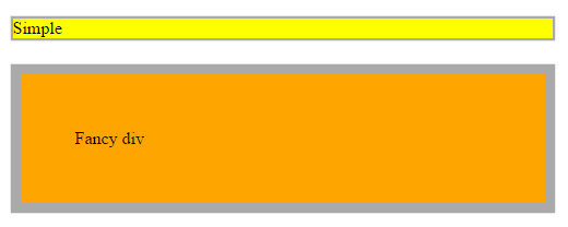
Inline
| Displays an element as an inline element (like <span>) |
//html
<div class="simple">Simple <span>div</span></div>
<div class="fancy">Fancy div</div>

//css
div {
  display: inline;
  box-sizing: border-box;
  width: 500px; //does not work here
  margin: 20px auto;
  border: solid #aaa;
}

span{
  color: red;
}

.simple {
  background: yellow;
}

.fancy {
  padding: 50px;
  border-width: 10px;
  background: orange;
}
Inline-block
| Displays an element as an inline-level block container. The inside of this block is formatted as block-level box, and the element itself is formatted as an inline-level box |
//html
<div class="simple">Simple <span>div</span></div>
<div class="fancy">Fancy div</div>

//css
div {
  box-sizing: border-box;
  width: 500px;
  margin: 20px auto;
  border: solid #aaa;
}

span{
  display: inline-block;
  width: 200px;
  color: red;
  background: white;
}

.simple {
  background: yellow;
}

.fancy {
  padding: 50px;
  border-width: 10px;
  background: orange;
}
Flex
Displays an element as an block-level flex container.
//html
<div class="simple">Simple <span>div</span></div>
<div class="fancy">Fancy div</div>

//css
div {
  display: flex;
  box-sizing: border-box;
  width: 500px;
  margin: 20px auto;
  border: solid #aaa;
}

span{
  display: flex;
  color: red;
}

.simple {
  background: yellow;
}

.fancy {
  padding: 50px;
  border-width: 10px;
  background: orange;
}
none
|
The element will not be displayed at all (has no effect on layout) |
//html
<div class="simple">Simple <span>div</span></div>
<div class="fancy">Fancy div</div>

//css
div {
  box-sizing: border-box;
  width: 500px;
  margin: 20px auto;
  border: solid #aaa;
}

span{
  display: none;
  color: red;
}

.simple {
  background: yellow;
}

.fancy {
  padding: 50px;
  border-width: 10px;
  background: orange;
}
Position
The position CSS property chooses alternative rules for positioning elements, designed to be useful for scripted animation effects.
position: static|absolute|fixed|relative|initial|inherit;static
Default value. Elements render in order, as they appear in the document flow
relative
The element is positioned relative to its normal position, so "left:20px" adds 20 pixels to the element's LEFT position
//html
<div class="simple">Simple div
  <div class="fancy">Fancy div</div>
</div>

//css
div {
  box-sizing: border-box;
  border: solid #aaa;
}

.simple {
  width: 500px;
  margin: 20px auto;
  background: yellow;
}

.fancy {
  position: relative;
  top: 20px;
  left: 20px;
  width: 200px;
  padding: 50px;
  border-width: 10px;
  background: orange;
}
| The element is positioned relative to the browser window |
Fixed
//html
<div class="simple">Simple div
  <div class="fancy">Fancy div</div>
</div>

//css
div {
  box-sizing: border-box;
  border: solid #aaa;
}

.simple {
  width: 500px;
  margin: 20px auto;
  background: yellow;
}

.fancy {
  position: fixed;
  top: 20px;
  left: 20px;
  width: 200px;
  padding: 50px;
  border-width: 10px;
  background: orange;
}
Absolute
The element is positioned relative to its first positioned (not static) ancestor element
//html
<div class="simple">Simple div
  <div class="fancy">Fancy div</div>
</div>

//css
div {
  box-sizing: border-box;
  border: solid #aaa;
}

.simple {
  position: relative
  width: 500px;
  margin: 20px auto;
  background: yellow;
}

.fancy {
  position: absolute;
  top: 20px;
  left: 20px;
  width: 200px;
  padding: 50px;
  border-width: 10px;
  background: orange;
}
Layout
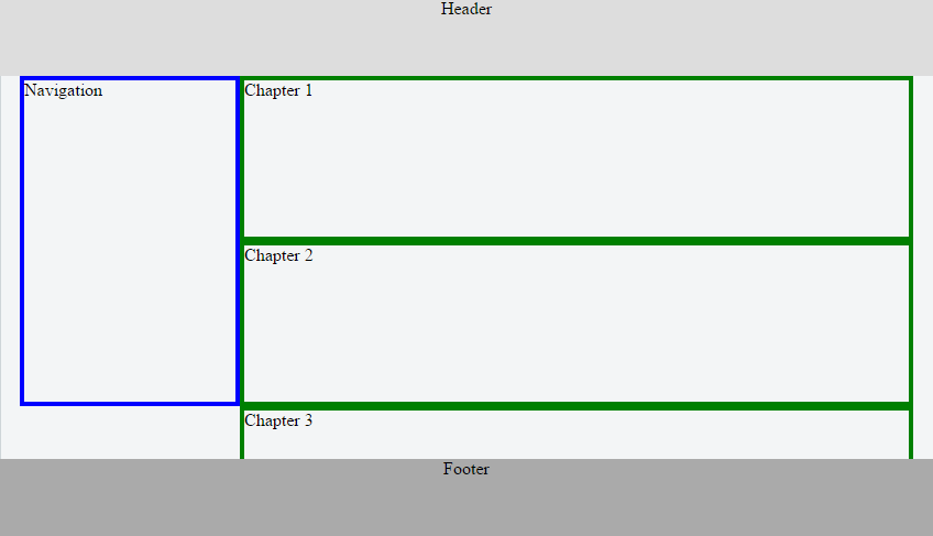
A simple layout 4 ways...
<div>
    <header>Header</header>
    <nav>Navigation</nav>
    <section>Chapter 1</section>
    <section>Chapter 2</section>
    <section>Chapter 3</section>
    <section>Chapter 4</section>
    <footer>Footer</footer>
</div>
Block
https://jsfiddle.net/uj7ky3d8/
* {
  box-sizing: border-box;
}
div {
  position: relative;
  margin: 70px 10px 120px;
}
header{
  position: fixed;
  top: 0;
  left: 0;
  height: 70px;
  width: 100%;
  background-color: #ddd;
  text-align: center;
  z-index: 1;
}
nav {
  position: absolute;
  left: 0px;
  width: 200px;
  height: 300px;
  border: 4px solid blue;
}
section {
height: 150px;
margin-left: 200px;
border: 4px solid green;
}
footer {
position: fixed;
bottom: 0;
left: 0;
width: 100%;
height: 70px;
background-color: #aaa;
text-align: center;
}* {
box-sizing: border-box;
}
div {
position: relative;
margin: 70px 10px 120px;
}
header{
position: fixed;
top: 0;
left: 0;
height: 70px;
width: 100%;
background-color: #ddd;
text-align: center;
z-index: 1;
}
nav {
position: absolute;
left: 0px;
width: 200px;
height: 300px;
border: 4px solid blue;
}Inline-block
Headache!!! Only usable for very simple layout issues
nav {
  display: inline-block;
  width: 18%;
  height: 300px;
  margin: 0;
  border: 4px solid blue;
}
section {
  display: inline-block;
  width: 80%;
  margin: 0;
  height: 150px;
  border: 4px solid green;
}

footer {
  position: fixed;
  bottom: 0;
  left: 0;
  width: 100%;
  height: 70px;
  background-color: #aaa;
  text-align: center;
}
//simple html
<div>
<header>inline-block</header>
<nav>Navigation</nav>
<section>Chapter 1</section>
<footer>Footer</footer>
</div>
//css
* {
box-sizing: border-box;
}
div {
margin: 70px 10px 120px;
}
header{
position: fixed;
top: 0;
left: 0;
height: 70px;
width: 100%;
background-color: #ddd;
text-align: center;
z-index: 1;
}
float
https://jsfiddle.net/kL8zd29t/
* {
  box-sizing: border-box;
}

div {
  margin: 70px 10px 120px;
}

.clearfix {
  overflow: auto;
}

header{
  position: fixed;
  top: 0;
  left: 0;
  height: 70px;
  width: 100%;
  background-color: #ddd;
  text-align: center;
  z-index: 1;
}
nav {
  float: left;
  width: 20%;
  margin: 0;
  border: 4px solid blue;
}

section {
  float: right;
  width: 80%;
  height: 150px;
  border: 4px solid green;
}

footer {
  position: fixed;
  bottom: 0;
  left: 0;
  width: 100%;
  height: 70px;
  background-color: #aaa;
  text-align: center;
}
Flexbox
https://jsfiddle.net/8adn7xrp/
//html
<div class="clearfix">
  <header>Header Flex</header>
  <nav>Navigation</nav>
  <main>
    <section>Chapter 1</section>
    <section>Chapter 2</section>
    <section>Chapter 3</section>
    <section>Chapter 4</section>
  </main>
  <footer>Footer</footer>
</div>

//css
* {
  box-sizing: border-box;
}
div {
  display: flex;
  margin: 70px 10px 120px;
}
header{
  position: fixed;
  top: 0;
  left: 0;
  height: 70px;
  width: 100%;
  background-color: #ddd;
  text-align: center;
  z-index: 1;
}
nav {
flex: 1 1 auto;
height: 300px;
margin: 0;
border: 4px solid blue;
}
main {
flex: 3 1 auto;
border: 4px solid purple;
}
section {
width: 100%;
height: 150px;
border: 4px solid green;
}
footer {
position: fixed;
bottom: 0;
left: 0;
width: 100%;
height: 70px;
background-color: #aaa;
text-align: center;
}Resources
Box-sizing
Display
Position
Flexbox
CSS layout principles
By tietyk
CSS layout principles
Everything you need to know about css layout to get started


