COMP 126: Practical Web Design & Development for Everyone
THE CSS GRID
What and why?
-
The CSS grid is a system of layout properties that allows us to stack and line up content in columns and rows
-
Flexbox allows rows or columns; grid allows rows and columns
-
Areas within your grid are containers for your content
-
Containing elements placed within your grid can be turned into sub-grids or flex boxes
A GRID IS A BUNCH OF BOXES
AND YOU PUT CONTENT IN THOSE BOXES
components of a grid layout
CSS grid terms
-
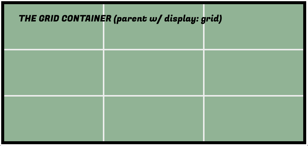
grid container: just like in flexbox: the containing unit
-
grid item: any DIRECT child element of the grid container
-
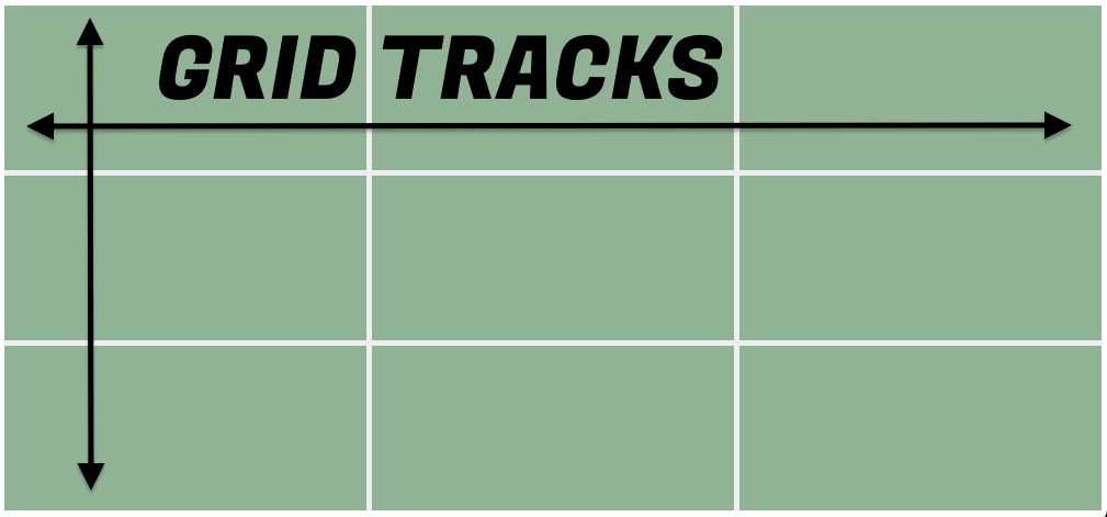
grid track: column or row within the grid container
-
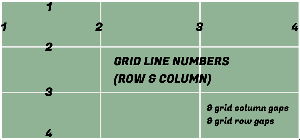
grid lines: the lines bounding each side of a grid track: starts at far left-hand border and ends at far right-hand border
-
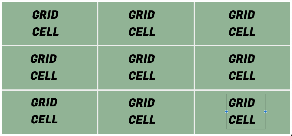
grid cell: the space made up by two adjacent row and column grid lines
-
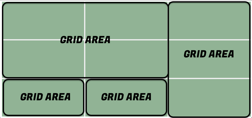
grid area: rectangular area comprising one or more grid cells
-
gap: the gutter/space between rows/columns
-
row axis: the x axis (always, not like in Flexbox)
-
column axis: the y axis (ditto)
in short:
-
A CSS grid is made up of rows and columns
-
A full row or column in a grid is called a grid track
-
The lines at which rows and columns meet are called grid line numbers
-
The cells formed when rows and columns meet are called grid cells
-
Grid cells can be combined to create larger grid areas, which function as containers/organizers for content elements (p, h1, img, etc.) or containing elements (div, header, main, aside, footer, nav, etc.)
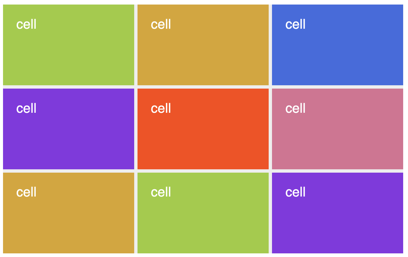
three equal rows, three equal columns
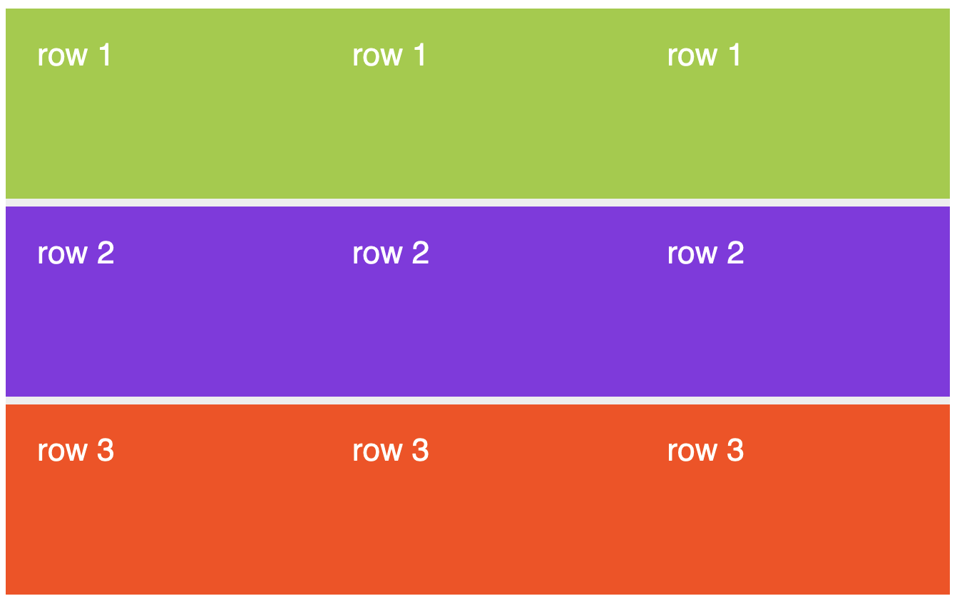
three equal rows, three equal columns
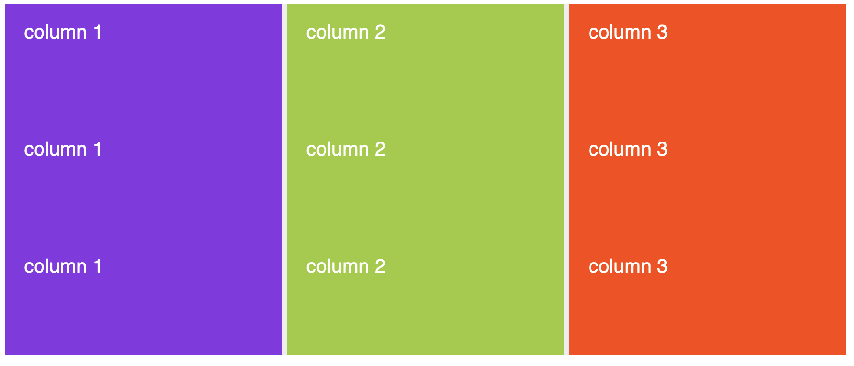
grid cells in equal rows and columns
cells can be combined into areas that are containers for content
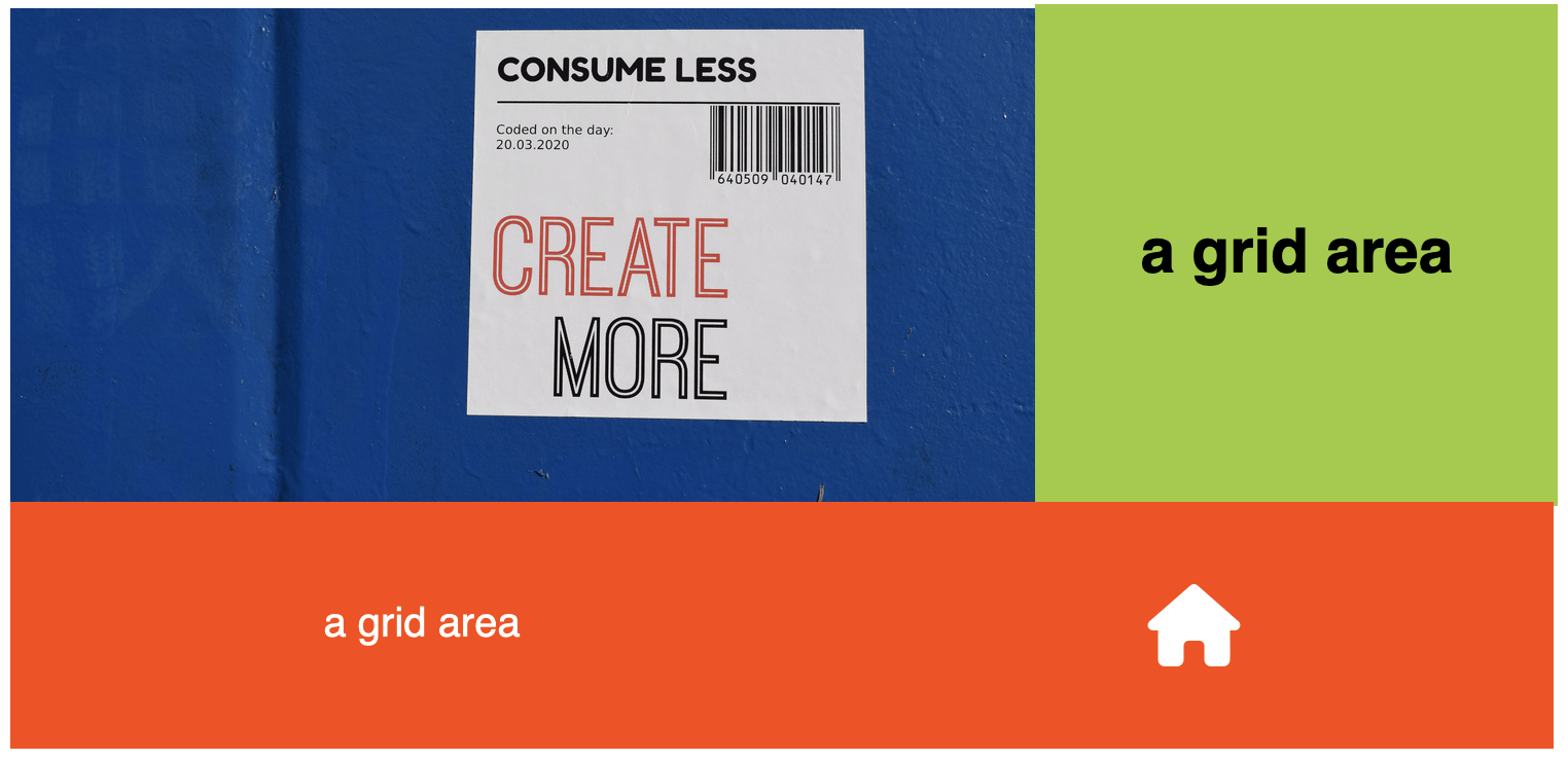
the grid is still there...
you just can't see it
1. come up with the design you want to build
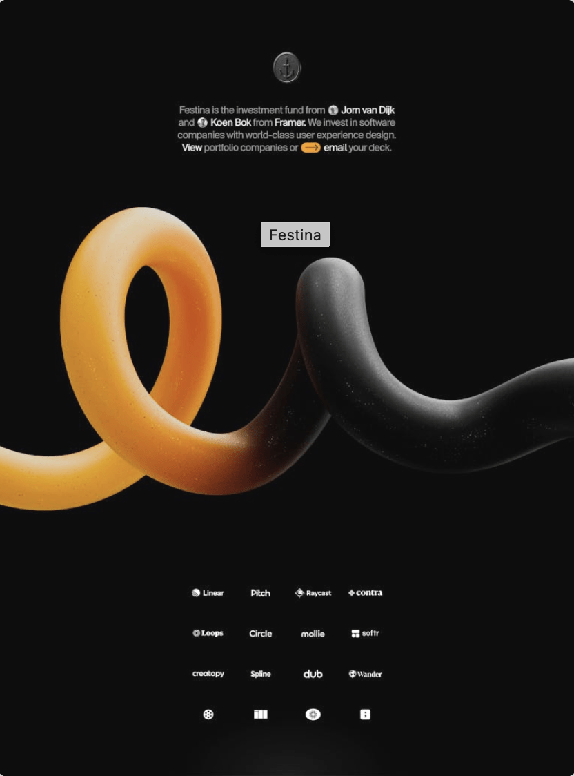
planning your grid
2. sketch out a grid that would provide useful container elements for the design you want--so maybe like this...
planning your grid
...or something like this that could be adapted for use across several different pages...
planning your grid
.grid-container {
  display: grid;
  background-color:grey;
  width: 80%;
  height: 600px;
  margin: 0 auto;
}
<div class="grid-container">
</div>BUILDING your grid
1. create a grid container with your chosen proportions and measurements

.grid-container {
  display: grid;
  grid-template-columns: 1fr 1.5fr 1fr;
  grid-template-rows: 1fr 1fr 5fr auto;
  background-color:grey;
  width: 80%;
  height: 100vh;
  margin: 0 auto;
}
<div class="grid-container">
</div>BUILDING your grid
2. define columns and rows with the desired measurements/proportions to match your sketch (the lines that you see in the image to the right will be invisible, but they'll be there)
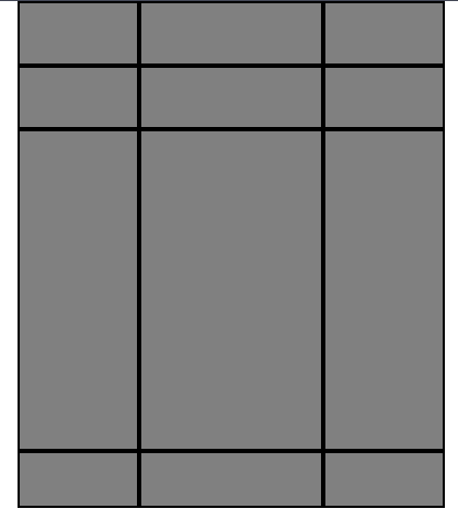
grid measurements, fr, repeat()
exercise 1.2.1: simple grid w/columns
exercise 1.2.2: unequal columns
exercise 1.2.3: both rows and columns
<div class="grid-container">
  <header>
    <div class="logo">
      <img src="logo.jpg" alt="logo">
    </div>
  </header>
  <div class="description">
    <div class="intro-text">
      <h2>
        text text text
      </h2>
    </div>
  </div>
  <main>
    <img class="big-img" alt="big image">
  </main>
  <footer>
    <aside class="left-aside"></aside>
    <nav class="subgrid-menu">
    <ul>
      <li></li>
       <li></li>
       <li></li>
       <li></li>
       <li></li>
       <li></li>
      </ul>
    </nav>
    <aside class="right-aside"></aside>
  </footer>
</div>
populating your grid
add grid items to the areas!
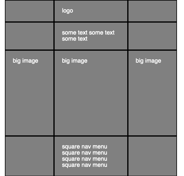
placing items in the grid: the grid line numbers method
exercise 1.2.4: placing grid items with the grid line number method
placing items in the grid: the grid line numbers method SHORTHAND
exercise 1.2.5: grid-column/grid-row shorthand
exercise 1.2.6: a simple CSS grid page layout
minmax() & auto-fit to the rescue
how it works
display: grid;
    grid-template-columns: repeat(auto-fit, minmax(250px, 1fr));
    gap: 20px;
minmax(250px, 1fr)
= each column can grow, but don't let them get narrower than 250px
auto-fit
= create as many of these columns as needed/will fit
So the column sizes will automatically adapt to fit the screen at any size! But...
Sometimes we want to optimize for different screen sizes, and sometimes that means changing the whole design.
Sometimes we don't just want things to fit on the screen.
That optimization is the goal of responsive design.
designing web pages/apps whose layouts adapt appropriately (and automatically) to different screen or viewport sizes.
There are two main ways of accomplishing this: by coding
-
fluid/adaptive behaviors or
-
breakpoint-based behaviors
RESPONSIVE DESIGN is about
Elements designed to be fluid/adaptive will adjust their behaviors automatically to different screen sizes without your having to do anything more in the code.
E.g.,
- using percentages instead of fixed widths for container widths
- using Flexbox or the CSS grid for layout instead of older methods
- using approaches like the one we just discussed: grid-template-columns: repeat(auto-fit, minmax(250px, 1fr));
But that isn't always enough! Sometimes you want to change something that can't be changed by this approach alone. More on that in a moment.
1. Fluid/adaptive behaviors
exercise 1.2.7: an adaptive grid
When you want to change something in a way that can't be accomplished by using fluid/adaptive methods alone, you can explicitly tell the CSS to change things at certain viewport sizes or when certain other conditions are met. These sizes/conditions are called breakpoints.
We do this using a media query.
2. Breakpoint-based behaviors
@media media type and (media feature/condition: breakpoint) {
  // CSS rules that kick in when the feature is present or the condition is met
}
The CSS outside (usually before) the media query is the default.
When the viewport is at least 700px wide, the rules in the media query override the default rules.
So this media query changes the grid-template-columns value when the viewport is at least 700px wide.
For example:
.container {
    display: grid;
    grid-template-columns: 1fr;
}

@media (min-width: 700px) {
    .container {
        grid-template-columns: 200px 1fr;
    }
}
Basically:
Use Flexbox's and Grid’s flexible sizing when the layout can adapt naturally.
Add media queries when the design needs to change.
exercise 1.2.8: when the layout needs to change
exercise 1.2.9: one grid, two layouts
exercise 1.2.10: repositioning at a breakpoint
placing items in the grid: grid template areas method with media queries
exercise 1.2.11: the grid template areas method
alignment in grid
126-The CSS Grid System
By tkjn