ARIA-
Making the web accessible
Dynamic content on a web page can be particularly problematic for users who, for whatever reason, are unable to view the screen. Stock tickers, live twitter feed updates, progress indicators, and similar content modify the DOM in ways that an assistive technology (AT) may not be aware of. That's where ARIA comes in.
from MDN
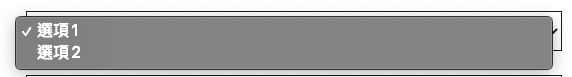
<select>
  <option value="A">A</option>
  <option value="B">B</option>
</select>
For example...
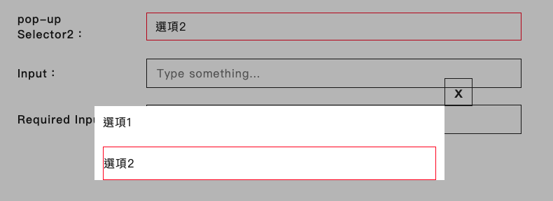
<div>
  <button
    type="button"
    role="listbox"
    aria-activedescendant="option-B"
    aria-owns="menu-modal-1">
    Preferences
  </button>
  <div id="menu-modal-1">
    <button
      id="option-A"
      role="option"
      aria-seleced="false">
      A
    </button>
    <button
      id="option-B"
      role="option"
      aria-selected>
      B
    </button>
  </div>
</div>| ARIA | 意義 |
|---|---|
| aria-activedescendant | 已選取的 id |
| aria-owns | 父子關係 |
| aria-selected | 選項狀態 |
Clear semantics
| ARIA | Description | 情境 |
|---|---|---|
| aria-label | 描述物件(會取代原本描述) | 無描述 or 看不見時 |
| aria-labelledby | 給 id, 描述物件(會取代原本描述) | 描述在其他地方時 |
| aria-describedby | 補充描述(會接在原本描述後方) | 補充描述物件 |
| aria-hidden | 略過不念(有互動性的無法略過) | 裝飾性物件 |
| aria-owns | 表達父子關係(千萬不要用在補充描述上) | 類 <select> |
| aria-controls | 表達某物件受控於自己 | |
| aria-live | 資料發生變化,自動報讀 polite: 有空閒時報讀 assertive: 立即報讀 (中斷目前的) |
control / value 是分開時(只會報讀離最近的) |
| aria-expanded | 描述物件是否展開 | 有展開/收合時 |
| aria-required | 必填欄位 | 必填時 |
<!--self close-->
<div id="section-closed" />

<!--neighbor-->
<div id="section-1" />
<div id="section-2">
  ...
</div>
ARIA Roles are important
<select>
- role: listbox
- aria-orientation: vertical (default)
- aria-owns
- aria-required
- aria-activedescendant: ${ID}
- aria-multiselectable
- aria-roledescription
<option>
- role: option
- aria-selected
<dialog>
or we called Modal
<body>
  <div id="root">
    <button id="selector" aria-owns="portal-1">
      Open dialog
    </button>
    <button id="button-2">
      Button
    </button>
  </div>
  <div id="portal-container">
    <dialog id="portal-1">
      ...
    </dialog>
  </div>
</body>
<dialog>
Required JavaScript features
- Include at least one focusable control (Close, OK ...etc)
- When dialog appears, keyboard focus should be moved to the dialog
- After dialog is dismissed, keyboard focus should be moved back to where it was before.
- The tab orders should "wraps"
<dialog>
- role: dialog
- aria-labelledby (dialog title)
- aria-describedby (dialog description)
<table>
<table>
  <thead>
    <tr>
      <th colspan="2">The table header</th>
    </tr>
  </thead>
  <tbody>
    <tr>
      <td>The table body</td>
      <td>with two columns</td>
    </tr>
  </tbody>
</table>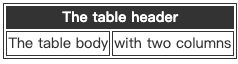
<table>
<div role="table" aria-label="Semantic Elements" aria-rowcount="3" aria-colcount="2">
  <div role="rowgroup">
    <div role="row" aria-rowindex="1">
      <span role="columnheader">ARIA Role</span>
      <span role="columnheader">Semantic Element</span>
    </div>
  </div>
  <div role="rowgroup">
    <div role="row" aria-rowindex="2">
      <span role="cell">row</span>
      <span role="cell">tr</span>
    </div>
    <div role="row" aria-rowindex="3">
      <span role="cell">rowgroup</span>
      <span role="cell">thead</span>
    </div>
  </div>
</div>| ARIA Role | Semantic Element |
|---|---|
| row | tr |
| rowgroup | thead, tbody |
row = 1
row = 2
row = 3
col = 1
col = 2
<table>
- role: table
- aria-rowcount
- aria-colcount
<tr>, <th>, <td>
- role: rowgroup, row, columnheader, cell
- aria-rowindex
<div
  role="presentation"
  onClick={() => {}}>
  I'm clickable
</div>
role="presentation" ?
The presentation role is used to remove semantic meaning from an element
Bad Accessibility !!
<div
  tabIndex="0"
  aria-label="I'm focusable">
  ...
</div>
tabIndex ?
-
tabindex is not present or does not have a valid value
- The element has its default focus behavior.
-
tabindex="0"
- The element is included in the tab sequence based on its position in the DOM.
-
tabindex="-1"
- The element is not included in the tab sequence but is focusable with element.focus().
-
tabindex="X" where X is an integer in the range 1 <= X <= 32767
- NOT RECOMMEND !!
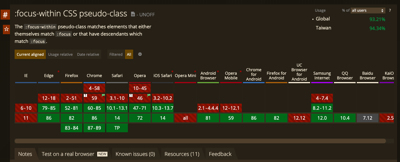
css focus-within
const wrapper = css`
  width: 100%;
  display: none;

  &[open] {
    display: block;
  }

  &:focus-within {
    border: 1px solid #1a1a1a;
  }
`;

return (
  <dialog open="true" className={wrapper}>
    <input type="text" />
    <button type="button">
      button
    </button>
  </dialog>
);
css focus-within
const wrapper = css`
  width: 100%;
  transition: opacity 0.2s ease-in;
  opacity: 0;
  pointer-events: none;
  visibility: hidden;

  &[open] {
    opacity: 1;
    pointer-events: auto;
    visibility: visible;
  }

  &[open]:not(:focus-within) {
    opacity: 0.99;
    transition: opacity 0.01s ease-in;
  }
`;

function Modal() {
  const ref = useRef();

  useEffect(() => {
    const { current: modal } = ref;

    function forceFocus() {
      const modalFocusableNodes = modal.querySelectorAll(
        'button, [href], input, select, textarea, [tabindex]:not([tabindex="-1"])'
      );

      if (modalFocusableNodes.length) {
        modalFocusableNodes[0].focus();
      }
    }

    if (modal) {
      modal.addEventListener('transitionend', forceFocus);
    }

    return () => {
      if (modal) {
        modal.removeEventListener('transitionend', forceFocus);
      }
    };
  }, []);

  return (
    <dialog ref={ref} open="true" className={wrapper}>
      <input type="text" />
      <button type="button">
        button
      </button>
    </dialog>
  );
}
DEMO
Thanks
ARIA
By Travor Lee


