Lesson 10
Information Dashboard Design

IS428 Visual Analytics for Business Intelligence
IS428 Visual Analytics for Business Intelligence
Lesson 10: Information Dashboard Design
Content
- Introducing information dashboard
- Information dashboard design best practices
- Common mistakes in dashboard design
- Ideal graphs for information dashboard
- Bullet graph
- Sparklines
- Bandlines
IS428 Visual Analytics for Business Intelligence
Lesson 10: Information Dashboard Design
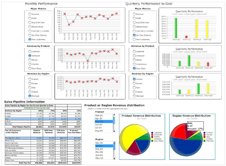
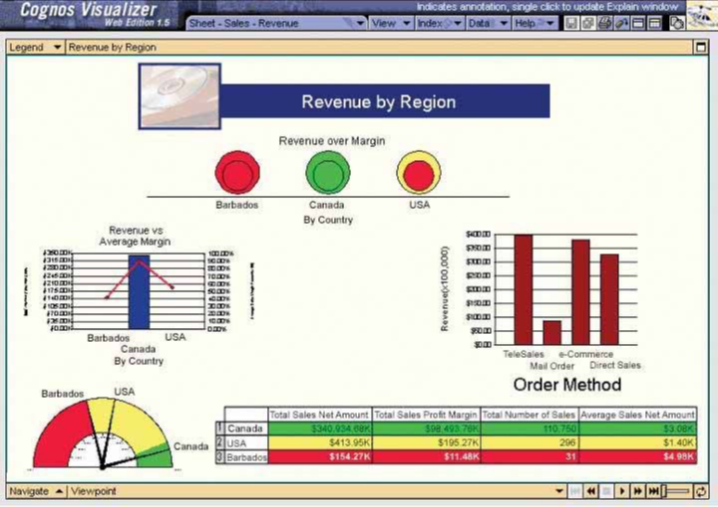
Introducing information dashboard
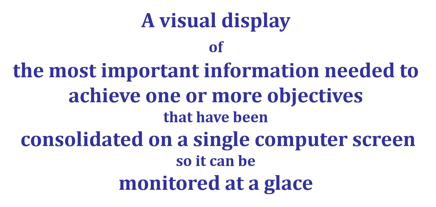
Source: Stephen Few (2006) Information Dashboard Design
IS428 Visual Analytics for Business Intelligence
Lesson 10: Information Dashboard Design
Introducing information dashboard
Why are dashboards so important?
- A well-designed performance dashboard helps you to see more clearly by helping you to understand each fact more quickly so you can find patterns in the storm.
IS428 Visual Analytics for Business Intelligence
Lesson 10: Information Dashboard Design
Introducing information dashboard
Classifying Dashboards by Role
- Dashboards for strategic purpose
- Dashboards for operational purpose
- Dashboards for analytics purpose
IS428 Visual Analytics for Business Intelligence
Lesson 10: Information Dashboard Design
Introducing information dashboard
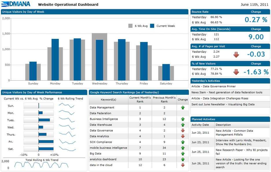
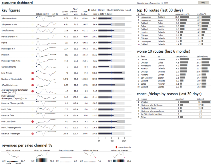
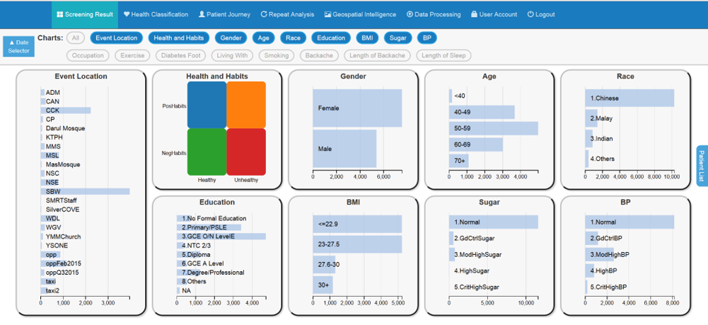
Dashboards for operational purpose
IS428 Visual Analytics for Business Intelligence
Lesson 10: Information Dashboard Design
Introducing information dashboard
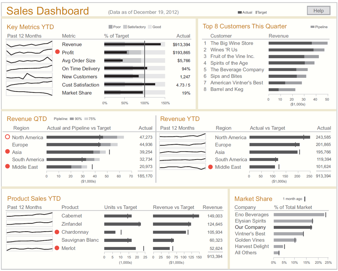
Dashboards for strategic purpose
IS428 Visual Analytics for Business Intelligence
Lesson 10: Information Dashboard Design
Introducing information dashboard
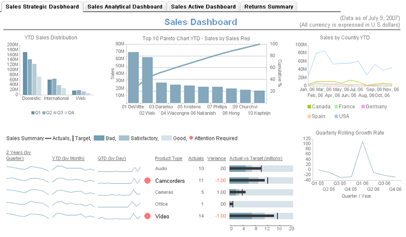
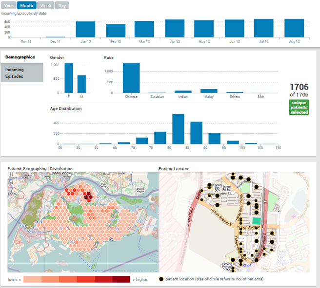
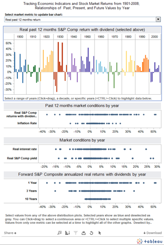
Dashboards for analytics purpose
IS428 Visual Analytics for Business Intelligence
Lesson 10: Information Dashboard Design
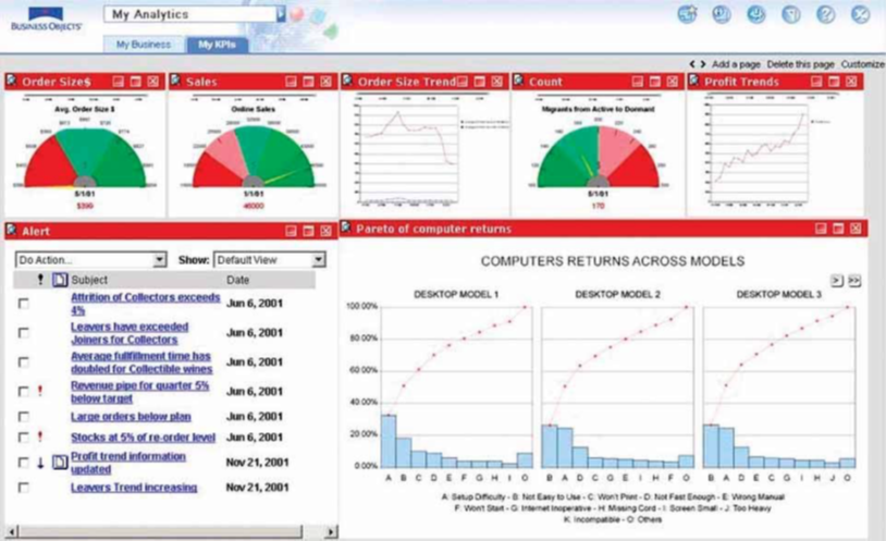
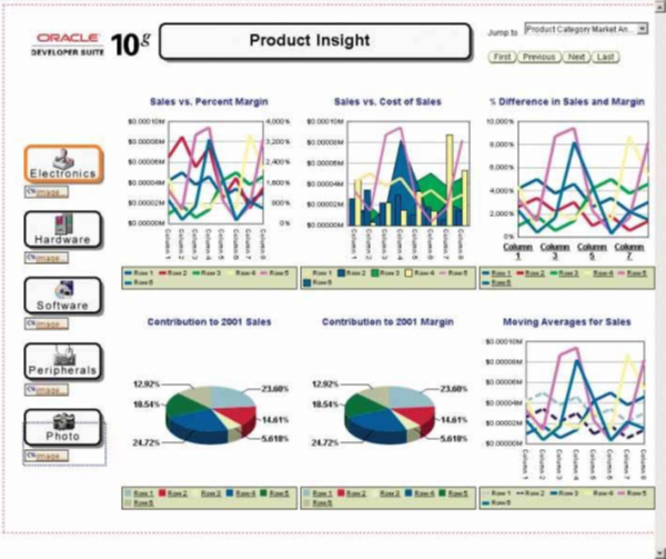
Evolution of information dashboard
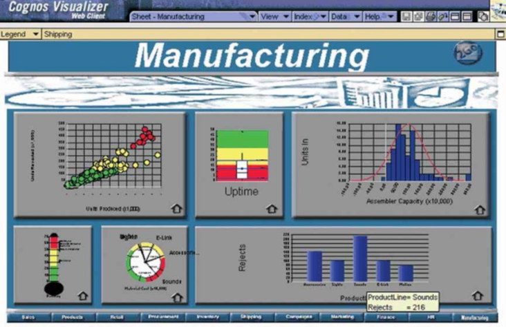
Traditional Dashboard and Reporting Tools
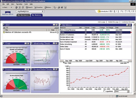
SAP-Business Objects
SAS Web Reporting Studio
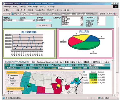
Oracle Hyperion
IS428 Visual Analytics for Business Intelligence
Lesson 10: Information Dashboard Design
Evolution of information dashboard
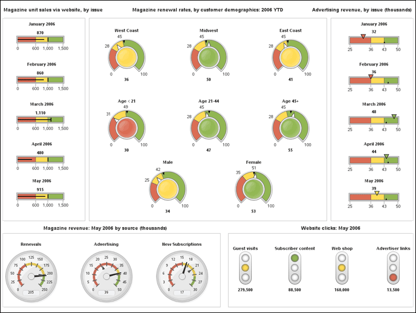
Second Generation Information Dashboard
IS428 Visual Analytics for Business Intelligence
Lesson 10: Information Dashboard Design
Evolution of information dashboard
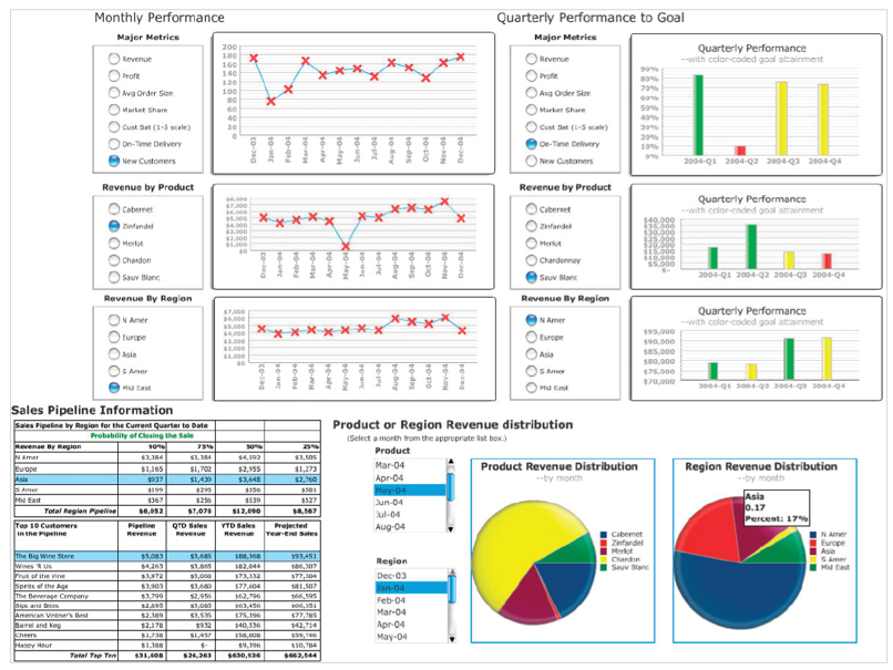
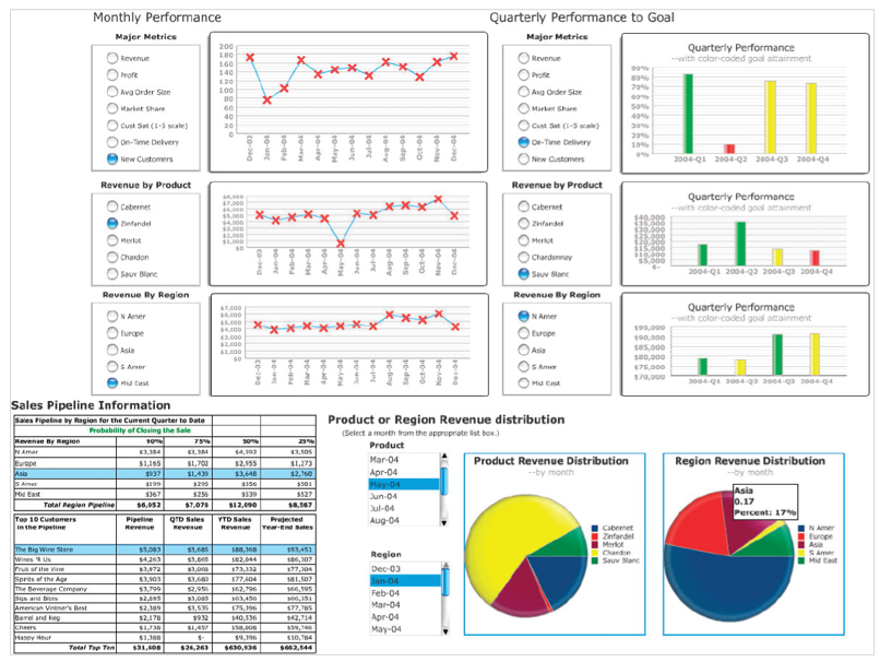
Second Generation Information Dashboard
- Excel-based dashboard is inexpensive
- Excel-based dashboard does not required costly and time-consuming training
- Excel-based dashboard is very flexible
- Excel-based dashboard is seamlessly integrated with spreadsheet’s advanced modelling functions
IS428 Visual Analytics for Business Intelligence
Lesson 10: Information Dashboard Design
Evolution of information dashboard
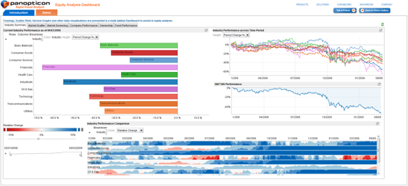
Second Generation Information Dashboard
Tableau
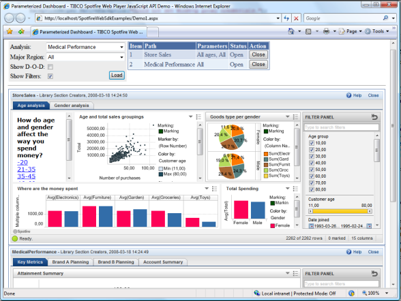
SpotFire
Panopticon
IS428 Visual Analytics for Business Intelligence
Lesson 10: Information Dashboard Design
Evolution of information dashboard
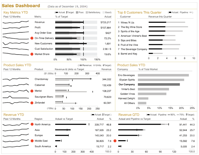
Third Generation Information Dashboard
IS428 Visual Analytics for Business Intelligence
Lesson 10: Information Dashboard Design
Best Practices for Dashboard Design
- Preparing stage
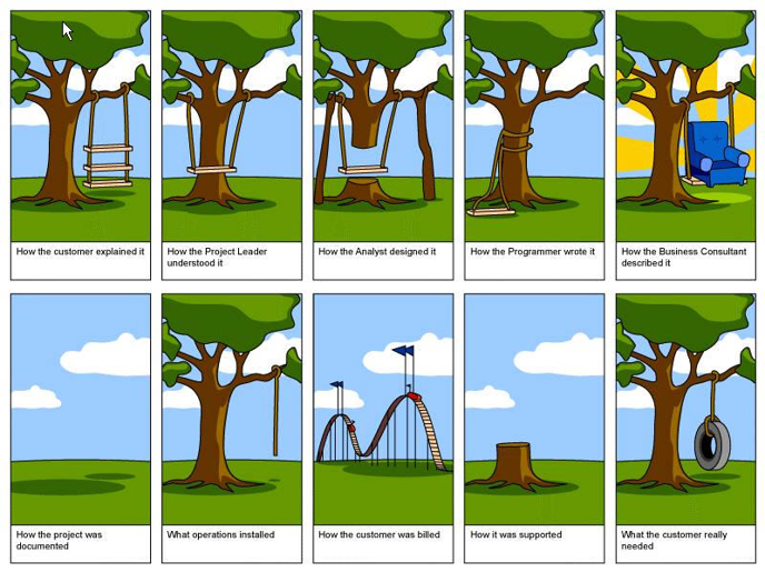
- Target the user
- Know what value your dashboard will add
- Display only actionable information
- Design stage
- Right tool for the right job
- Context
- Layout and clarity
- Visual aesthetics
IS428 Visual Analytics for Business Intelligence
Lesson 10: Information Dashboard Design
Best Practices for Dashboard Design
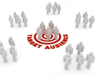
Preparing stage: Target the user
IS428 Visual Analytics for Business Intelligence
Lesson 10: Information Dashboard Design
Best Practices for Dashboard Design
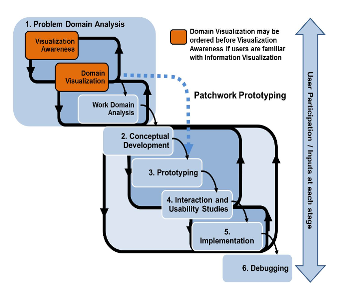
Preparing stage: User-centered Design Process
IS428 Visual Analytics for Business Intelligence
Lesson 10: Information Dashboard Design
Best Practices for Dashboard Design
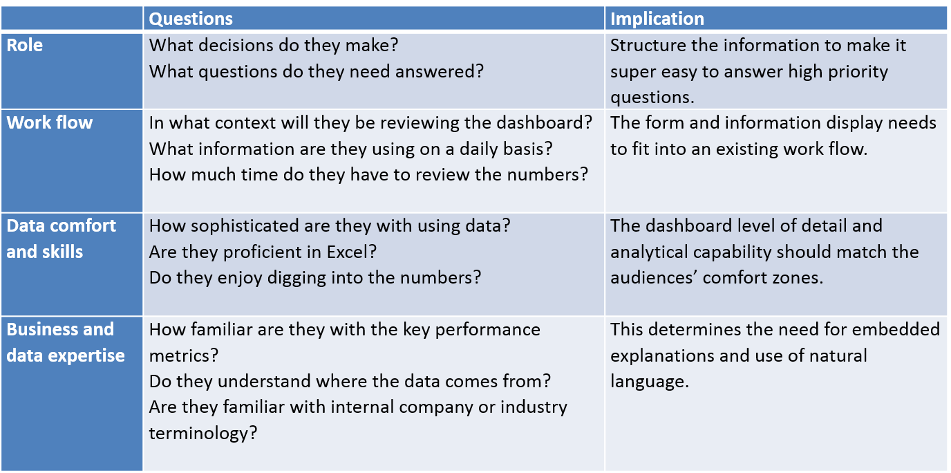
Preparing stage: A User-Centric Dashboard Design Guide


- Who is my target audience?
-
What value will the dashboard add?
-
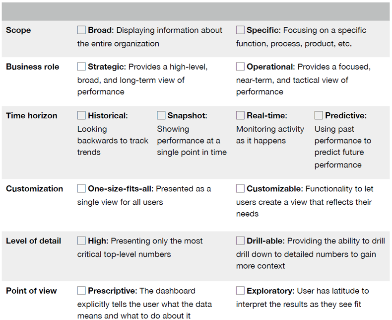
What type of dashboard am I creating?
IS428 Visual Analytics for Business Intelligence
Lesson 10: Information Dashboard Design
Best Practices for Dashboard Design
Preparing stage: A User-Centric Dashboard Design Guide
- Who is my target audience?
IS428 Visual Analytics for Business Intelligence
Lesson 10: Information Dashboard Design
Best Practices for Dashboard Design
Preparing stage: A User-Centric Dashboard Design Guide
- What value will the dashboard bring?
IS428 Visual Analytics for Business Intelligence
Lesson 10: Information Dashboard Design
Best Practices for Dashboard Design
Preparing stage: A User-Centric Dashboard Design Guide
- What value will the dashboard bring?
-
Help management define what is important.
-
Educate people in the organization about the things that matter.
-
Set goals and expectations for specific individuals or groups.
-
Help executives sleep at night because they know what’s going on.
-
Encourage specific actions in a timely manner.
-
IS428 Visual Analytics for Business Intelligence
Lesson 10: Information Dashboard Design
Best Practices for Dashboard Design
Preparing stage: A User-Centric Dashboard Design Guide
- What value will the dashboard bring?
-
Highlight exceptions and provide alerts when problems occur.
-
Communicate progress and success.
-
Provide a common interface for interacting with and analysing important business data.
-
IS428 Visual Analytics for Business Intelligence
Lesson 10: Information Dashboard Design
Best Practices for Dashboard Design
Preparing stage: A User-Centric Dashboard Design Guide
- What type of dashboard am I creating?
IS428 Visual Analytics for Business Intelligence
Lesson 10: Information Dashboard Design
Best Practices for Dashboard Design
Preparing stage: A User-Centric Dashboard Design Guide
- Information Discrimination
-
Find the core
-
Ask a better question
-
Push to the appendix
-
Reporting vs exploration
-

IS428 Visual Analytics for Business Intelligence
Lesson 10: Information Dashboard Design
Best Practices for Dashboard Design
Preparing stage: A User-Centric Dashboard Design Guide
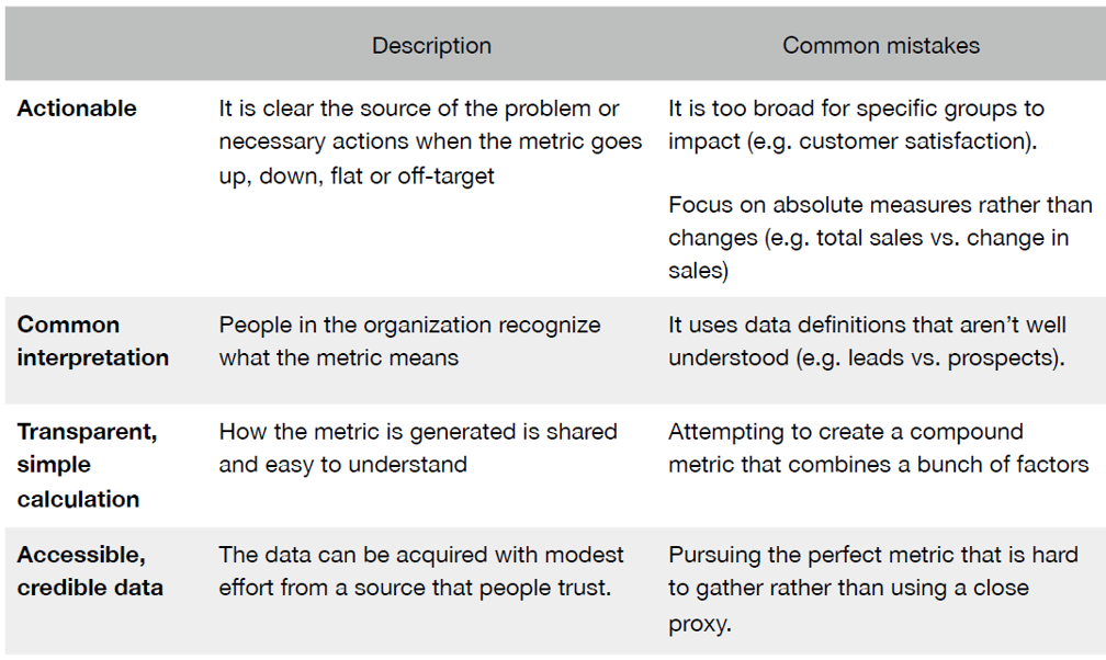
- Choosing the perfect metric
IS428 Visual Analytics for Business Intelligence
Lesson 10: Information Dashboard Design
Best Practices for Dashboard Design
Design stage
- Common mistakes in dashboard design
- Context
- Layout and clarity
- Visual aesthetics
IS428 Visual Analytics for Business Intelligence
Lesson 10: Information Dashboard Design
Best Practices for Dashboard Design
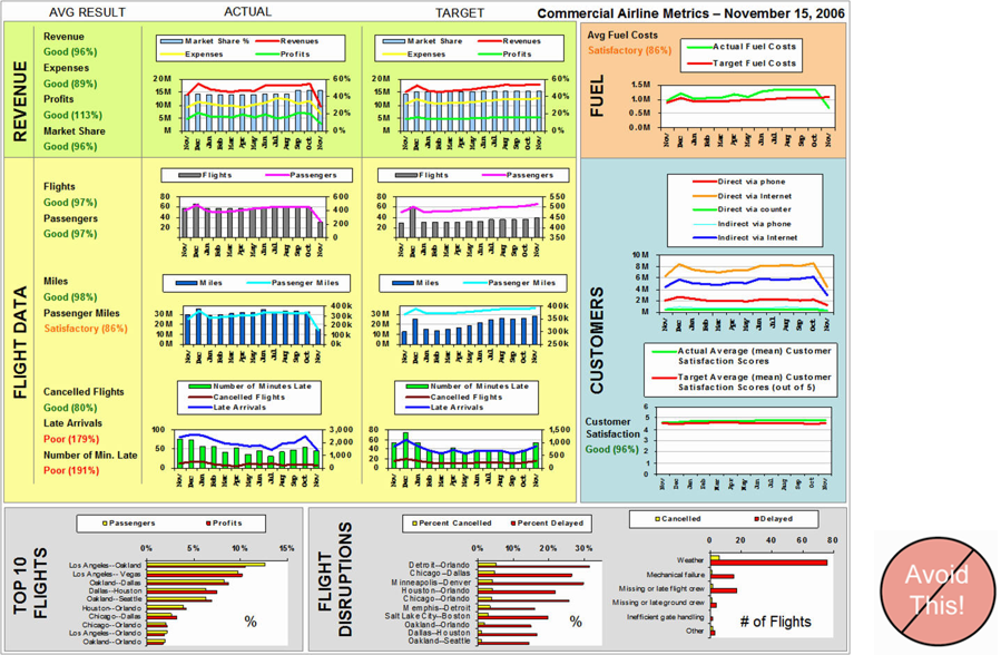
Common mistakes in dashboard design
-
Exceeding the boundaries of a single page
-
Supplying inadequate context for the data
-
Displaying excessive detail or precision
-
Exposing measure indirectly
-
Choosing inappropriate display media
-
Introducing meaningless variety
-
Using poorly designed display media
-
Encoding quantitative data inaccurately
IS428 Visual Analytics for Business Intelligence
Lesson 10: Information Dashboard Design
Best Practices for Dashboard Design
Common mistakes in dashboard design
-
Arranging information poorly
-
Highlighting important information ineffectively or not at all
-
Clustering the display with visual effects
-
Misusing or overusing colour
-
Designing an unattractive visual display
IS428 Visual Analytics for Business Intelligence
Lesson 10: Information Dashboard Design
Best Practices for Dashboard Design
Common mistakes in dashboard design
-
Exceeding the boundaries of a single page
-
Requiring the viewer to scroll
-
IS428 Visual Analytics for Business Intelligence
Lesson 10: Information Dashboard Design
Best Practices for Dashboard Design
Common mistakes in dashboard design
-
Exceeding the boundaries of a single page
-
Fragmenting data into separate screen
-
IS428 Visual Analytics for Business Intelligence
Lesson 10: Information Dashboard Design
Best Practices for Dashboard Design
Common mistakes in dashboard design
-
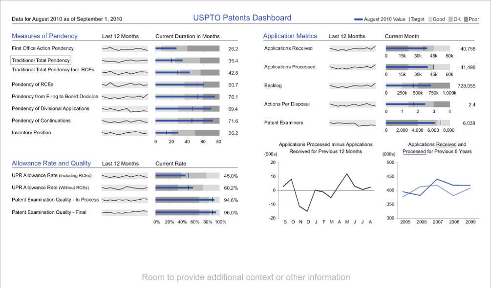
Supplying Inadequate Context for the Data
IS428 Visual Analytics for Business Intelligence
Lesson 10: Information Dashboard Design
Best Practices for Dashboard Design
Common mistakes in dashboard design
-
Supplying Inadequate Context for the Data
IS428 Visual Analytics for Business Intelligence
Lesson 10: Information Dashboard Design
Best Practices for Dashboard Design
Common mistakes in dashboard design
-
Displaying excessive detail or precision
IS428 Visual Analytics for Business Intelligence
Lesson 10: Information Dashboard Design
Best Practices for Dashboard Design
Common mistakes in dashboard design
-
Choosing a deficient measure
IS428 Visual Analytics for Business Intelligence
Lesson 10: Information Dashboard Design
Best Practices for Dashboard Design
Common mistakes in dashboard design
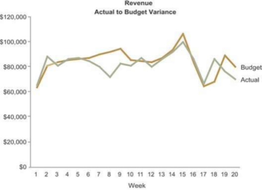
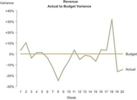
-
Choosing inappropriate display media
IS428 Visual Analytics for Business Intelligence
Lesson 10: Information Dashboard Design
Best Practices for Dashboard Design
Common mistakes in dashboard design
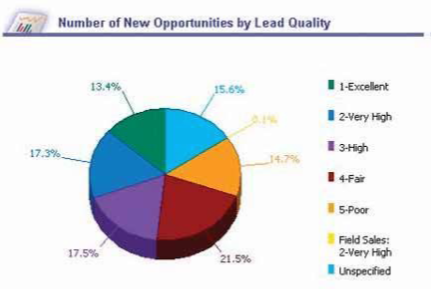
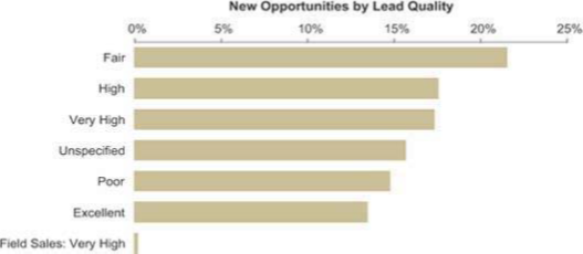
-
Introducing meaningless variety
IS428 Visual Analytics for Business Intelligence
Lesson 10: Information Dashboard Design
Best Practices for Dashboard Design
Common mistakes in dashboard design
-
Using poorly designed display media such as 3D
IS428 Visual Analytics for Business Intelligence
Lesson 10: Information Dashboard Design
Best Practices for Dashboard Design
Common mistakes in dashboard design
-
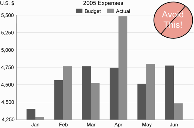
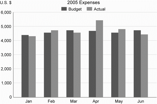
Encoding quantitative data inaccurately
IS428 Visual Analytics for Business Intelligence
Lesson 10: Information Dashboard Design
Best Practices for Dashboard Design
Common mistakes in dashboard design
-
Arranging the data poorly
IS428 Visual Analytics for Business Intelligence
Lesson 10: Information Dashboard Design
Best Practices for Dashboard Design
Common mistakes in dashboard design
-
Highlighting important data ineffectively or not
IS428 Visual Analytics for Business Intelligence
Lesson 10: Information Dashboard Design
Best Practices for Dashboard Design
Common mistakes in dashboard design
-
Appropriate used of highlighting
IS428 Visual Analytics for Business Intelligence
Lesson 10: Information Dashboard Design
Best Practices for Dashboard Design
Common mistakes in dashboard design
-
Cluttering the display with useless decoration
IS428 Visual Analytics for Business Intelligence
Lesson 10: Information Dashboard Design
Best Practices for Dashboard Design
Common mistakes in dashboard design
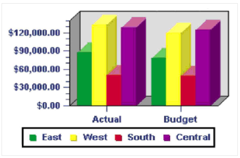
Misusing or overusing colour
IS428 Visual Analytics for Business Intelligence
Lesson 10: Information Dashboard Design
Best Practices for Dashboard Design
Common mistakes in dashboard design
-
Designing an unattractive visual display
IS428 Visual Analytics for Business Intelligence
Lesson 10: Information Dashboard Design
Best Practices for Dashboard Design
Common mistakes in dashboard design
-
Design that failed to reveal KPIs effectively
IS428 Visual Analytics for Business Intelligence
Lesson 10: Information Dashboard Design
Best Practices for Dashboard Design
Common mistakes in dashboard design
-
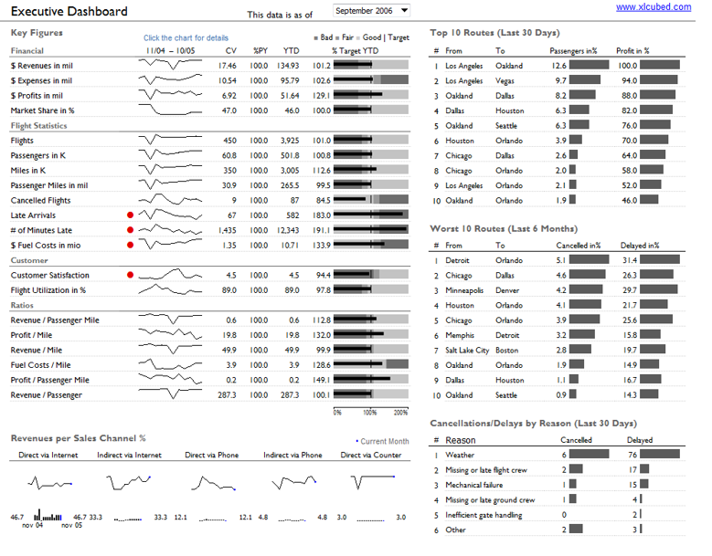
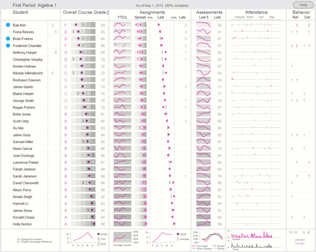
Design that reveals KPIs effectively
IS428 Visual Analytics for Business Intelligence
Lesson 10: Information Dashboard Design
Best Practices for Dashboard Design
Common mistakes in dashboard design
-
Design with poor layout and clarity
IS428 Visual Analytics for Business Intelligence
Lesson 10: Information Dashboard Design
Best Practices for Dashboard Design
Common mistakes in dashboard design
-
Design with good layout and clarity
IS428 Visual Analytics for Business Intelligence
Lesson 10: Information Dashboard Design
Best Practices for Dashboard Design
Common mistakes in dashboard design
-
Design with poor visual aestheticsness
IS428 Visual Analytics for Business Intelligence
Lesson 10: Information Dashboard Design
Best Practices for Dashboard Design
Common mistakes in dashboard design
-
Design with good visual aestheticsness
IS428 Visual Analytics for Business Intelligence
Lesson 10: Information Dashboard Design
Best Practices for Dashboard Design
Common mistakes in dashboard design
-
Design with good visual aestheticsness
IS428 Visual Analytics for Business Intelligence
Lesson 10: Information Dashboard Design
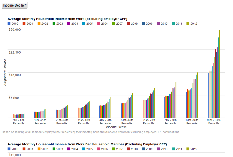
Ideal graphs for information dashboard
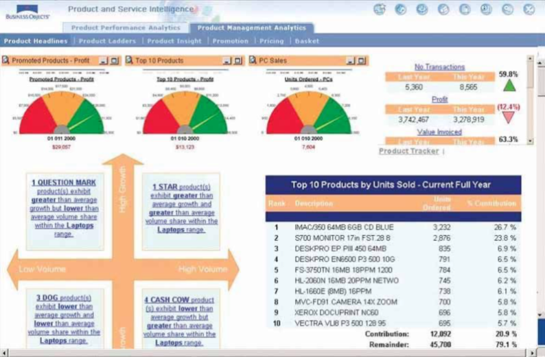
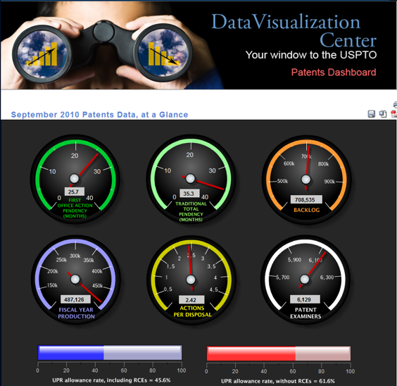
Right tool for the right job
-
Poor choice of visual representation
IS428 Visual Analytics for Business Intelligence
Lesson 10: Information Dashboard Design
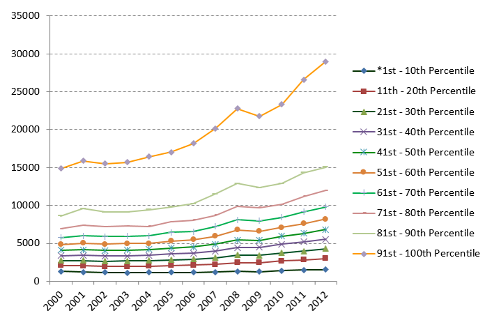
Ideal graphs for information dashboard
Right tool for the right job
-
Appropriate choice of visual representation
IS428 Visual Analytics for Business Intelligence
Lesson 10: Information Dashboard Design
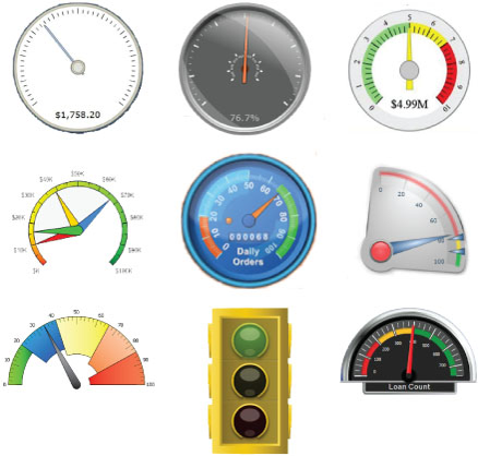
Ideal graphs for information dashboard
Right tool for the right job
-
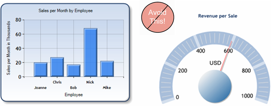
An assortment of typical dashboard gauges
IS428 Visual Analytics for Business Intelligence
Lesson 10: Information Dashboard Design
Ideal graphs for information dashboard
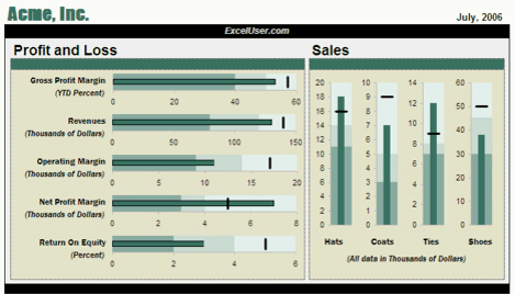
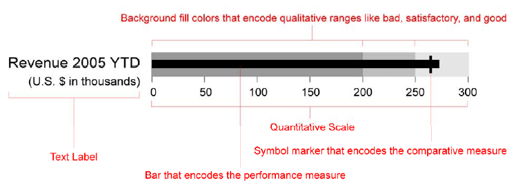
Introduction to Bullet Graphs
-
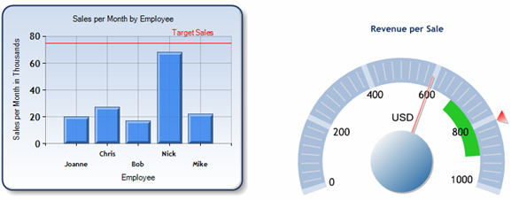
Bullet graphs to replace gauges

IS428 Visual Analytics for Business Intelligence
Lesson 10: Information Dashboard Design
Ideal graphs for information dashboard
Introduction to Bullet Graphs
-
Bullet graph specifications
IS428 Visual Analytics for Business Intelligence
Lesson 10: Information Dashboard Design
Ideal graphs for information dashboard
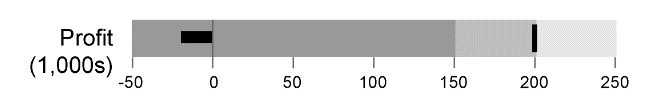
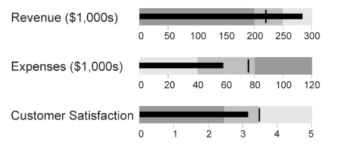
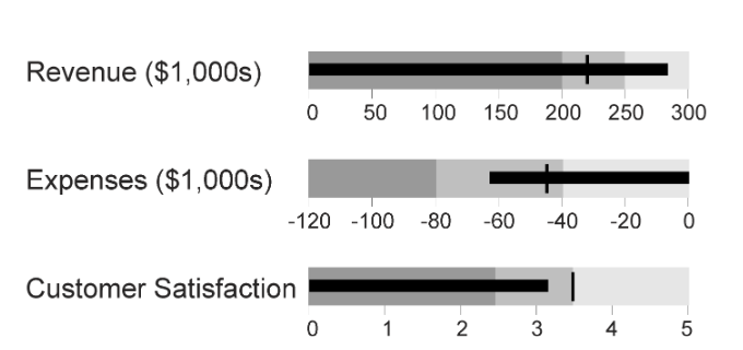
Introduction to Bullet Graphs
-
Alternative design
IS428 Visual Analytics for Business Intelligence
Lesson 10: Information Dashboard Design
Ideal graphs for information dashboard
Introduction to Bullet Graphs
-
Alternative design
IS428 Visual Analytics for Business Intelligence
Lesson 10: Information Dashboard Design
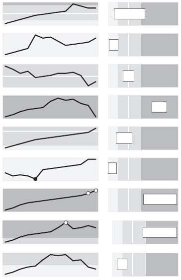
Ideal graphs for information dashboard
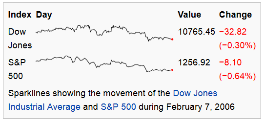
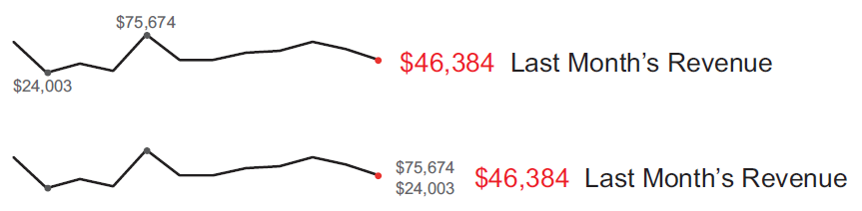
Introduction to Sparklines
- A sparkline is a very small line chart, typically drawn without axes or coordinates.

IS428 Visual Analytics for Business Intelligence
Lesson 10: Information Dashboard Design
Ideal graphs for information dashboard
Introduction to Sparklines
- Unintentional optical clutter
IS428 Visual Analytics for Business Intelligence
Lesson 10: Information Dashboard Design
Ideal graphs for information dashboard
Introduction to Sparklines
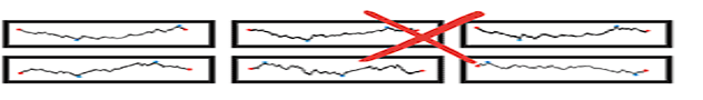
-
Aspect ratio: A graphic's width/height ratio makes a big difference in displaying data.
IS428 Visual Analytics for Business Intelligence
Lesson 10: Information Dashboard Design
Ideal graphs for information dashboard
Introduction to Sparklines
-
Aspect ratio consideration
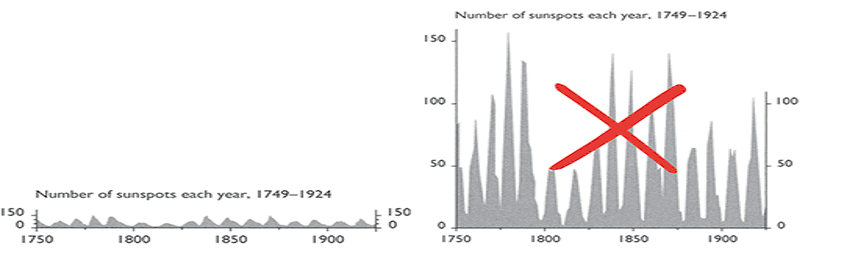
IS428 Visual Analytics for Business Intelligence
Lesson 10: Information Dashboard Design
Ideal graphs for information dashboard
Introduction to Sparklines
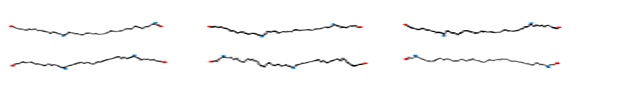
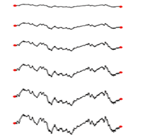
-
How should a sparkline aspect ratio be chosen?

IS428 Visual Analytics for Business Intelligence
Lesson 10: Information Dashboard Design
Ideal graphs for information dashboard
Introduction to Sparklines
-
Enriched with context
IS428 Visual Analytics for Business Intelligence
Lesson 10: Information Dashboard Design
Ideal graphs for information dashboard
Introduction to Sparklines
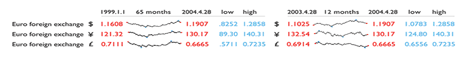
-
Use reference line to provide context

IS428 Visual Analytics for Business Intelligence
Lesson 10: Information Dashboard Design
Ideal graphs for information dashboard
Introduction to Sparklines
-
Use reference region to provide context

IS428 Visual Analytics for Business Intelligence
Lesson 10: Information Dashboard Design
Ideal graphs for information dashboard
Introduction to Sparklines
-
Sparklines for Excel
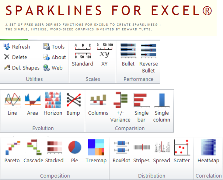
IS428 Visual Analytics for Business Intelligence
Lesson 10: Information Dashboard Design
Ideal graphs for information dashboard
Introduction to Sparklines
-
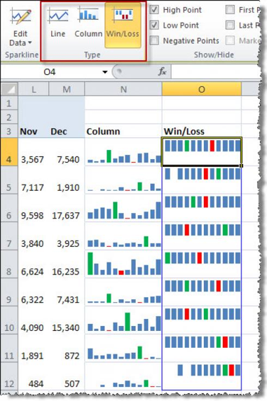
Microsoft Excel’s Sparklines ribbon
IS428 Visual Analytics for Business Intelligence
Lesson 10: Information Dashboard Design
Ideal graphs for information dashboard
Introduction to Sparklines
-
Limitation: featuring patterns and magnitude together
IS428 Visual Analytics for Business Intelligence
Lesson 10: Information Dashboard Design
Ideal graphs for information dashboard
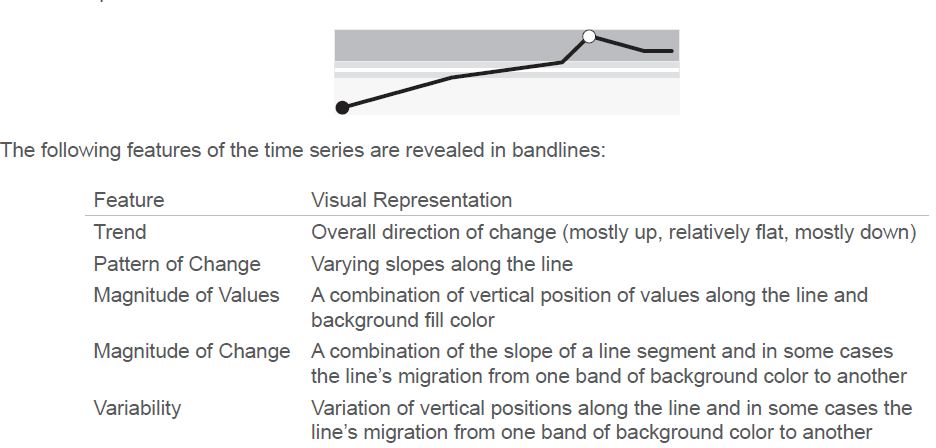
Introducing bandlines
IS428 Visual Analytics for Business Intelligence
Lesson 10: Information Dashboard Design
Ideal graphs for information dashboard
Introducing bandlines
- How to interpret bandlines?
IS428 Visual Analytics for Business Intelligence
Lesson 10: Information Dashboard Design
Ideal graphs for information dashboard
Introducing bandlines
- How to interpret bandlines?
IS428 Visual Analytics for Business Intelligence
Lesson 10: Information Dashboard Design
Ideal graphs for information dashboard
Introducing bandlines
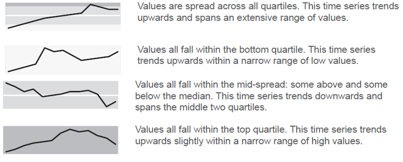
- Bandlines with magnitude information
IS428 Visual Analytics for Business Intelligence
Lesson 10: Information Dashboard Design
Ideal graphs for information dashboard
Introducing bandlines
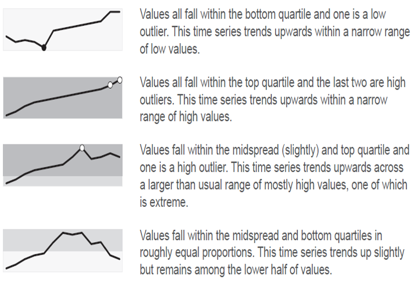
- Bandlines use case
IS428 Visual Analytics for Business Intelligence
Lesson 10: Information Dashboard Design
References
-
A Guide to Creating Dashboards People Love to Use (http://static.squarespace.com/static/52f42657e4b0b3416ff6b831/t/5310292ce4b08d35a87c9426/1393568044420/Guide_to_Dashboard_Design.pdf)
-
5 Best Practices for Creating Effective Dashboards (http://www.tableausoftware.com/learn/whitepapers/5-best-practices-for-effective-dashboards)
-
The Must Do’s of Marketing Dashboards (http://www.tableau.com/sites/default/files/media/whitepaper_mustdosofmarketingdashboards_eng_3.pdf)
-
Making Flow Happen (http://www.tableau.com/learn/webinars/making-flow-happen-dashboards-persuade-inform-and-engage)
-
With Dashboards: Formatting and layout Definitely Matter (http://www.perceptualedge.com/articles/Whitepapers/Formatting_and_Layout_Matter.pdf)
-
Dashboard Design for real-Time Situation Awareness (http://www.perceptualedge.com/articles/Whitepapers/Dashboard_Design.pdf)
IS428 Visual Analytics for Business Intelligence
Lesson 10: Information Dashboard Design
References
- Dashboard Design for Rich and Rapid Monitoring (http://www.perceptualedge.com/articles/visual_business_intelligence/dd_for_rapid_monitoring.pdf)
- Pervasive Hurdles to Effective Dashboard Design (http://www.perceptualedge.com/articles/visual_business_intelligence/pervasive_hurdles_to_dd.pdf)
- Why Most Dashboards Fail (http://www.perceptualedge.com/articles/misc/WhyMostDashboardsFail.pdf)
- Dashboard Confusion (http://www.perceptualedge.com/articles/ie/dashboard_confusion.pdf)
- Dashboard Confusion Revisited (http://www.perceptualedge.com/articles/visual_business_intelligence/dboard_confusion_revisited.pdf)
- Dashboard Design for at-a-glance monitoring (http://courses.ischool.berkeley.edu/i247/s10/lectures/Few-Dashboards.pdf)
IS428 Visual Analytics for Business Intelligence
Lesson 11: Information Dashboard Design
References
- Bullet graph @wiki (https://en.wikipedia.org/wiki/Bullet_graph)
- Bullet Graph Design Specification (http://www.perceptualedge.com/articles/misc/Bullet_Graph_Design_Spec.pdf)
- Sparkline theory and practice (http://www.edwardtufte.com/bboard/q-and-a-fetch-msg?msg_id=0001OR)
- Best Practices for Scaling Sparklines in Dashboard (http://www.perceptualedge.com/articles/visual_business_intelligence/best_practices_for_scaling_sparklines.pdf)
- Introducing Bandlines (https://www.perceptualedge.com/articles/visual_business_intelligence/introducing_bandlines.pdf)
IS428 Visual Analytics for Business Intelligence
Lesson 10: Information Dashboard Design
References
Blog
- Dashboard Design @ Perceptual Edge (http://www.perceptualedge.com/discussion.htm)
- ExcelChart (http://www.excelcharts.com/blog/dashboards/)
- Excel Dashboard (http://chandoo.org/wp/excel-dashboards/)
- ExcelUser (http://www.exceluser.com/excel_dashboards/index.htm)
IS428-Lesson10
By Kam Tin Seong


