Atomic Web
design and dev
http://atomicdesign.bradfrost.com/
Book Report
tl;dr?

http://bradfrost.com/
Author
I'm just curating... direct your praise and/or anger to:
Book Audience
-
generally, every discipline involved with creating a UI
- devs, designers, management
- specifically, designers: particularly those from a non-digital background
- specifically, front-end devs: those who create and maintain user-facing apps/pages
Book Structure
- conceptually instructional
- not a dive into code
- he makes many assertions & opinions
need your comments
in the beginning...
The "Page"
Each page was handcrafted
academics could easily share and link together their documents
The page metaphor has been baked into the lexicon of the Web since the very beginning.
the page metaphor helped new Web users explore and eventually master an entirely new medium using conventions they were already comfortable with.
the metaphor lives today

the way things are named very much impacts how they’re perceived and utilized
“We’re a startup looking to launch a 5-page website this October…”
“... how long will the home page take to build?”
“How are we ever going to redesign this university website that contains over 30,000 pages?!”
resulting in...
a project’s level of effort is much better determined by the functionality and components contained within those pages -- not quantity of pages themselves.
the fundamental mistake: assuming a page is a uniform, isolated, quantifiable thing. The reality is that the Web is a fluid, bi-directional, interdependent medium


the bi-directional and interactive nature of the Web adds many more dimensions to what constitutes good design. Speed, screen size, environment, technological capabilities, form-factor, ergonomics, usability, accessibility, context, and user preferences must be considered if we want to create great work for this brave new digital world.
Unique Digital Design Considerations
Flexibility
Impact of the network
Interaction
Motion
Ergonomics
Color and text rendering
Pixel density
Scrolling performance
Device and browser quirks
User preferences
25 years into this new medium, and this once-necessary figure of speech has overstayed its welcome.
time has come for us to evolve beyond the "page"
Explosion of the Web
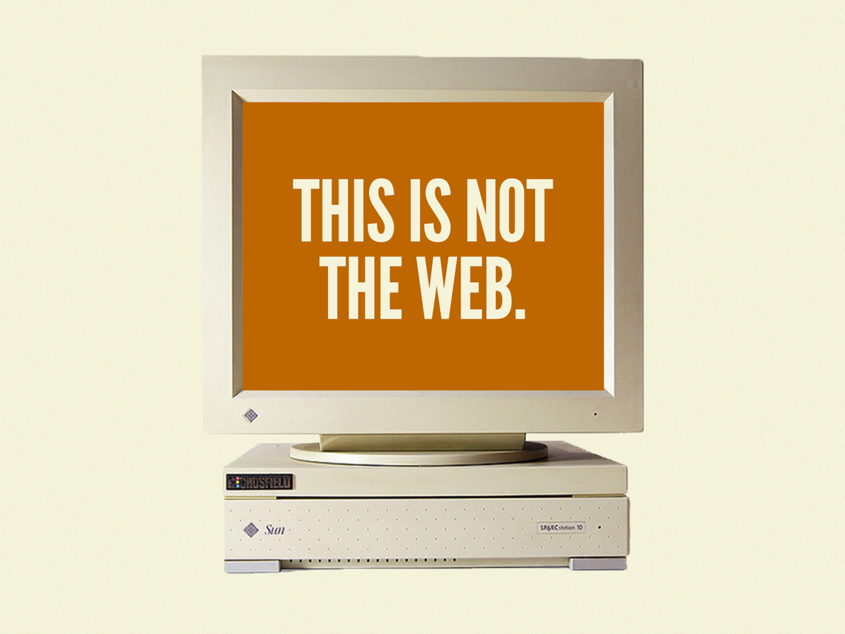
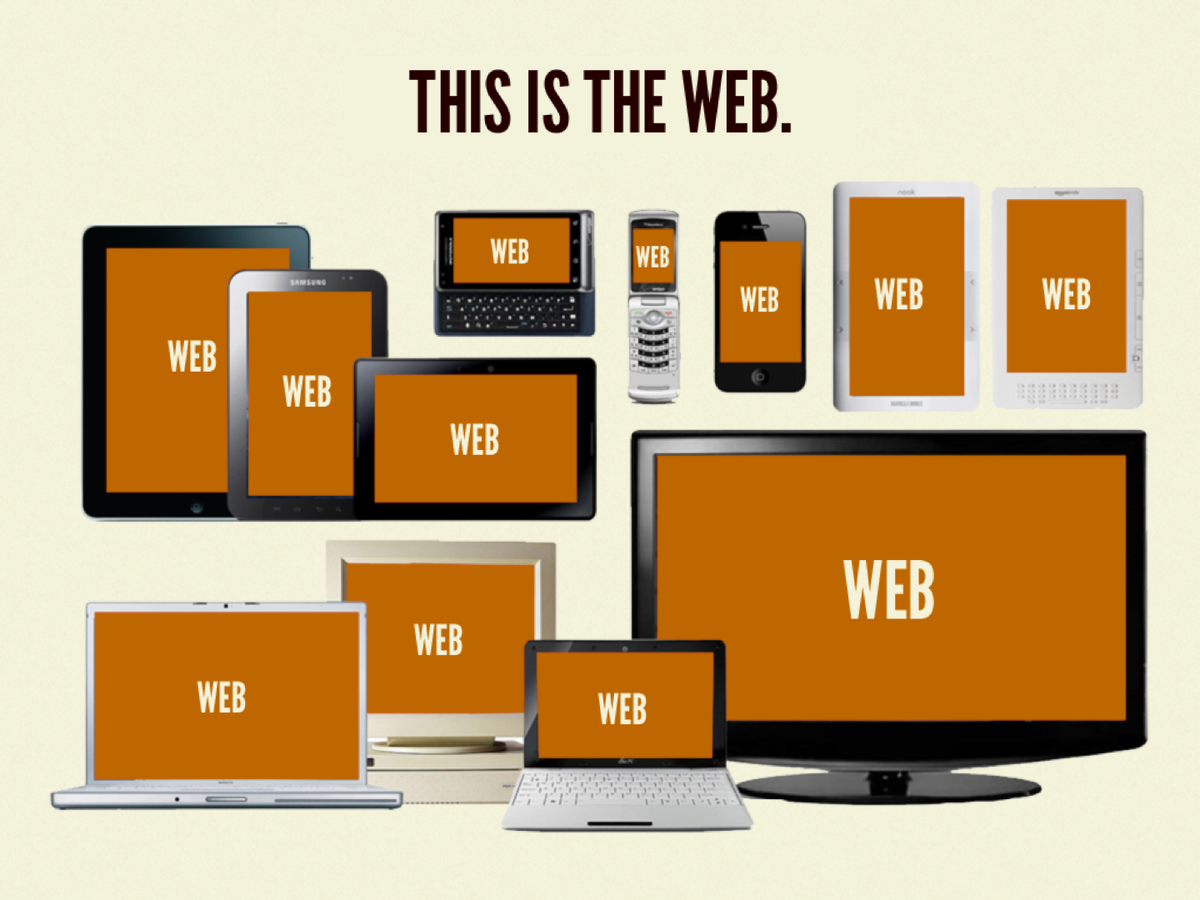

The device and Web landscape of tomorrow will undoubtedly be even bigger and diverse than today’s
"Drowning in a Sea of devices"
a "piece" of content is being viewed in many different shapes and sizes
the Web is Crazy
Leveling Up
Dev
leveling-up
smaller, more manageable chunks.
to maintain sanity, we need
Hence the Buzzwords
Front-end
Components
Node Modules
Micro Services
BEM
CSS Modules
SRP
OOCSS
SMACSS
Modularity FTW
The spirit of modularity is weaving its way into every aspect of the Web creation process and having profound effects on organizations’ strategy, process, content, design, and development.
Design
leveling-up
untenable to produce static mockups of every page on a Web experience
the most effective way to show your clients what their website will never look like.
Photoshop Comps
We’re not designing pages, we’re designing systems of components.
-- Stephen Hay
It’s essential to get stakeholders comfortable with reviewing works in progress rather than fully-baked designs and code.
getting the design into the browser as fast as possible, you confront stakeholders with the realities of the final medium much sooner in the process
Giant Photoshop Comps
Style Tiles
Element Collages
Pattern Libraries
Content
leveling-up
"In order to properly address this increasingly diverse and eclectic digital landscape, we need to dramatically overhaul our perception of content and the tools we use to manage it."
Get your content ready to go anywhere, because it’s going to go everywhere.
- For A Future-Friendly Web
we need well-designed chunks of content that we can then figure out how we want to restructure and publish and display in a way that’s going to be right for the appropriate platform.
- Karen McGrane
If you've stored a view model in database, you're not prepared to go everywhere.
- Me
Teams
leveling-up
front-end developers are often relegated to crude production machines that are brought into the project only after all the design decisions are made. This archaic process keeps disciplines out of sync with each other and prevents teams from working together in a meaningful way. This of course is a huge mistake.
creating a division between designers and frontend developers is an absolutely terrible idea
it’s crucial to treat frontend development as a core part of the design process
People
leveling-up
You can have all the right technologies in place, use the latest-and-greatest tools, and even have extraordinarily talented individuals on board, but if everyone involved isn’t actually cooperating and communicating with each other then you’re not going to create great work. It’s as simple as that.
Process
leveling-up
Waterfall
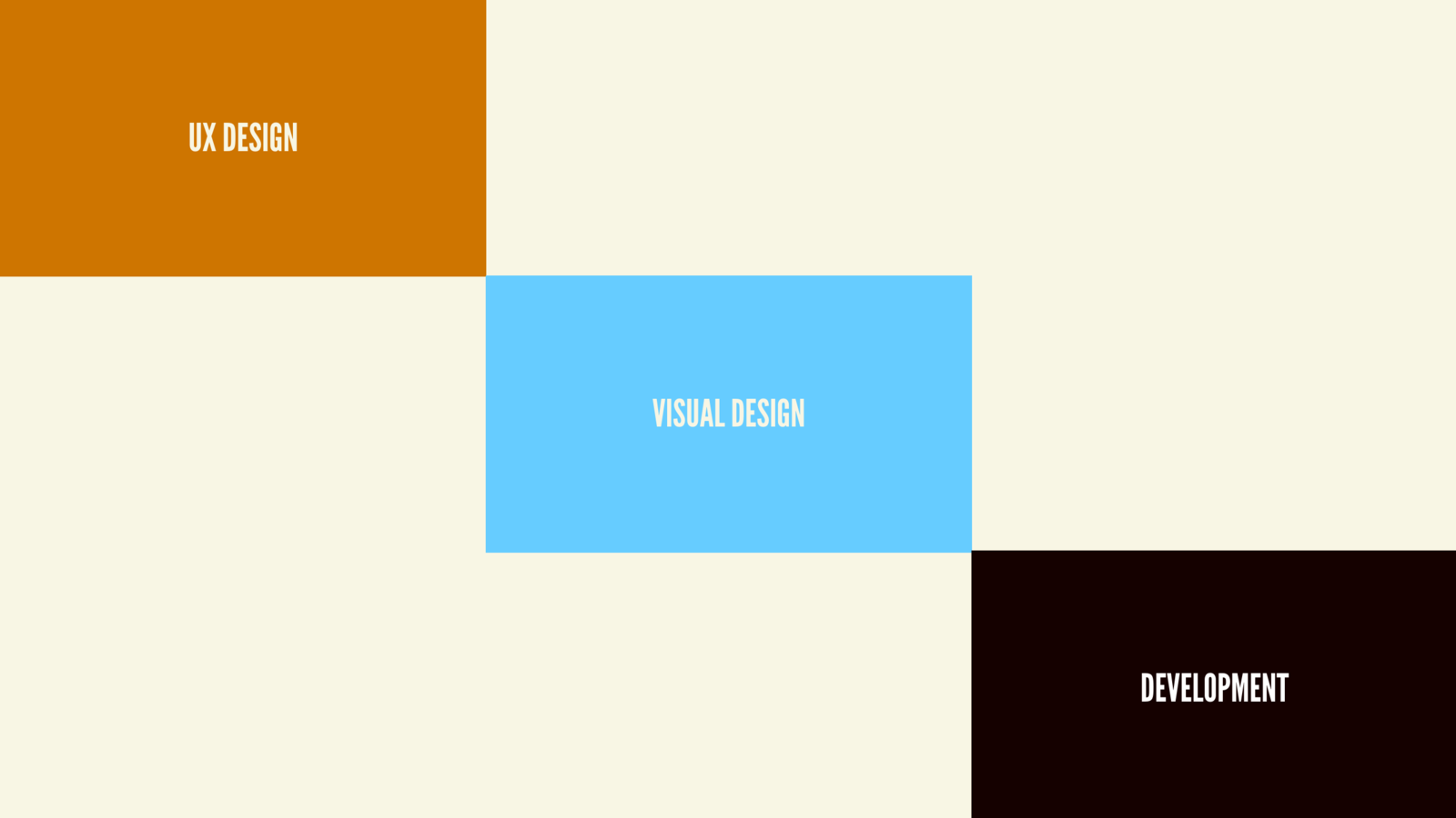
Iterative
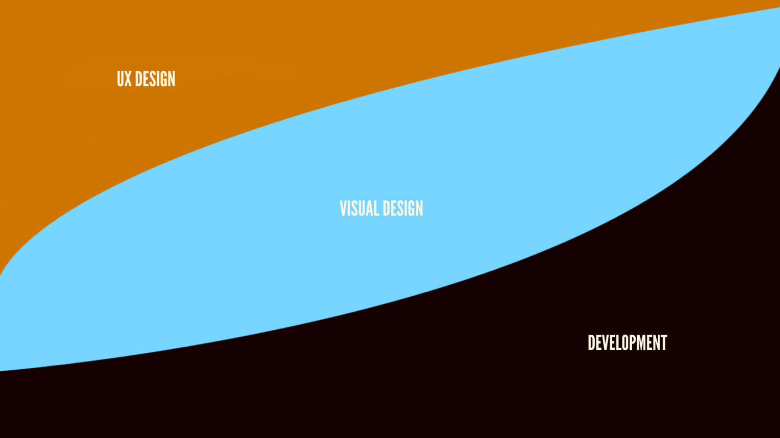
Production
leveling-up
Atomic Design
what is
a mental model that allows us to concurrently create final UIs and their underlying design systems.
a language for discussing the structure of our UI patterns and the content that goes inside those patterns
a buzzword which encapsulates the concepts of modular design and development
allows us to mentally traverse between abstract concepts and concrete instances
not rigid dogma, you can name these things however you want, organize how you want, etc.
it’s conceptual
not a linear, waterfall process
ie: not step-by-step instructions
Chemistry Refresher
first a
Chemistry
- Atoms: basic building blocks of all matter. (ignore protons, electrons, etc)
- Molecules: two+ atoms held together by chemical bond
- Organisms: assemblies of molecules functioning together
Atomic Design
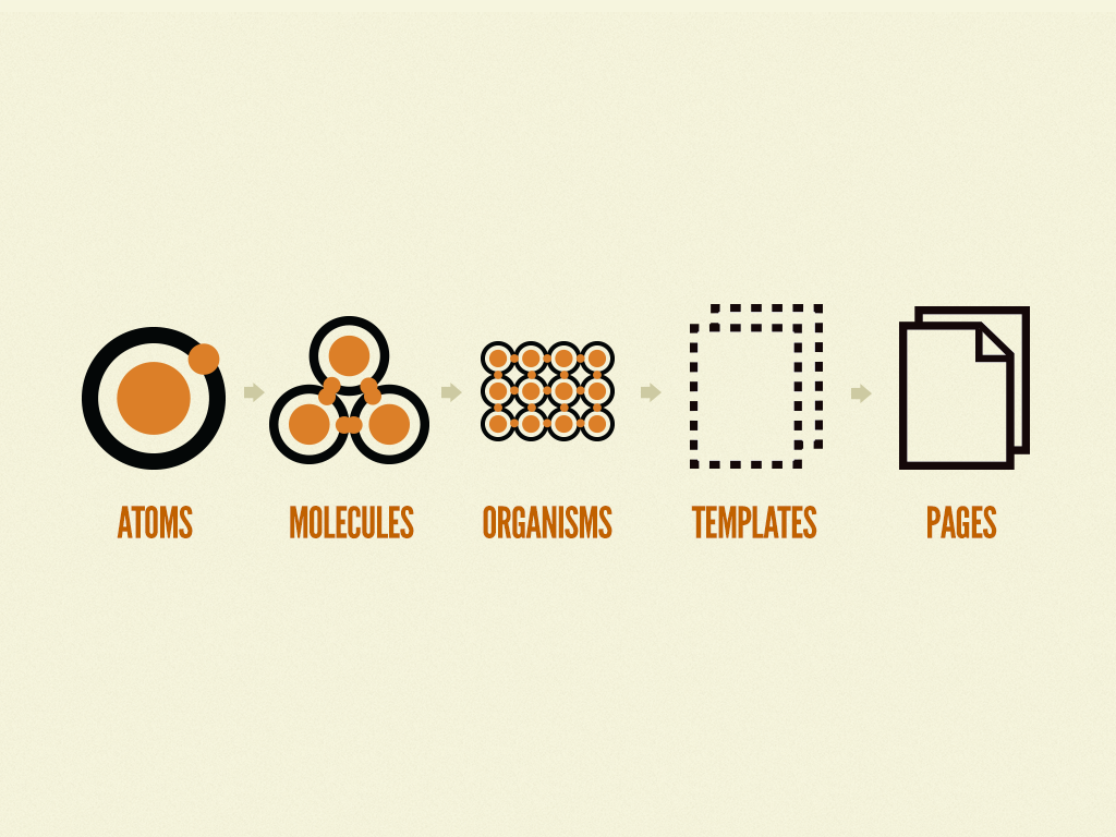
Atoms
Atoms
- the foundational building blocks that comprise all our user interfaces.
- Demonstrate all your global styles at a glance
Example: HTML Tags
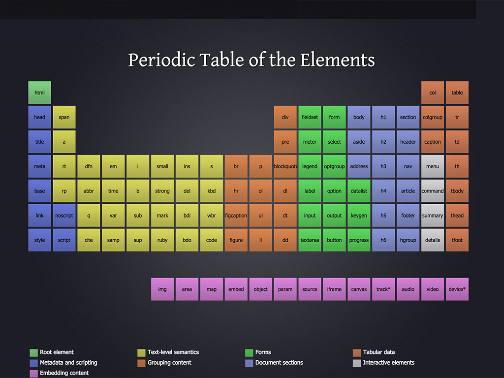
HTML Tags

- Each atom contains its own unique attributes, eg: ol vs ul
- "Normalizing" or modifying HTML tags are atomic level changes
Atoms
- HTML Tags
- color palettes
- font stacks
- CSS Normalizations
- animations
Potential Atom Products
- CSS / style variables
- colors, font families, etc
- font-face definitions
- CSS normalization / reset
- type hierarchy, spacing, basic styles
- Media Queries Definitions
- All the foundational styles that everything will inherit from
Molecules
relatively simple groups of UI elements (atoms) functioning together as a unit
Example
label + input + button = QuickForm
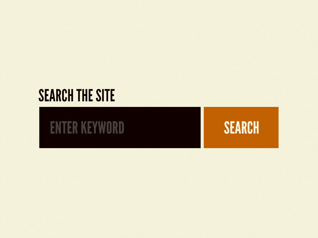
use cases
- "search the site"
- "subscribe to newsletter"
simple, portable, reusable components that can be dropped in anywhere that functionality is needed
does one thing and does it well
Benefits
- makes testing easier
-
encourages reusability
-
promotes consistency throughout interface
Organisms
relatively complex UI components composed of groups of molecules, atoms and/or other organisms.
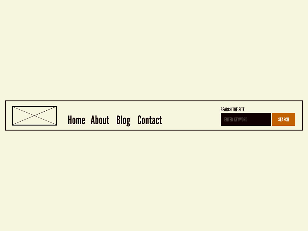
Example
more complex compositions
more opinionated
May be composing many different elements
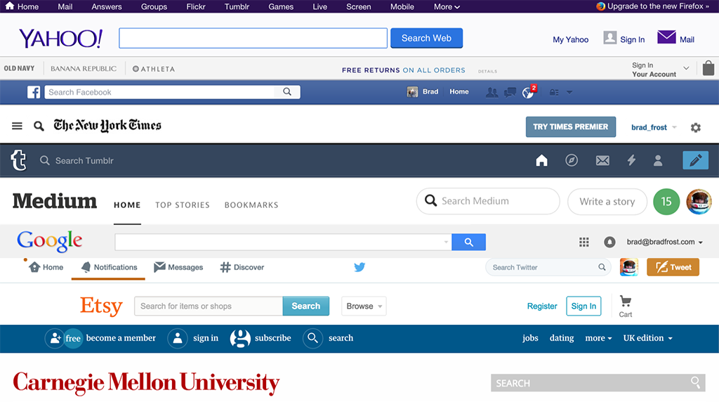
May compose same element one over and over

Building up from molecules to relatively complex organisms provides designers and developers with an important sense of context
Organisms demonstrate those smaller, simpler components in action and serve as distinct patterns that can be used again and again.
Templates
Breaking away from chemistry metaphor ~ taking it too far.
"page"-level objects that place components into a layout and articulate the design’s underlying content structure.
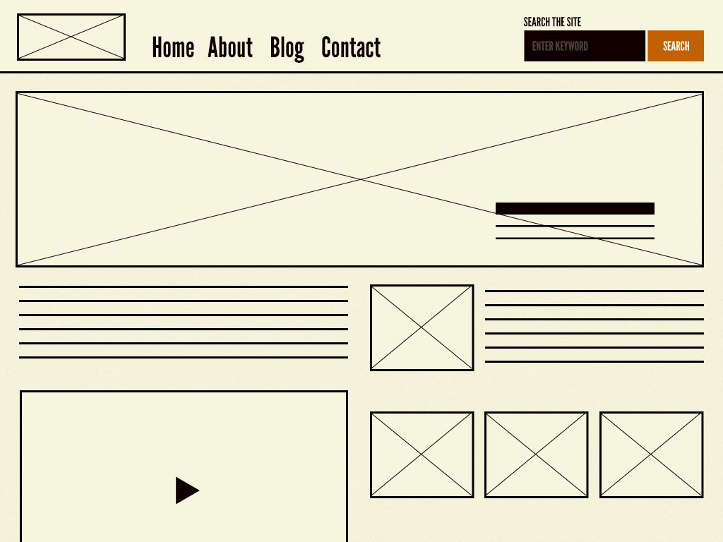
Example
provides context for these relatively abstract molecules and organisms
focus on the page’s underlying content structure rather than the page’s final content
You can create good experiences without knowing the content. What you can’t do is create good experiences without knowing your content structure. What is your content made from, not what your content is.
— Mark Boulton
a system that can account for a variety of dynamic content, all while providing needed guardrails for the types of content that populates certain design patterns
Pages
specific instances of templates that replace placeholder content with real representative content
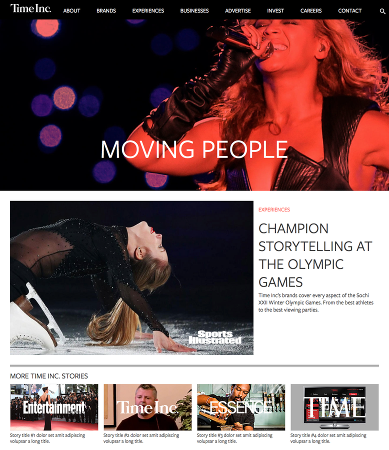
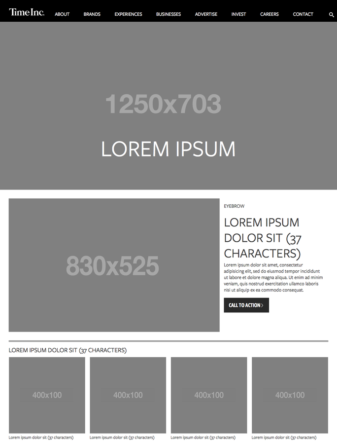
template
page
Example
most concrete stage of atomic design
what users see
what stakeholders sign off on
essential for testing the effectiveness of the underlying design system
a place to articulate variations in templates, which is crucial for establishing robust and reliant design systems
Eg:
- A user has one item in their shopping cart and another user has 10 items in their cart
- A web app’s dashboard typically shows recent activity, but that section is suppressed for first-time users
- An article contains a 40-character-long headline while other article with a 340-character-long headline
- Users with administrative privileges see additional buttons and options on their dashboard compared to users who aren’t admins
when things break
we loop back and modify our molecules, organisms, and templates
Review
Atomic Design
- Atoms are UI elements that can’t be broken down any further and serve as the elemental building blocks of an interface
- Molecules are collections of atoms that form relatively simple UI components
- Organisms are relatively complex components that form discrete sections of an interface
- Templates place components into a page layout and demonstrate the design’s underlying content structure
- Pages apply real content to templates and articulate variations to demonstrate the final UI and test the resiliency of the design system
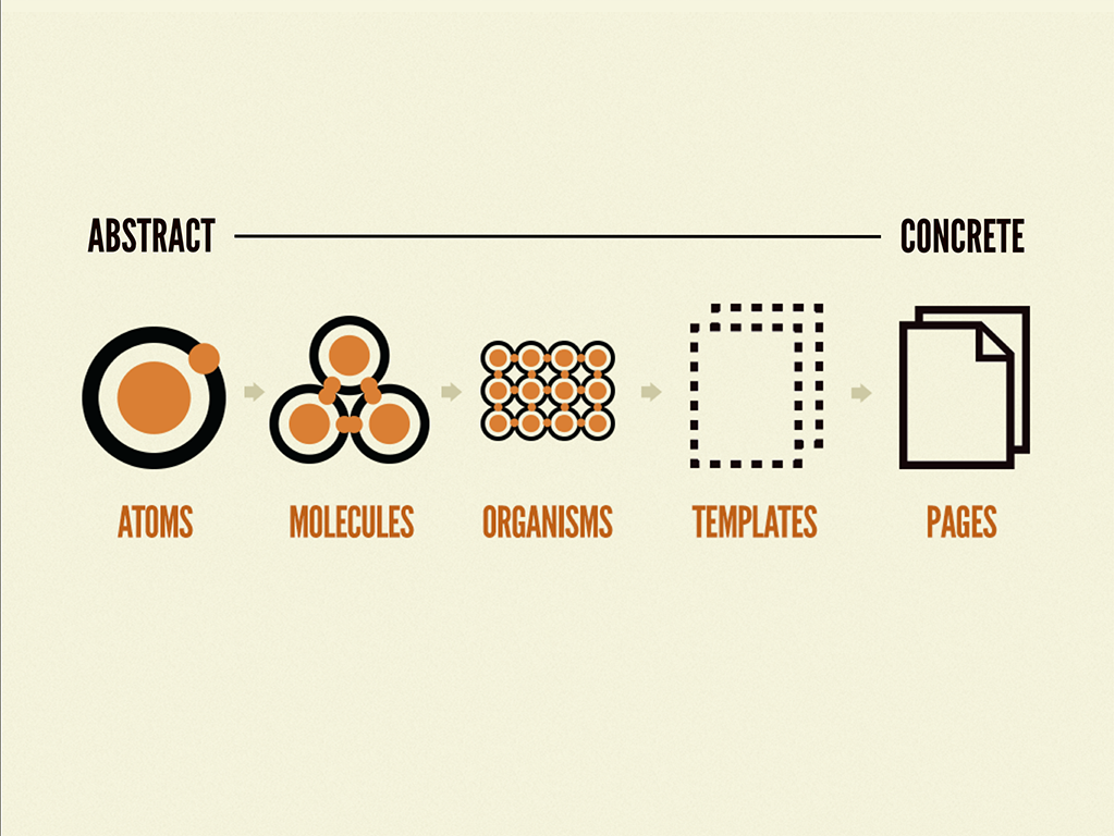
From Abstract to Concrete
Pattern Library
mental model
in practice
Pattern Library
Atomic Design
yields
a centralized hub of all the UI components that comprise your interface
Example
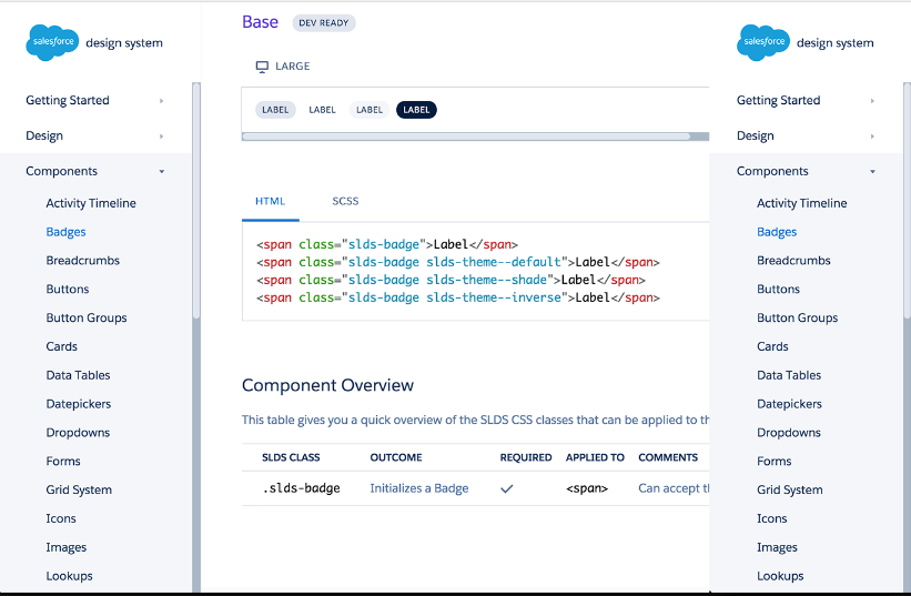
https://standards.usa.gov/
http://styleguides.io/examples.html
more examples
Pattern Libraries
- promote consistency and cohesion across the entire experience
- speed up your team’s workflow, saving time and money
- establish a more collaborative workflow between all disciplines involved in a project
- establish a shared vocabulary between everyone in an organization, including outside vendors
- provide helpful documentation to help educate stakeholders, colleagues, and even third parties
- make cross-browser/device, performance, and accessibility testing easier
- serve as a future-friendly foundation for teams to modify, extend, and improve upon over time
Good Qualities & Features
- articulate pattern variations, such as active or disabled tabs
- ability to view patterns across the entire resolution spectrum
- provide pattern descriptions and annotations
- show me the code
- ability to dynamically pour real representative content into the patterns’ structure
- provides contextual information like which patterns make up a particular component as well as where that component gets utilized
of a pattern library site / tool
no institutional support to create a pattern library?
Do it anyways
-- Brad Frost
(not the stack team)

Do it anyways
- the fact of the matter is: in order to create the whole, you need to create the parts of that whole
- taking the time to organize the parts, you can now create the whole in a more realistic, deliberate, and efficient manner
- as you’re showing progress on the final work, you can decide how much of your internal process you’re willing to expose to them
- the fact that you’re creating a design system to produce the final product is really of no concern to them; it’s simply a decision your team is making to create better work
- it would be extremely difficult for them to argue against you now, especially if the project came in on time and on budget 🚢
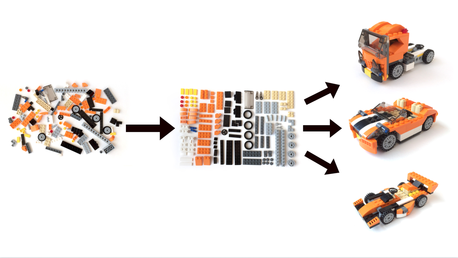
Organized Process
Maintaining
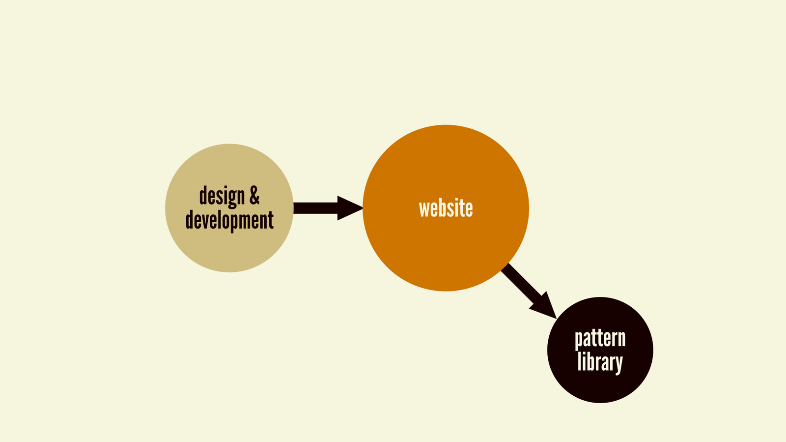
Pattern Library
not an afterthought
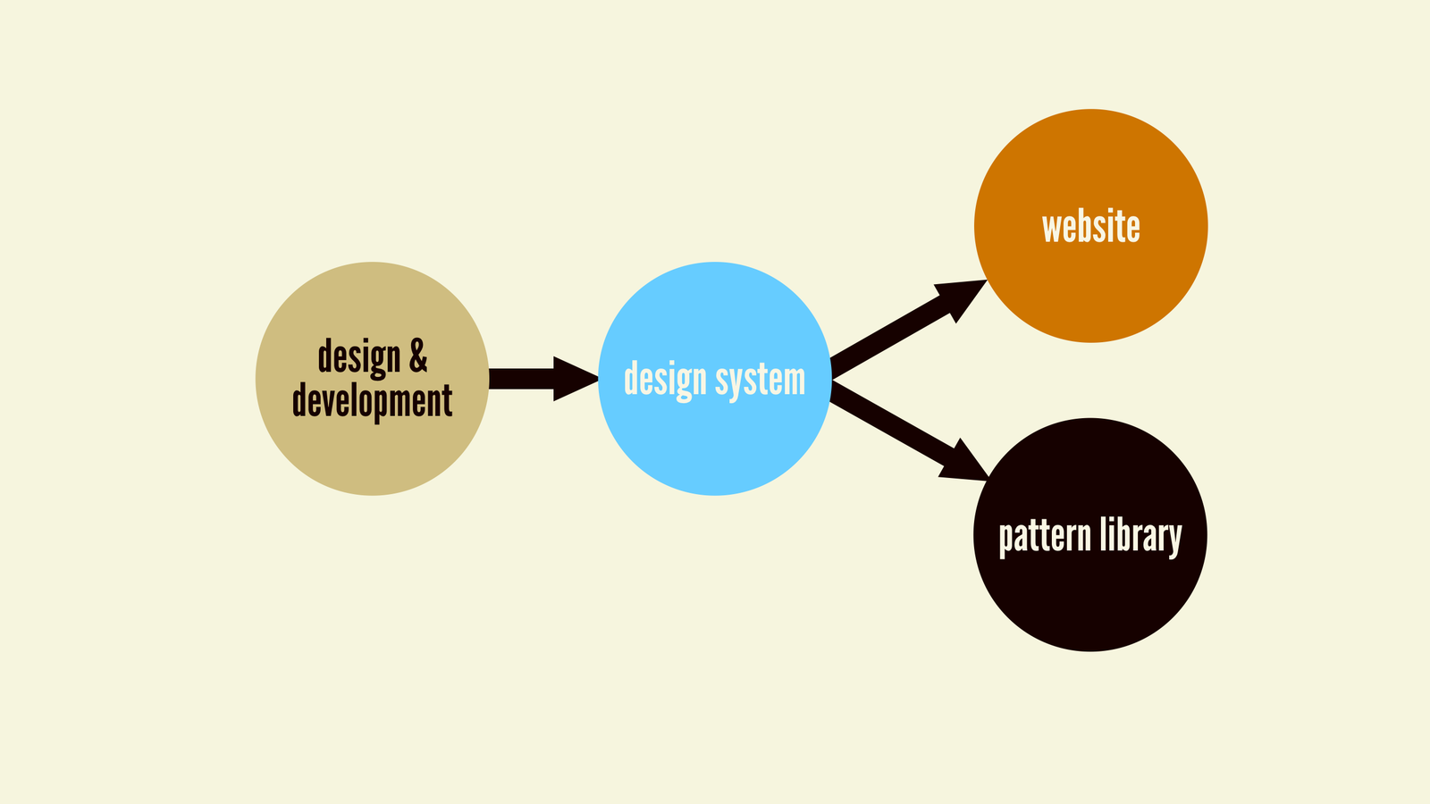
Design System First
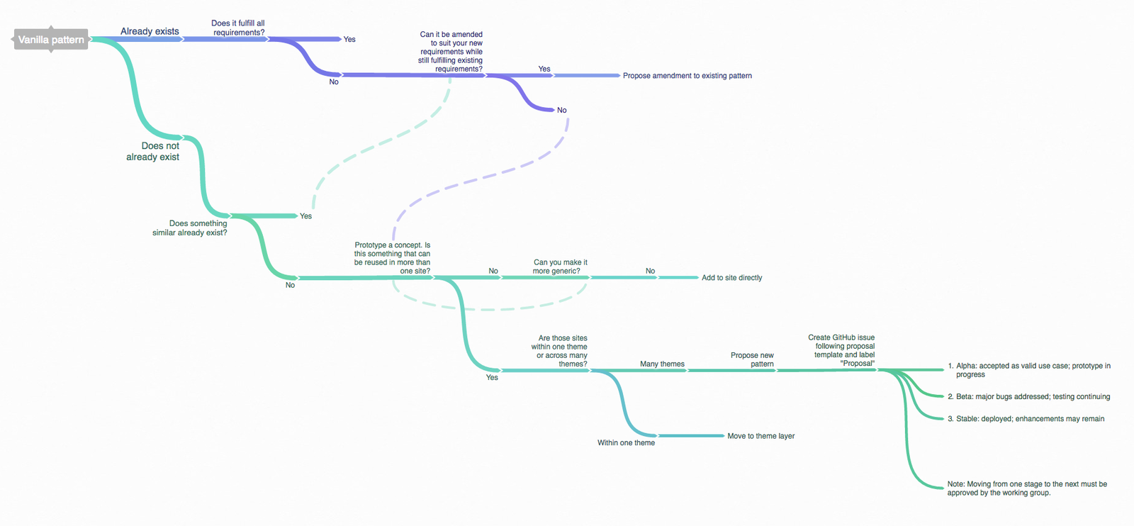
Extending
Quotes from the Book
Henry Ford broke the automobile down into its component parts and modularized the assembly process. The results spoke for themselves: more uniform, more reliable, safer cars rolled out of the factory, and in record time to boot
Ideas are meant to be ugly.
— Jason Santa Maria
Let’s change the phrase “designing in the browser” to “deciding in the browser.”
— Dan Mall
the more fluid a UI component is, the more resilient and versatile it becomes
It’s ludicrous for anyone to utter the phrase “this is how we’ve always done things” in an industry that’s only 25 years old.
The design process is weird and complicated, because people are weird and complicated.
— Mark Boulton
monolithic redesigns don’t get to the organizational root of the problem"
Our React Starters
Component Authoring Starter
App Starter
The End
Atomic Web
By Jared Anderson
Atomic Web
- 1,771


