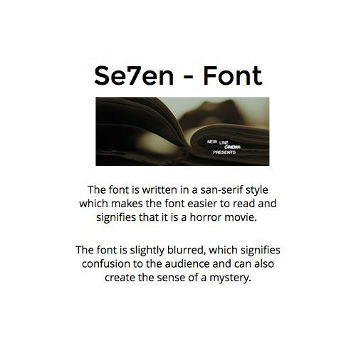
Se7en - Font and Colour

-White font which has connotations of purity and innocence creates juxtaposition wth the genre of the film
-The credit it small which draws attention into what is happening in the scene rather than the actual credits
-San serif font keeps it simplistic and easier to read
San serif font can also signify formality
Se7en - Placement and Suitability

-Uses the rule of thirds, to make it easier for the audience to see and acknowledge
The credit it small which draws attention into what is happening in the scene rather than the actual credits
Suitability is good because the font is slightly blurred, which creates slight confusion and mystery
deck
By twbsgroup6