Se7en - Font

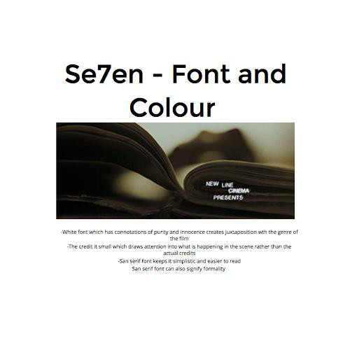
The font is written in a san-serif style which makes the font easier to read and signifies that it is a horror movie.
The font is slightly blurred, which signifies confusion to the audience and can also create the sense of a mystery.
Se7en - Placement of frame


Most shots containing credits use the rule of thirds. This places the credit and title in certain corners of the screen which makes it easier to acknowledge and read for the audience.
Se7en- Font Size

The Size of the font is large which fills the screen which makes the text centre of attention and also makes it stand out which enables the audience to read it easily.
Se7en-Colour
The font is white which has connotations of purity and innocence. This creates juxtaposition to the genre of the film, which reinforces this sense of confusion the audience witness during the opening sequence.
Se7en - Suitability of Genre


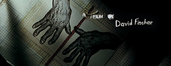
Credits are written in a font that look like they have been hand written, to create the impression that the man in this opening has written them, as he is seen writing letters and drawing. The other titles have also been blurred to reinforce the sense of mystery.
Se7en- Animation

The title of the film uses a jump cut and moves to the centre of the screen. This stumbles the audience and makes the opening more confusing.
deck
By twbsgroup6