giessdenkiez.de
Einführung
in das Frontend
Einführung in das Frontend
Einführung in das Frontend
Too Long; Didn't Listen
- React App mit custom Webpack Bundling
- In TypeScript geschrieben
- Benutzt react-map-gl und deck.gl
- Lokaler State mit useState or useReducer
- Globaler State mit Unistore (Easy redux)
- Externe Daten mit React Query
- Deployed auf Netlify
🙉
👂
Einführung in das Frontend
- Ein Blick in den Webpack Ordner
- Konfiguriert die passenden Dateien
- 😩 ODER...
- Macht das Bundling komplett anders!
- Z.B. mit Create React App oder NextJs
- Erfindet das Rad nicht neu!
Dasselbe gilt auch für deployment!
😤
🤯
Einführung in das Frontend
- Mehr Sicherheit
- Selbsterklärender Code
- Fehlervermeidung
- Bessere Autovervollständigung
⛑
🦺
Einführung in das Frontend
interface WateringType {
  id: string | number;
  user: string;
  literAmount: number;
}

interface WateringListPropType {
  waterings: WateringType[];
}

export const WateringList: React.FC<WateringListPropType> = ({
  waterings,
}) => (
  <ul>
    {waterings.map(({ id, user, literAmount }) => (
      <li key={id}>{`${user}: ${literAmount}l`}</li>
    ))}
  </ul>
);
Einführung in das Frontend
Tips & Tricks
- Definiert Types so lokal wie möglich
- Exportiert nur die, die überall verw. werden
- Lieber erst streng, und graduell lockerer
- Bleibt semantisch und verständlich
- Suffix -PropTypes für React Components
- Suffix -Type für Types (auch interfaces)
👩🍳
👨🍳
Einführung in das Frontend
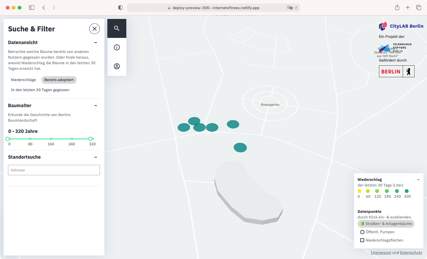
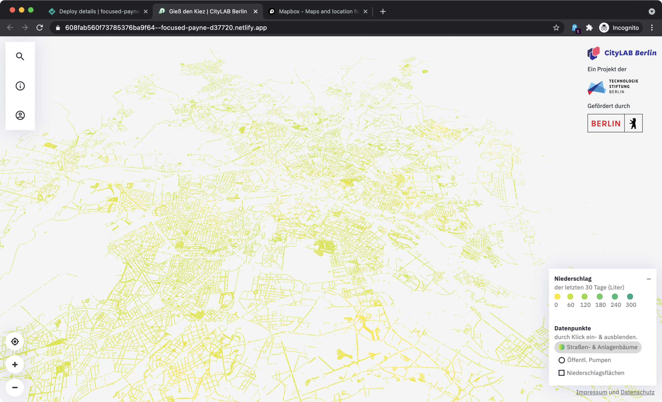
React Map und Deck.gl
- react-map-gl → basemap (Straßen usw.)
- deck.gl → Trees, Pumpen, Regenchart, ...
- Rendert zusätzliche UI (Tooltips, Zoomnav)
- Erstellung/Filtrierung der GeoJSON Layers
- Mobile Adaptierung
- Zusatz-Features wie Geolokalisierung
- Viewport Management für Fly-into
🗺
📍
Einführung in das Frontend
visibleMapLayer
= Filtered GeoJSON
mapViewFilter
Bonus: focusPoint
Einführung in das Frontend
Working with Data
- Data so lokal wie möglich
- Externe Daten separat vom UI State
- Externe Daten müssen gecached werden
- Globales State nur wenn überall verwendet
- UI State lieber zu präzise benennen
💽
💾
Einführung in das Frontend
interface ExpandableTextPropType {
  title: string
}

export const ExpandableText: React.FC<ExpandableTextPropType> = ({
  title,
  children,
}) => {
  const [isExpanded, setIsExpanded] = useState(false);
  const toggleIsExpanded = (): void => setIsExpanded(!isExpanded);
  return (
    <div>
      <button onClick={toggleIsExpanded}>
        {title}
      <button>
      {isExpanded && <p>{children}</p>}
    </div>
  );
};
Lokal
Einführung in das Frontend
const SidebarToggle: FC = () => {
  const isSidebarOpened = useStoreState("isSidebarOpened");
  const { toggleSidebar } = useActions();
  return (
    <button onClick={toggleSidebar}>
      {isSidebarOpened ? "Close" : "Open"}
    </button>
  );
};
Global
Einführung in das Frontend
type ItemsType = any[] | undefined;

const reactQueryOptions = {
  staleTime: Infinity,
  refetchOnWindowFocus: false,
};

const useItems = () => {
  const { data: items, error } = useQuery<ItemsType[], Error>(
    "items",
    asynchronouslyFetchItems,
    reactQueryOptions
  );
  return { error, items };
};
External
Einführung in das Frontend
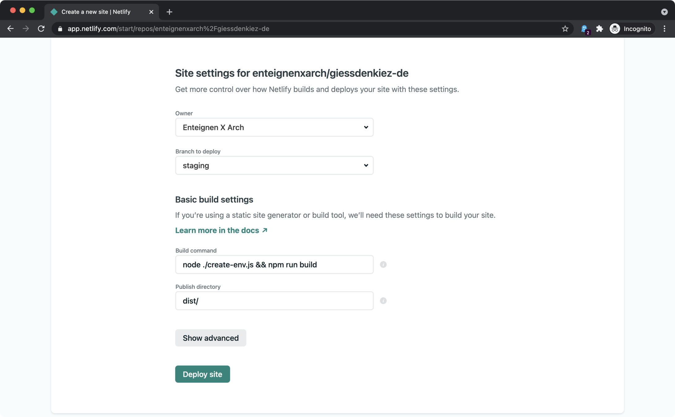
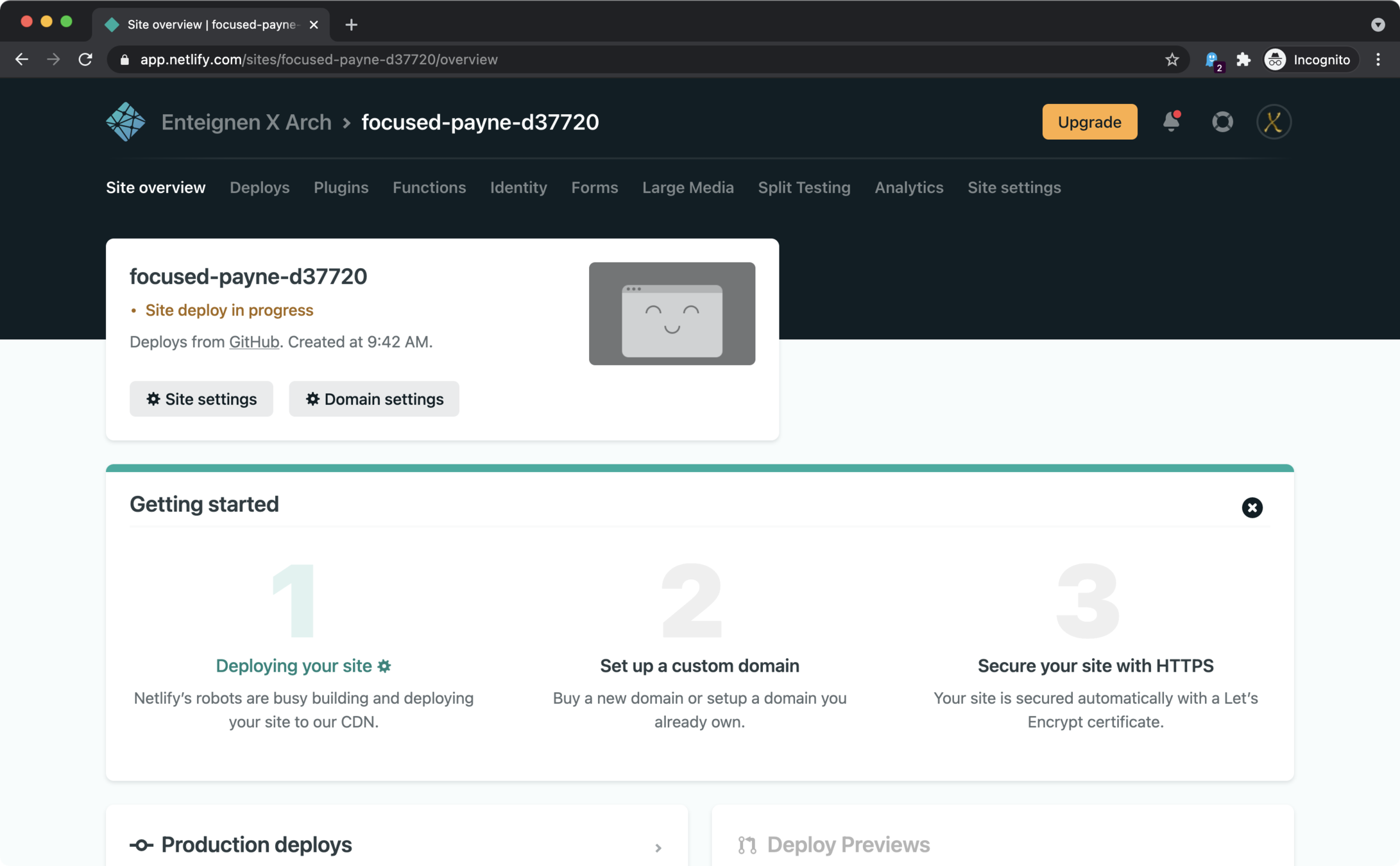
Deployment auf Netlify
- Regulären `npm run build`
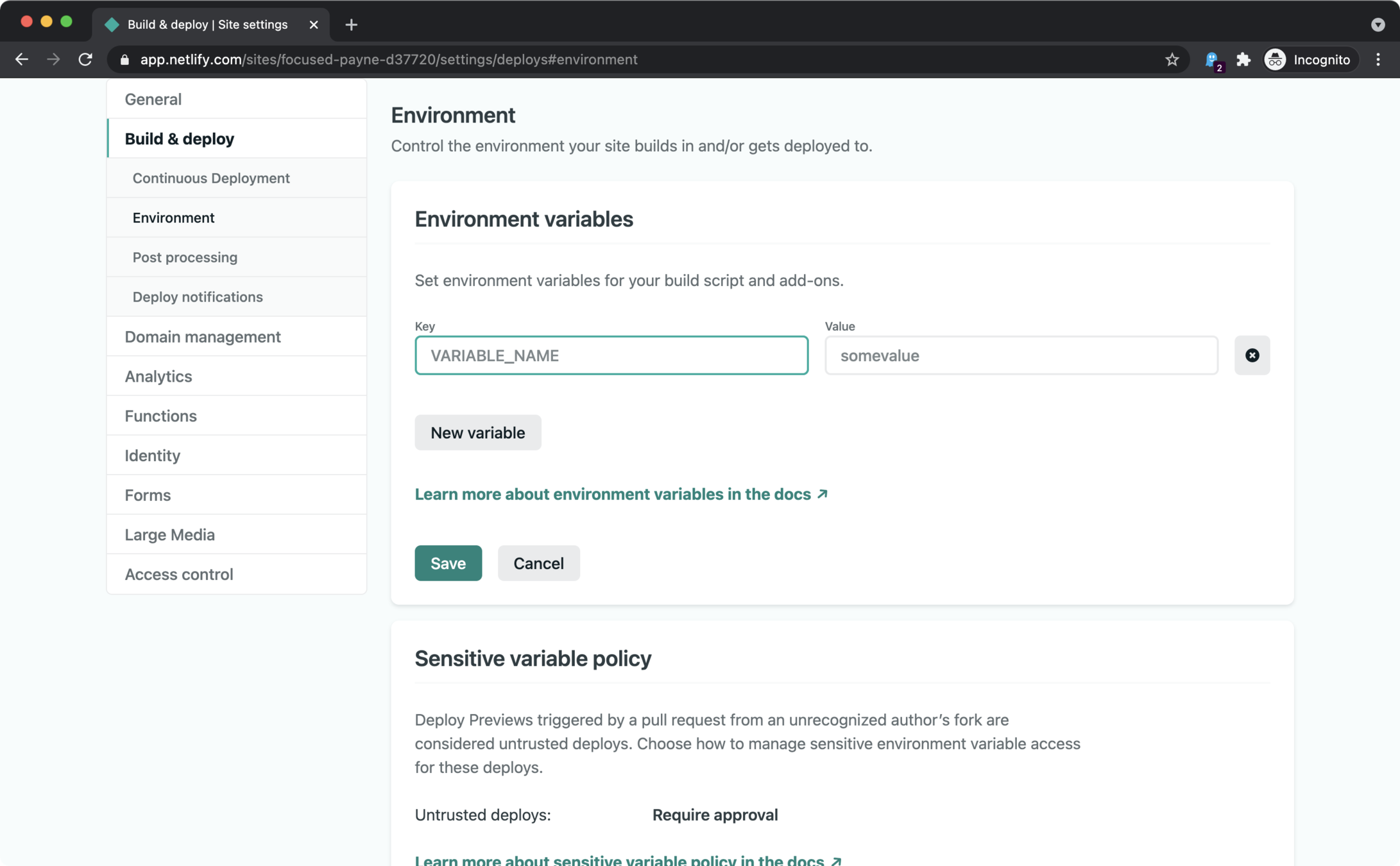
- Einrichtung von environment variables
- Einrichtung einer eigenen Domain
- Aktivierung von SSL/TLS certificate
⛅️
☁️
Einführung in das Frontend
Deployment auf Netlify
- Regulären `npm run build`
- Einrichtung einer eigenen Domain
- Aktivierung von SSL/TLS certificate
⛅️
☁️
- Einrichtung von environment variables
Einführung in das Frontend
# Mapbox Token
MAPBOX_API_KEY="pk.123.xyz"

# Auth0
AUTH0_DOMAIN="myauthzeropath.eu.auth0.com"
AUTH0_CLIENT_ID="7479d17d-2212-4a23-a42c-363b898dc618"
AUTH0_AUDIENCE="https://my-tree-api-url.io"

# User management
USER_DATA_API_URL="https://my-user-management-api.io"

# Gieß den Kiez API
API_ENDPOINT="https://localhost:8000/my-local-postgres-api"
.env
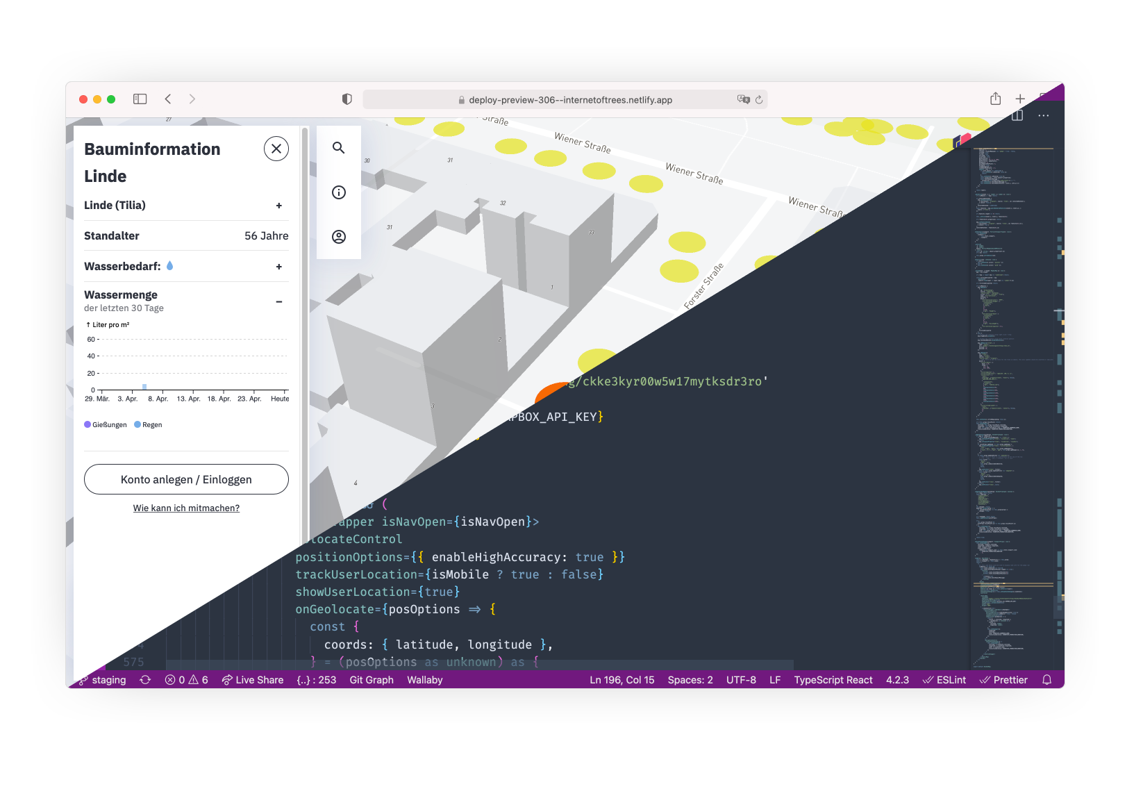
Einführung in das Frontend
[build]

command = "node ./create-env.js && npm run build"
publish = "dist/"

[build.environment]

BUILD_TARGET = "DEFAULT"

[context.demo]

command = "node ./create-env.js && npm run build"
# environment = {BUILD_TARGET = "DEMO", NODE_ENV = "production"}
publish = "dist/"

[context.demo.environment]

...
netlify.toml
Einführung in das Frontend
Einführung in das Frontend
Einführung in das Frontend
Einführung in das Frontend
Einführung in das Frontend
Einführung in das Frontend
Einführung in das Frontend
Einführung in das Frontend
Einführung in das Frontend
Einführung in das Frontend
Einführung in das Frontend
Einführung in das Frontend
Styling
- Styling mit `styled-components` 💅
- Erzeugt scoped CSS Klassen
- Ermöglicht Theming
- Kann als React component benutzt werden
- Funktioniert für global CSS auch
Einführung in das Frontend
const SmallParagraphContainer = styled.p`
  line-height: 150%;
  font-size: ${p => p.theme.fontSizeL};
  opacity: 0.66;
  letter-spacing: 0.125px;
  padding: 0;
  margin: 0;
  font-weight: normal;

  a {
    color: ${p => p.theme.colorTextDark};
    transition: opacity 200ms ease-out;
    opacity: 1;
  }
  a:hover {
    opacity: 0.33;
  }
`;
Als component
Einführung in das Frontend
const SmallParagraph = ({
  children,
  className = '',
  onClick = () => undefined,
}) => (
  <SmallParagraphContainer
    className={className}
    onClick={onClick}
  >
    {children}
  </SmallParagraphContainer>
);
Usage
Einführung in das Frontend
const GlobalStyles = createGlobalStyle`
  ${styledNormalize}

  body {
    color: ${({ theme }) => theme.color};
    font-family: 'IBM Plex Sans', sans-serif;
  }
`;

const customTheme = { color: 'red' };

export const App: FC = ({ children }) => (
  <ThemeProvider theme={customTheme}>
    <GlobalStyles />
    {children}
  </ThemeProvider>
);
Globally
Einführung in das Frontend
const GlobalStyles = createGlobalStyle`
  ${styledNormalize}

  body {
    color: ${({ theme }) => theme.color};
    font-family: 'IBM Plex Sans', sans-serif;
  }
`;

const customTheme = { color: 'red' };

export const App: FC = ({ children }) => (
  <ThemeProvider theme={customTheme}>
    <GlobalStyles />
    {children}
  </ThemeProvider>
);
With theming
Die Datei Providers.tsx
sammelt alle Providers
für Tests und Storybook
Einführung in das Frontend
Qualitätsicherung
- Unit testing mit Jest & Testing Library
- Visual+Snapshot testing mit Storybook
- Continuous integration mit Github Actions
npm run test:watch # or `npm run test:ci`
npm run type-check
npm run storybook
🤓
🛠
Siehe in dem Ordner
.github/workflows
für Github Actions
Backend Repos
Danke!
Fragen?

Gieß Den Kiez - Einführung in das Frontend
By Lucas Vogel
Gieß Den Kiez - Einführung in das Frontend
In dieser Präsentation wird das Frontend der Anwendung Gieß den Kiez vorgestellt.


