Wilson Mendes
@willmendesneto
Google Developer Expert Web technologies

Angular modules
Let’s have #ngFun!
So, let's start?
HI, IT'S ME


<webapps/> are evolving
or moving from AngularJS to Angular
Share components is ❤️
<ItemsList />
<About />
<Gallery />
...
<page1>
</page1>
<component1 />
<component2>
</component2>
<component3 />
bundle
test
publish
lint
Opinions ?
reporter
dev server
types
coverage
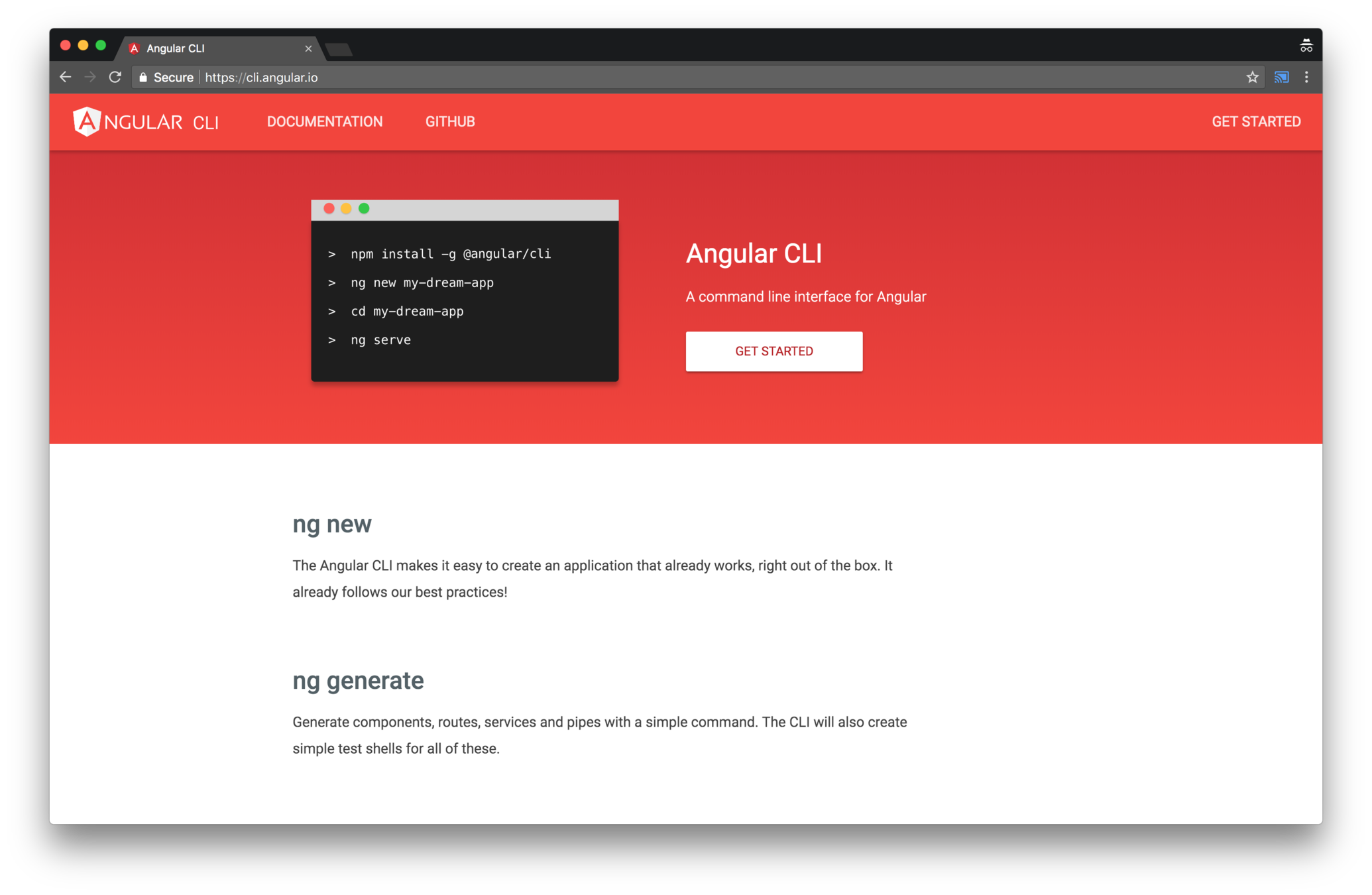
npm install -g @angular/cli
// Installing Angular CLI
ng new my-app
// Creating a new Angular App
ng serve// Starting local server


We have several options
What if the app
doesn't need
all of that?
structure of a page
<page1>
</page1>
<component1 />
<component2>
</component2>
<component3 />
<page1>
</page1>
<component1 />
<component2>
</component2>
<component3 />
small scope
boundaries
plug-and-play
Everything is a component
Integration in your module
Easy to maintain
Refactor across teams
Why small packages
Let's start the #ngFun
Let's start a project!
🎉🎉🎉🎉🎉🎉🎉🎉🎉
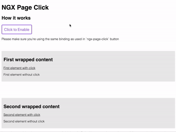
#1 - NGX Page Click
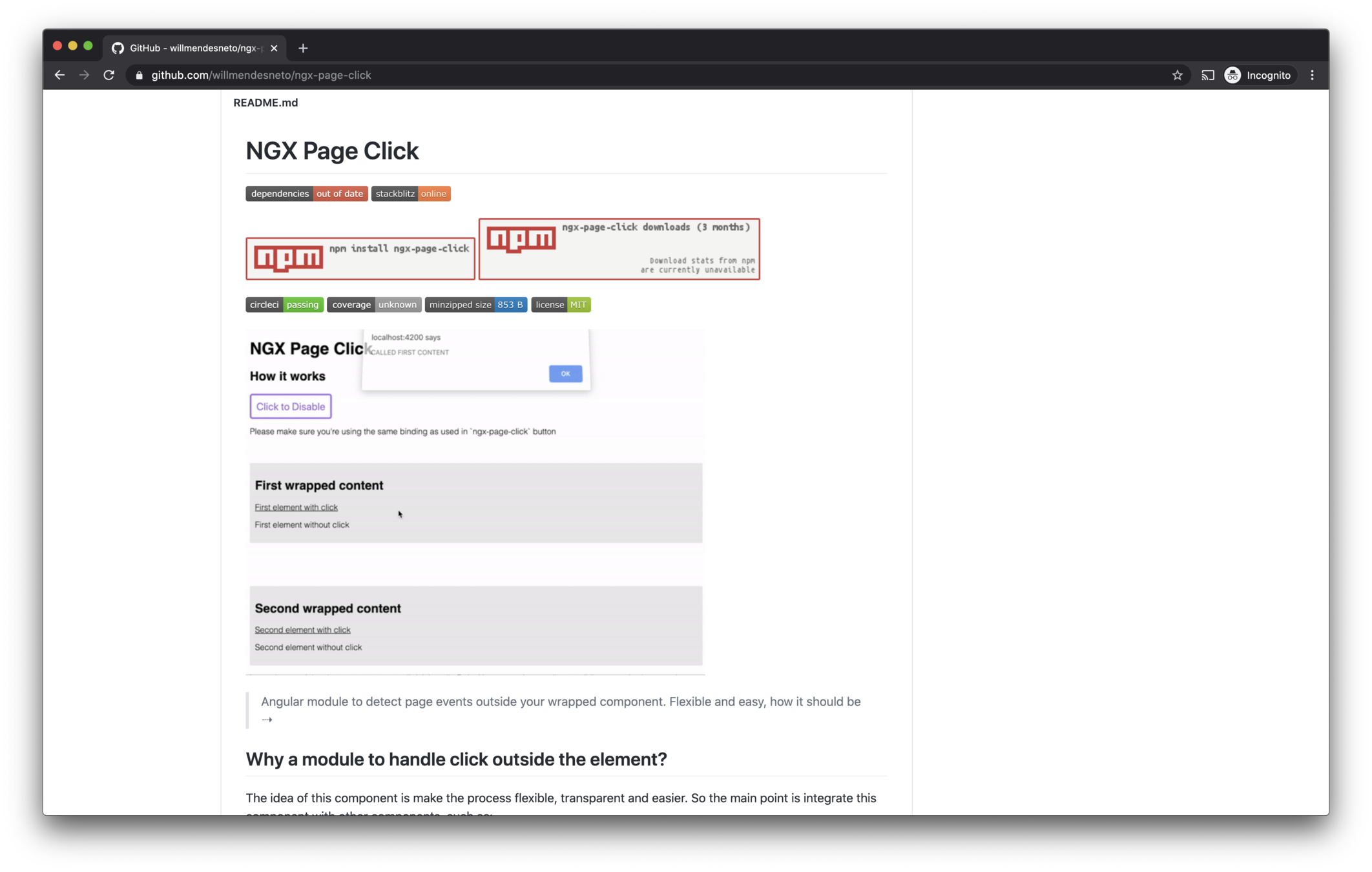
Avoid bubbling
Declarative API
Component
Easy to integrate
Small package
Decoupled
#NG Why?
...
import {
  NgxPageClickModule
} from 'ngx-page-click';
...

@NgModule({
  ...
  imports: [NgxPageClickModule],
  ...
})

export class AppModule { }
<ngx-page-click
[disabled]="disabled"
[outsideClickHandler]="outsideClickHandler"
[listenTo]="on"
>
<div><p>Content goes here</p></div>
</ngx-page-click>
#2 - NGX Feature Toggle
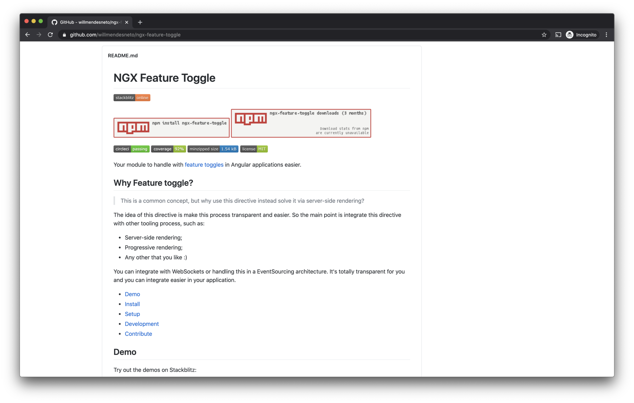
Feature config
Routing Guards
Component
Third-parties
SSR Ready
Directive
#NG Why?
...
import {
  FeatureToggleModule
} from 'ngx-feature-toggle';
...

@NgModule({
  ...
  imports: [FeatureToggleModule],
  ...
})

export class AppModule { }
<!--
const features = {
enableDescription: true
}
-->
<feature-toggle-provider [features]="features">
<div *featureToggle="'enableDescription'">
<p>condition is `true`</p>
<p>this content will be displayed.</p>
</div>
<div *featureToggle="'!enableDescription'">
<p>condition is `false`</p>
<p>this content will be displayed.</p>
</div>
</feature-toggle-provider>import {
Routes, RouterModule
} from '@angular/router';
import {
FeatureToggleModule,
NgxFeatureToggleCanLoadGuard,
} from 'ngx-feature-toggle';
...
// Using route guards in application
const routes: Routes = [
{
path: 'playground',
component: PlaygroundComponent,
canLoad: [NgxFeatureToggleCanLoadGuard],
data: {
featureToggle: ['enablePlayground'],
}
},
];
But this is "simple", let's build something really cool!

#3 - NGX Skeleton Loader
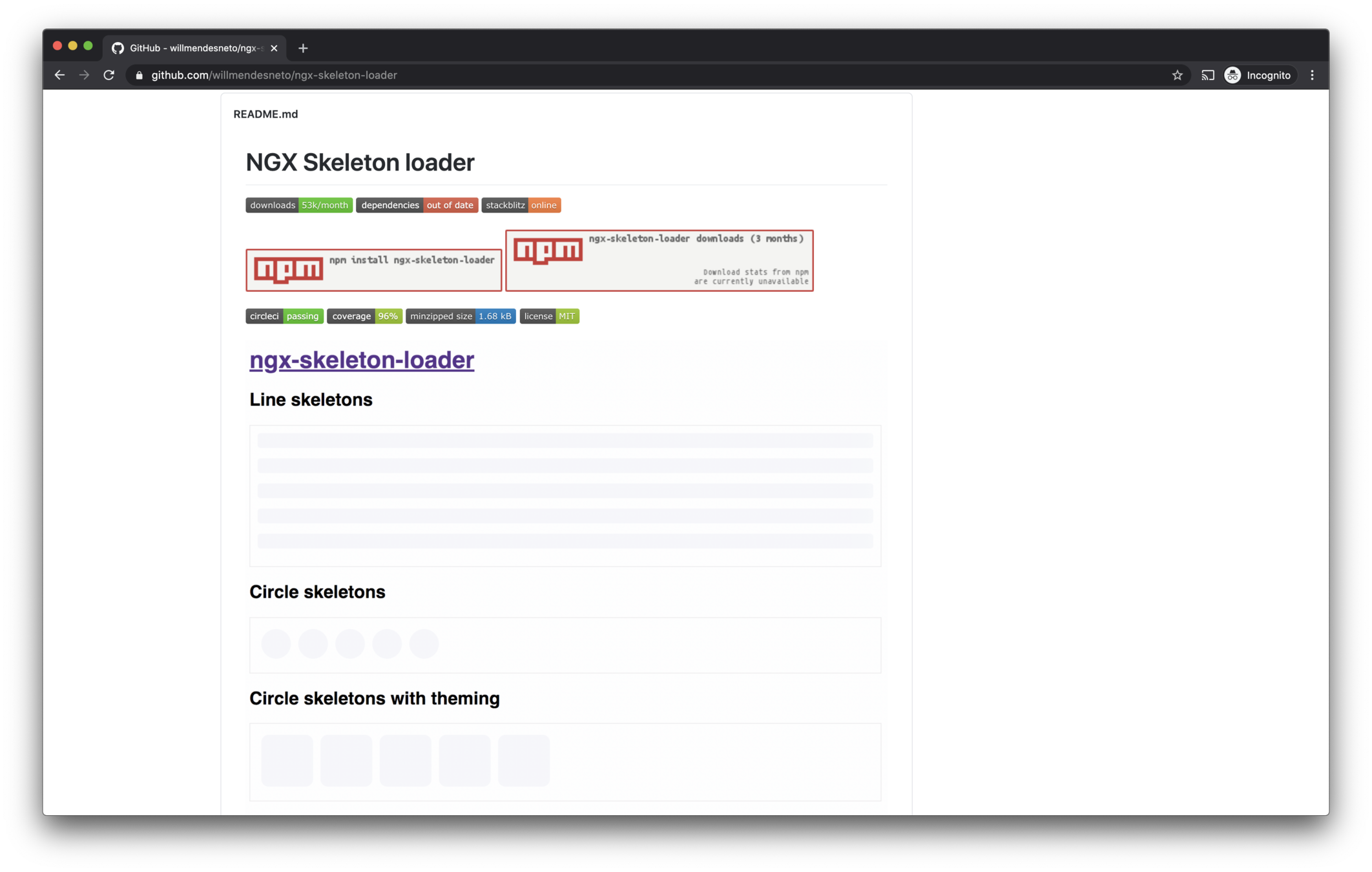
UX Improve
Declarative API
Plug-and-play
Accessibility
Animations
Themes
#NG Why?
...
import {
  NgxSkeletonLoaderModule
} from 'ngx-skeleton-loader';
...

@NgModule({
  ...
  imports: [NgxSkeletonLoaderModule],
  ...
})

export class AppModule { }
<ngx-skeleton-loader
  count="5"
  [theme]="{
    'border-radius': '5px',
     height: '50px'
  }"
>
</ngx-skeleton-loader>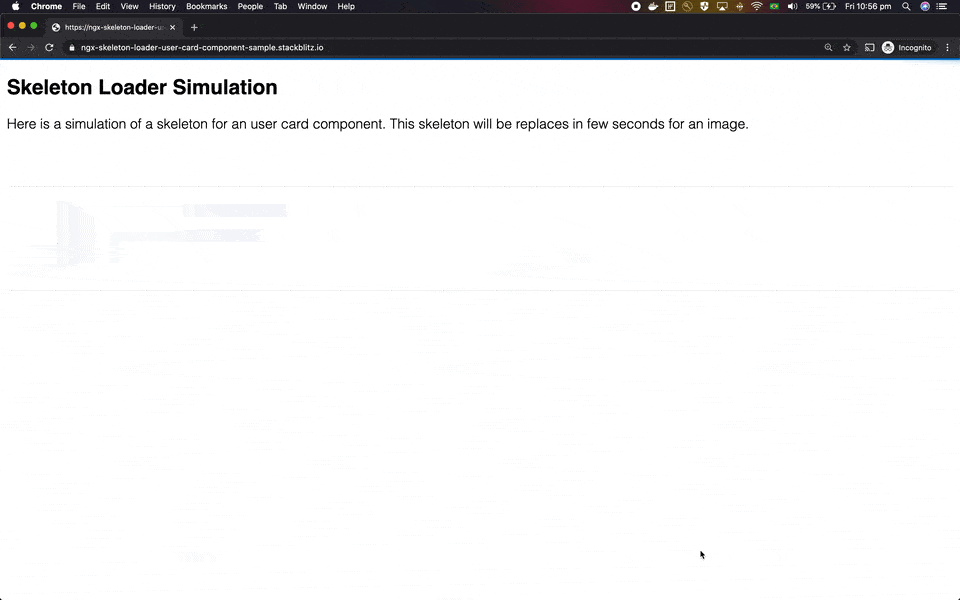
How to integrate accessibility in a Skeleton?
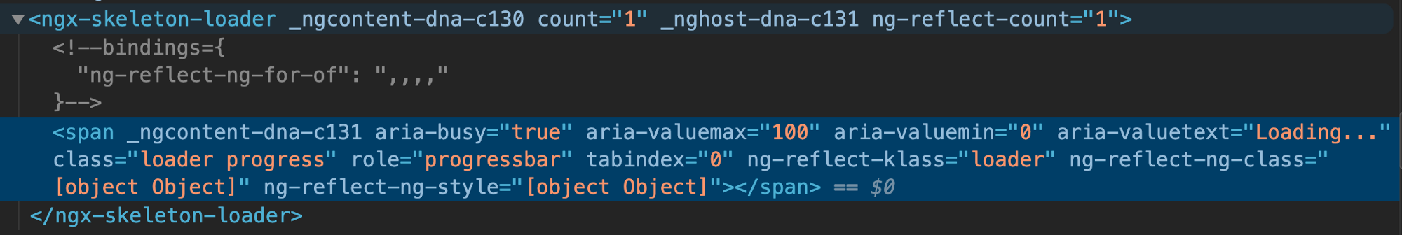
Web ARIA Attributes
...
aria-valuemax="100"
aria-valuemin="0"
aria-valuetext="Loading..."
role="progressbar"
...
Web ARIA Attributes
attributes for assistive tech
Combine states and a11y
Available in the package
Web ARIA Attributes
...
.skeleton-loader {
  &.progress {
    /* ...css animation for progress */
  }

  @media (prefers-reduced-motion: reduce) {
    /* ...removing css animation */
    &.progress {
      background-image: none;
    }
  }
}
prefers-reduced-motion
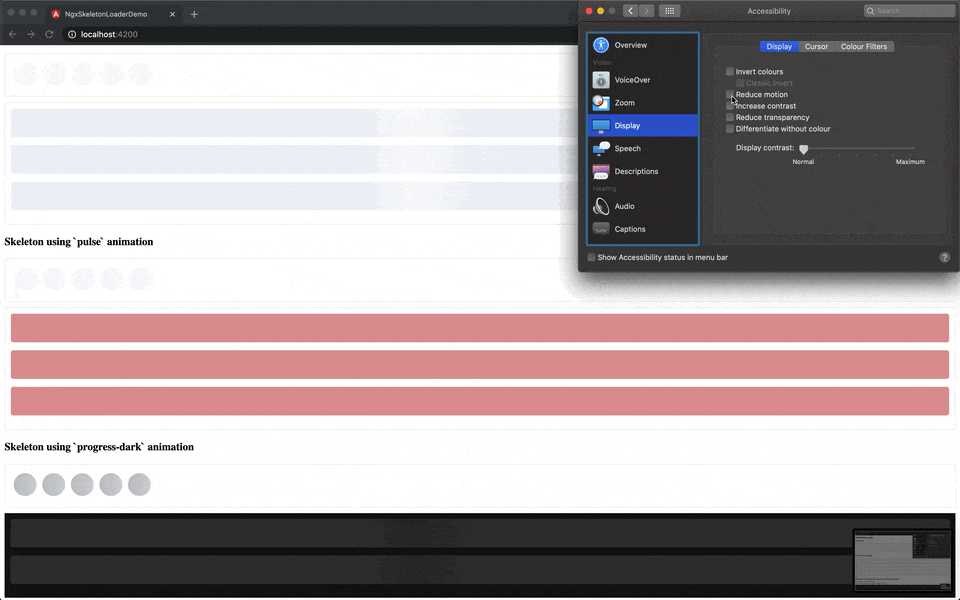
What about dark mode ?
<!-- Uses `progress-dark` as animation -->
<ngx-skeleton-loader
  animation="progress-dark"
  count="3"
>
</ngx-skeleton-loader>
Dark-mode usage
What if I need to create a new theme for skeletons in my app?
  <ngx-skeleton-loader
    count="5"
    [theme]="{
      'border-radius': '5px',
      height: '50px',
      'background-color': '#992929',
      border: '1px solid white'
    }"
  ></ngx-skeleton-loader>
Theme via @Input()
/*
 * You can find more details about `:host`
 * at Angular Component Style Docs
 * https://angular.io/guide/component-styles#host
 */
:host >>> ngx-skeleton-loader .skeleton-loader {
  border-radius: 5px;
  height: 50px;
  background-color: #992929;
  border: 1px solid white;
}
Theme via css
<ngx-recap/>
Have fun and learn with it
Start with small components
Make a plan, keep working on it
Web platform is in your favour
Sharing is caring. OSS ❤️
Thank you 👋
Wilson Mendes
@willmendesneto
Google Developer Expert Web technologies
Angular modules: Let’s have #ngFun!
By willmendesneto
Angular modules: Let’s have #ngFun!
Remember your first time with Angular? A lot of fun, right? We all know that components are the best way to share your code across web apps, but why it’s so hard to find a package that solves our problem nowadays? Skeleton components, a component that copies the page content to the clipboard, page scroll locker or even some ideas you have can be helpful for everyone! In this talk we will learn how to contribute to the NG-Ecosystem sharing your components, experiments and how to improve and how to bring back all that fun we had with Angular.


