


david wolfpaw
WordPress Maintenance at fixupfox.com On the Internet, everyone knows I'm a dog. They/Them/Woof
Changes the display of existing elements
:focus
:hover
:checked
:only-of-type
Creates elements that do not exist in the document
::after
::before
::first-line
::selection
::placeholder
.comment-body::before {
    border-width: 0 15px 15px 0;
    border-color:
        transparent
        rgba(158, 158, 158, 0.33);
    border-style: solid;
    bottom: auto;
    content: '';
    display: block;
    left: -17px;
    position: absolute;
    top: 35px;
}

.bypostauthor > .comment-body::before {
    border-color:
        transparent
        rgba(158, 158, 158, 1);
}.alignfull {
margin: 2em calc(50% - 50vw);
}.wp-block-cover:first-child {
margin-top: 0;
}p:first-of-type {
color: rgba(50, 92, 134, 0.8);
font-size: 1.2em;
font-weight: 600;
margin-bottom: 1em;
}p {
margin-bottom: 2em;
}.comment-content p:last-of-type {
margin-bottom: 0;
}.comment.parent
.comment-body::after,
.comment.parent .children
.comment:not(:last-child)::after {
border-left:
2px dashed rgba(158, 158, 158, 0.15);
content: '';
display: block;
height: 100%;
left: -48px;
position: absolute;
top: 56px;
width: 2px;
}ul > li::after {
content: ", ";
}ul > li:not(:last-child):after {
content: ", ";
}.wp-block-gallery img {
width: 180px;
height: 120px;
}.wp-block-gallery img {
width: 180px;
height: 120px;
object-fit: contain;
}.wp-block-gallery img {
width: 180px;
height: 120px;
object-fit: cover;
}<div class="typewriter">
<h1>WP Y'all!!!</h1>
</div>
.typewriter h1 {
font-family: monospace;
overflow: hidden;
border-right: .15em solid orange;
white-space: nowrap;
margin: 0 auto;
letter-spacing: .15em;
animation:
typing 3.5s steps(30, end),
blink-caret .5s step-end infinite;
}
/* The typing effect */
@keyframes typing {
from { width: 0 }
to { width: 100% }
}
/* The typewriter cursor effect */
@keyframes blink-caret {
from, to { border-color: transparent }
50% { border-color: orange }
}By david wolfpaw
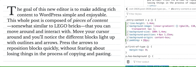
Frontend Developers are trained to work with JavaScript, and to use it to create interactivity on sites. But there are plenty of cool things that you can do with standard HTML and CSS. Whether it’s fitting images into boxes, fitting boxes onto screens, or filling screens with beautifully animated user interactions, CSS can have you covered!


