Responsive Images in Drupal 8
Nathan Lawson
Lead Front End Developer
@ Consult and Design
Worked w/ Drupal for 5 years
Organiser @ Sunderland Digital
Tweet @nathanlawsn
What we'll cover
Setting up responsive images in Drupal 8 using Responsive Image and Breakpoint modules
-
Why should we use responsive images?
-
srcset and sizes attributes and <picture> element
-
Configuring Responsive Images in D8
-
Tips for faster page load
Why do we need responsive images?
Why do we need them?
The web is growing. Fast.
- Average web page is now 3MB (July 2017)
- Average web page in November 2011 was 1MB
- Almost 60% is attributed to image files
Source: http://httparchive.org/
Why is this a problem?
In a word of responsive design, we're serving files sizes way bigger than necessary:
- Pixelated for some or slow for all?
- Designers choosing to serve highest resolution screen possible
- A lot of that data is simply wasted
- Pages slow to load on mobile data connections
- Data costs people money
Responsive Images
Designers have been tackling the issue of responsive images ever since Ethan Marcotte introduced Responsive Design in 2010
- Images are stubborn: size, format, crop, single src
- What is the most efficient approach?
img {
    width: 100%;
    height: auto;
}
Responsive Images
This allows us to display the same image under different circumstances, but it doesn't allow us to specify different images for differing circumstances.
srcset and sizes
srcset and sizes attributes give developers greater flexibility in specifying image sources.
srcset and sizes attributes on an <img> element provide information that the browser can use to make an informed decision about what image is most appropriate for the user.
srcset
Basic implementation of srcset with options for display density (retina devices):
<img
    srcset="skyline.jpg 1x,
            skyline-2x.jpg 2x,
            skyline-3x.jpg 3x"

    src="skyline.jpg"

    alt="City Skyline"
/>
x descriptor in the srcset attribute is used to define the device-pixel ratio.
srcset
Using the x descriptor, the same image will be served on devices with a similar device-pixel ratio.
But what if we want a different size image on larger or smaller viewports?
Enter the w descriptor and sizes attribute.
srcset
Example implementation of w descriptor in srcset:
<img
    srcset="skyline.jpg 480w,
            skyline-2x.jpg 960w,
            skyline-3x.jpg 1440w"

    src="skyline.jpg"

    alt="City Skyline"
/>
If you want a different size image on different screen sizes, this is where the sizes attribute comes in.
srcset and sizes
Example implementation of sizes attribute:
<img
    srcset="skyline.jpg 480w,
            skyline-2x.jpg 960w,
            skyline-3x.jpg 1440w"

    sizes="(max-width: 40em) 100vw, 50vw"

    src="skyline.jpg"

    alt="City Skyline"
/>
If viewport is less than 40em, the image is as wide as the viewport, otherwise image is half the viewport (50vw).
srcset and sizes
For most cases, using srcset and sizes on an <img> element is maybe all you really need.
But what if you want to change the art direction?
<picture>
<picture> allows us to instruct the browser to use specific images via media queries
- useful for changing focal point of an image at different breakpoints
<picture>
<picture> consists of:
- One or more <source> tags
- each can possess upto four attributes
- srcset (required), media, sizes, type (optional)
- each can possess upto four attributes
- Fallback <img> element
<picture>
Example of <picture> implementation using srcset and media attributes with <img> fallback:
<picture>
    <source media="(max-width: 30.99em)">

            srcset="small/skyline.jpg 1x,
                    small/skyline-2x.jpg 2x">

    <source  media="(min-width: 40em) and
                    (max-width: 59.99em">

            srcset="medium/skyline.jpg 1x,
                    medium/skyline-2x.jpg 2x">

    <source media="(min-width: 60em)"

            srcset="large/skyline.jpg 1x,
                    large/skyline-2x.jpg 2x">

    <img src="skyline.jpg" alt="City Skyline">
</picture>
srcset/sizes
- Use srcset and sizes for specifying image sizes/densities across breakpoints
- Allows the browser to make informed decisions about which image to serve
<picture>
- Use <picture> for setting art direction
- Explicitly tells the browser which images to use and when via media queries
Browser Support
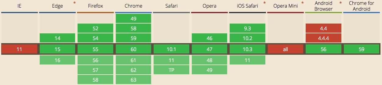
<picture> has good browser support, except for... you guessed it ;)
Picturefill
A responsive image polyfill for <picture>, srcset, sizes
https://github.com/scottjehl/picturefill
Great news is that Responsive Image module includes Picturefill out the box.

Configuring Responsive Images in Drupal 8
Demo
Configuring D8
Setting up responsive images in Drupal 8:
- Enable Responsive Image and Breakpoint modules
-
Set up breakpoints in your theme's breakpoints.yml
-
Create your image styles
- Create your responsive image style
-
Change image formatter in your content type
Modules
Responsive Image
The Responsive Image module in Drupal 8 provides an image formatter and breakpoint mappings to output responsive images using the HTML5 picture tag.
Breakpoint
The Breakpoint module standardizes the use of breakpoints, and enables modules and themes to expose or use each others' breakpoints.
breakpoints.yml
Example (bartik.breakpoints.yml)
bartik.mobile:
  label: mobile
  mediaQuery: ''
  weight: 0
  multipliers:
    - 1x
bartik.narrow:
  label: narrow
  mediaQuery: 'all and (min-width: 560px) and (max-width: 850px)'
  weight: 1
  multipliers:
    - 1x
bartik.wide:
  label: wide
  mediaQuery: 'all and (min-width: 851px)'
  weight: 2
  multipliers:
    - 1x
breakpoints.yml
Add in your multipliers e.g. 2x
bartik.mobile:
  label: mobile
  mediaQuery: ''
  weight: 0
  multipliers:
    - 1x
    - 2x
bartik.narrow:
  label: narrow
  mediaQuery: 'all and (min-width: 560px) and (max-width: 850px)'
  weight: 1
  multipliers:
    - 1x
    - 2x
bartik.wide:
  label: wide
  mediaQuery: 'all and (min-width: 851px)'
  weight: 2
  multipliers:
    - 1x
    - 2x
Responsive Images + Lazy Loading =

Blazy
Blazy module provides integration with bLazy, a lightweight pure JS script for lazy loading images
- faster page load times
- saves data usage if user doesn't browse whole page
- supports lazy loading core Image
- supports lazy loading core Responsive Image
- lightweight, less than 1.4KB
Configuring Blazy
Setting up Blazy in Drupal 8:
- Go to "/admin/config/media/blazy" to manage few global options, including enabling support for lazy loading core Responsive Image
- Go to Manage display page, e.g.:
/admin/structure/types/manage/page/display
Find "Blazy" formatter under "Manage display"
Configuring Blazy in Drupal 8
Demo
What about D7?
Responsive Image and Breakpoints are not part of core, but available as contrib modules. No support for Blazy!
Picture
https://www.drupal.org/project/picture
Breakpoints
https://www.drupal.org/project/breakpoints
Further Reading
Responsive Images Done Right
https://www.smashingmagazine.com/2014/05/responsive-images-done-right-guide-picture-srcset/
Responsive Images in Practice
https://alistapart.com/article/responsive-images-in-practice
The Anatomy of Responsive Images
https://jakearchibald.com/2015/anatomy-of-responsive-images/
Questions?
Responsive Images in Drupal 8
By nathanlawsn
Responsive Images in Drupal 8
Presented to Drupal North East on Wednesday 30th August 2017 at Campus North.