Information Design in Language Data
Session 2: Data Storytelling
Ahmad Haj Mosa
PwC Austria & FH Campus Wien
Vienna 2023

Contents
-
Definition of Storytelling
-
Design principles
Storytelling
Storytelling
“intentional communicative artefacts”
Gregory Currie (2012)
Feigenbaum, Anna; Alamalhodaei, Aria. The Data Storytelling Workbook (p. 3). Taylor and Francis. Kindle Edition.
dramatization of meaning in an interesting, evocative, informative way”
Theodore Cheney (2001)
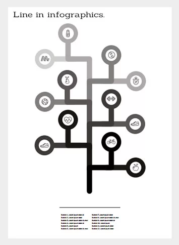
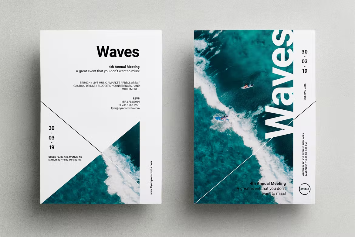
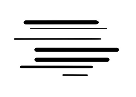
Use cases of lines
Organise information
Connect
Highlight information
Divide
Create grid, chart or graph
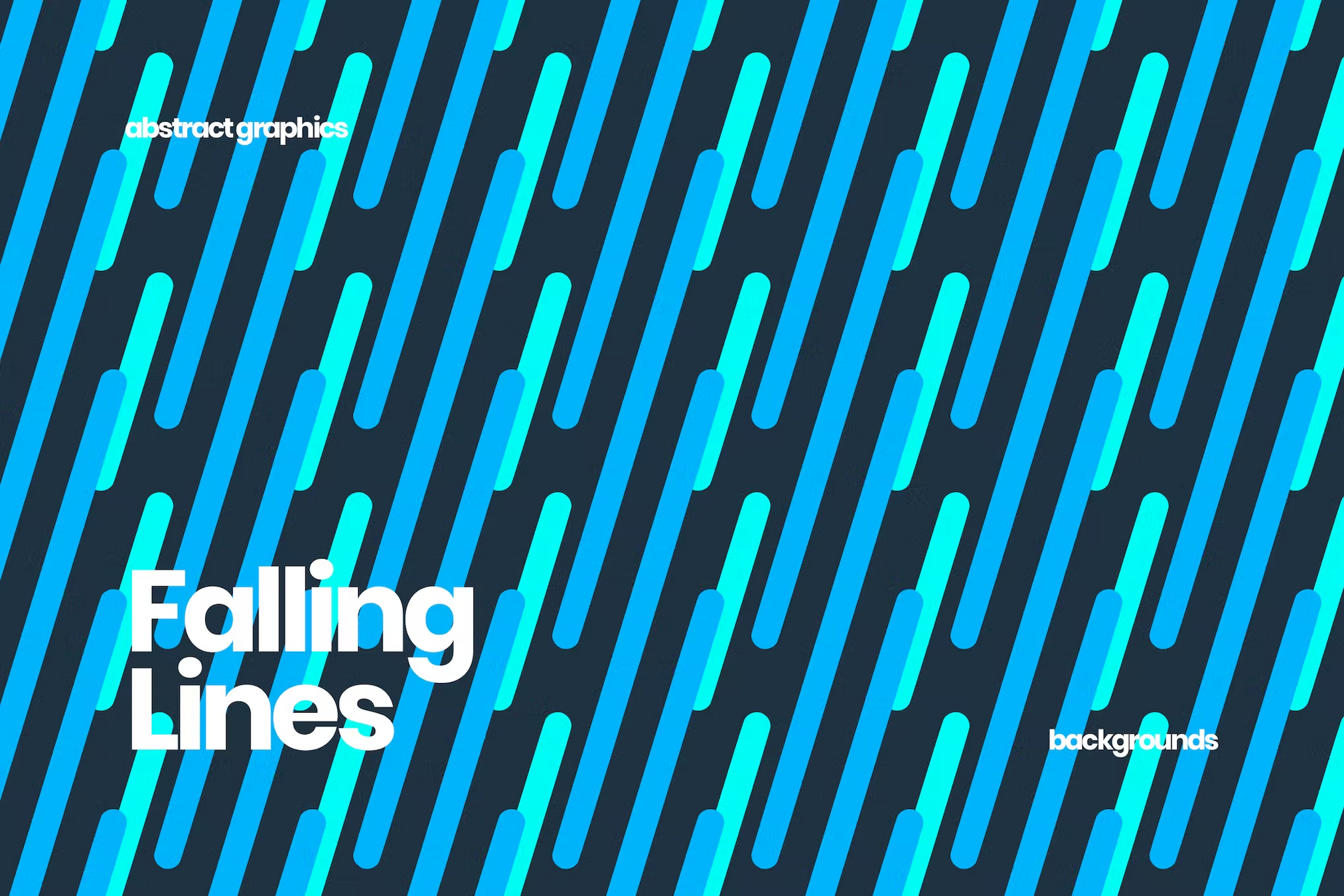
Create pattern or rhythm
Direct reader's eye
Outline
Decorate
Linear element
BAMAIYI, ISHAYA. THE UNREFUTABLE ELEMENTS AND PRINCIPLES OF GRAPHIC DESIGN: YOUR SURE GUIDE TO GRAPHIC DESIGN PROFESSIONALISM (p. 11). Kindle Edition.
Organise information
Designing Information: Human Factors and Common Sense in Information Design
Highlight information
Designing Information: Human Factors and Common Sense in Information Design
Lines are used to Highlight information
Connect
Divide
Direction and Movement
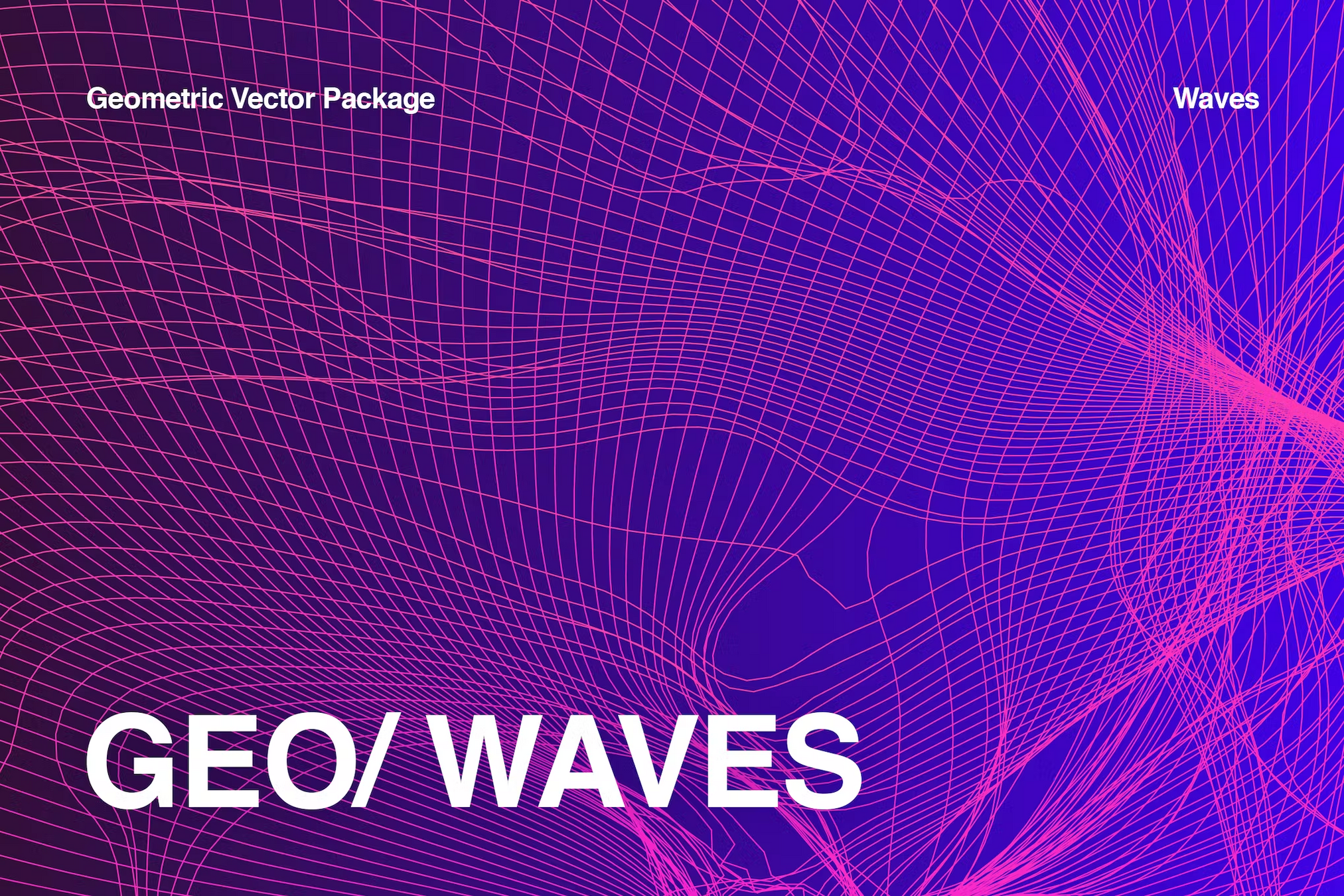
Patterns and Rhythm
Linear Elements
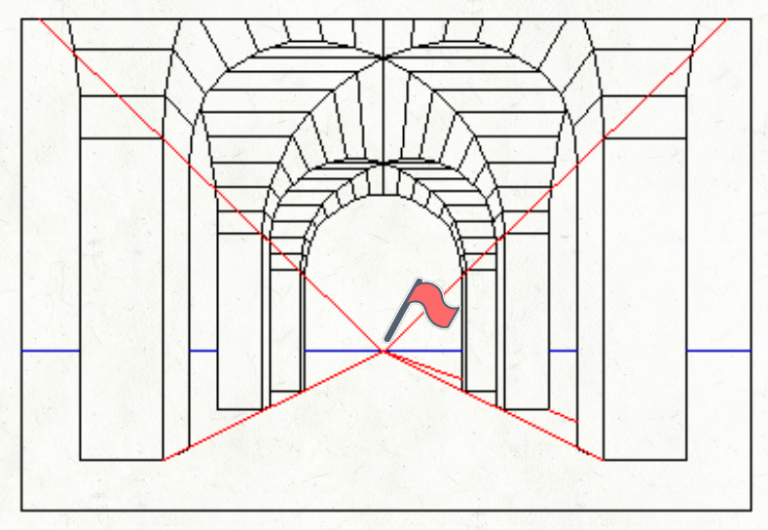
Do you see any lines?

Do you see any lines?
Unvisible lines
Unvisible lines
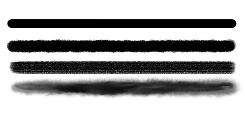
Characteristic of lines
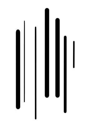
Width
Width
Aggressive, Strong
Simple, Cute
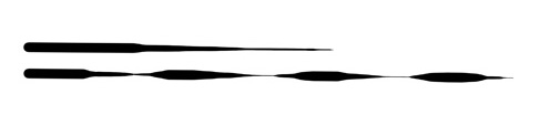
Weight
Weight in lines means the continuous change of width. By varying the weight, one can capture energy, movement and even suggest when one object is in front of the other.
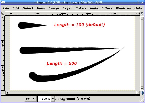
Length
Length
A long line generally conveys a sense of stability, calmness, and orderliness
short line may suggest movement, energy, and dynamism
Long lines can also create a sense of directionality or flow, guiding the viewer's eye along a particular path. In contrast, short lines can create a more abrupt or discontinuous feel.
https://yourartpath.com/types-of-line-in-art-meaning
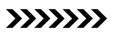
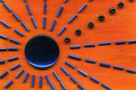
Direction
Vertical lines are straight up and down lines that are moving in space without any slant and are perpendicular to horizontal lines. They suggest height and strength because they extend towards the sky and seem unshakeable.
Horizontal lines are straight lines parallel to the horizon that move from left to right. They suggest width, distance, calmness, and stability.
Direction
Radial lines suggest movement, rhythm and choas
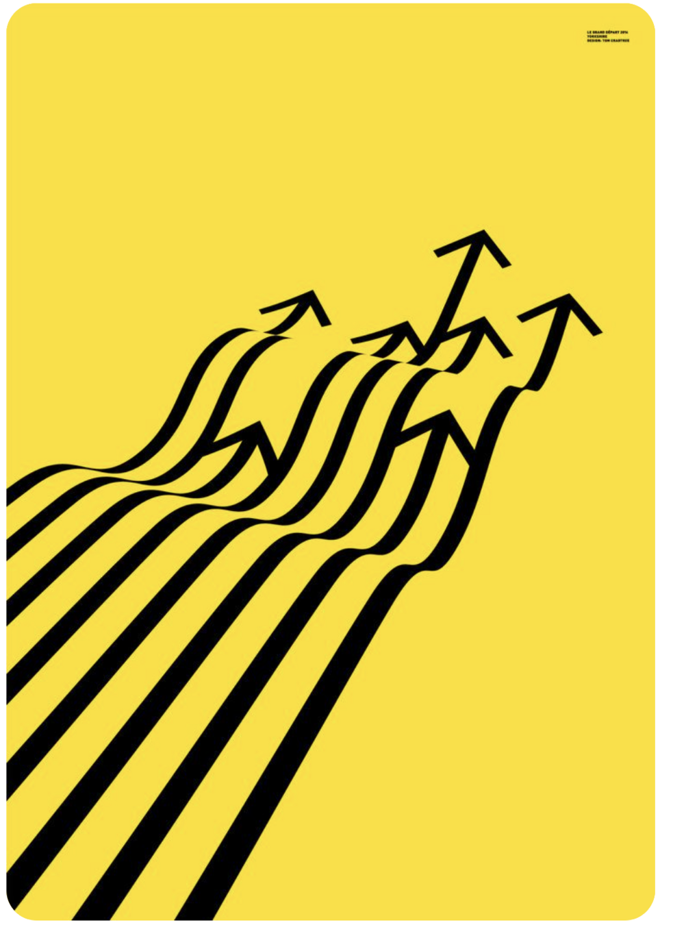
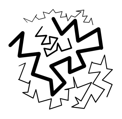
Zigzag lines are a series of diagonal lines joined at ends. They can convey action and excitement, as well as restlessness and anxiety.
Curved Lines
Curved lines can represent movement in graphics design by creating the illusion of flow, energy, and dynamism. Here are some ways curved lines can be used to represent movement
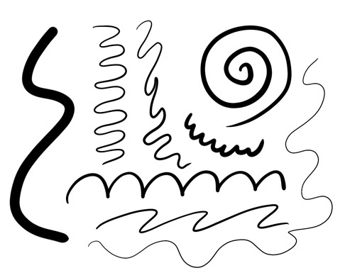
Curved Lines
Directionality: Curved lines can be used to suggest the direction of movement, such as a curving line that suggests a path of motion.
Speed: Curved lines can be used to suggest the speed of movement, such as a highly curved line that suggests fast motion, or a gentle curve that suggests slow motion.
Fluidity: Curved lines can be used to suggest fluidity of movement, such as the curve of a wave or the undulating movement of a dancer.
Momentum: Curved lines can be used to suggest momentum or the buildup of energy, such as the curve of a rollercoaster track or the arc of a swinging pendulum.
Rhythm: Curved lines can be used to create a sense of rhythm or repetition, such as the repeated curves of a sine wave or the flowing curves of a ribbon.
Texture
Texture in lines defines how smooth or rough it is. Varying it can simply mean changing your working medium (for example, going from marker to charcoal or changing your digital brush).
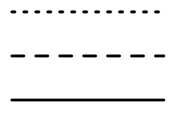
Style
Style of lines refers to continuous, dotted, dashed or implied lines. Continuous or implied lines are great for leading the eye of the viewer in the direction you want them to go. Dashed or dotted lines are great for patterns, energy and calling for attention.
https://yourartpath.com/types-of-line-in-art-meaning
The neuroscience of human perception
The visual system is specialized to detect edges and contours, which are defined by changes in luminance or color. Lines are essentially long edges, so they are readily detected by the visual system.
The brain processes lines in a hierarchical manner, with low-level neurons detecting basic features like orientation and contrast, and higher-level neurons integrating these features to form more complex representations like curves and shapes.
The neuroscience of human perception
The perception of lines can be influenced by context and other visual cues. For example, lines that are placed in a particular arrangement can create the illusion of depth, and lines that are spaced a certain distance apart can create the perception of texture or pattern.
Different characteristics of lines, such as color, thickness, and texture, are processed by different neural pathways in the brain. For example, color information is processed in the ventral pathway, while spatial information (such as orientation and position) is processed in the dorsal pathway.
Excersie
Exercise 1
In a group of 2-3 students, design the following using lines only: happiness, tension, calmness, chaos, and movement.
Hints
-> Use curved, upward lines to convey a sense of joy and positivity.
-> Experiment with different thicknesses and lengths to add variety.
-> Arrange the lines in a radiating pattern, suggesting an uplifting energy.
-> Utilize straight, diagonal lines to evoke a feeling of tension or unease.
-> Vary the thickness and length of the lines to create contrast and intensity.
-> Arrange the lines in a way that they appear to intersect or clash, emphasizing the tension.
Happiness
Tension
Hints
-> Use smooth, horizontal lines to communicate a sense of calm and tranquility.
-> Keep the line thickness consistent and opt for longer lines to emphasize stability.
-> Space the lines evenly apart, creating a sense of harmony and balance
-> Combine different types of lines (straight, curved, wavy, dotted) to express chaos and disorder.
-> Vary the line properties, including thickness, length, direction, and density, to create visual complexity.
-> Arrange the lines randomly, overlapping and intertwining, to reinforce the feeling of chaos.
Calmness
Choas
Hints
-> Use curved, upward lines to convey a sense of joy and positivity.
-> Experiment with different thicknesses and lengths to add variety.
-> Arrange the lines in a radiating pattern, suggesting an uplifting energy.
-> Utilize straight, diagonal lines to evoke a feeling of tension or unease.
-> Vary the thickness and length of the lines to create contrast and intensity.
-> Arrange the lines in a way that they appear to intersect or clash, emphasizing the tension.
Happiness
Tension
Exercise 2
use lines to create visual narratives and how to apply the principles of design to convey a story
Line based story telling
use lines to create visual narratives and how to apply the principles of design to convey a story
Story
Once upon a time in a small village, a young boy named Tim had a colorful kite. He loved flying his kite in the open fields during the warm and windy days of spring. One day, as Tim was happily flying his kite, a sudden gust of wind ripped the string from his hands, and the kite soared high into the sky.
As the kite drifted away, Tim chased after it, determined to retrieve his beloved toy. He followed the kite through the village, past the market, and into the nearby forest. In the forest, the kite became entangled in the branches of a tall, old tree. Tim tried his best to reach the kite, but it was too high up.
Just as he was about to give up, a friendly squirrel appeared. With a swift leap, the squirrel climbed the tree and retrieved the kite for Tim. Grateful for the help, Tim thanked the squirrel and promised to visit the forest more often to play with his new friend.
Together, they walked back to the village, with the kite dancing in the wind behind them. From that day on, Tim and the squirrel became the best of friends, and their playful adventures brought joy to the village and the forest alike.
Story
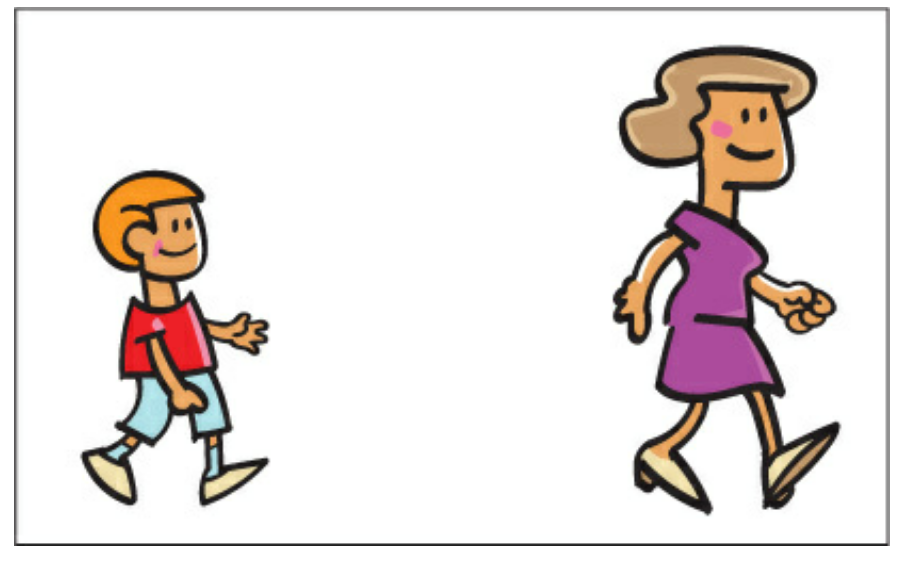
Create a three-panel storyboard focusing on the key moments. Here's a breakdown of each panel
Panel 1: The Village and the Windy Day
wind blowing
houses in the village
ground or grass
Tim holding the kite
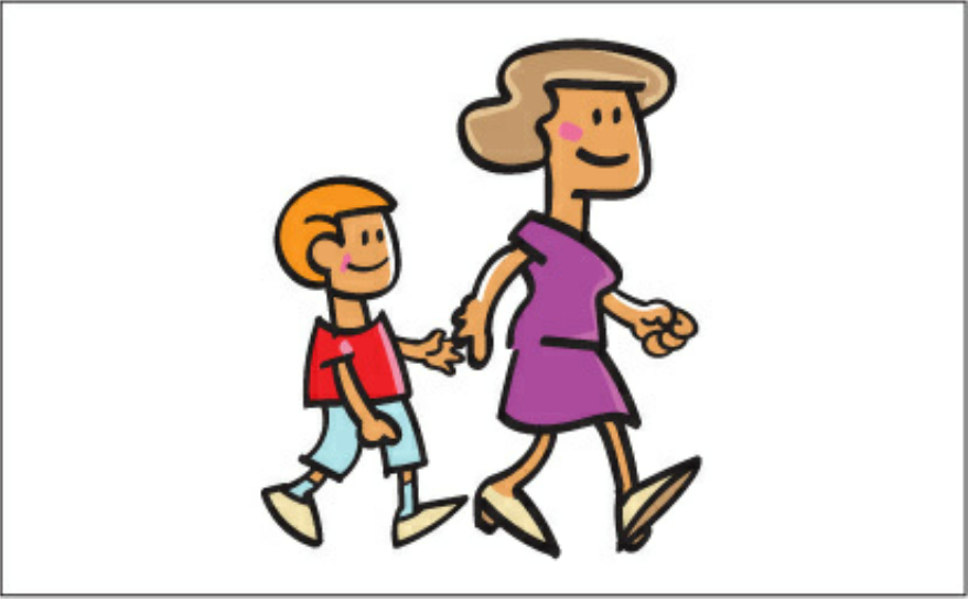
Story
Create a three-panel storyboard focusing on the key moments. Here's a breakdown of each panel
Panel 2: The Kite in the Forest
Intertwine the kite in the tree branches
Tree trunks and branches
Tim standing below the tree
Shape
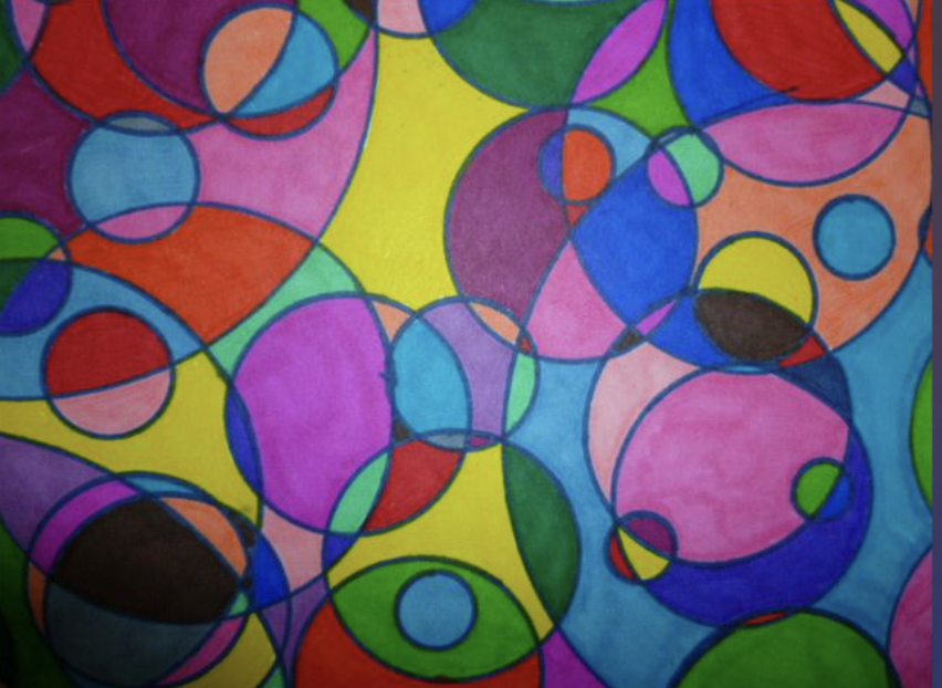
Shape
A shape can be geometric (like a circle, triangle, or square), or it can be organic (such as leaves, flowers, and animals). Boundaries—including lines and color—ultimately define shapes and can also help emphasize an area of the page
https://xd.adobe.com/ideas/process/ui-design/6-elements-design/#:~:text=The%20second%20element%20of%20design,an%20area%20of%20the%20page.
Shapes are used to add taste and substance to a piece of graphic work. They can be used to beautify, they can be symbolic and can be used to form patterns and textures.
BAMAIYI, ISHAYA. THE UNREFUTABLE ELEMENTS AND PRINCIPLES OF GRAPHIC DESIGN: YOUR SURE GUIDE TO GRAPHIC DESIGN PROFESSIONALISM (p. 47). Kindle Edition.
Shape
Shapes are signal visual elements
When they are placed in graph, they should have a meaning
BAMAIYI, ISHAYA. THE UNREFUTABLE ELEMENTS AND PRINCIPLES OF GRAPHIC DESIGN: YOUR SURE GUIDE TO GRAPHIC DESIGN PROFESSIONALISM (p. 47). Kindle Edition.
In design when we begin to place shapes together we form a relationship between them
BAMAIYI, ISHAYA. THE UNREFUTABLE ELEMENTS AND PRINCIPLES OF GRAPHIC DESIGN: YOUR SURE GUIDE TO GRAPHIC DESIGN PROFESSIONALISM (p. 47). Kindle Edition.
Types of Shape
shapes that can be drawn using a ruler or compass. Whether simple or complex, these shapes produce a feeling of control or order
shapes that can be drawn by free hand or shapes found in nature. Organic shapes whether simple or complex produce a natural feel.
BAMAIYI, ISHAYA. THE UNREFUTABLE ELEMENTS AND PRINCIPLES OF GRAPHIC DESIGN: YOUR SURE GUIDE TO GRAPHIC DESIGN PROFESSIONALISM (p. 47). Kindle Edition.
Geometric shapes
BAMAIYI, ISHAYA. THE UNREFUTABLE ELEMENTS AND PRINCIPLES OF GRAPHIC DESIGN: YOUR SURE GUIDE TO GRAPHIC DESIGN PROFESSIONALISM (p. 47). Kindle Edition.
Organic shapes
Types of Shape
Shapes play a crucial role in creating a sense of movement in visual communication.
Movement can help guide the viewer's eye through a design, create a sense of dynamism, and make the content more engaging.
In the following are some ways that shapes are used to form movement in information design
Directional shapes
-
Arrows or other pointed shapes can be used to guide the viewer's eye through the design, indicating where they should focus next. Triangles, chevrons, and even organic shapes with clear directional cues can serve this purpose.
Repetition and pattern
Repeating shapes or patterns can create a sense of movement, especially when they gradually change in size, orientation, or color. This can give the illusion of motion, like a series of waves, or create a sense of progression, like a row of dots getting larger as they move across the design
Overlapping shapes
By layering shapes on top of one another, you can create a sense of depth and movement. The viewer's eye will naturally follow the layers from front to back or vice versa, creating a sense of motion
Framing (focus)
Use shapes to create a frame or border around the area you want to emphasize. This can be achieved with simple rectangles or more decorative shapes that enclose the focal point, drawing the viewer's attention to it
Alignment and proximity (focus)
Align related shapes and elements in a way that naturally leads the viewer's eye to the area of focus. Grouping related elements together and keeping adequate white space around the focal point can also help direct attention
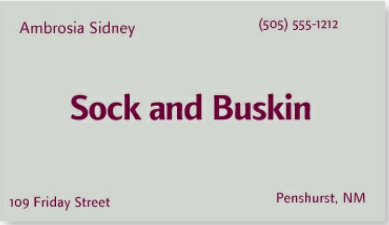
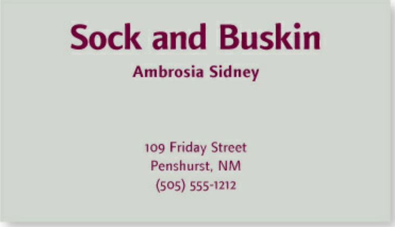
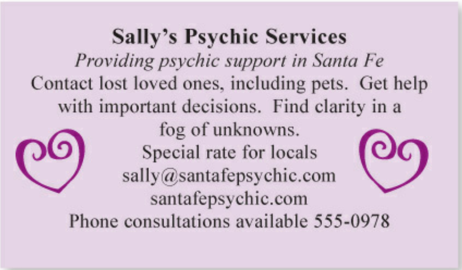
The Principle of Proximity states: Group related items together. Move them physically close to each other so the related items are seen as one cohesive group rather than a bunch of unrelated bits.
Robin, Williams. Non-Designer's Design Book, The (Non Designer's Design Book) (p. 25). Pearson Education. Kindle Edition.
Items or groups of information that are not related to each other should not be in close proximity (nearness) to the other elements, which gives the reader an instant visual clue to the organization and content of the page.
Alignment and proximity (focus)
Robin, Williams. Non-Designer's Design Book, The (Non Designer's Design Book) (p. 25). Pearson Education. Kindle Edition.
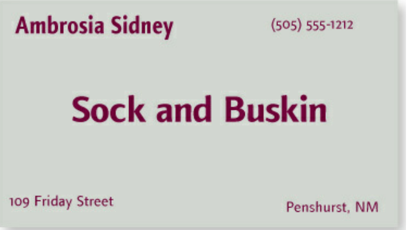
In Design as in life, physical closeness implies a relationship.
The number of separate elements implies how many times viewer eye stops
Alignment and proximity (focus)
Robin, Williams. Non-Designer's Design Book, The (Non Designer's Design Book) (p. 25). Pearson Education. Kindle Edition.
Alignment and proximity (focus)
Robin, Williams. Non-Designer's Design Book, The (Non Designer's Design Book) (p. 25). Pearson Education. Kindle Edition.
Alignment and proximity (focus)
Robin, Williams. Non-Designer's Design Book, The (Non Designer's Design Book) (p. 25). Pearson Education. Kindle Edition.
Alignment and proximity (focus)
Robin, Williams. Non-Designer's Design Book, The (Non Designer's Design Book) (p. 25). Pearson Education. Kindle Edition.
Alignment and proximity (focus)
Robin, Williams. Non-Designer's Design Book, The (Non Designer's Design Book) (p. 25). Pearson Education. Kindle Edition.
Form
Forms
Forms are one of the fundamental elements of design that contribute to the overall composition and aesthetic of a piece of art or design.
They refer to the three-dimensional shapes and structures within a design, encompassing aspects such as volume, space, and mass.
Forms can be both organic (curved, irregular, or fluid) or geometric (regular, angular, or symmetrical).
Understanding and utilizing forms effectively is essential for creating visually engaging and harmonious designs.
Other Elements
Elements of Design
Line
Shape
Form
Color
Texture
Space
Principle of Design
Design Principles
Design principles are fundamental guidelines to create visually appealing and effective designs
They apply across various disciplines
The goal of effective design is to communicate a message or idea, guide the viewer's attention, and create a visual experience that is both engaging and memorable
Design Principles
Balance
Contrast
Emphasis
Proportion
Unity
Movement
Balance
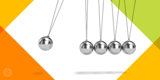
Balance
Balance is the distribution of visual weight in a design, creating a sense of equilibrium
The concept of balance, as applied in design, refers to the arrangement of elements within a particular artwork or design.
Humans have an inherent tendency to perceive order and equilibrium in any visual representation, which is why symmetrical faces and objects often hold greater appeal.
Balance
The perceived weight of an individual element in design. To manipulate visual weights you can adjust the size, color, shape and texture of the element.
The direction in which an individual element shifts the focus or appears to move. To manipulate visual direction, you can alter attributes like structural skeleton or the location of elements
Visual Weight
Visual Direction
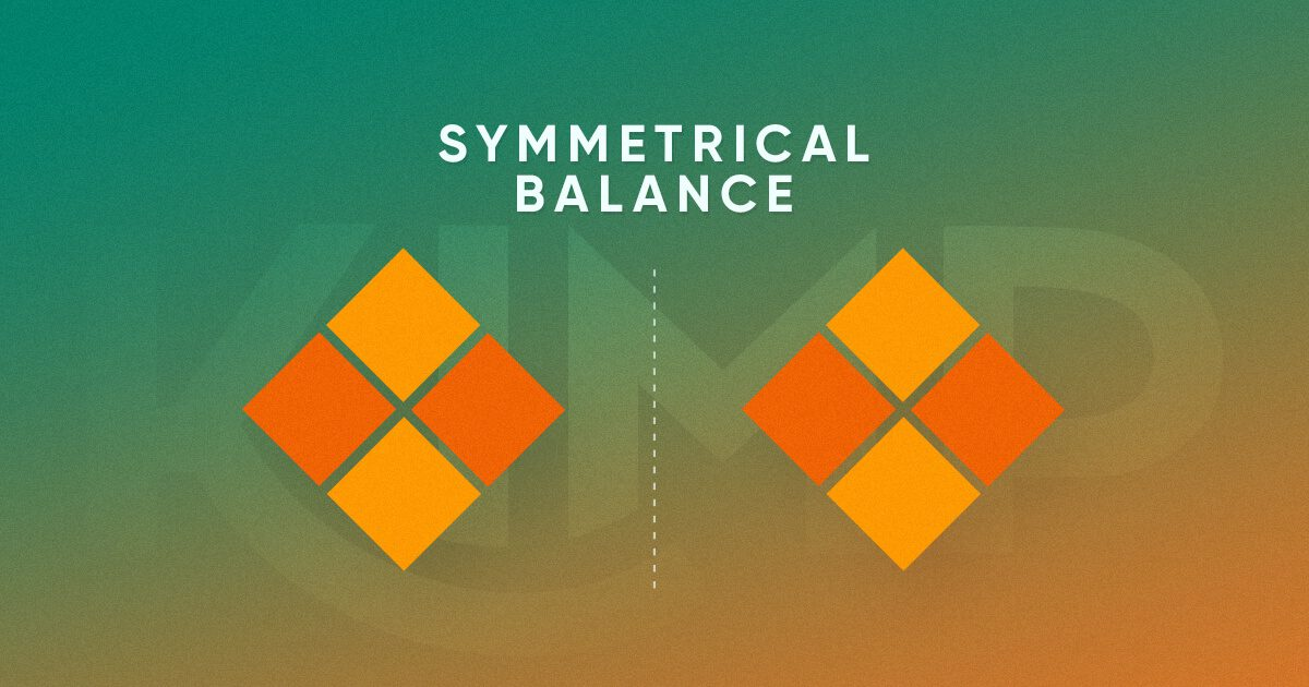
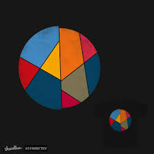
Types of Balance
Elements are mirrored on either side of an imaginary central axis, creating a formal and organized appearance.
Elements are distributed unevenly, but still achieve equilibrium through the use of contrasting visual weights, creating a more dynamic and interesting design.
Symmetrical balance
Asymmetrical balance
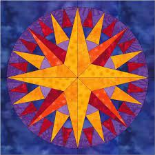
Radial balance
Elements are arranged around a central focal point, radiating outward in a circular patter
Symmetrical Balance
Symmetrical Balance
The most prevalent form of balance observed in designs is symmetrical balance
By drawing a vertical or horizontal line, one can easily determine that the visual weight of the design is equally distributed on both sides, creating a sense of harmony and ease for the viewer
This type of balance is commonly used in design as it is aesthetically pleasing and provides a sense of stability.
Symmetrical Balance
Robin, Williams. Non-Designer's Design Book, The (Non Designer's Design Book) (p. 25). Pearson Education. Kindle Edition.
Symmetrical Balance
Robin, Williams. Non-Designer's Design Book, The (Non Designer's Design Book) (p. 25). Pearson Education. Kindle Edition.
Symmetrical Balance
Robin, Williams. Non-Designer's Design Book, The (Non Designer's Design Book) (p. 25). Pearson Education. Kindle Edition.
Symmetrical Balance
Robin, Williams. Non-Designer's Design Book, The (Non Designer's Design Book) (p. 25). Pearson Education. Kindle Edition.
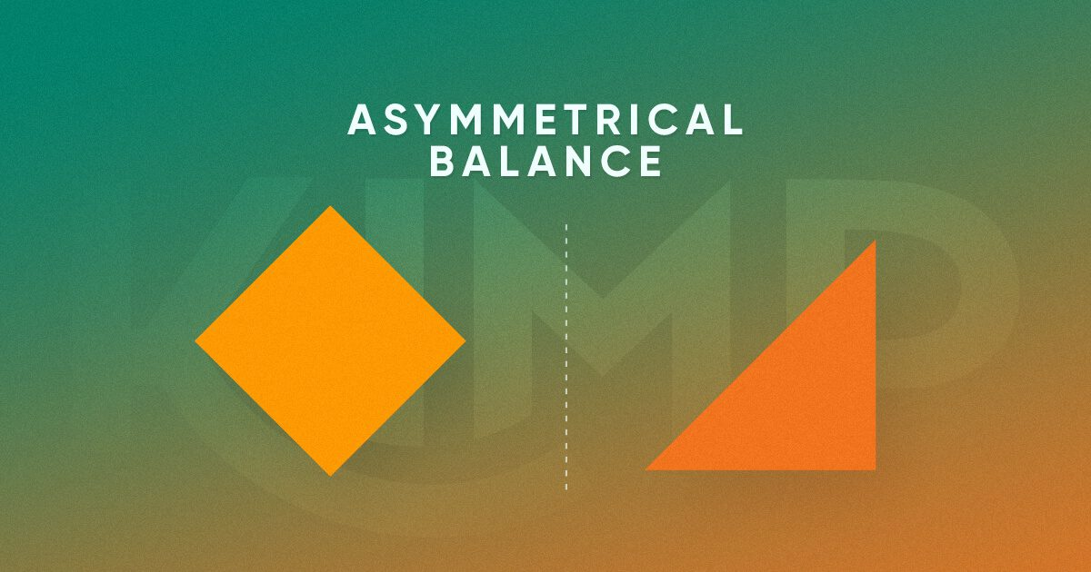
Asymmetrical Balance
Asymmetrical Balance
Elements are distributed unevenly, but still achieve equilibrium through the use of contrasting visual weights, creating a more dynamic and interesting design
Even though one side of the design or image will be visually heavier than the other, there is still a strong sense of balance and appeal that can be created with asymmetrical balance.
Asymmetrical Balance
Asymmetrical Balance
Radial Balance
Radial Balance
Elements are arranged around a central focal point, radiating outward in a circular pattern.
Visual elements will radiate from a center point. In other words there are multiple axes in the design and they all meet at one point
Equal visual weight is given to the various elements that are distributed on the sides of these axes. And they are all symmetrically at the same distance from their corresponding axes as well.
Radial Balance
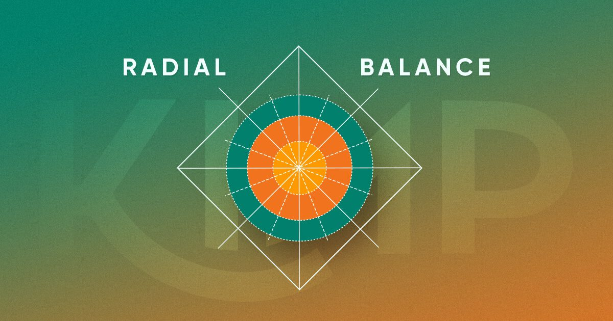
Radial Balance
Radial Balance
Creating harmony and unity: Radial balance can produce a sense of harmony and unity in designs, as the elements share a common center and relate to one another in a cohesive manner.
Drawing attention to a central point: By arranging elements around a central focal point, radial balance can effectively draw the viewer's attention to that point, which might be a logo, key message, or important piece of information
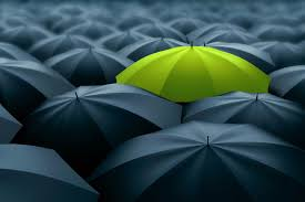
Contrast
Contrast
Balance is the distribution of visual weight in a design, creating a sense of equilibrium
Types of contrast: size (big vs. small), shape (round vs. angular), color (complementary colors), texture (smooth vs. rough), typography (serif vs. sans-serif)
Contrast various elements of the piece to draw a reader’s eye into the page. If two items are not exactly the same, then make them different. Really different.
Contrast
Contrast not only serves to draw in the eye, but you can use it to organize information, clarify the hierarchy, guide a reader around the page, and provide a focus.
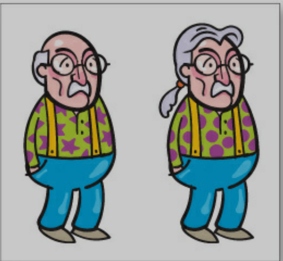
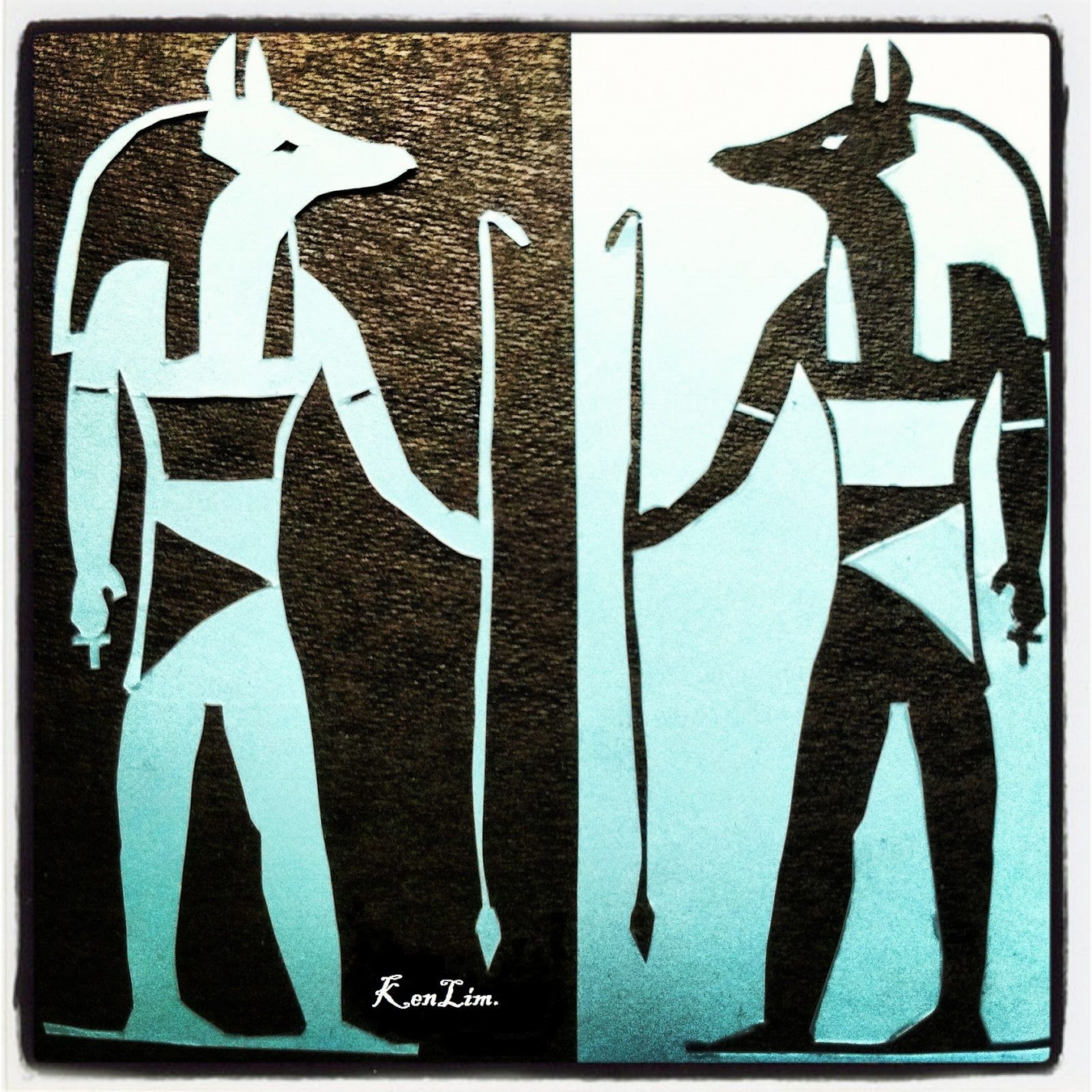
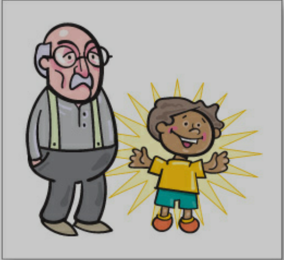
Are these two guys different?
Contrast
If they are not the same make them different
Contrast
vs
Contrast use cases
Focal point: By creating a strong contrast between elements, you can draw the viewer's attention to a specific area or focal point in your design. This can be achieved by using contrasting colors, sizes, shapes, or typography.
Hierarchy and organization: Contrast helps to establish a visual hierarchy within a design by distinguishing between different levels of importance. For example, you can use larger, bolder fonts for headlines and smaller, lighter fonts for body text to create a clear hierarchy.
Separation and grouping: Contrast can be used to separate or group design elements, guiding the viewer's eye through the design and improving its overall organization. For example, you can use contrasting colors or lines to divide sections of content or group related elements together.
Contrast use cases
Conveying meaning and emotions: Contrast can also be used to convey meaning or emotions in your design. For instance, using contrasting colors like black and white can create a sense of drama or sophistication, while using high-contrast shapes or lines can convey a sense of energy or tension.
Emphasis
Emphasis
Emphasis is the technique of making certain elements stand out in a design, drawing the viewer's attention to key information or feature
How to create emphasis
Size – larger elements carry more weight
Color – some colors are perceived as weighing more than others. Red seems to be heaviest while yellow seems to be lightest.
Density – Packing more elements into a given space gives more weight to that space
Value – A darker object will have more weight than a lighter object
Whitespace – Positive space weighs more than negative space or whitespace
Emphasis: levels of dominance
Dominant: The element on the page that is given the most visual weight
Emphasis: levels of dominance
Sub-dominant: The elements on the page that become the middle ground of the composition

Emphasis: levels of dominance
Subordinate: The elements on the page that are given the least visual weight
Proportion
Proportion
Proportion refers to the relative size and scale of elements within a design, contributing to the overall harmony and visual appeal of the composition
Proportion in the principles of design is the sense of unity created when all the elements in a composition relate well with each other.
Proportion is mostly about scale and size
Proportion
Proportion is a concept capable of blending art and science
Using proportion in graphic design allows designers to leverage concepts like emphasis and contrast more effectively
Proportion is mostly about scale and size
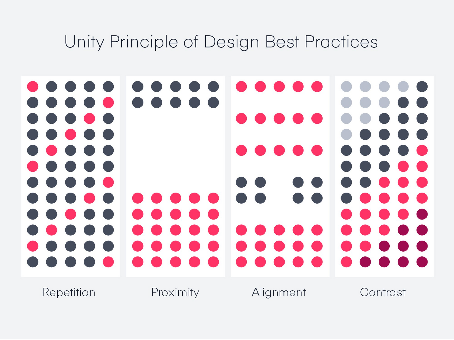
Unity
Unity
The Unity Principle of Design states that design elements should be both visually and conceptually harmonious
Exercise
Task 1
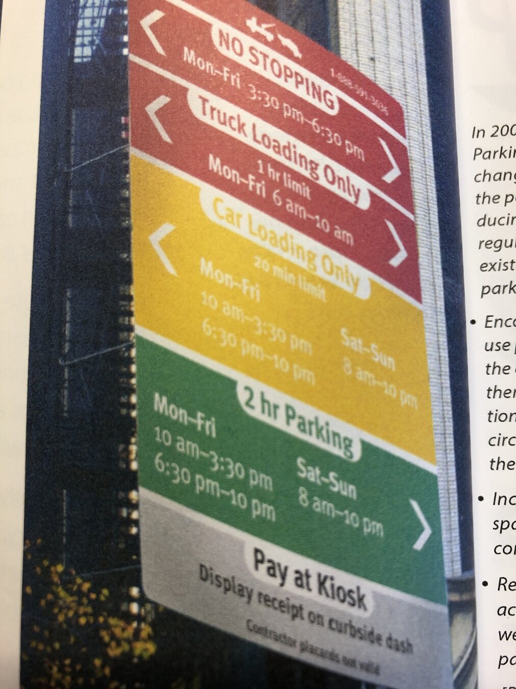
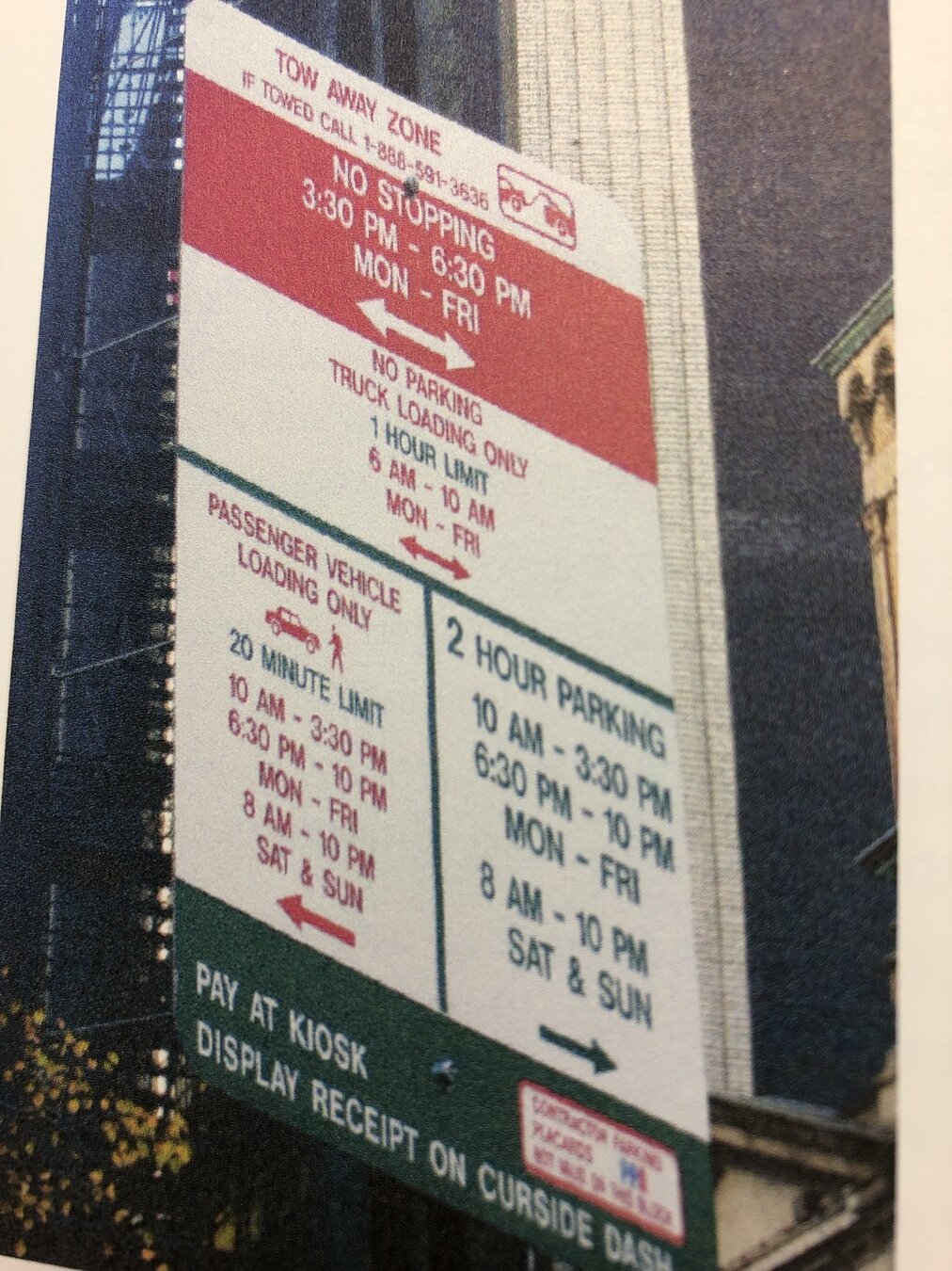
Task: Design a parking sign
This street is a tow zone
Information to be included:
No stopping on both directions from 3:30 PM to 6:30 PM and 10:00 PM to 06:00 AM
Truck loading only on both directions from 06:00 AM to 10:00 AM (limit 1 hour)
Passenger loading only on the left direction from 10:00 AM to 03:30 PM or from 6:30 PM to 10:00 PM (limit 20 min)
Parking allowed on the right direction from 10:00 AM to 03:30 PM or from 6:30 PM to 10:00 PM
Pay at Kiosk
Task 1
Designing Information: Human Factors and Common Sense in Information Design
Design?
History and definition of Information Design
Design Thinking
Data storytelling
Human-AI interaction design guidelines
Language Data
Ethics of information design
A/B testing for UX/UI design
Information Design Session 3
By ahmadadiga


