The Human Side of Accessibility


Alex Moldovan
@alexnmoldovan
Co-Founder @ JSHeroes
UI/UX Developer @ teleportHQ
Accessibility is the design of products, devices, services, or environments for people with disabilities.
Accessibility is the design of products, devices, services, or environments for people with disabilities.
ACCESSIBILITY = DESIGN FOR PEOPLE
Accessibility is a real problem
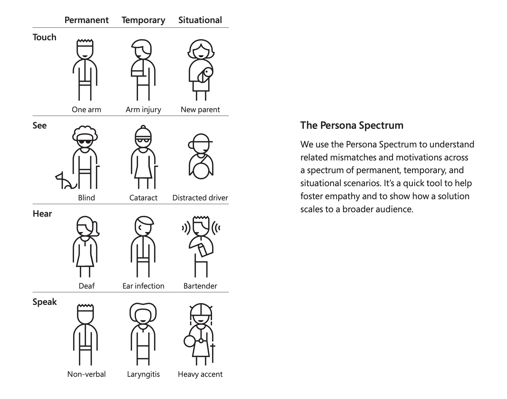
Accessibility is Diversity


Alice

Bob

Charlie

Dominic

https://www.microsoft.com/design/inclusive/
Accessibility is UX
Before software can be reusable it first has to be usable.
Ralph E Johnson, GoF
Availability and Accessibility
Safety and Privacy
Convenience and Cost
Delightful Experience
Availability and Accessibility
Safety and Privacy
Convenience and Cost
Delightful Experience
Availability and Accessibility
Safety and Privacy
Convenience and Cost
Delightful Experience
Accessibility Practices
1. Visual

Color Contrast

✅ Aim for >3:1 - AA
✅ Prioritize Text
Patterns and colors


Typography
✅ Minimum 16px text
✅ Font-family consistency
✅ Standard paragraphs and letter spacing
✅ 80 characters per line
Animations
Animations
✅ No unexpected transitions
✅ Use prefers-reduced-motion

✅ No parallax / scroll to
1. Visual
2. Semantic
A11y Object Model

Page Semantic

✅ Stop the divfest
✅ Define landmarks
✅ Use headings in the right order
✅ Use the <label> tag
Menus
✅ Should be keyboard accessibile
✅ Use nav and list elements

Images & Links
✅ Use meaningful alt text
✅ Use clear title for links

✅ Avoid "click here" and "read more"
1. Visual
2. Semantic
3. Interaction
Keyboard Nav
✅ Support for tab navigation
✅ Menu / lists - support left/right & up/down arrows
✅ Escape / Enter support
Outline


✅ Never do outline: 0
✅ Style your own outline
✅ At a minimum support keyboard outline
https://developer.mozilla.org/en-US/docs/Web/CSS/:focus-visible
Focus
✅ :focus should accompany :hover / onclick
✅ Follow the natural order (tabindex > 0 is an antipattern)
✅ Focus trap / loop in modal windows
✅ Handle focus after navigation / content change
Touch Area
✅ Interactive elements should be at least 44px big
✅ Small icons should use paddings to increase touch area

VoiceOver


Orca


Lighthouse


Take Ownership
Working on accessibility is about doing someone a favor
Working on accessibility is about doing someone a favor
doing your job

I'm open to questions!
@alexnmoldovan
Co-Founder @ JSHeroes

Thank You!
Code Generator @ teleportHQ
The Human Side of Accessibility - 2020
By Alex Moldovan
The Human Side of Accessibility - 2020
- 1,019


