Responsive Web Design...
Andrei Voicu - Haufe-Lexware Romania
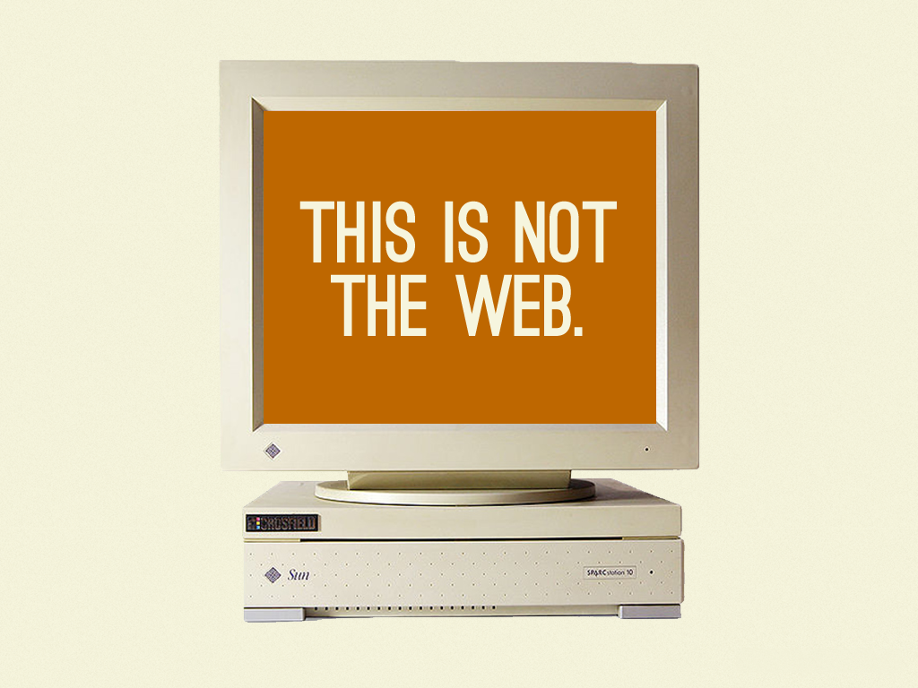
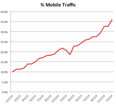
How content is accessed...
- Emails
- Websites
- Social Media
- Apps
- Shopping
- Other

6.8
Billion
Mobile devices out there, nearly enough for everyone on the planet

2008
We must have an
iPhone App!

2009
We must have an
Android App!

2010
We must have an
iPad App!

2011
We must have a...
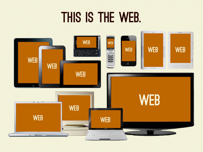

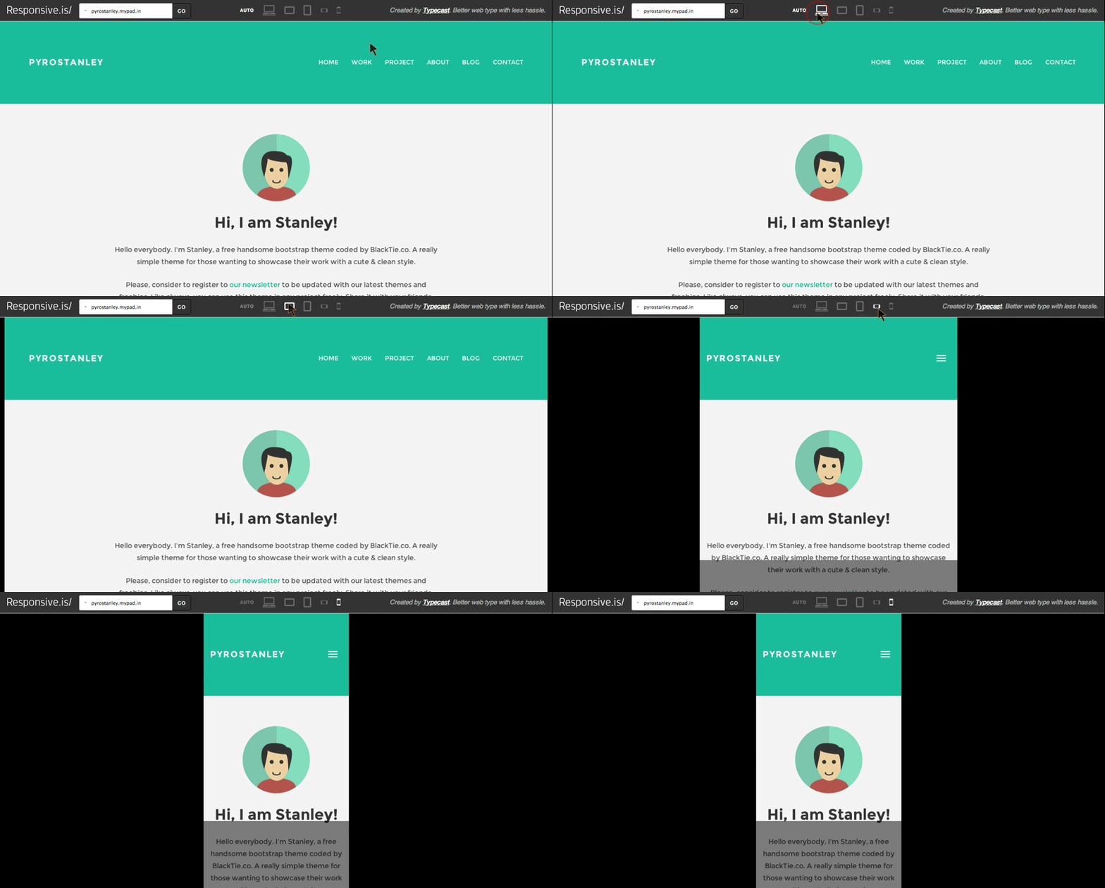
Responsive is the answer
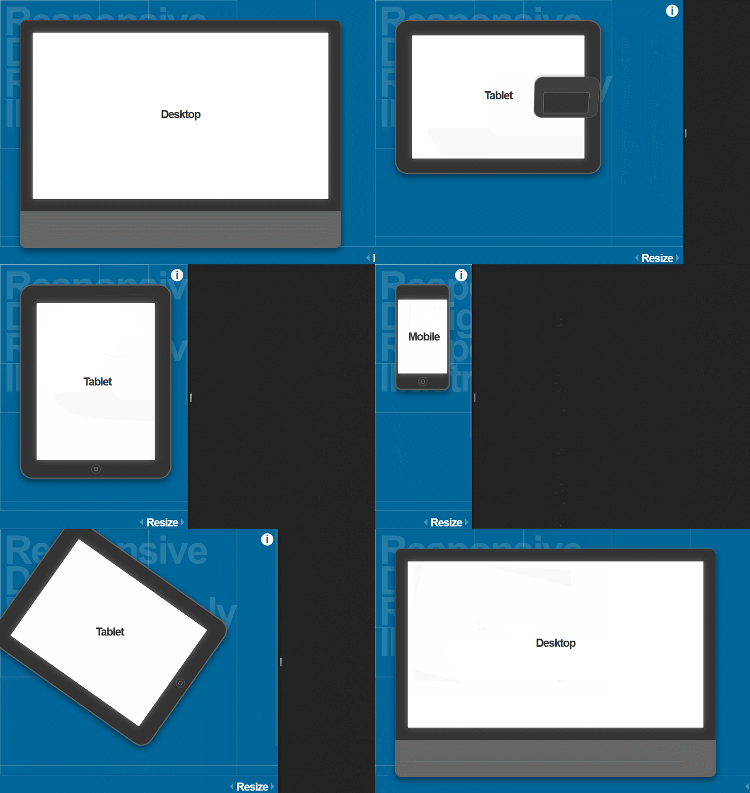
CSS 3 media queries
Evaluating certain aspects of the current browser environment to determine which CSS to apply.
We can apply different CSS rules based on things like browser window width, aspect ratio, and orientation.
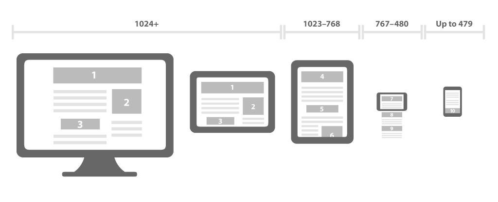
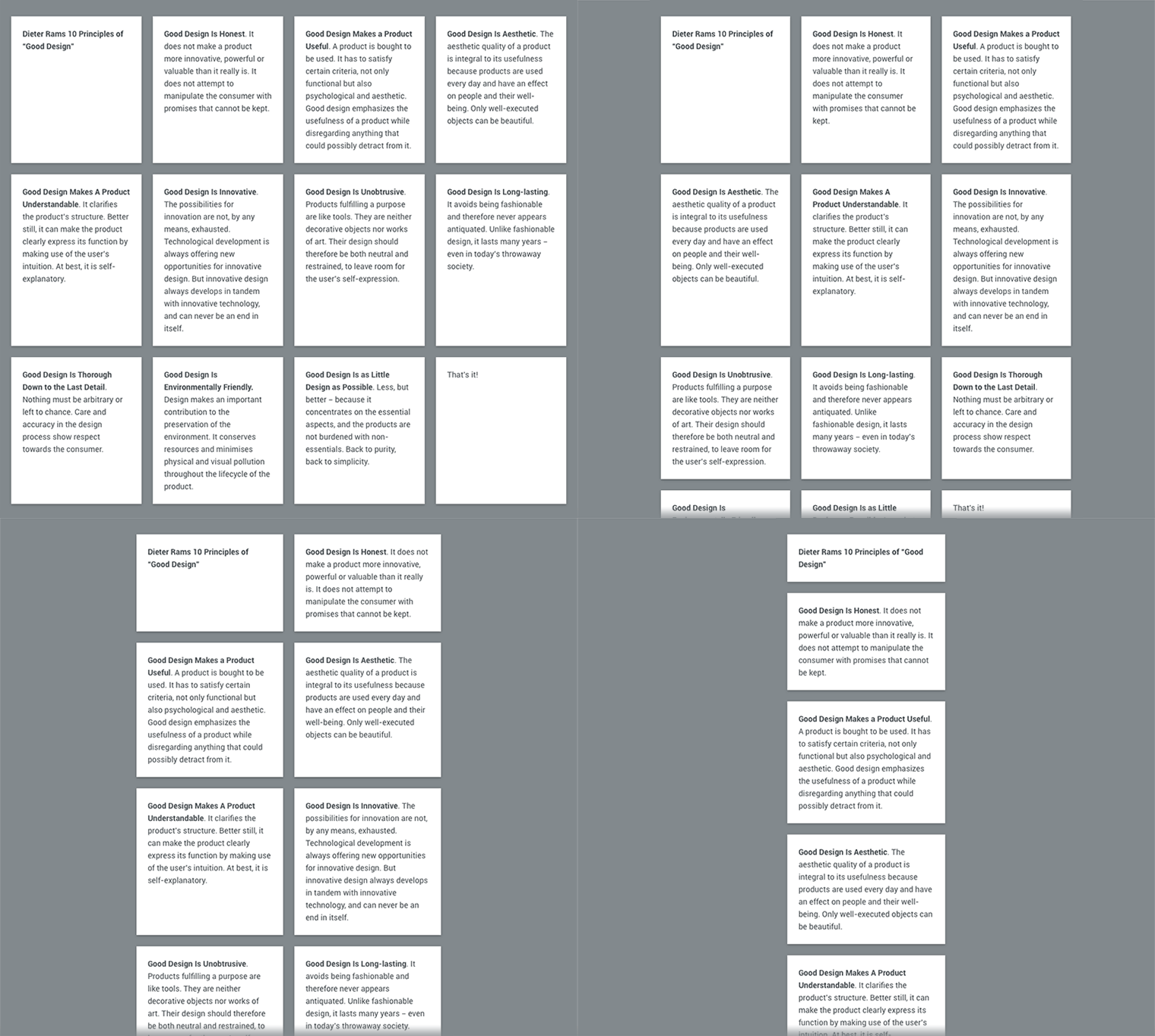
Fluid grid layouts
Using relative CSS positions instead of absolute sizes for page layout elements.
Percentages instead of pixels as units for columns and other layout elements.
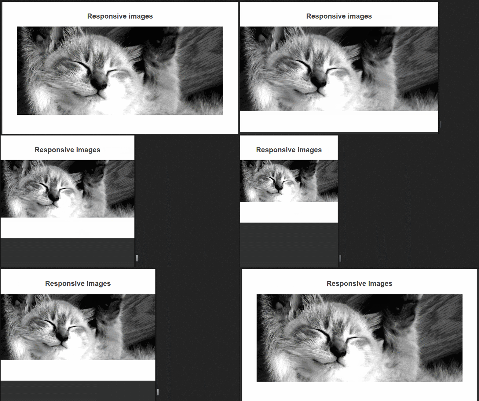
Fluid images and media
Making out images and media scale to fit within the size constraints of their containers by using some CSS tricks.
Fluid images and media keep within the bounds of their parent elements, scaling proportionally with the rest of the layout.
SVG / Responsive Icons
they are independent of the screen size that they are rendered into, use them whenever you can.
depending of the view size they are rendered into they can show / hide detail.
What we commonly do:
Focus on parts of the interface, not the whole page.
Prototype outside of the actual environment to keep
things lightweight and fast.
Build common pieces that can be reused.
Only when we have the small screen interface nailed,
worry about larger screens and integration.
What we commonly do:
Do the minimal possible to convey how it should work.
Pick the pieces of the interface that we think will be the
most difficult to do on small screens and start there.
Refactor a lot as we learn in the design.
That was easy.
What's the catch?
The page content must also be optimized for mobile, it doesn't stop at the UI.
Being Responsive from a layout perspective should not preclude us from being responsive from a performance and interaction perspective.
#1
Build Mobile First
Responsive Designs
-
don't be afraid to start from a clean slate
-
ask yourself what the mobile version should look like
-
after implementing it, wonder if you could better the desktop version using what you've learned from the mobile version.

#2
Keep CSS images in their place
- do not download images or resources that you are not going to show
- make sure to provide appropriate image sizes for different view sizes.
#3
Conditionally load JS based on
screen size and capabilities
You can use AJAX to include needed JS

Thank You! / Questions?
Andrei Voicu
Development Engineer
@Haufe-Lexware Romania
dreivoicu@gmail.com

Responsive Design
By Andrei
Responsive Design
- 324


