
Senior Principal Engineer
@ Secureworks
SoodAnkita
GuacamoleAnkita


Austin, Texas
Ankita Sood
(uh nk - ee t ah s oo d)
ankitasood.bsky.social

WebVibesOnlyDeep Dive into
The Material World

Deep Dive into
Angular Material's
Latest Updates
Material Design
Google’s open-source design system
Material Design
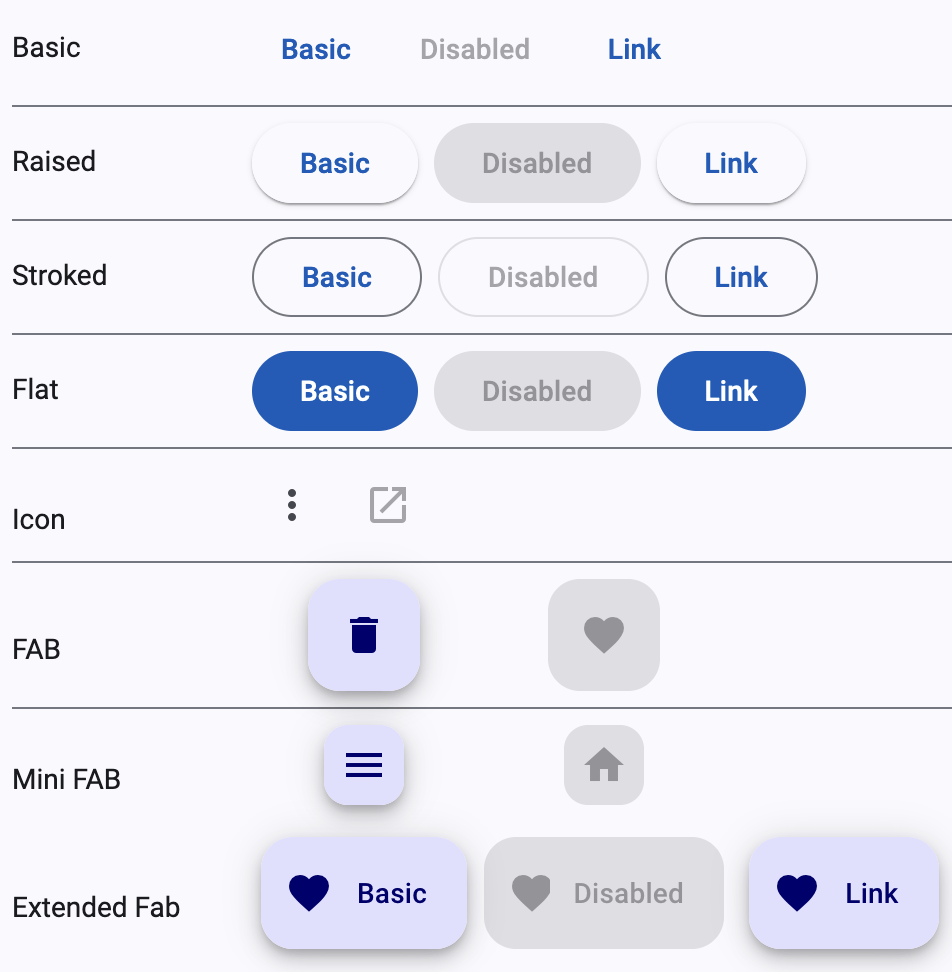
Angular Material
In Angular Material v15, many of the components were refactored to be based on the official Material Design Components for Web (MDC)
Material Web Components
in Maintenance mode
- Angular Material does not use or depend on MWC and is not impacted by this change.
- Angular Material currently uses a library called MDC Web under the hood.
- MWC was developed entirely separately from MDC Web.

Angular Material
-
Ubiquitous UX: Google's Material Design - intuitive, familiar patterns baked right in.
-
Accessibility: Built-in ARIA attributes, keyboard navigation, and screen reader compatibility.
-
Thriving ecosystem: Active community & dedicated Google support.
-
Always in sync: Guaranteed releases with every Angular update.
-
Effortless to integrate: Free, quick setup via Angular CLI.
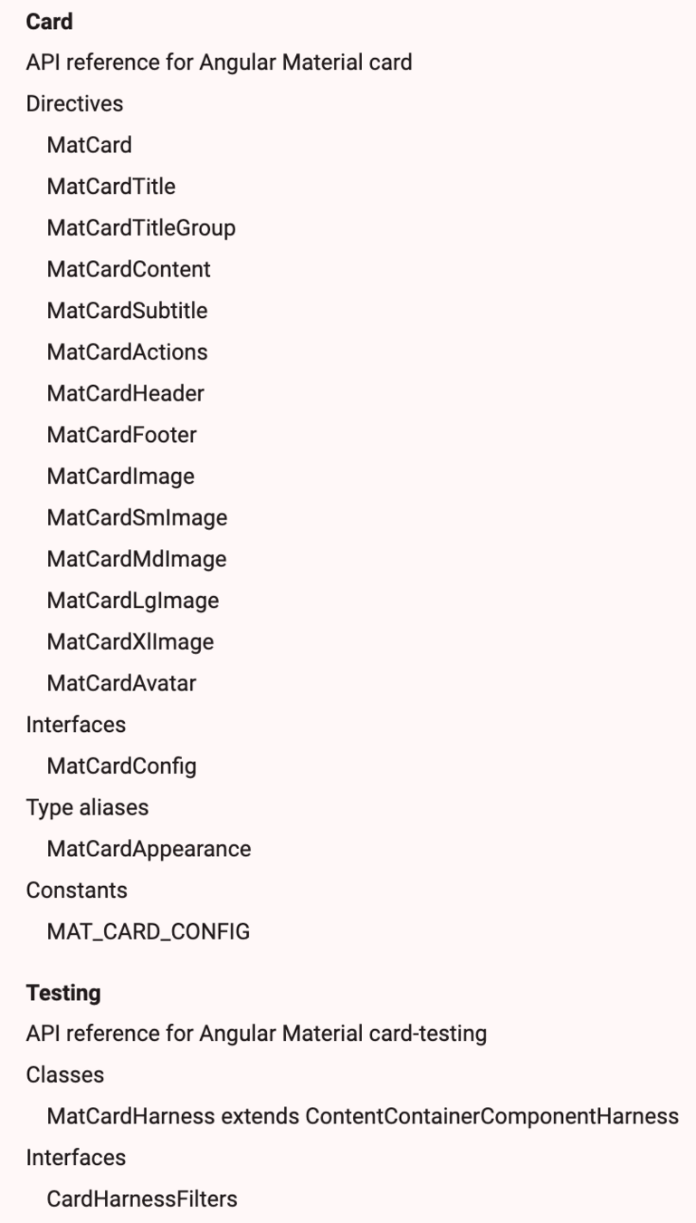
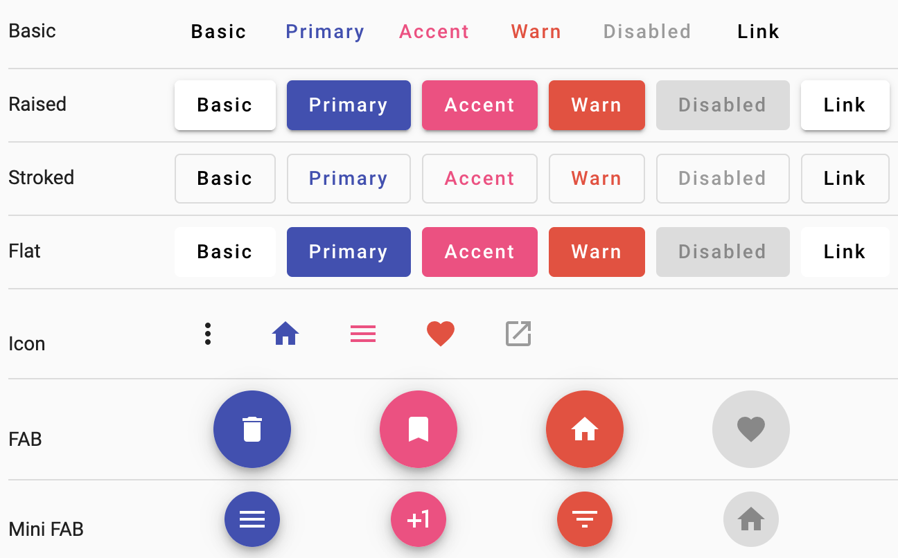
Cards API v14
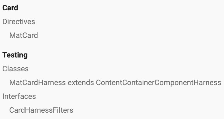
Cards API v18
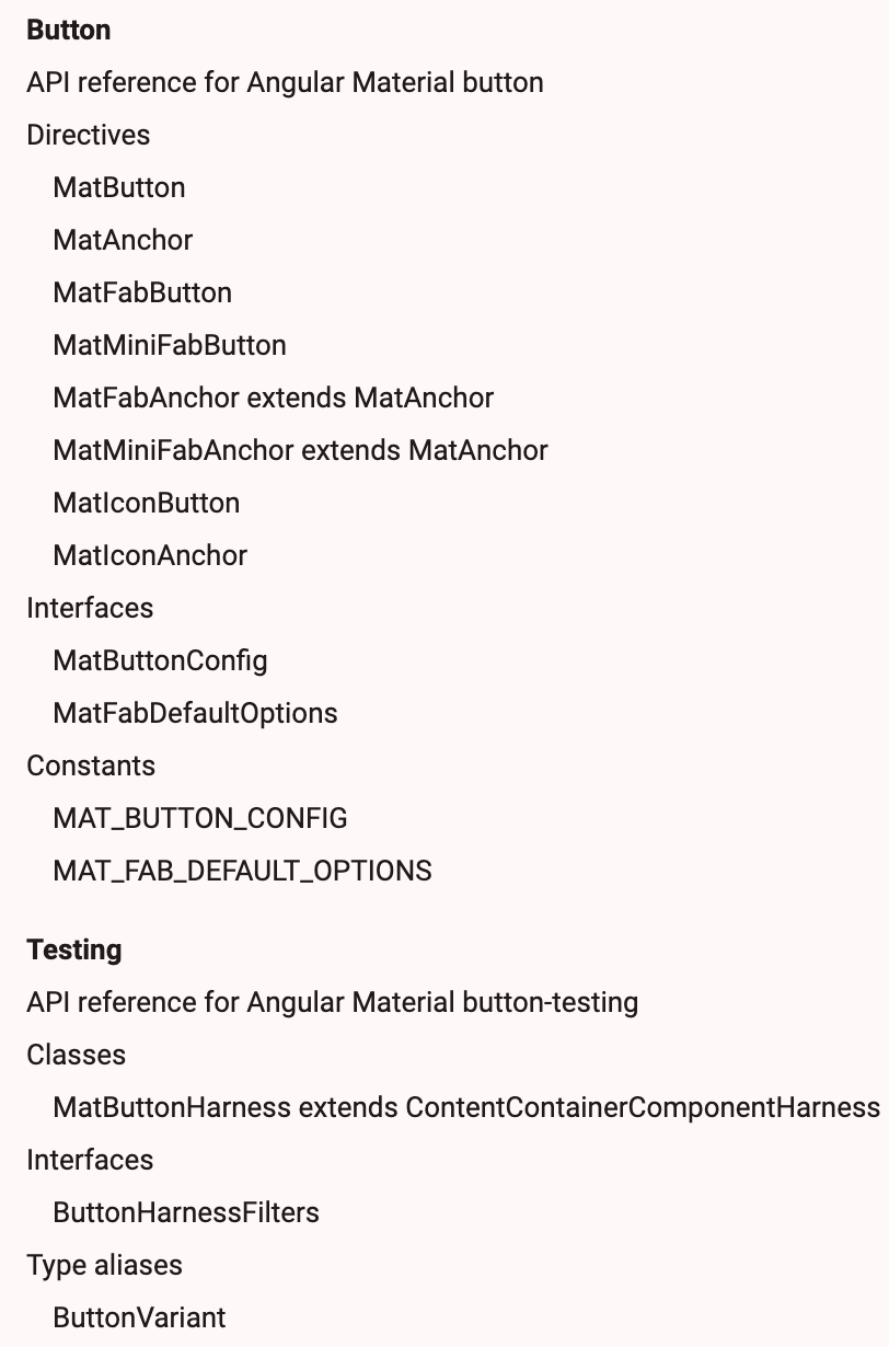
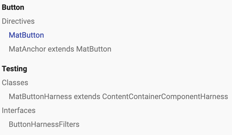
Button API v14
Button API v18
Material 3
Google's latest design system that’s
"adaptive, personal, and expressive"
M2 Support Continues in v18
$my-primary: mat.m2-define-palette(mat.$m2-indigo-palette, 500);
$my-accent: mat.m2-define-palette(mat.$m2-pink-palette,
			A200, A100, A400);
$my-warn: mat.m2-define-palette(mat.$m2-red-palette);

$my-theme: mat.m2-define-light-theme((
 color: (
   primary: $my-primary,
   accent: $my-accent,
   warn: $my-warn,
 ),
 typography: mat.m2-define-typography-config(),
 density: 0,
));
Visual Differences
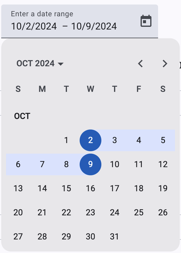
Visual Differences
Visual Differences
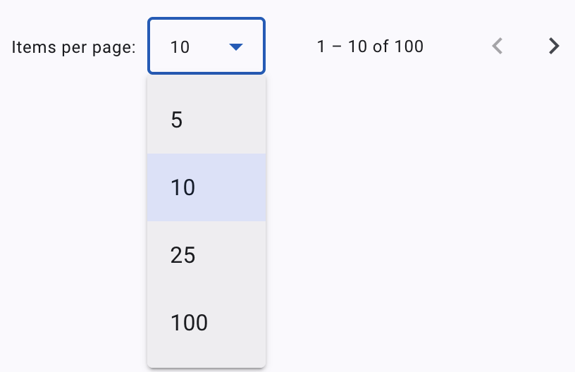
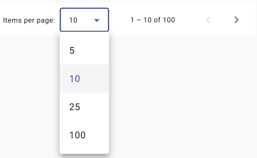
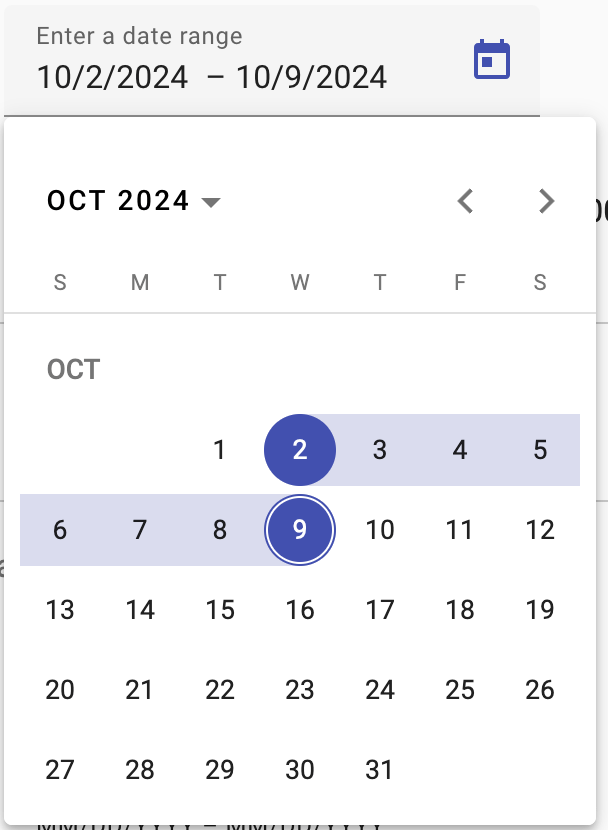
Visual Differences
Migrating from M2 to M3
-
No automated migration.
-
Mixins that take an M2 theme are compatible with M3 themes.
-
To maintain the behavior of
color="primary",color="accent", orcolor="warn", enable the backwards compatibility styles.
-
To ease migration
typography-hierarchymixin can emit both old(M2) and new(M3) class names.
Enable by passing$back-compat:trueto the mixin.
@include mat.color-variants-backwards-compatibility($theme);@include mat.typography-hierarchy($theme, $back-compat: true);Differences between M2 & M3
-
Mixin Usage: M3 requires
-theme,-color,-typography,-density, and-basemixins to be wrapped in a selector
(e.g.,html{...}). -
Component Color Variants: Color mixins instead of input.
<section class="tertiary-btn">
  <button mat-button>Print</button>
  <button mat-button>Share</button>
<section>
<button mat-button class="tertiary-btn">Download</button>
.tertiary-btn {
@include mat.button($theme, $color-variant: tertiary);
}Differences between M2 & M3
-
Unsupported Properties:
-
backgroundColorfor<mat-tab-group>is not supported. -
appearance="legacy"for<mat-button-toggle>is not supported.
-
-
Typography Mixins:
all-component-typographiesno longer emitstypography-hierarchyin M3. Explicitly calltypography-hierarchymixin to include these styles. -
Typography Classes:
typography-hierarchymixin outputs new CSS class names for typescale levels. Update any M2-based class names accordingly.
Theming in Material
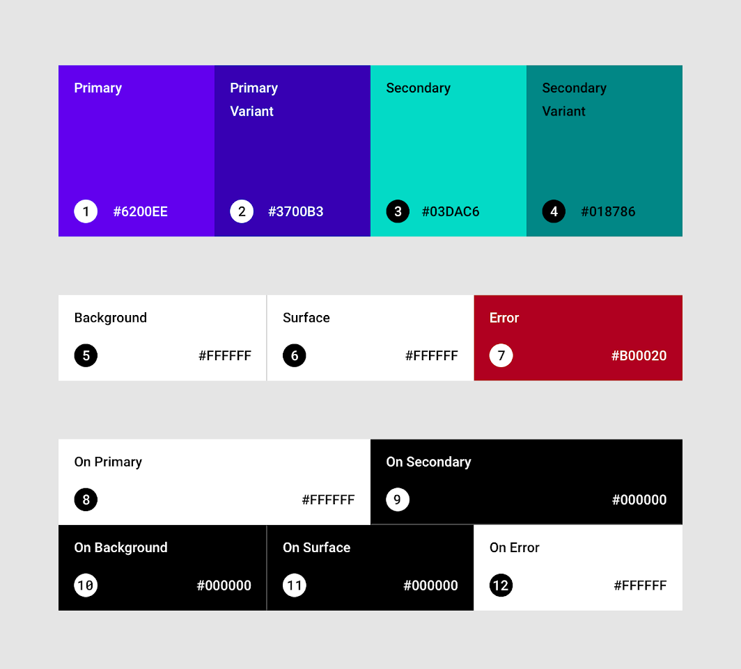
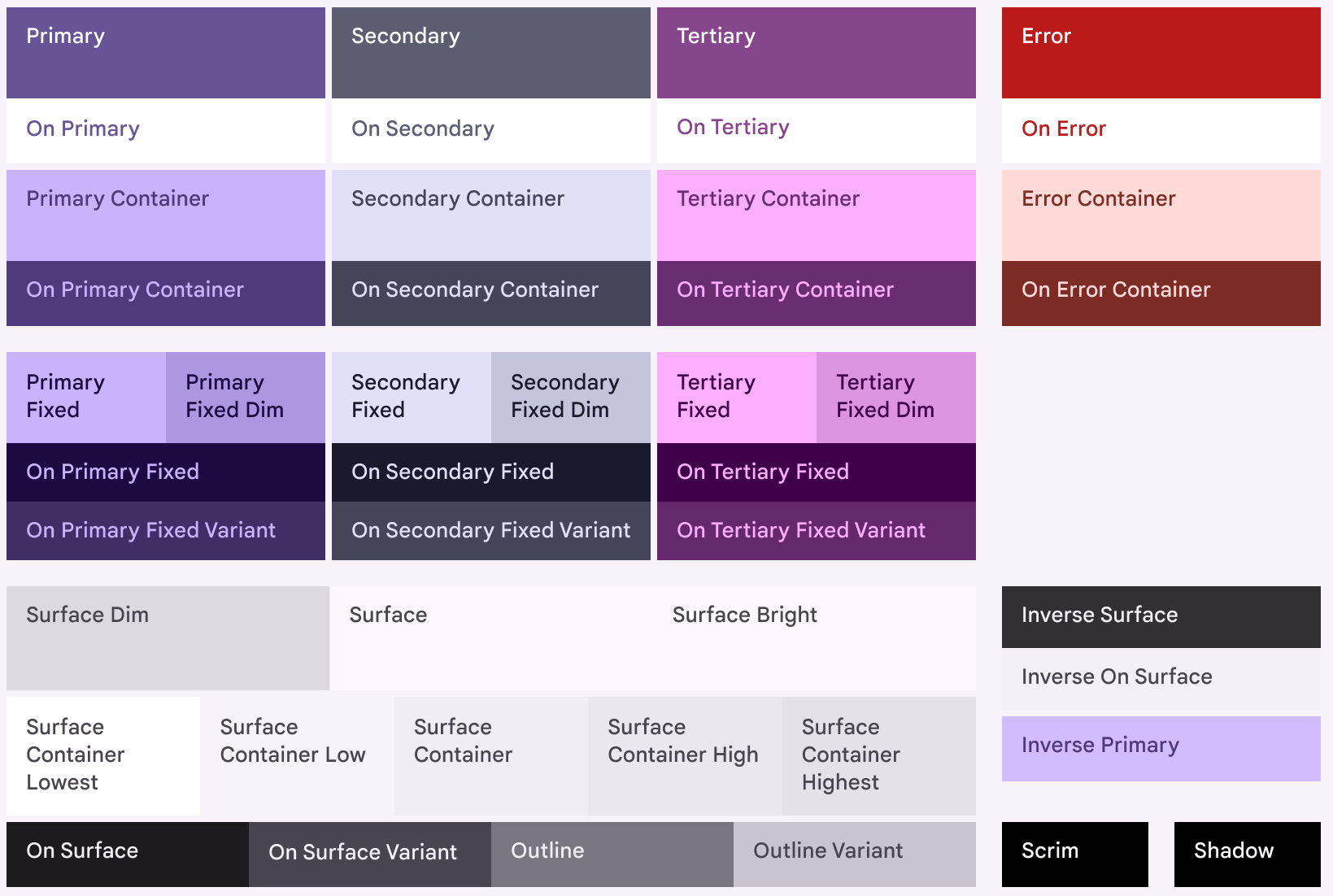
Diagram of all Material 3 color roles
Diagram of all Material 2 color roles
Material 3 Theming API
-
Granular Customization: Fine-tune themes with CSS variables.
-
Simplified Styling: No extra selector specificity.
-
-
Flexible API: Applying color variants to components via CSS.
-
Theming Custom Components: New Sass APIs let you access M3 theme properties for custom component creation.
$theme: mat.define-theme((
  color: (
    theme-type: dark,
    primary: mat.$violet-palette,
  ),
  typography: (
    brand-family: 'Comic Sans',
    bold-weight: 900
  ),
  density: (
    scale: -1
  )
));
ng generate @angular/material:m3-themeMaterial 3 Theming API
$theme: mat.define-theme((
  color: (
    theme-type: dark,
    primary: mat.$rose-palette,
    secondary: mat.$blue-palette,
  ),
  typography: (
    brand-family: 'Comic Sans',
    bold-weight: 900
  ),
  density: (
    scale: -1
  )
));
- Theme [optional]: Choice of Light vs Dark. Both generated if not specified.
-
Primary: App's primary color palette.
- If not specified- secondary, neutral, and neutral-variant palettes automatically generated per M3 specs.
Material 3 Theming API
$theme: mat.define-theme((
  color: (
    theme-type: dark,
    primary: mat.$rose-palette,
  ),
  typography: (
    brand-family: 'Comic Sans',
    bold-weight: 900
  ),
  density: (
    scale: -1
  )
));
-
Typography [optional]:
- plain-family: Font-family for body (plain-text).
- brand-family: Font-family for headings etc (brand-text)
- bold-weight: font-weight for bold text.
- medium-weight: font-weight for medium text.
- regular-weight: font-weight for regular text.
Material 3 Theming API
$theme: mat.define-theme((
  color: (
    theme-type: dark,
    primary: mat.$rose-palette,
  ),
  typography: (
    brand-family: 'Comic Sans',
    bold-weight: 900
  ),
  density: (
    scale: -1
  )
));
-
Density [optional]: Level of compactness of components.
- From 0 (most space) to -5 (most compact).
Component Schematics
Generate Material Design components easily
| Name | Description |
|---|---|
address-form |
Form group consisting: Form fields, Radio controls, Buttons |
| navigation | Toolbar & a responsive side nav based on Material breakpoints |
| dashboard | Dynamic list of cards & menus aligned in a grid layout |
| table | Pre-configured <table> with a datasource for sorting & pagination |
| tree |
<mat-tree> component to visualize a nested folder structure |
| drag-drop (CDK) | component that uses the CDK drag and drop directives |
ng generate @angular/material:address-form <component-name>
ng generate @angular/material:navigation <component-name>
ng generate @angular/material:dashboard <component-name>ng generate @angular/material:table <component-name>ng generate @angular/material:tree <component-name>
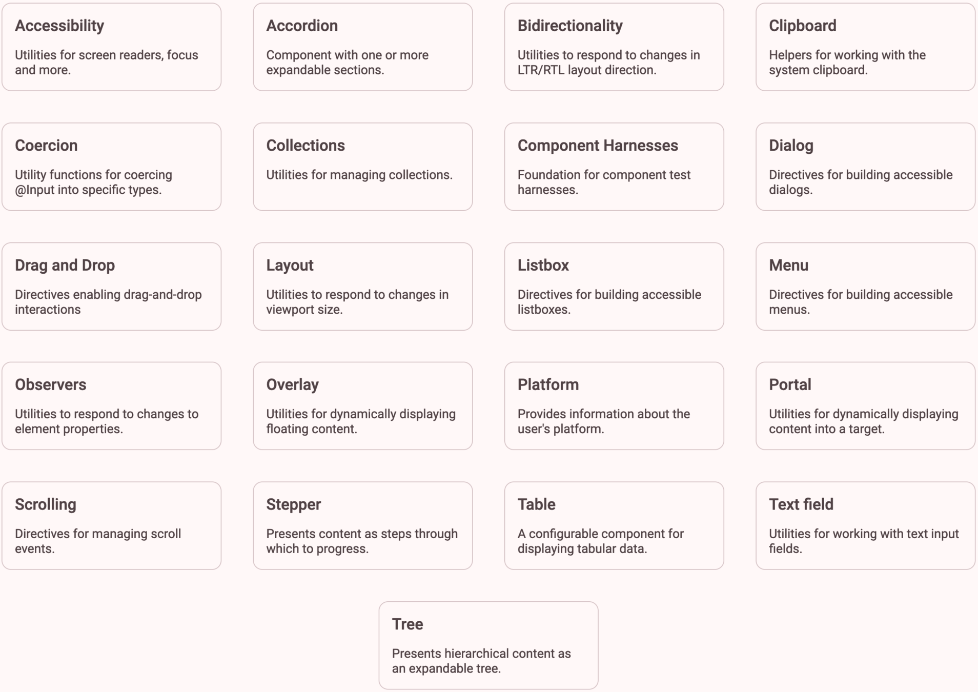
ng generate @angular/cdk:drag-drop <component-name>Component Dev Kit (CDK)
Set of behavior primitives for building UI components
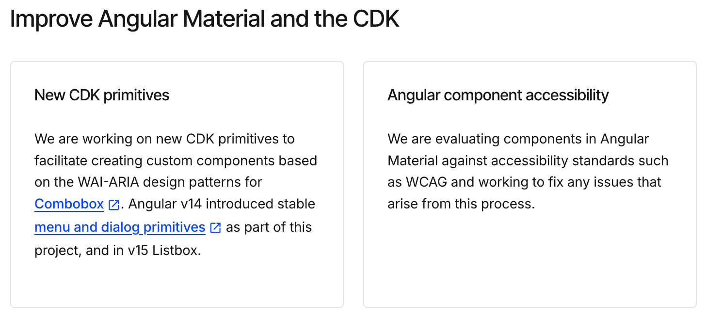
Future Updates in the Works
Thank You !
SoodAnkita
@GuacamoleAnkita

Angular Material v18 updates
By Ankita Sood
Angular Material v18 updates
A Deep Dive into Angular Material's Latest (v18)


