CSS3

Anupama H

What is CSS3 ?

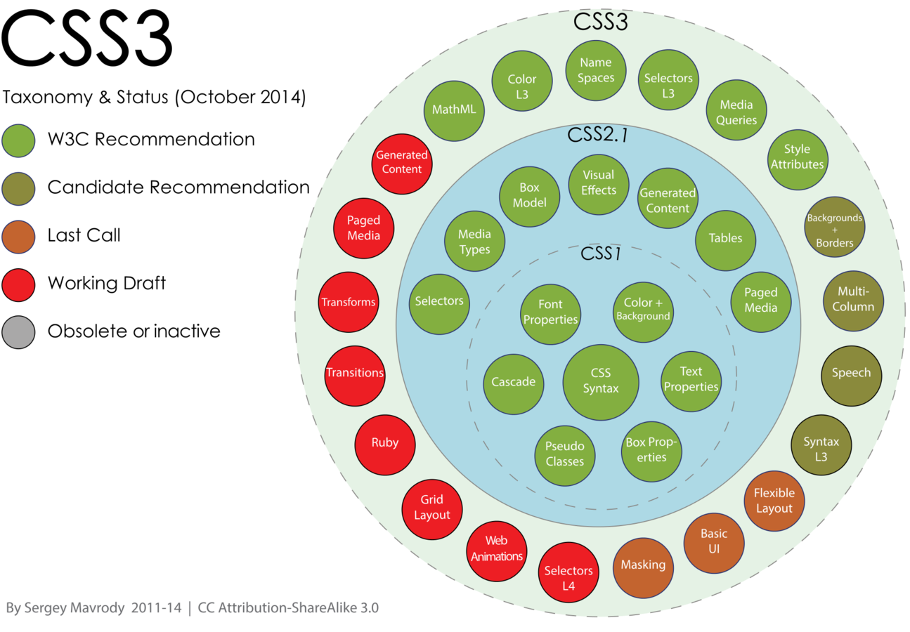
CSS3 is the latest evolution of the Cascading Style Sheets language and aims at extending CSS2.1


It brings a lot of long-awaited novelties, like rounded corners, shadows, gradients , transitions or animations, as well as new layouts like multi-columns, flexible box or grid layouts.


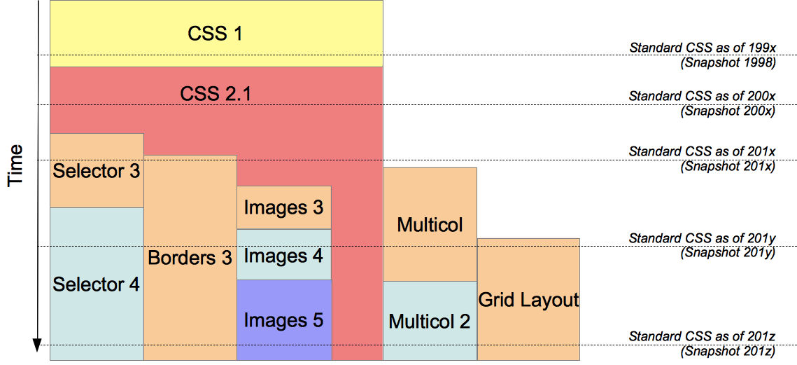
Earliest drafts started in 1999

Standards Process

  • Editor's Draft
    • starting stage , idea of a new CSS property is specified
  • Working Draft
    • design stage of a standardization
    • CSSWG works iteratively to check technical feasibility
    • If spec passes, published as FPWD
  • Candidate Recommendation
    • spec is tested by CSSWG & browser vendors
    • CSSWG has to demonstrate two correct implementations of the specification
  • Recommendation
    • considered complete & ready for browsers to implement

Going a little back in time..

  • CSS 1 - Recommendation status in Dec 1996 
    • most basic properties of CSS, such as 'margin', 'padding', 'background', 'color' and 'font', with restrictions on the allowed values
  • CSS 2Recommendation status in May 1998
    • includes a number of new capabilities like absolute, relative, and fixed positioning of elements and z-index
  • CSS 2.1 - August 2002 to June 2011 to reach rec status
    • corrects errors in CSS2
    • Adds highly requested features originally meant for CSS3 but widely implemented

Current Status

Current Status (contd..)

Let's dive in !

Color (REC)

  • Transparent colors :
    • adds alpha component to colors 
    • rgba(), hsla(), opacity
    • Examples
background: rgba(0, 0, 0, 0.5)​;
opacity: 0.6;

Selectors (REC)

  • Substring matching attribute selectors E[attribute^="value"] , E[attribute$="value"] , E[attribute*="value"]
/* begins with selector */
div[class^="card-"] {
   /* CSS to be applied to all cards */
}

/* ends with selector */
a[href$=".pdf"] {
    background-image: url(pdf-icon.png);
}

/* contains selector */
a[href*="google.com"] {
    background-image: url(google-icon.png);
}

Selectors (contd..)

  • New pseudo-classes:
    • :target - selects the element with an id matching the fragment identifier of the URI
    • :enabled and :disabled - selects elements that are enabled/disabled
    • :checked - selects checked elements
    • :root - selects the root of the document
    • :nth-child and :nth-last-child
    • :nth-of-type, :nth-last-of-type, :first-of-type, :last-of-type, :only-of-type
    • :last-child,  :only-child
    • :empty, and :not

Selectors (contd...)

  • Pseudo-elements are now characterized by two colons rather then one colon
    Ex -  :after becomes ::after, :before becomes ::before
  • The new general sibling combinator ( h1~pre )

Backgrounds & Borders (CR)

  • Backgrounds
/* background clip - set visible range of background */
background-clip: border-box;

/* background origin - defines background image position */
background-origin: padding-box;

/* background size - resize background image */
background-size: 50% 25%;

/* Multiple backgrounds */
background: url(image1.png), url(image2.png), url(image3.png);

Backgrounds & Borders (contd..)

  • Border Radius :   border-radius: 20px


  • Border Image :  border-image: url(border.png);

Shadows

  • Box shadow :   box-shadow: 40px 8px 30px #fff;


      - give 'inset' for inside shadow

  • Text shadow :  text-shadow: 8px 20px 10px #fafafa;

Gradient

  • Linear Gradients
    • background: linear-gradient(left, red, blue 30%, green)
  • Radial Gradients
    • background: radial-gradient(60px 45px, circle closest-side, red, blue 60%, green)
  • Repeating Linear Gradients
    • background: repeating-linear-gradient(red, green 18%, blue 25%)
  • Repeating Radial Gradients
    • background: repeating-radial-gradient(closest-side, red, green 20%, blue 50%)

Multi Column Layout (CR) 

  • column-count, column-width, column-gap
  • column-rule, column-rule-width column-rule-style, column-rule-color
.three-col {
    column-count: 3;
    column-gap: 20px;
    column-rule-color:  #ccc;
    column-rule-style:  solid;
    column-rule-width:  1px;
}

CSS Shapes (CR)

  • Wrap content around custom paths like circles, ellipses and polygons
  • Shapes can be defined manually or can be inferred from images
<img class=”element” src=”image.png” />
<p>Lorem ipsum…</p>

<style>
.element{
  shape-outside: url(image.png);
  shape-image-threshold: 0.5;
  float: left;
}
</style>

CSS Shapes (CR)

  • Creating shapes manually
    • circle() - shape-outside: circle(r at cx cy)
      • Reference boxes - margin-box, border-box, padding-box, content-box
      • Coordinate system origin is at top left of element
    • ellipse() - shape-outside: ellipse(rx ry at cx cy)
    • inset() - shape-outside: inset(top right bottom left border-radius)
      • Creates a rectangular shape
    • polygon() - shape-outside: polygon(x1 y1, x2 y2, ...)

Transformations (WD)

transform: rotate(30deg)

transform: scale(0.75,1.25)

transform: skew(30deg,10deg)

transform: translate(100px, 20px)

transform-origin: left top;

Rotate

Scale


Skew


Transitions (WD)

  • Syntax  
    • transition: <property> <duration> <timing-function> <delay>,
                         <property> <duration> <timing-function> <delay>
  • Easing functions : http://easings.net/


Animations (WD)

Transition & Animation Events

/* Transition events */
elem.addEventListener("transitionend", updateTransition, false);
function updateTransition(e) {
     console.log("property transitioned" + e.propertyName);
     console.log("elapsed time" + elapsedTime);
}

/* Animation events */
elem.addEventListener("animationstart", listener, false);
elem.addEventListener("animationend", listener, false);
elem.addEventListener("animationiteration", listener, false);

function listener(e) {
  switch(e.type) {
    case "animationstart":
         console.log("Started: elapsed time is " + e.elapsedTime);
      break;
    case "animationend":
         console.log("Ended: elapsed time is " + e.elapsedTime);
      break;
    case "animationiteration":
         console.log("New loop started at time " + e.elapsedTime);
      break;
  }
}

Transitions 

Vs

Animations

  • Transitions
    • Single fire - if you want something to happen only once  
    • Granular - can animate one or two properties in a given state


  • Animations
    • Looping - can loop/repeat infinitely
    • Alternate - can alternate between start & end state
    • Grouping - each animation can change number of properties

CSS

Vs

JS Animations

  • Depends on what effects you are trying to achieve
     
  • Use CSS animations for simpler “one-shot” transitions, like toggling UI element states, fading in etc
     
  • Use JavaScript animations when you want to have advanced effects & need more control over your animations
     
  • Manage state with JS, animation with CSS

References

  •  CSS properties reference : 
  •  Check browser compatibility :
  •  CSS3 quick reference : 

CSS3 Tech Talk

By anupama hosad

CSS3 Tech Talk

  • 800