HTML & CSS: Episode II
The Saga Continues!
What We'll Cover Today
- HTML <table> element - when and when not to use
- HTML <div> element - one element to rule them all
- More CSS! - margin, padding, float, rinse, repeat
- HTML5 elements - new kids on the block
Totally Tablulare!
	<table>
		<tr>
			<th>State</th>
			<th>Capital</th>
		</tr>
		<tr>
			<td>Georgia</td>
			<td>Atlanta</td>
		</tr>
		<tr>
			<td>South Carolina</td>
			<td>Columbia</td>
		</tr>
		<tr>
			<td>North Carolina</td>
			<td>Raleigh</td>
		</tr>
</table>- Tables are great, but should be used sparingly.
- Don't rely on tables to layout a page (that's what <div>'s are for!)
Stylin' Tables
Let's utilize CSS to gussy up this table.
		table, th, td {
			border:1px solid blue;
		}
		td {
			text-align: center;
		}
		/* th is inherently center! */
		.capital{
			color: red;
		}
		/* remember to go back and add class="capital" to
                   HTML elements containing capitals! */
Crowded House
That table was pretty cramped looking, right?
CSS can help us out with that!
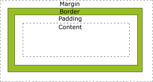
- Margin - we can set the space around an HTML element
- Border - we can set the size of border (we just did that!)
- Padding - we can set the space around the content and the edge of the HTML element
Nice Pad!
Let's use padding to give us some breathing room in the table.
		table, th, td {
			border:1px solid blue;
		}
		td {
			text-align: center;
			padding: 10px;
		}
		.capital{
			color: red;
		}
Now we have some room to stretch! Ahhhh!
Padding: It's all around you
As you just saw, if you give "padding" just one value, you'll have that amount of padding all around your content.
But there is another way...
td{
    padding-top: 10px;
    padding-bottom: 10px;
    padding-right: 10px;
    padding-left: 10px;
}
You can specify where you want the padding to be applied. The code written above would be the long form of padding: 10px;
What if we want to get more specific, but want to keep it all in one line of code?
.funky-cell {
    padding: 10px 20px;
   /* this would give top & bottom 10px
      and right & left 20px */
}

.groovy-cell {
    padding: 10px 25px 15px 20px;
    /* this would give you 10px on the top,
       25 on the right, 15 on the bottom, and
       20 on the left (it runs clockwise)  */
}
<div> and Conquer
<h1>So Boring</h1>
<div>This is one div.</div>
<div>This is another</div>.
<div>s are similar to <p>s - block containers - but they have absolutely no formatting attached (where as the <p> has some space above and below).
But being a blank canvas is the <div>'s greatest virtue!
We can shape it to be the take the form of the container we need.
margin-ally better
While "padding" gives us some space within an element, "margin" builds a moat of space around the element.
Defining a "margin" works the same defining "padding": -top, -bottom, -right, -left; or all on one line.
.my-margin {
    margin: 10px 20px;
    /* a top and bottom margin of 10px,
       a right and left margin of 20px */
}

.your-margin {
    margin: 10px 5px 15px 20px;
    /* margins running clockwise (top, right,
       bottom, left). */
}
We All Float On
We can direct which side of the page we want an element to appear on.
.my-div {
    float: right;
    /* an element inherently floats to the left */
}
Width Heights like these...
We can use "width" and "height" to size containers (<div>) as well as <img>s and videos (<iframe>).
.special-pic {
    /* we can define width and height in pixels: */
    width: 100px;
    height: 100px;
}

.cool-div {
    /* or we can define them as a percentage: */
    width: 50%;
    height: 25%;
    /* this is either a percentage of the whole page
       or a percentage of a larger element this element
       may be contained within */
}
Side-by-Side <div>s
We can utilize floating and width percentage to space our <div>s in columns (rather than stacked rows).
<style>
.column-divs{
float:left;
width: 50%;
}
</style>
<div class="column-divs">
Lorem ipsum dolor sit amet, consectetur adipiscing elit,
sed do eiusmod tempor incididunt ut labore et dolore magna aliqua.
Ut enim ad minim veniam, quis nostrud exercitation ullamco laboris
nisi ut aliquip ex ea commodo consequat.
</div>
<div class="column-divs">
Duis aute irure dolor in reprehenderit in voluptate velit esse cillum
dolore eu fugiat nulla pariatur. Excepteur sint occaecat cupidatat non
proident, sunt in culpa qui officia deserunt mollit anim id est laborum.
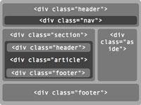
</div>That <DIV> Thinks it's a <table>!
With the addition of a "parent" <div> for each row, we can create columned-<div>s that resemble a table layout.
<style>
    .parent-div {
        height: 120px;
    }
    .column-div {
	float:left;
	width: 45%;
	height: inherit;
        text-align: center;
	border: 1px solid black;
        /* having the border helps us track the edge of the <div> */
    }
</style>

<div class="parent-div">
	<div class="column-div">
	    This div is the awesomest!
	</div>
	<div class="column-div">
	    Not as awesome as this div. Obvi.
	</div>
</div>
<div class="parent-div">
	<div class="column-div">
	    Oh, I don't know. This one here is pretty sweet.
	</div>
	<div class="column-div">
	    A fourth one? Oooh...I can't choose! You choose for me!
	</div>
</div>
So What? So Buttons!
<button type="button" onclick="alert('Hello world!')">Click Me!</button>
Header of the Class
One Footer in Front of the Other
<header>Important stuff up here at the top!</header><footer> © Tech Talent South 2014</footer>Create buttons! We'll learn more about how to utilize buttons once we work in Rails projects. Until then, try it out with a lil' bit of JavaScript (onclick).
Essentially, <header> is just a <div>, replacing <div class="header">. This way, you can apply styling to all header elements, without calling a class, if you want a standard header on all your pages.
Everything said about <header> above also applies to <footer>!
HTML5-Specific Elements
htmlcss2
By argroch


