Introduction to HTML and Bootstrap
Title Text
<!DOCTYPE HTML>
<html>
<head>
<link rel="stylesheet" href="https://maxcdn.bootstrapcdn.com/bootstrap/3.3.4/css/bootstrap.min.css">

	<style>

		.example-box{
			height: 200px;
			background-color: #aaa;
                        margin: 20px 0 0 0;
		}
	</style>
</head>
<body>
	<div class='row'>
		<div class='col-sm-1'>
			<div class='example-box'></div>
		</div>
		<div class='col-sm-2'>
			<div class='example-box'></div>
		</div>
		<div class='col-sm-3'>
			<div class='example-box'></div>
		</div>
		<div class='col-sm-6'>
			<div class='example-box'></div>
		</div>
	</div>
</body>
</html>
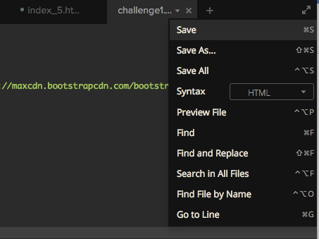
To preview your koding.com file you need to press the upside down triangle and then preview file

Your browser should look like this:

1. Change the height of all three blocks to 150 px
(you need to save all changes to your koding.com file before previewing it. Otherwise those changes will not show)
Your browser should now look like this

2. Change the hexadecimal value of the blue block to be a yellow color
3. Change the hexadecimal value of the red block to an orange color, the green block to a black color, and the height of the middle block to 100px.
4. Change the height of all three blocks to 100px
5. Each "div" section has a class of col-md-4. Change them all to col-md-3 and see what happens.
6. What do you think all of the numbers after col-md have to add up to for the blocks to cover the width of the screen?
7. Change the color of the first block to red, the second block to green, and the third block to blue
8. Adjust the numbers after col-md to make your screen match the one below

9. Adjust the numbers after col-md to make your screen match the one below

10. Adjust the numbers after col-md to make your screen match the one below


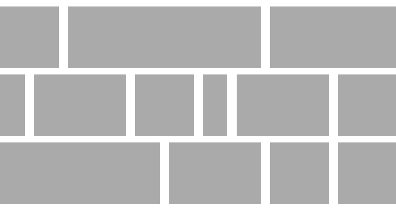
Challenge 11: Adjust your code so that your browser looks like the image below
Challenge 12: Try to add the following text to your browser
- Your name in the first red block
- Your city in the first green block
- Any pets that you have in the first blue block
- The names of your closest friends in the second red block
- The college you want to go to in the second green block
- The person who inspires you in the second blue block
Bootstrap

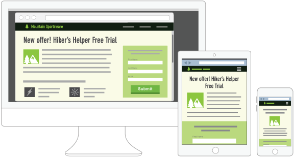
Responsive Design

Adding Bootstrap to your webpage
<!DOCTYPE HTML>
<html>
<head>
	<link rel="stylesheet" href="https://maxcdn.bootstrapcdn.com/bootstrap/3.3.4/css/bootstrap.min.css">

	<style>
What does
col-md mean anyway??
.col-xs = Extra small devices (ie Phones) (<768px)
.col-sm = Small devices (ie Tablets) (≥768px)
.col-md = Medium devices (ie laptops, or small desktops) (≥992px)
.col-lg = Large devices (ie Desktops) (≥1200px)*

Changing the width of a <div> on different devices
Copy and paste the following code into a new file
<!DOCTYPE HTML>
<html>
<head>
	<link rel="stylesheet" href="https://maxcdn.bootstrapcdn.com/bootstrap/3.3.4/css/bootstrap.min.css">

	<style>

		.example-box{
			height: 200px;
			background-color: #aaa;
                        margin: 20px 0 0 0;
		}
	</style>
</head>
<body>
	<div class='row'>
		<div class='col-sm-4'>
			<div class='example-box'></div>
		</div>
		<div class='col-sm-4'>
			<div class='example-box'></div>
		</div>
		<div class='col-sm-4'>
			<div class='example-box'></div>
		</div>
	</div>
</body>
</html>
When you preview the file in your browser it should look like this

Challenge 1
Make your screen look like this

Challenge 2
Write something in every div

Introduction to HTML and Boostrap
By Delaine Wendling
Introduction to HTML and Boostrap
- 4,478


